When I was a kid, I remember hearing of seasonally-adjusted economic indicators. I was rather disappointed to learn, upon growing up and taking econ, that seasonally-adjusted economic indicators were not calculated using some highly theoretical formulas taking into account all manners of variation, but were merely moving averages.
In Highlight Certain Time Periods in a Chart, I used my blog stats to illustrate how to highlight weekdays from weekends. Another way to account for cyclical variations is to take a moving average. I’ll use the same data here to show two ways to construct moving averages. A moving average simply moves along the data, taking the average at each point of the previous N values.
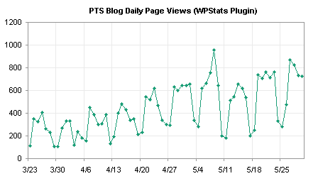
The raw data is shown in this chart, and the cyclical variation is pronounced, making it more difficult to pick out longer term trends.

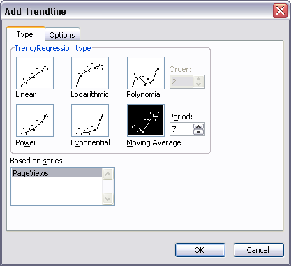
The easiest way to take a moving average probably is to right click on the chart series, and choose Add Trendline. Excel offers several types of trendlines, and moving average is included among them. For daily data that has different weekday and weekend values, a 7-point moving average is an appropriate option.

Here is the chart with a moving average trendline.

You can also calculate your own averages in the worksheet, and add a series with the average values. This is appropriate if you are using a weighted moving average (such as an exponential moving average) or if you need to use the averages in subsequent worksheet analysis. The technique is simple. Skip the first N-1 points (i.e., 6 points for a 7-point moving average), then use a simple formula to average seven points, and fill the rest of the range with this formula. For data starting in cell B2, make a 7-point moving average starting in cell C8 with this formula, and fill the formula down column C to the last row with data in column B:
=AVERAGE(B2:B8)
Then add this column’s data to the chart as a new series.

For this simple example the two approaches are virtually indistinguishable. If you’ve calculated your own averages, you can remove the raw data series and show just the smoothed line.

Trendline and Regression Articles on this Web Site
- Trendlines and Chart Types in Excel
- Add One Trendline for Multiple Series
- Trendline Calculator for Multiple Series
- Trendline Fitting Errors
- Choosing a Trendline Type
- Plot Two Time Series and Trendlines with Different Dates
- Polynomial Fit vs. Statistical Process Control
- Stacked Column Chart with Stacked Trendlines
- Deming Regression
- Deming Regression Utility
- LOESS Smoothing in Excel
- LOESS Utility for Excel


Rick Williams says
Hi Jon,
Seasonal adjustment is not just something that can be done using moving averages. The way I remember it went something like this:
The seasonality factor is calculated by taking the average value for each (in your example) day of the week, then dividing this by the average of the entire dataset. This would give seven factors, presumably Saturday and Sunday would be 1.0 (above average)
Then each data point is ‘seasonally-adjusted’ by dividing it by the relevant seasonality factor.
The resultant plot should reveal the outliers you mentioned in you previous post as deviations from a more-or-less straight line. Also I would expect you would pick up some change in the magnitude of weekday/weekend fluctuations over time.
Cheers,
Rick
Rick Williams says
Also, this website has some FAQs on seasonal adjustment.
http://www.census.gov/const/www/faq2.html#twelve
Clearly, the method I have described above is the simplest method of seasonal adjustment, and the US Census Bureau use more complex methods. From what I read from this page, this involves using a range either side of each data point (e.g. analagous to 1 week either side in your data) to determine the seasonal factors, so that they evolve over time, and would hence perform better at removing weekly variations.
Rick
Tony Rose says
Jon – as we have previously discussed, moving averages are very handy when it comes to smoothing out data such as Feedburner data or daily site traffic because of the vast fluctuations from day to day.
Without going too in-depth, it’s good to mention moving averages for those readers that may not be too familiar.
BTW – looks like PTS is recovering nicely from the ~5/18 decline.
Jon Peltier says
Rick –
Thanks for your comments. That’s why I like this blog. I open my mouth and make a grand oversimplification, and someone not only calls me out, but gives me something interesting to read.
I know that moving averages are really more detailed than I blustered about. Monthly averages have to be tweaked to account for some months having more weekends and fewer weekdays, for example. December has two holidays (Christmas and New Years) and a light week between them.
I was going to show a couple charts here, but I decided it would make better sense to start another post for them. I don’t have enough data for a full blown seasonal analysis, not yet, but I’m intrigued.
This also will help my argument in Births by Day of the Year, a follow-up to a New York Times article. The premise of the article was that people scheduled deliveries in order to gain a tax deduction. My analysis indicated (to me, at least) that deliveries were scheduled for during the week all year round (why else are weekend births 1/3 lower than weekday births?), and for the days before major holidays, especially Thanksgiving, Christmas, and New Years, but also Independence Day, Labor Day, and Memorial Day. My premise is that the tax deduction was less of a driver than a doctor having to deliver on a weekend or holiday.
Jon Peltier says
Tony –
The week of 5/11-5/17 showed lower pageviews every day than had been typical. I don’t know why, but I didn’t post over the prior weekend, and only had two posts during the week. Posting frequency can sure complicate these statistics. The stat that intrigues me more is the peak the previous Thursday, 5/8. On 5/6 (probably in the evening) I posted a widely read and heavily commented post, Changes to Charting in Excel 2007. Perhaps this topic led to the pageview spike.
Jeremy says
Good Afternoon Mr. Peltier,
I am able to create the moving average Trendline (10-Point) easily enough, but I have taken it upon myself to solve a challenge posed to me by a VP. The goal is to create a 10-day moving average Trendline that does not venture beyond the last data point when graphed, but in which we can still view future dates on the x-axis of the graph. That is, we don’t want to cut the graph (x-Axis) at the last data point, just the trendline data. I have seen mention of Dynamic Charts and Dynamic Data, but I am unsure how to apply this. I’ve tried to use it, but I receive error messages and I’m not experienced enough to troubleshoot it. Any advice would be greatly appreciated.
Thank You for your time,
Jeremy
Jon Peltier says
If the X axis is a date-scale axis, set the maximum beyond the last data point.
Peter says
Do you know a simple way in excel to calculate/recognize, if the given point is above or below simple moving averages?
Jon Peltier says
Peter –
You need a calculation of moving averages, using a column of data, and a test (or two, if you want to plot different markers for each) for whether the current value is greater than or less than the average.
Stella Garcia says
Different investors use moving average. Thank you a lot for sharing this with all people your blog is great.