In Marimekko Replacement – Overlapping Bars (Easy) I showed a quick and dirty way to make an overlapping bar chart that used only bar length, not rectangle length, width, and area, to encode values. The “easy” method in that tutorial was limited in that the data needed to be symmetric (equal numbers of rows and columns) and the wide and narrow bars were not perfectly aligned. So I came up with an alternative “hard” method, though in retrospect, it may not really be harder than the easy method. I’ll let you be the judge.
Like most advanced charts, you need to rearrange the data in order to make it work. Here is the original asymmetric data and a Marimekko chart made from it. The overlapping bar chart is one graphical technique designed to minimize problems with Marimekko charts.

The first step is to arrange the data into the following sparse array. The gray rows are blank; I’ve only colored them to clarify the data structure. Notice that there are two blank rows between the column (Company) and row (Segment) data. This provides wider spacing between these sections of the finished chart.

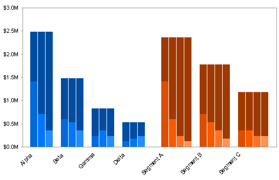
Create a column chart from this data, with series in columns. To make sure Excel parses the data properly (one row for series names, one column for category labels), type a letter (“x”) into cell A20, so there’s only one blank cell in the top left of the range. Then create the chart, and finally delete the character you types in A20. Set the Overlap option to 100 and the Gap Width to zero. In the first chart I’ve set the Gap Width to 10, so it’s obvious that the large fat bars are really comprised of several narrow bars next to each other.
Here’s a glimpse of the custom palette I used in Excel 2003 to color the bars. Bar_Chart_Graded_Colors.xls is a small downloadable Excel 2003 workbook that uses this palette.
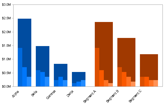
Here’s that chart with a Gap Width of zero. Look at the perfect alignment, in contrast to the slight mismatch in the “easy” version of this chart.
The data is plotted nicely, but those category labels aren’t so nice. Set up the following data for category labels. We’ll make a dummy XY series, add labels, and hide the data points.
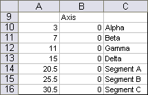
The X values in this table are chosen to align the markers with the clusters of bars. The numbers start with 1at the first category position (which has no bars: see below), and increment with each slot along the axis. To center a label below the first cluster of three blue bars, the point must have an X value of 3. To center a label below the first cluster of four red bars, the point must be between categories 20 and 21, so it must have an X value of 20.5. The Y values place the markers along the bottom of the chart.

Copy the first two columns of this data (not the actual labels), select the chart, and use Paste Special to add the data as a new series.
The series initially does not appear. Select one of the visible narrow series and pressing the up arrow key until the new seeries is selected. You’ll probably be able to see a line of selection handles along the left portion of the bottom axis.
Use Chart menu > Chart Type or Chart Tools > Design ribbon tab > Change Chart Type to change this series to an XY type series. It now appears as a set of markers along the bottom of the chart, and Excel has conveniently added secondary axes for the new series.
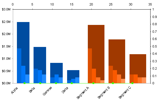
Well, in this case, not so conveniently. Format the new XY series to associate it with the primary axis, and the markers now line up perfectly with our clusters of bars.

If you’re a regular reader, you already use Rob Bovey’s totally excellent Chart Labeler. If you’re not using it already, then run, don’t walk, to Rob’s Applications Professionals web site, and download the Chart Labeler. Rob calls it the XY Chart Labeler, but it works for any chart type that supports data labels. It’s free, easy to install, and easy to use.
Using the Chart Labeler, add the labels from the third column of the data range shown above to the points of the XY series. For clarity I’ve colored the labels green to match the points and to distinguish them from the default labels, which we are going to jettison in a moment.

There’s just a little cleaning up. First, hide the XY series by formatting it to show no markers and no lines. Change the labels we’ve recently added to black text. Format the category axis to use no axis tick labels. This removes the margin below the plot area, and our added labels float above the bottom edge of the chart. Resize the plot area to regain this margin and provide room for the labels.
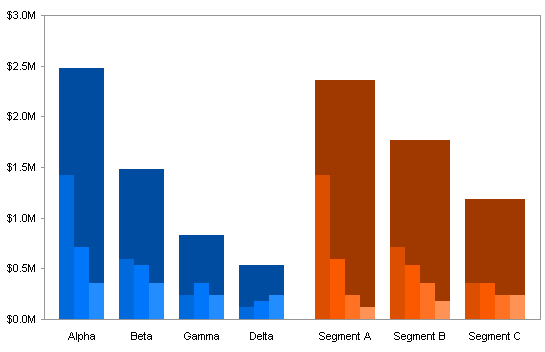
Is the “hard” overlapping bar chart method really more difficult than the “easy” method. It’s certainly more flexible.
To construct a 2×2 panel chart that shows the same data, perhaps somewhat more clearly, see Marimekko Replacement – 2 by 2 Panel.

IIf you still want to make a Marimekko chart, you might consider the PTS Marimekko Chart Utility. Like all of my commercial utilities, it reduces the manual process of constructing a complex chart to simply selecting a range, choosing a couple of options, and admiring the result.
I’ve recently developed the PTS Merimekko Chart Utility. Like all of my commercial utilities, it reduces the manual process of constructing a complex chart to simply selecting a range, choosing a couple of options, and admiring the result.


Peter Bartholomew says
Jon
I have put a couple of, what I consider to be, plausible options for combining a series average/series total with the initial line or column charts. I would value your opinion. Meanwhile I will spend a little more time looking through other material you have posted.
https://skydrive.live.com/#cid=59A816B11701AEAC&id=59A816B11701AEAC%21104
Peter Bartholomew says
Sorry Jon. I have just realised that my previous post shared an exploration of ‘alternative solutions’ without first commenting to explain the problems I have with the, admittedly technically ingenious, presentations proposed above.
The first is that for any chart with a large number of series the total will, by definition,
be ‘off the scale’ as far as the individual series values are concerned.
The second is that, although I ‘understand’ that if I stacked the series columns top to bottom they fit exactly within the outer box in terms of height I cannot help seeing the container as being much ‘bigger’ because of its width.
This made me think that the ideal for the 2×2 panel version of your chart would be to scale the upper panels so that the height is determined by the series average. Visually, since the areas (totals) of the upper and lower panels are then identical, a more intuitive link is made.
The ideas I posted are merely attempts to recombine the top and bottom elements of the panels into one – overlapping column charts didn’t work too well.
Nathan says
There is actually a simpler way to “center” the x-axis labels to each large totals bar – and that’s to move the label text in the spreadsheet down a few cells. In your example spreadsheet above, you could for example, move “Alpha” from A-21 to A-22. Granted, this will not be exactly centered if you have an even number of datapoints, but if you have three (or another odd number) assigning the label to the second data point will do the trick.
Jon Peltier says
Nathan –
There’s “good enough”, and there’s spot on. If it’s a chart for initial investigation of the data, then it doesn’t really matter. But the kind of charts shown here are for a more finished presentation. It’s worth a little extra work to make the labels exact. Attention to this detail lends credibility to the analysis.