I showed an overlapping bar chart alternative to a Marimekko chart in my recent post The Problem with Marimekkos. I gave very few clues about how to construct such a chart, so now I’m showing the protocol.
The approach shown here is somewhat simplified, and works only when the grid is symmetrical, with the same number of rows and columns.
Like most advanced charts, you need to rearrange the data in order to make it work. Here is the original data and a Marimekko chart made from it.

The first step is to compile the row and column subtotals into columns, with row and column headers in the first column, and the data staggered so each set of data appears in its half of the chart (in this case, Company to the left and Segment to the right).

Make a clustered column chart with these three columns of data.
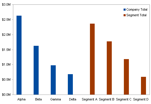
Set the Gap Width of these series to 25, so the gaps between clusters are 25% as wide as the bars. This 25% comes from the final chart, which will have four narrow columns per wide column, with a narrow-column-width gap between.
Set the Overlap to 100, so the bars of one series overlap with the blanks in the other.

Now rearrange the rest of the data into the following sparse array. The gray rows are blank; I’ve only colored them for my own benefit in my working file.
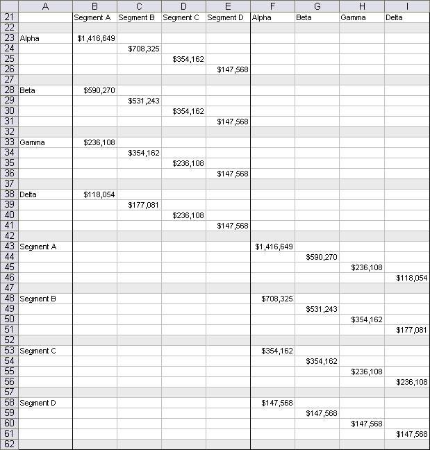
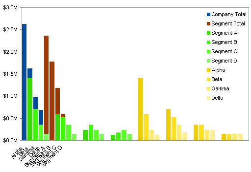
Copy this range, select the chart, and use Paste Special to add the data to the chart as new series. Because the Overlap was set to 100, these new bars overlap the existing ones. For now I’ve colored the bars in contrasting colors with a custom palette.
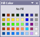
Here’s a glimpse of the custom Excel 2003 color palette I used to format these bars. Bar_Chart_Graded_Colors.xls is a small downloadable Excel 2003 workbook that uses this palette.
One by one, move each of the series you’ve just added to the secondary axis. Change the Gap Width of one of the added series to 0 (zero). This is as good a time as any to remove the legend.

Excel has added the secondary Y axis, but we want the secondary X axis. In Excel 2003 and earlier, go to Chart menu > Chart Options > Axes tab, uncheck the Secondary Value (Y) Axis box and check the Secondary Category (X) Axis box. In Excel 2007 and later, go to Chart Tools > Layout tab > Axes > Secondary Vertical Axis > None, then Chart Tools > Layout tab > Axes > Secondary Horizontal Axis > Show Left To Right Axis. The bars almost line up.
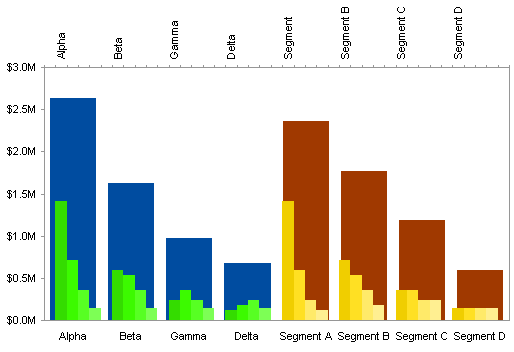
Format the secondary category axis (top of the chart) and uncheck the Value Y Axis Crosses Between Categories in Format Axis dialog > Scale tab in Excel 2003, or select Position Axis > On Tick Marks in Format Axis dialog > Axis Options in Excel 2007. The alignment of columns in Excel 2007 is precise, but the alignment in Excel 2003 needs a little adjustment. Tweaking the width of the chart by a couple pixels may make the alignment slightly better, or slightly worse.
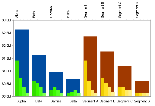
Changing to a matching color scheme completes the chart, and makes the misalignment almost vanish.
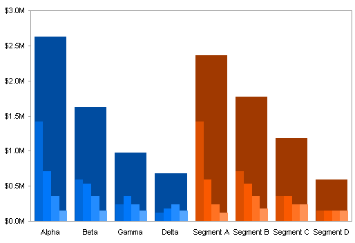
Changing the gap width of the secondary axis bars to 10 minimizes the misalignment and provides a border between the small bars.

The more complicated approach allows for asymmetric data arrays (different numbers of rows and columns) and also eliminates this slight misalignment. The next tutorial, Marimekko Replacement – Overlapping Bars (Hard), will describe that method for making overlapping column charts.
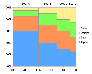
To construct a 2×2 panel chart that shows the same data, perhaps somewhat more clearly, see Marimekko Replacement – 2 by 2 Panel.

IIf you still want to make a Marimekko chart, you might consider the PTS Marimekko Chart Utility. Like all of my commercial utilities, it reduces the manual process of constructing a complex chart to simply selecting a range, choosing a couple of options, and admiring the result.


Chandoo says
Jon, While the marimekko chart provides a good utility in terms of showing segment-wise sales, I think this chart would be more difficult to interpret. It might be easier to read the stacked chart (regular variety or the variable width variety) than this one.
For one, when you look at the chart, the blank space (between the dark blue and lighter shades of blue) can confuse as it gives an impression of area chart rather than bar chart. I liked your chart version : https://peltiertech.com/images/2009-02/MariBar_PanelColumns.png compared to what you have shown here. I guess it is much more easier to read.
Jon Peltier says
Chandoo –
I concluded the same about the readability of the overlapping bar chart in The Problem with Marimekkos. I’m finishing up the series with Marimekko Replacement – 2 by 2 Panel.
Michel Gerday says
Can you release the color palette you mentioned above ?
Thank you.
Jon Peltier says
Michel –
Good idea. It isn’t perfect, I only changed the colors needed for the graded bar fills, plus I lightened up the grays. Anyway, here it is:
Bar_Chart_Graded_Colors.xls
Michel Gerday says
Jon,
I really thank you for this.
I recently created a line chart with 27 different series, i.e. all European Union’s Member States.
With the standard color palette (and also with the one I got from the Excel dashboards as advertised below :-) ), it is really a nightmare because all colors seem identical or the contrast is weak (yellow on white chart background).
You could ask : “Why do you want such a mess of lines ?”
And I would reply: “Just because God wants it, whoever God is )
Hence it would be good idea to develop a range of color palettes, hopefully by Excel version.
I am sure that Excel geeks, like myself, would be even ready to buy them, :-)
Jon Peltier says
Michel –
I’d think it would be impossible to make sense of your 27-series chart by using different colors. How about this approach, which shows all the data, but only emphasizes one series at a time:
Easier Interactive Multiple Line Chart
Gabriel says
I cannot make the new series appear as requested for the following step with 2007:
“Excel has added the secondary Y axis, but we want the secondary X axis.In Excel 2003 and earlier, go to Chart menu > Chart Options > Axes tab, uncheck the Secondary Value (Y) Axis box and check the Secondary Category (X) Axis box. The bars almost line up.”
After pasting the new series, whatever I do to the Axis, the original series only use a small part of the horizontal axis.
Jon Peltier says
Hi Gabriel –
I’ve updated the article to include the Excel 2007 steps, which I’ve tested to make sure they work.
Gabriel says
Thanks Jon, now it works fine with the 2 step for axis in Excel 2007.