I recently posted a tutorial showing how to construct Marimekko Charts in Excel.
Based on Stephen Few‘s earlier analysis of Marimekko Chart in A Design Problem, I followed up with The Problem with Marimekkos, in which I showed a couple of approaches to charting the same data, partly based on a multiple bar chart approach proposed by Few.
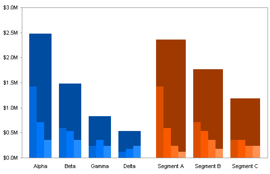
I have already written about overlapping bar charts in Marimekko Replacement – Overlapping Bars (Easy) and Marimekko Replacement – Overlapping Bars (Hard). This approach is compact but doesn’t seem as clear as a four-bar-chart approach.
I combined the four bar charts into a 2×2 panel bar chart alternative to a Marimekko chart, but I gave no hints about how to construct such a chart. I’ve already described How to Build a 2×2 Panel Chart, bit this chart is more complicated than the one in that tutorial.

This tutorial applies the same approach as the “hard” overlapping bars technique. In retrospect, there isn’t much difference in effort required between the “easy” and “hard”techniques, but the “hard” way is more flexible, allowing unequal numbres of rows and columns in the original data table.
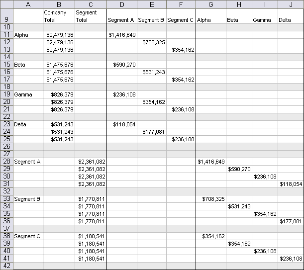
As in the previous Marimekko-related examples, the data consists of this compact table.

The data layout is the same as in the overlapping bar chart. It is a sparse array, with the data staggered to produce the arrangement of bars in the chart.
Construction begins in the same manner as in the overlapping bar chart. The data in the table above is used to create a clustered column chart. The gap width is set to zero and the overlap is set to 100.

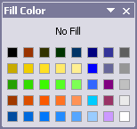
Here is a view of the custom color palette I used to format the bars in this chart. Bar_Chart_Graded_Colors.xls is a small downloadable Excel 2003 workbook that uses this palette.
The Company Total and Segment Total series are moved to the secondary axis. Only the tallest of the individual primary axis series peek over the tops of the Total series.

The two Y axis scales are adjusted to offset the primary and secondary bars. The secondary axis is given a minimum of -$3 million and a maximum of $3 million, so the bars occupy the upper half of the chart. The primary axis is given a maximum of $3.5 million, more than twice the maximum value on the primary axis, so the primary series occupy the bottom half of the chart. These values can be adjusted to make one row of panels taller than the other.
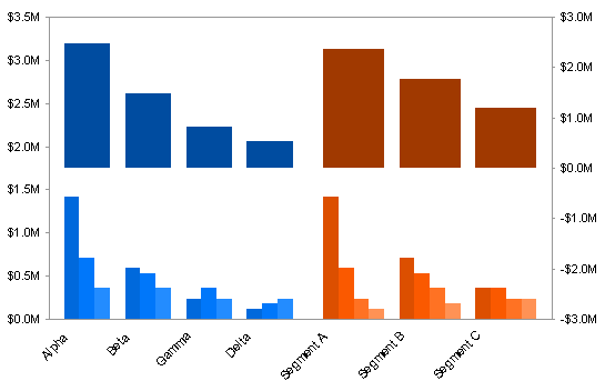
When the Total series were assigned to the secondary axis, Excel only provided a secondary Y axis. A secondary X axis now must be added. Since its default position is at the secondary Y maximum (the top of the chart), the bars seem to hang from the top to their values.
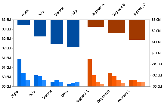
The secondary Y axis is formatted to make the secondary X axis cross at zero, which is in the middle of the chart.
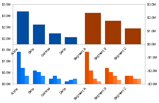
All of the default axis labels will be replaced with customized labels, so these default labels are removed.
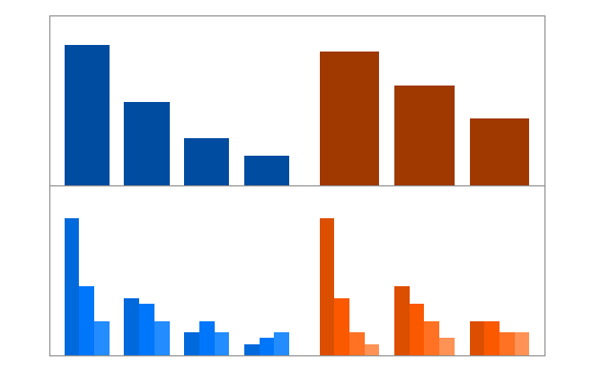
A number of helper series will be added to the chart. These will be XY series, and the X values are defined as the positions of the points along the category axis. This particular chart has 33 category slots as shown below. The XY sereis can be located anywhere along the axis, not just on the integral positions indicated. For example, the left Y axis is located at X=0.5, the gap in the middle is centered on X=17.5, and the right Y axis is located at X=33.5.
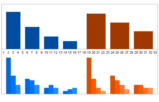
Data for the vertical divider is shown in teal text and for the category labels in purple text in the grid below.
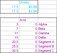
The Divider data is copied and pasted into the chart as a new series. It turns into another column series on the secondary axis.
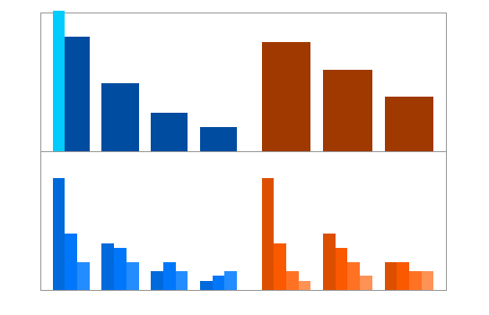
When the series is changed to an XY type and moved to the primary axis, it fits between the groups of bars, and reaches from the top to bottom of the chart.

The first two columns of the Axis data are copied, then pasted in the chart as another new series. Since the previous series was converted to an XY series and moved to the primary axis, this new series is added as an XY series on the primary axis.
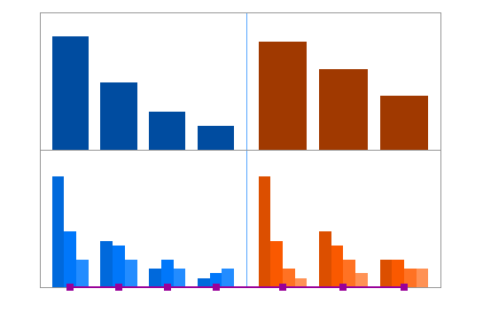
Using Rob Bovey‘s Chart Labeler, a free and very well-designed Excel add-in, add the labels to the Axis series. The Chart labeler can be downloaded from Rob’s Applications Professionals web site
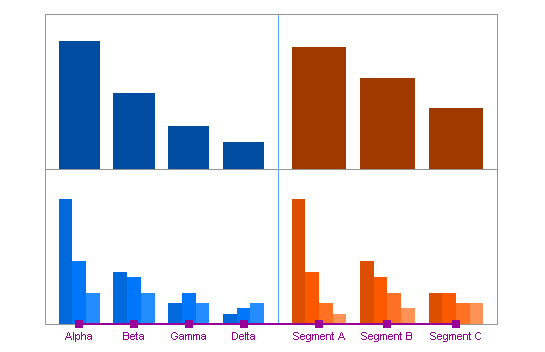
Here’s the chart after a bit of formatting.

Data for four sets of Y axis labels are shown below. The top and bottom rows of panels each have labels for values and for percentages of the total.
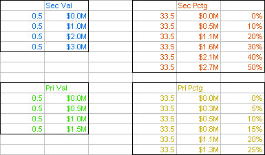
As before, each block of data is pasted in the chart as a new series and assigned to the appropriate axis. The data labels on the two Values series simply use the built-in Values option for data labels. The Percentages series are labeled using the Chart Labeler. The sereies and labels in the chart below are formatted with the same colors as the text in the table above.

Here’s the chart after the labels and axis series are formatted appropriately.

The method described in Double Legend in a Single Chart can be used to add legends to the bottom panels.

By adjusting the Y axis scales, the relative heights of the two panels can be adjusted. For example, in the following chart, the maximum of the primary Y axis was changed to $2.3 million, and the minimum of the secondary Y axis was changed to -$7.5 million. The Y value of the uppermost point of the Divider series also had to be changed to $2.3 million. Everything else in the chart updated automatically, although the Y values for the legend markers were adjusted, because stretching the panel spread them too far apart.


Jerry Betz says
Hi Jon,
I ended up with different percent scales for the Primary Percentage and Secondary Percentage axes. The two figures shown are taken before the final resizing step, however, the issue was also present in the final resizing step.
In the first slide, I’ve highlighted in green some dollar values in the dollar input table, as well as selected values in red in an percent table calculated from the dollar input table. The dollar values were in good agreement with the scale on the primary axis, the percent values were not in good agreement with the scale on the secondary axis:
In the second slide, the Secondary Percentage value at 50% is no longer equal to $3.0M, but $2.7M (more precisely, half of the $5,312,434 total dollar value). This same calculation was carried out for the rest of the entries in the Primary Percentage Scale and Secondary Percentage Scale tables:
I’m not sure what caused my error, the secondary Y Axis has a maximum of positive 3 million and a minimum of negative 3 million.
Jon Peltier says
Jerry –
Ha! I caused your error.
Those percentages were calculated from the original data set, before I removed Segment D to demonstrate with an asymmetric data set. I have corrected the calculations and the charts.
Bob says
Hi Jon,
Too slick. There is thinking outside the box, but this is too much.
Can’t wait to try this. Great tutorial.
Cheers,
Bob
derek says
Sometimes I think this is the way spreadsheet chart applications *should* be done, by the spreadsheet vendors themselves. A chart wizard would set it all up as easily as the present one does, but the output results would all be special series on a (hidden?) spreadsheet, for tweaking by advanced users.
Jon Peltier says
Derek –
That’s how I handle my small utilities. User selects the data, which is rearranged on another worksheet, or in some cases on the same sheet, off to the side, then this rearranged data is put into an appropriate chart. Some tools hide the data construction worksheets, and I guess if you make a lot of these charts that makes sense, but personally I like to be able to easily access my data.
Ashade says
This is one of the best written and more useful articles I’ve read in a while. Thank you.