I was recently asked whether Excel can make an axis in which the value of each label was double the previous value, but the labels were equally spaced. I’ve covered custom axis scales several times (see Custom Axis Scales using Dummy Series), and this is simply another example.
The specific question was about labels 1, 2, 4, 8, etc. This kind of progression can be linearized by a logarithmic transformation; since the specific labels are powers of 2, base 2 logarithms are an exact fit.
The trick with a fake axis is that the data values are subjected to the same transformation as the axis label values, so the data lines up with the axis. The original axis label data is used for the labels themselves.
Excel 2003
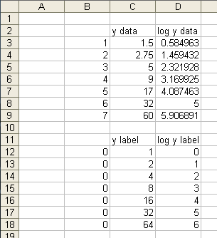
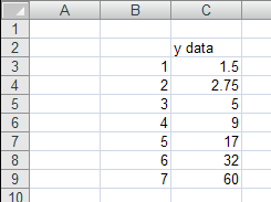
We’ll start with this sample data. B2:C9 is the original data. D2:D9 has the base 2 logarithms of C2:C9.
Data for the custom axis labels is in B11:D18. Column B has zeros, for the X position of the axis points. Column C has Y values selected for the Y axis labels. Column D has the base 2 logs of these values, for positioning of the axis labels.
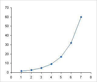
Here’s what the original data in column C looks like The Y position is proportional to the Y value.
This is the transformed Y data in column D. The Y position in the chart is proportional to the logarithm of the Y value.
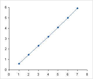
We can’t leave those Y axis labels there. People can’t readily convert 0, 1, 2, etc. into 1, 2, 4 in their heads. Most people, anyway. Select B11:B18, hold Ctrl, and select D11:D18, so that both areas are selected. Copy, select the chart, and use Paste Special to add the data as a new series, with categories in the first column and series names in the first row.

Add the labels to the new series. I’ve used Rob Bovey’s Chart Labeler, which is one of the best free Excel utilities on the internet. The range C12:C18 contains the labels, and they’re added to the left of the added data points. I’ve colored the labels to match the points.>
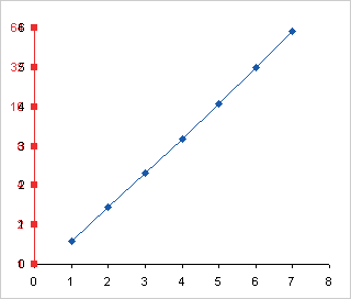
Format the real Y axis to hide the labels, but in this case we can keep the axis line and tick marks. Adjust the width of the plot area to make room for the labels.
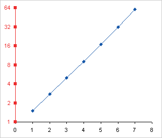
Hide the added series by removing lines and markers, and the chart is done.

Excel 2007
Excel 2007 makes the chart much easier, because Microsoft introduced the ability to use a logarithmic axis scale with any base. All we need is the original data. (In general the protocol would be the same for both versions, but the log transformation makes this case different.)
Here’s the data in a default XY chart.

Here’s the data with the default base-10 log axis scale.

Here is the chart with a base 2 log axis scale.

This more flexible log axis is one of the rare examples of Excel 2007 charting actually improving on Excel 2003’s charting.
More Axis Scale Articles
- Calculate Nice Axis Scales with LET and LAMBDA
- Calculate Nice Axis Scales in Your Excel Worksheet
- Calculate Nice Axis Scales in Excel VBA
- Chart UDF to Control Axis Scale
- How Excel Calculates Automatic Chart Axis Limits
- Reciprocal Chart Axis Scale
- Custom Axis Labels and Gridlines in an Excel Chart
- Custom Axis, Y = 1, 2, 4, 8, 16
- Logarithmic Axis Scales
- Link Excel Chart Axis Scale to Values in Cells
- Consistent Axis Scales Across Multiple Charts
- Gantt Chart with Nice Date Axis
- Select Meaningful Axis Scales
- Bar Chart Value Axis Scale Must Include Zero


Jonathan says
Excellent post!
How do you keep the y axis from automatically increasing? When I tried to repeat this, the scale on the y axis jumps up to 8, instead of 7 like in your example.
Jon Peltier says
Jonathan –
I’ve manually set the axis scale’s minimum and maximum values.