The Problem
I came across a post on the Super User forum whose author wanted to Get Excel to base tick marks on 0 instead of axis ends (with fixed maximum or minimum). Essentially, the user wanted to scale the axes of his plot to ±35, but have axis labels every 10 units centered on zero, not starting at -35. The desired chart is shown here:
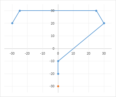
It seems like this should be easy in any charting software. It was a built-in feature of the first charting software I ever used, but then, I wrote that software myself in the mid-1980s. However, it’s not part of Excel’s charting engine, nor of many other charting packages.
Positioning your own custom axis labels and gridlines is not too difficult to do, by dispensing with the default labels and gridlines, and using dummy series along the X and Y axes, with data labels and error bars on these series.
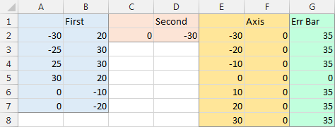
Here is the data used in this tutorial. The First and Second blocks are used for the chart’s main series; the Axis block is used for both dummy series; and the Err Bar block is used if you don’t want the error bars to obscure the default axis lines.
The Original Chart
Here is the XY Scatter chart of the First (blue) and Second (orange) data sets. I guess it’s a question mark symbolizing the confusion expressed by the original questioner.
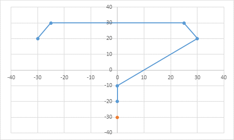
Here is the chart, squared-up so the gridlines outline approximately square regions. At this scale, the default axis limits are ±40.
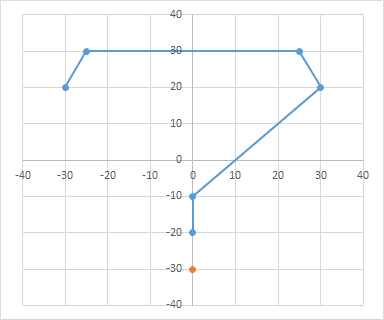
The margin around the plotted points is wider than desired, but any attempt to place the axis labels on multiples of 10 result in something like the chart above (±40) with too wide a margin, or the chart below (±30), with no margin.

Setting the axis scales at ±35 also locks the axis labels at half-multiples of 10 (at the 5’s: -35, -25, etc.).

Adding Custom Axis Labels
We will add two series, whose data labels will replace the built-in axis labels. The horizontal axis dummy series (gray line and circle markers) uses the column of numbers (E2:E8) as X values and the column of zeros (F2:F8) as Y values. The vertical axis dummy series (yellow line and circle markers) uses the same column of numbers (F2:F8) as X values and the column of numbers (E2:E8) as Y values.
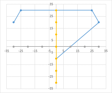
Select the vertical dummy series and add data labels, as follows. In Excel 2007-2010, go to the Chart Tools > Layout tab > Data Labels > More Data label Options. In Excel 2013, click the “+” icon to the top right of the chart, click the right arrow next to Data Labels, and choose More Options…. Then in all versions, choose the Label Contains option for Y Values and the Label Position option for Left. The labels are (temporarily) shaded yellow to distinguish them from the built-in axis labels.
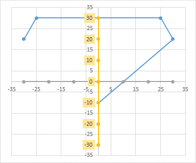
Select the horizontal dummy series and add data labels. In Excel 2007-2010, go to the Chart Tools > Layout tab > Data Labels > More Data Label Options. In Excel 2013, click the “+” icon to the top right of the chart, click the right arrow next to Data Labels, and choose More Options…. Then in either case, choose the Label Contains option for X Values and the Label Position option for Below. The new labels are shaded gray to set them apart from the built-in axis labels.

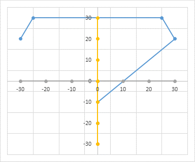
Select each axis in turn, and select the None option for Axis Label.
Adding Custom Gridlines
We will use error bars to the dummy axis series to replace the built-in gridlines. Select the horizontal dummy series and add error bars as follows. In Excel 2007-2010, go to the Chart Tools > Layout tab > Error Bars > more Error Bar Options…. In Excel 2013, click the “+” icon to the top right of the chart, click the right arrow next to Error Bars, and choose More Options…. In all versions, default horizontal and vertical error bars of length 1 will appear on the data series.
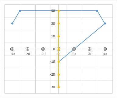
Select the new horizontal error bars. You may have to use the Current Selection dropdown on the Chart Tools > Layout or Format tabs or on the right click formatting popup to select them. Click Delete.
Select the vertical error bars. Format them to have an Error Amount (length) of 35 and no end caps. I’ve kept the default error bar line color of black, to distinguish them from the built-in gridlines.
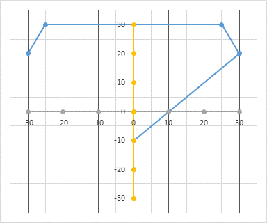
Select the vertical dummy series and add error bars in the same way. In Excel 2007-2010, go to the Chart Tools > Layout tab > Error Bars > more Error Bar Options…. In Excel 2013, click the “+” icon to the top right of the chart, click the right arrow next to Error Bars, and choose More Options…. In all versions, default horizontal and vertical error bars of length 1 will appear on the data series.

Select the new vertical error bars. Again, you may have to use the Current Selection dropdown on the Chart Tools > Layout or Format tabs or on the right click formatting popup to select them. Click Delete.
Select the horizontal error bars. Format them to have an Error Amount (length) of 35 and no end caps. The error bars are shown below in their default black line color, to distinguish them from the built-in gridlines.

Select each set of built-in gridlines (not the error bars we’ve just added so painstakingly) and press Delete.
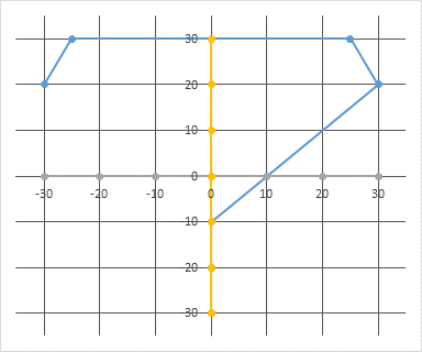
Format the error bars to have a light gray line color.
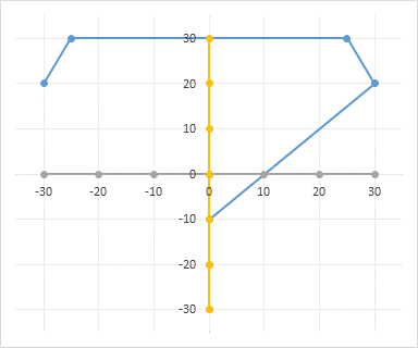
Finally, hide the two dummy axis series, by formatting them to have no markers and no lines.
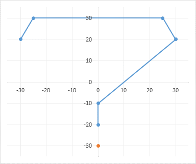
Note that the error bars on the (0,0) points of the dummy series block the axis lines, which are slightly darker gray. You may wish to keep the darker axis lines to help clarify the chart. This means applying custom error bar values, with 35 for all points except zero for the point at the origin.
Custom Error Bars that Don’t Obscure the Axis Lines
Select the vertical error bars. On the format dialog, under Error Amount, select Custom (they will suddenly transform to very short error bars with length 1), then click Specify Value. Delete the “={1}” from the Positive Error Value box, and select the range with custom error bar values (G2:G8). Then delete the “={1}” from the Negative Error Value box, and select the range with custom error bar values (G2:G8). Press Okay.
Select the horizontal error bars and repeat the steps above to assign the range G2:G8 as Custom Error Amount for the positive and negative error bars.
The result is shown here, with light gray error bars and slightly darker axis lines.

This tutorial is just another example showing how to enhance your chart in ways that were not built into Excel’s extensive charting capabilities. Using other capabilities, there are numerous ways to add lines, labels, and other features to an Excel chart exactly where you want them. Just remember that you are controlling Excel, and not vice versa.
More Axis Scale Articles
- Calculate Nice Axis Scales with LET and LAMBDA
- Calculate Nice Axis Scales in Your Excel Worksheet
- Calculate Nice Axis Scales in Excel VBA
- Chart UDF to Control Axis Scale
- How Excel Calculates Automatic Chart Axis Limits
- Reciprocal Chart Axis Scale
- Custom Axis Labels and Gridlines in an Excel Chart
- Custom Axis, Y = 1, 2, 4, 8, 16
- Logarithmic Axis Scales
- Link Excel Chart Axis Scale to Values in Cells
- Consistent Axis Scales Across Multiple Charts
- Gantt Chart with Nice Date Axis
- Select Meaningful Axis Scales
- Bar Chart Value Axis Scale Must Include Zero


derek says
I was designing a chart the other day with data labels indicating values at the end of the year, where the data labels were within the chart area (naturally), but outside the plot area. Since this is the end of the chart, that’s a good clear place for them to be. But because the end of year is a manager-demanded snarl of numbers, I thought it would help clarify if there was a small horizontal tick mark between the end of each line and its data label.
Imagine my disappointment when I realized that horizontal error bars no longer extend even a little bit outside the plot area! They used to, before Excel 2007, and I used to use them for custom axis tick marks. Thank goodness at least data labels can show outside the plot area.
Do you know of a workaround for this, or did I just fail to create an invisible secondary axis into which the error bars could bleed? (I think I tried that and it still didn’t work)
Jon Peltier says
Derek –
You could try using an en- or em-dash as the first character of the data label.
I did discover one time that the end caps of error bars can exist outside the plot area under certain conditions. For example, a data point slightly below the plot area will not be drawn, and its horizontal error bar running along but just outside the bottom edge of the plot area will also not be drawn. But if it’s close enough, the end cap will be drawn, even if it’s slightly outside the plot area. I tried using this for a project one time, but it was incredibly tedious to set up.
Bobb D says
Thanks a lot for this.
I was having trouble representing the audio spectrum (logarithmic) in octaves and got around it by using this technique. I would’ve thought it’d be as easy as checking a tick box. Maybe it’s something better suited to Matlab.
Cheers
Flavio Henrique da Silva says
Hi, Jhon Peltier,
please send to my email this sample file of this chart,
this is the step to solution of my chart, save mutch time and errors for me.
thanks.
Flavio.
Jon Peltier says
This tutorial is several years old, so the example workbook is long gone. The example is rather simple, though, so it shouldn’t take long to work out, even if you have to type a few values and insert the chart yourself.