In your dashboard, you may have several charts that show different but related data, and you’d like them to have the same axis scales to make comparisons from chart to chart possible. You could manually reset the axis scales whenever the data changes, or you could write some VBA code to keep them synchronized, but I’m going to show a simple and reliable way to handle this.
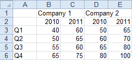
In the data below, there are two years of data for two different companies.
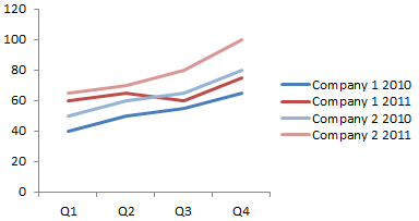
Here is all of the data plotted in a single chart.
Comparing data for a given company is most important, so I want to separate the data into separate charts for each company. But I still want to be able to compare the two companies. Here are my two charts.
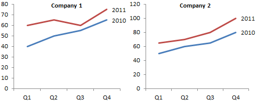
Since Company 2’s data is higher, the maximum Y axis scale is larger. I could manually set the Y axis maximum for both charts to 120, but if the data changes, I’ll have to reset both charts again.
To determine what values to use, I add a small summary table near the main data table. Cells B10 and B11 compute the minimum and maximum of the data. Cells C10 and C11 show the values I will use. I want the minimum to be zero, so I simply type 0 in C10. I want the maximum to range with the data, so I enter =B11 into C11.

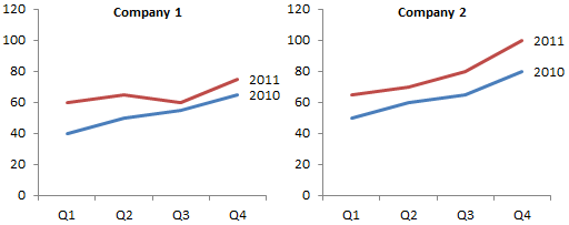
Copy C9:C11 and use Paste Special to add this data to each chart as a new series, with data in columns and series names in the first row (don’t worry about X values). Notice the two charts have the same Y axis maximum, because they have the same maximum value from the added series.

It’s a simple matter to format the added series to use no line, and the charts will magically stay in synch.
To demonstrate the value of this approach instead of the manual approach, let’s add another year of data. Company 2 has really started to take off.

Here is all the data in one messy chart.

Here are the two original charts, with no attempt to synchronize axes.
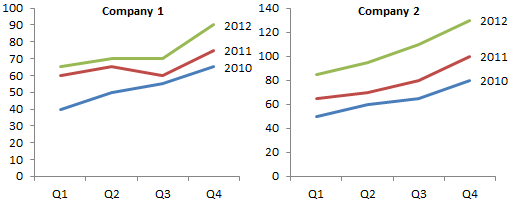
Here is how the charts would look if the maximum had been manually fixed at 120. The 2012 data for Company 2 is cut off between Q3 and Q4.

However, if we make sure that our minimum and maximum formulas in B10 and B11 include the added data, the hidden series of both charts include the new maximum, so the axis scales are the same.
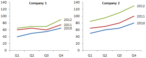
This is a very easy technique, applicable to line, column, and area charts (in all cases, change the added series to a line chart series). It can also be used for both X and Y scales of an XY chart if we determine minimum and maximum values for X and Y.
More Axis Scale Articles
- Calculate Nice Axis Scales with LET and LAMBDA
- Calculate Nice Axis Scales in Your Excel Worksheet
- Calculate Nice Axis Scales in Excel VBA
- Chart UDF to Control Axis Scale
- How Excel Calculates Automatic Chart Axis Limits
- Reciprocal Chart Axis Scale
- Custom Axis Labels and Gridlines in an Excel Chart
- Custom Axis, Y = 1, 2, 4, 8, 16
- Logarithmic Axis Scales
- Link Excel Chart Axis Scale to Values in Cells
- Consistent Axis Scales Across Multiple Charts
- Gantt Chart with Nice Date Axis
- Select Meaningful Axis Scales
- Bar Chart Value Axis Scale Must Include Zero


Calvin Graham says
chrisham says
Wowie! Its only the best mind that come up with something so effective and yet so simple! Thanks!
derek says
A similar technique helps to keep the bubbles consistent across multiple bubble charts. Otherwise the bubbles in each chart just normalise to the largest bubble.
ScottW says
The trick of a hidden data series to keep multiple chart axis in sync (or just to have a more sensible max and min to sensible rounded values than what the Excel default algorithm sometimes provides) is one I often use myself. One wonders why Excel still doesn’t have any ability to define chart axis maximum and minimum via a worksheet range after all this time, you would think it would not be that hard a feature to build in. I think I have seen custom UDFs from Stephen Bullen and Tushar to do this but why it can’t simply be native in Excel is beyond me.
Robert says
After diligently working through, i.e., recreating your example step-by-step, it became evident to me that the examples are using Excel 2003. I am unable to locate ALL the new ribbon/menu commands; but I have made significant progress with Excel 2007.
I am stuck at the point where Chart menu is Chart Tools, then X-Y Chart Type is X-Y (scatter- and it’s the second ‘icon’ type). When it came to “Move the XY series to the primary axis: double click the series, and on the Axis tab, choose Primary.” I am unable to complete this step.
Ultimately, I can hardly wait to get to the Panel Chart with Variable Height Panels. Your work is fantastic! It’s amazing, and it’s just what I need to develop a State funding policy based on county population data, unemployment rates, and averages wages!
Thank you for any assistance you can provide.
Jon Peltier says
Robert –
Actually, this example was done in Excel 2010.
I don’t use Excel 2007 much, so I keep forgetting that it doesn’t let you double click chart elements to format them the way 2003 did. Fortunately Excel 2010 has brought back that convenience. If you are using Excel 2007, right click on the chart element, and choose the pop up menu item to format the element you’ve clicked.
Sicco Jan Bier says
with ceiling and floor to remove constants there is even more fun to add.
Will says
Is there a way to do this to preserve the interval scale, but not the min and max values? For example, I have 3 sets of data, each of which is at a completely different point in terms of y values (30,000 range, 250,000 range, etc.), so keeping min and max the same across the charts is rather futile in terms of visualization.
Instead, I would like to be able to automate the scaling of the charts to insure they have the same intervals….
Sicco Jan Bier says
not tested
perhaps if the data moves within a 20k range of 35k, 250k and 1,000k, a solution for lower range (x-y crossing) would be low=floor(min(x;y;x;…),5k) with an upper range of high=lower+30k. Add these to data points ranges for the chart.
Or if you have different size ranges around the same point there is some way to apply the biggest difference between min and max of the ranges to each of the data ranges. Then the lower+30k type structure must be flexible to accomodate biggest difference.
as said, not tested.
Bailey says
Fantastic tutorial – exactly what I’ve been looking for to solve my issue and, as are all the tutorials, it’s so easy to understand and implement.
I do have one (small) request, is there any chance you could demonstrate how to do this when using error bars as they impact on the auto scale that Excel chooses and I can’t quite figure out how to adjust your example to accommodate this.
most grateful excel student
Jon Peltier says
Unfortunately you’ll have to manually adjust the axes so the error bars extend across the whole chart.
Mark says
I would like to have consistent axes across a series of pivot charts representing a series of questions in a survey – however I am finding it impossible to maintain consistent headings if there were no responses in one or more of the categories (Strongly Agree, Agree, Neutral, Disagree, Strongly Disagree). For example If there were no respondees who ‘Disagreed’ but there was at least one in all the other categories then ‘Disagree just drops out of the axis making it inconsistent with the others axes on other charts. I need to have all the axis items/headings/units showing even if one or more have a zero value.
Jon Peltier says
Mark –
Is there any way you could keep all categories in your data range, even with just zero or blank entries? Sometimes the setting ‘Show Entries with No Values’ can help.
Julian de Groot says
Super, smart and simple
Nick Rivera says
This is gold man, thank you!
Tanya says
Many many thanks. I used this on a group of bar charts with success!