In I Keep Saying, Use Bar Charts, Not Pies, I described the process of making better column charts to replace a horrendous pie chart. At one point I said “Let’s add a weighted average of all responses, using a set of horizontal lines.” I neglected to share the technique for adding individual target lines, though I’ve shown similar techniques elsewhere.
Here is the data used in the chart, part of a larger pivot table.

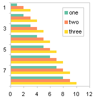
The chart without error bars uses the first four columns: one column of category labels and three columns of favorable ratings data.

Step one is to add the fifth column (the fourth column of ratings). It is added as another column chart series.

The added series has to be converted to an XY chart type. Only XY series can have horizontal error bars, which we’ll use for the horizontal target lines. Be aware that changing the chart type is likely to add tick marks to the horizontal axis.

Having added the series and converted it to XY, we now add horizontal (X) error bars. The Excel 2003 Format Series dialog’s X Error Bars dialog is shown below; in Excel 2007 you have to add error bars from the Chart Tools > Layout tab. At first I used a Fixed Value of 0.45, but when I saw the resulting error bars, I realized they were not symmetrical. I changed the negative value to 0.48 to make the bars look the same. Excel 2007 may or may not need a similar correction.

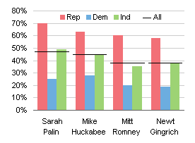
Here is the chart with its error bars.

The end caps have to be removed from the ends of the error bars.
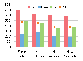
The XY series is hidden by choosing None for marker style (it already had None for line type). To provide a line symbol for the “All” legend entry, I inserted an em-dash at the start of the series name, changing “All” to “— All”. You can type an em-dash by holding Alt, typing 0151 on the numeric keypad, and releasing Alt.

Maybe next time I’ll show how to add target lines to a pie chart. Or not.







 My colleague and fellow Excel MVP Mike Alexander of

