In a comment to another post, Lynn buttered me up a bit, then asked how to make a certain chart for her boss. Lynn has to plot ten employees’ hourly wages against recommended maximum, minimum, and medium wages. Only four actual wages fall within the recommended limits. I can think of many ways to plot actual values against limits, and I’ll show a few here. If you have any favorite approaches, tell us about them in the comments.
Lynn didn’t provide the actual values, so I constructed this little table.

I’ve repeated the recommended values for each employee beneath the actual wage. I’ve also sorted employees in increasing order of hourly wage, which makes charts easier to understand.
Simple Line Chart
For the chart I used a simple line chart. I formatted the limits to show lines without markers and the actual wages as markers without lines.

This is somewhat reminiscent of a Run Chart.
Colored Bands
That may be simple enough, but an alternative approach uses colored bands rather than lines to denote limits or regions within the data. To start constructing bands, I converted the limits from lines to columns.

At first the columns are clustered and non-overlapping, but I changed them to 100% overlapping. The white Min series blocks the bottom of the green Mid series, which blocks the bottom of the red Max series. I changed the gap width to 0% so the columns were all touching. Finally I removed the borders so the columns merged into bands.
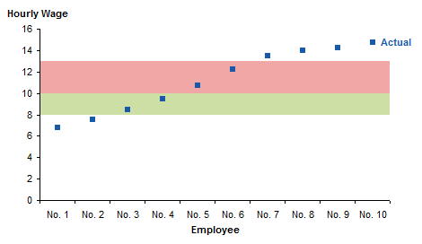
For a simple data set like this, the column chart is perfect. You could also use an area chart approach to construct Horizontal Bands in the Background of an Excel Chart, and you are not limited to parallel horizontal bands: you can Show Uncertainty in Predictions with Shaded Bands.
Number Line
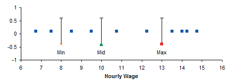
Another way to show data against limits is along a number line. The data is a little different. The Y values of 0.1 for the actual wages and -0.4 for the limits were arbitrarily chosen to align the chart features nicely with a Y axis scaled from -1 to +1.

Here are the data points. The Min, Mid, and Max points have data labels beneath the points and positive Y error bars of length 1.
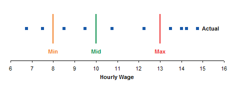
The Y axis is unnecessary, and a little formatting dresses up the chart.
Peltier Tech Update
New posts on this blog have been few and far between for the last few months. It’s certainly not for lack of material. I keep saying I’ll start writing more, but things keep getting in the way.
I’ve had to spend hours on updates to my charting programs to account for differences in the way Classic Excel (up to 2003) and New Excel (2007 and later) handle different languages and regional settings. I’ve had a few unexpected issues in other projects that have sucked up time. And once momentum is lost, it becomes inertia.
My new hobby, learning guitar, is proceeding steadily but slowly. I am still pretty bad, but the things I’m bad now at much more difficult than what I was bad at last month. The theory (scales, chords, progressions) is coming easily, since it’s largely math, and I seem to have a pretty good ear. What’s more difficult is getting my sausage-like fingers into position on the right fret and the right string in a reasonable time. I’m toughening the skin of my fingertips and learning not to squeeze so hard that I get deep grooves after playing.
I spent a couple weeks on Cape Cod and a couple weekends on the coast of Maine. I’m not a beach kind of guy, but I bought a kayak (my other new hobby) and put on 60 or 70 miles. We stay next to a river on the cape which I never thought much of, but I’ve learned it’s an estuary with many convoluted side branches, supporting much wildlife, and subject to strong currents if you misjudge the tide.
Now the family is getting back to school as teacher or pupils, and the daughter who graduated from college is starting her new job and her career. So I’ll have fewer excuses and more opportunities to keep this blog current.


