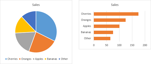
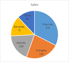
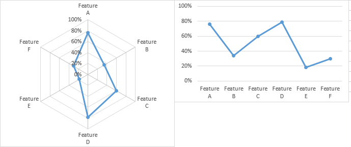
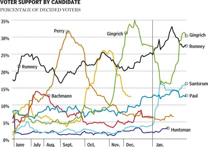
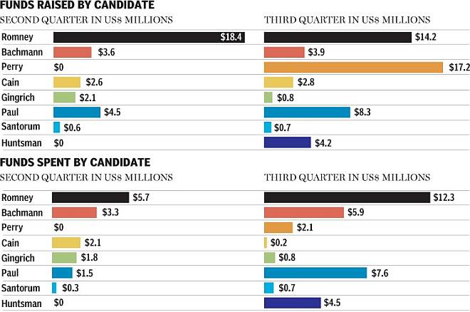
In The Right Colors Make Data Easier To Read (Harvard Business Review), Sharon Lin and Jeffrey Heer report that using “semantically resonant colors” make charts easier to read. They offer this before and after figure to support their claim, where default colors are shown at left, and semantically resonant colors shown at right.

See what they did there? Apples are green (except of course when they’re red), bananas are yellow (except for the green and brown ones in my kitchen), blueberries are blue, etc. Joking aside, this makes intuitive sense at first.
However, I didn’t think the changed colors made the second chart appreciably easier to read. Part of the problem is that the identification of the colored bars requires repeated eye jumps from the chart to the legend, and the seven colors in this chart use up the three to five to seven chunks of short term memory at my disposal.
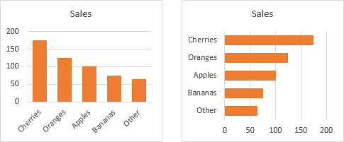
I usually advise people to replace the chart’s legend with labels closer to the data points. In this case, category labels right on the axis work well. I’ve also rotated the chart to make use of easy to read horizontal labels. The numerical scale also has a greater resolution, since it uses the width of the chart rather than the shorter height. This is another advantage of a rotated chart, given a wider than tall aspect ratio.
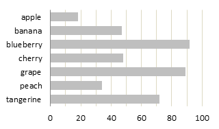
Note that no colors are required to give the chart meaning.
Unless you need to look up a particular value by name, it is usually beneficial to sort the data by a factor other than alphabetically by name. In this case, I’ve applied a sort by decreasing value. With only seven points, looking up a particular fruit isn’t much of a burden despite not being sorted alphabetically.
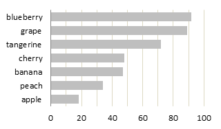
Colors or shades of color can be useful to highlight particular values. If I were writing a brochure about the growing tangerine market, I could use a darker shade of my fill color to easily show where tangerines fit among their peers.

I realize the authors were using the simple bar chart to illustrate their point about semantically resonant colors. However, more basic best practices for simple bar charts tell us to ignore these colors.
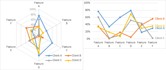
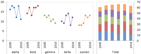
If I wanted to differentiate different data sets in a line chart, of course, this use of colors would be helpful.
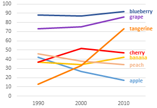
Note the use of best practices here. There is no legend, instead, data labels have been applied directly to the data. The labels have also been colored to match the data.


