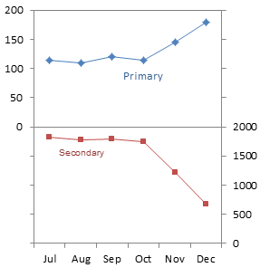
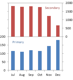
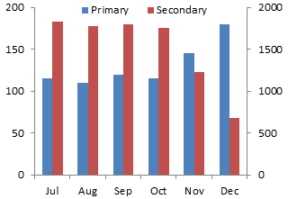
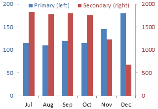
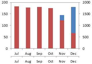
I’ve written often about panel charts, and I’ve made some simple ones, but I don’t seem to have explained the process in enough detail for people to reproduce these simple ones with their own data. Easy Two-Panel Column Chart in Excel was the first of several quick tutorials on easy panel charts. This article shows the instructions for a two-panel line chart.
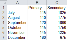
Let’s use the following simple data for this exercise.
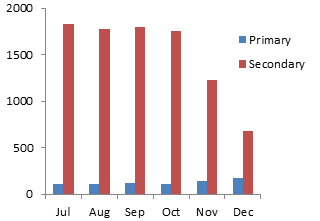
Values for the two data series fall within vastly different ranges, as seen in this line chart.

Problems with Primary and Secondary Axis Line Charts
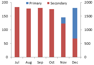
When we move the Secondary series to the secondary axis, there is an apparent relationship between the series, which changes as the axis scales are changed. It is hard to separate the data, despite the presence of the two axes. Who can figure out, let alone remember, which data should be measured against which axis? Our eyes see the series overlapping, and our brain interprets them as having overlapping data ranges.

Here the series start out far apart, one much higher than the other for several months. By the end of the year, they have switched places.

In contrast, the data in this chart starts the same, but after several months the two series suddenly diverge.
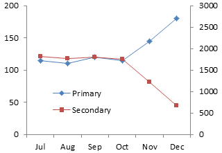
But it’s the same data in both of the previous charts. Through intentional or inadvertent axis scale dishonesty, you can tell any story you want.
The Panel Chart, Step-by-Step
You can avoid the problems with two-axis charts by plotting the data in separate panels. Start your panel chart by making a line chart with the data.

Right click the Secondary series, choose Format Series (or similar, it varies with Excel version), and select the Secondary Axis option.

We have primary and secondary Y axes, but only the primary X axis. Add the secondary X axis. In Excel 2007/2010, go to the Chart Tools > Layout tab, click on Axes, and for Secondary Horizontal Axis, select Show Left to Right Axis. In Excel 97-2003, go to the Chart menu > Chart Options, and on the Axes tab, under Secondary X Axis, choose the Category option.

Explanation of Required Axis Formatting
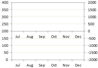
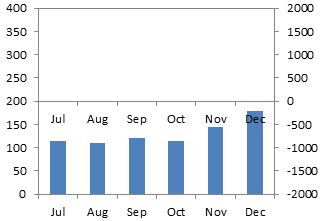
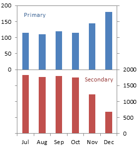
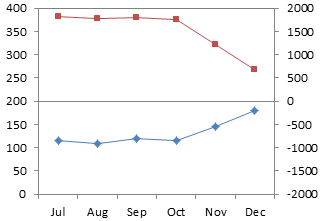
What we want is a chart divided into two panels like the chart below shows. I’ve temporarily hidden the plotted data, but you don’t need to.
The primary axis above spans 0 to 200. To plot the Primary series in the bottom panel, the primary Y axis must span 0 to 200 in the bottom panel, or 0 to 400 overall (the same amount in the top and bottom panels).
The secondary axis above spans 0 to 2000. To plot the Secondary series in the top panel, the primary Y axis must span 0 to 2000 in the top panel, or -2000 to 2000 overall (the same amount in the top and bottom panels). Since the secondary axis crosses at zero, it forms the dividing line in the middle of the chart.
If you have nice data, or if you’re good at algebra, you can pick axis scale parameters that align the axis tick marks on the left and right sides of the chart. The temporary gridlines in this chart show how nicely aligned these tick marks can be.
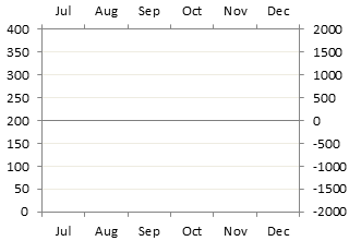
So the Primary series fits into the bottom panel. . .
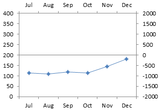
. . . and the Secondary series fits into the top panel.

Apply Axis Settings and Continue
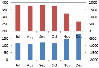
Here is how the chart looks with the desired axis scales applied, and with the data unhidden.

We will use the secondary horizontal axis as the panel separator. Right click the secondary (right) Y axis, choose Format Axis, and change the Horizontal Axis Crosses setting to Automatic (which means it crosses at zero).

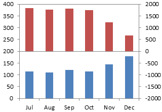
We still need to do some cleanup. The month names in the middle of the chart are redundant, and easy to remove. Right click on the axis, choose Format Axis, and for Axis Ticks and Tick Labels, choose None.
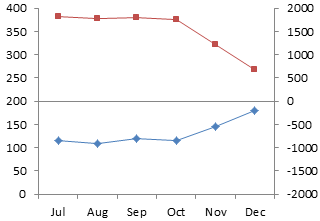
There is now an open space across the top of the chart where the secondary horizontal axis was. We can close it by applying an appropriate border color to the plot area.

We need to apply some number format magic to the Y axis labels: we only want primary axis labels in the bottom, and secondary axis labels in the top, of the chart. I’ve written an article about Number Formats in Excel, but there’s room for a quick refresher class.
The secondary (right) axis is easy. We need a format like “0;;0;”. A number format has up to four elements, separated by semicolons. The first indicates what format to apply to positive numbers, the second to negative numbers, the third to zero values, and the fourth to text. A number format of “0” means simply show the numerical value without any decimal digits; “0.0” would mean show one decimal digit, “0.00” two decimal digits, etc. A missing format means don’t show anything. So this format tells Excel to format positive and zero values as whole numbers, and don’t show anything else.
The primary (left) axis is a bit trickier, but we can use simple conditions to turn formats on and off. The format we need is “[<=200]0;”. The expression in square brackets is the condition that sets the format. It says to display any number of value equal to or less than 200 as a whole number, and don’t display anything else. These conditions override the default positive-negative-zero sequence, but we can only apply two conditions, like “[one condition]format;[another condition]format;[all other numbers]format;[text]format”.
Right click each axis and choose Format Axis. Select the Number tab of the dialog, click on Custom, and enter the appropriate format into the box (without the quotes). Don’t forget to click the Add button, or Excel will discard your carefully typed format.

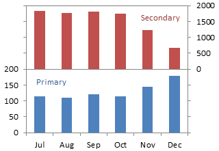
You can apply data labels to identify the series in your chart. Here I’ve applied series name labels to point 4 of the Primary series and to point 2 of the Secondary series.

We can’t resize the data labels, but I’ve removed that unsightly line wrapping in the Secondary label by shrinking the font size by 0.5 points. A better decision would have been to use free-floating text boxes for these labels, but I like to use data labels which are anchored to the data points.

You can stretch the chart if you want more resolution in the Y values. (My data labels needed further shrinking. Should have used text boxes.)
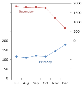
It would have been easy enough to switch the panels. In the next chart, the primary Y axis is scaled from -200 to 200, and the number format is “0;;0;”. The secondary Y axis is scaled from 0 to 4000, and the number format is “[<=2000]0;”.
