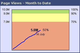
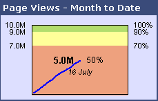
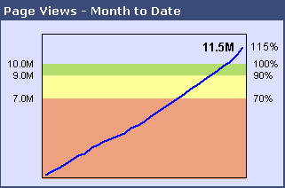
Stephen Few of Perceptual Edge introduced the concept of Bullet Graphs a few years ago, and their use as a replacement for various gauge charts is slowly expanding. Bullet graphs are easier to read than the many gauges that adorn poorly designed business dashboards, while taking up less space and breaking the ineffective metaphor of a business dashboard as the cockpit of a 747.
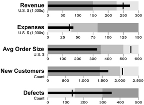
Charley Kyd of Excel User shows How to Create Bullet Graphs To Replace Gauges in Excel.

Dealer Diagnostics shows how to Create Bullet Graphs with Google Charts.
![]()
![]()
And now Chandoo of Pointy Haired Dilbert wants to help you Become a Dashboard Ninja with Bullet Graphs. Chandoo has done some interesting things with conditional formatting (visit his blog for examples), which he uses for the background colors of his bullets, shown below. The bars and the ticks used to indicate last year’s performance are controlled by worksheet formulas.
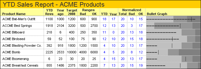
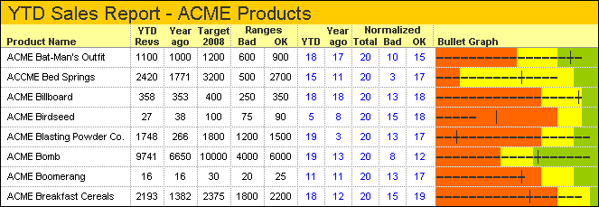
This is a clever way to get bullet charts into an Excel report.


