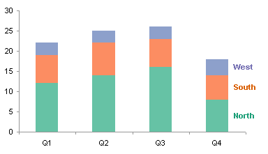
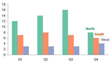
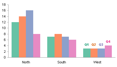
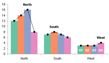
I compared stacked and clustered charts in Stacked vs. Clustered. Stacked charts seem like they’d be good at showing proportions making up whole quantities, but I showed that the stacks only clearly display the bottom item in the stack and the total stack.
To illustrate this shortcoming, Nicolas Bissantz shows us a stacked bar chart showing the relative contribution of petroleum cost (base price) and taxes to the total price of a liter of gasoline. He goes on to explain why this is a poor graphic for this purpose.
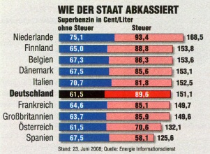
Which country pays the highest taxes per liter of gas? Only the numbers tell the answer.
The chart doesn’t help. (auto motor und sport 16/2008, p. 3)
The chart allows one to see the variability of base price and also total price across the list of countries. The bars are stacked according to the order in which the costs are determined: start with base price, add tax, to get the total. Unfortunately, by stacking the tax on top of the base price, the tax series has a staggered baseline, and it is difficult by eye to see how taxes vary by country.
Here are two versions of this chart, done in Excel The first is stacked in the order shown above, and all you can see is that variation in the total price is not very much dependent on variation in the base price. The second has series stacked with tax first, and at least you can judge that variation in the tax accounts for a great deal of the variation in the total price.

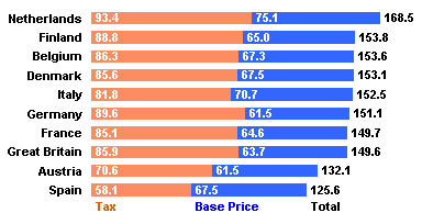
It is a fairly easy task in Excel to insert a series between two stacked series to establish a constant baseline for the upper series in the stack (see Stacked Charts With Vertical Separation). When this is done, the order of stacking makes no difference, and you can readily relate changes in variation of either component to variation in the total.
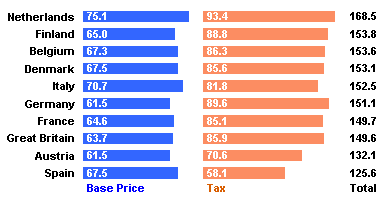

In Stacking is out, Nicolas uses a similar technique to show separate bars instead of stacked bars to show the constituents that comprise the total price. His bars include an additional encoding of the values by subtly shading low to high values from light to dark.
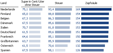
Nicolas includes total price among the bars he draws. Perhaps my charts above suffer from not showing this data. But as Nicolas points out (and as I probably subconsciously noted), this third column of bars adds a lot of space for only a little information.
In Reference bars, Nicolas shows a further improvement over stacked bar charts for showing constituents that comprise a whole. Rather than showing the total as a distinct set of bars, he uses an outline of the total as a reference bar for each of the constituent sets of bars.
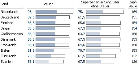
This is a nice enhancement, because it simplifies the reader’s tasks of estimating the proportion of each constituent to the total price, and of correlating variations between the constituents and the total. Here is my Excel version of Nicolas’ innovation:


