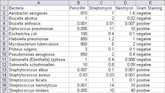
Chance Magazine is holding a data visualization contest. The objective is to produce a clear, insightful, succinct, original, and aesthetically appealing display of a set of comparative data on antibiotic effectiveness. The data is shown below: click on the picture of the data to download a CSV file if you want to play along at home.
The numerical data is Minimum Inhibitory Concentration (MIC), the smallest amount of an antibiotic required to prevent in vitro bacteria growth. Presumably it’s in units of mcg/ml, but I could not verify that. Gram staining indicates whether the bacteria picks up a dark blue or violet color (positive) or a faint pink (negative) when exposed to Gram stain. This is a quick-and-dirty way to separate bacteria into two classes.
The first step in any analysis is to plot the data. Here I’ve created a bar chart with MIC on a logarithmic scale.
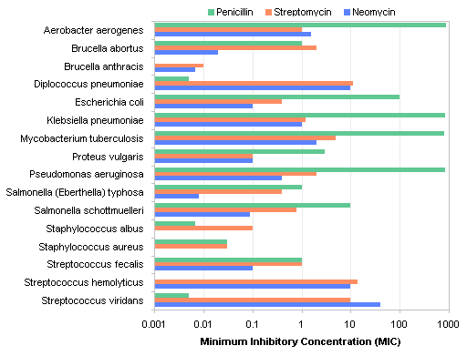
The larger the concentration, the less effective an antibiotic is at inhibiting bacteria growth, so the longer bars above indicate lower effectiveness, which is counterintuitive. My next step then was to reverse the direction of the log scale, so that longer bars correspond to higher effectiveness.
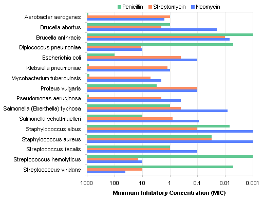
That’s better, but it’s still not very easy to read. With so many categories (bacteria species), the bars are too narrow to be clearly resolved.
I decided to try a panel chart to separate the colors, with one panel for each antibiotic. Here is the first cut.
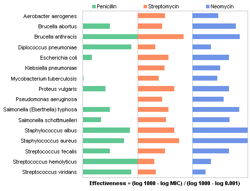
We see the alphabetical sorting issue in this chart. There are a number of ways we could sort the data, and probably the most arbitrary is by alphabetical order of the category labels. What if I sort by effectiveness of Penicillin? (Once the chart is created, the points are sorted by sorting the original data table by the desired column.)
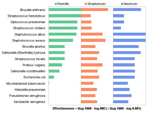
That’s more meaningful. Here is the data sorted by effectiveness of Streptomycin:
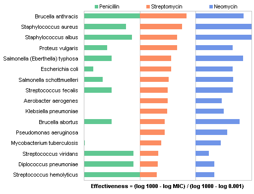
Now sorted by Neomycin effectiveness:
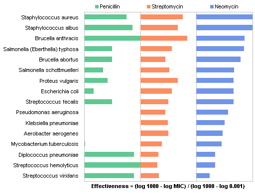
I thought the panel charts could be simplified by using the Overlapped Bar Chart – Longer Bars in Back approach of Robert Kosara of EagerEyes. This shows the data ranked by penicillin effectiveness.
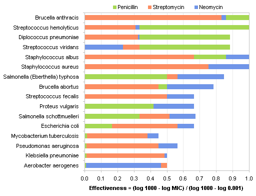
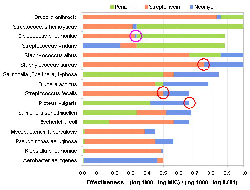
There are problems with this kind of chart. First, I had to choose an uglier green, because the original green was too hard to distinguish from the blue. Second, It’s difficult to get over the ingrained misunderstanding that the bars are not stacked, but shown shorter in front of longer. Also, there are several places, circled below, where two bars coincide (or nearly coincide), making it impossible to identify all three values for each microbe.
These attempts so far show the effectiveness of the antibiotics well enough, but they omit the Gram staining behavior. I decided to shade the rows next to Gram positive bacteria, and use a dot plot instead of a bar chart to show the data.
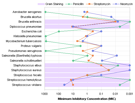
There’s that alpha sort issue again. With this arbitrary sort, it’s very hard to see any correlations in the data. But when we sort by Penicillin effectiveness, we see much more information. When sorted in this way, the Gram-positive bacteria are seen as those against which Penicillin is most effective.
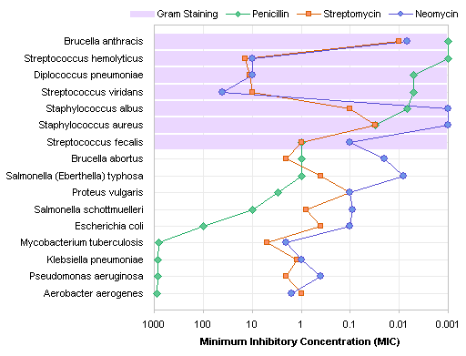
Sorting by effectiveness of Streptomycin and Neomycin (omitted to keep this post reasonably long) is good for comparisons among the antibiotics, but loses the impact of the correlation between Penicillin effectiveness and Gram staining.
This type of chart readily translates to a gray-scale version.

This is the chart I submitted to the contest. What could I have done better?
