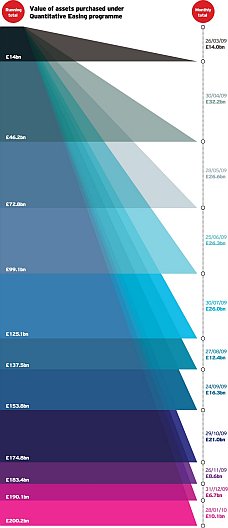
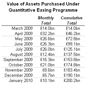
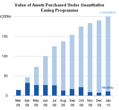
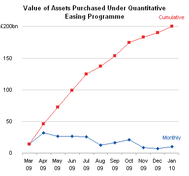
While in line at the bank last week, I picked up a copy of the Worcester MA Telegram and Gazette, and stuck in the middle of the front section I saw a chart showing how much a family of four would have to pay for health care for the three health reform plans under debate. I had to reproduce it from memory: it wasn’t my paper, and I can’t find an online version. The chart was a bubble chart that looked much like this:

Okay, as you move left to right, the bubbles get larger. The bubbles in the top row are larger than the rest, but except for the first bubble in the second row, the bubbles don’t change much from row to row. If not for the numerical labels, we wouldn’t notice any difference at all.
Apparently bubble area, not diameter, encodes the values; if diameters controlled size, the leftmost bubbles would practically disappear. On closer inspection, I noticed that the top row of bubbles, Income, obviously uses a different scale than the others.
Given our difficulty in judging bubble areas (or diameters), and given the unannounced scale change between Income and Family Contribution, the data may as well have been presented in a table. It has the same grid and numbers, but is smaller and lacks those distracting circles.

However, you can make much sense of the data if you make a simple line chart. Now you can see the similarities and differences in the three plans.

But I thought this was a bit simplistic, a bit incomplete. I spent ten or fifteen minutes at the Kaiser Family Foundation Health Reform Subsidy Calculator and filled out the data. When you’re making a bubble chart, you don’t need many data points, in fact, you can’t accommodate many data points. But a line chart can represent a continuum of data points.
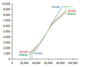
In this chart it becomes clear that the plans are similar in the middle of the income range, but differ at the ends, not only in the costs, but also in the income levels where the plans kick in at the low end and where the plans reach maximum contribution at the high end.
If we superimpose the data from the bubble chart onto the line chart, we see that the bubble data actually shows a smaller difference between the plans at the high end than we can see in the line chart.

Nice chart and all, but I’ve neglected some details. There are no titles in the chart, so someone reading the newspaper would actually have to read the article to get the story. Also, except for USA Today, most newspapers are limited to black and white graphics. And the charts I’ve made are rather large for their data content (though smaller than the original bubble chart).
So how can we make this chart more suitable for a newspaper? Shrink it, add titles, and convert the colors to black and two shades of gray.
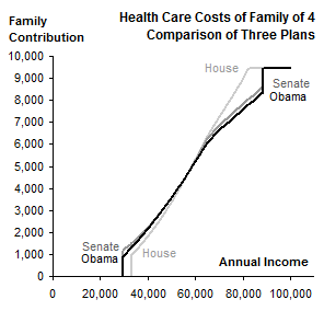
You could use dashed or dotted lines as well. Excel up to 2003 does poorly with thicker dashed or dotted chart lines, but Excel 2007 renders these features nicely.


