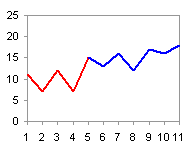
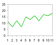
In Category Axis Tricks for Line and Area Charts – 1, we saw how to use two line series to create a two-toned line chart. This is useful if we want to differentiate between actual values up to a certain date and predicted values thereafter, or if we want to distinguish values from different periods of time. This is relatively easy to do for a line chart by distributing the data into two columns, where both series have the same number of category values, and the Y values for each series are lined up with the corresponding category values.
|
|
The line chart works fine, one series starting where the other leaves off. Area charts, on the other hand, don’t work as well. Looking at the two series individually, we see that both have colored regions between categories 4 and 6.


[Read more…] about Category Axis Tricks for Line and Area Charts – 2
