In a recent post I described how How Excel Calculates Automatic Chart Axis Limits. The problem with these automatic limits is that they often leave a little too much white space around the outside of the plotted data, especially between the lowest data point and zero. But it’s tedious to guess at your own axis scale, and it would be nice to calculate your own limits in your latest and greatest VBA charting code.
This article presents code that takes high and low series values and computes “nice” axis scaling parameters. The code can be called by other VBA procedures, or it can be used in the worksheet as a user defined function (UDF).
The VBA Code
I started with code from a November 2001 newsgroup post by Stephen Bullen. I modified it slightly, and corrected a minor algebraic error.
The following is an entire module, including a user defined variable type (scaleAxisScale) to contain the axis scaling parameters, the main function procedure that does all of the work (fnAxisScale), and a small function procedure that is the UDF interface with the worksheet (udfAxisScale).
Option Explicit

Public Type scaleAxisScale
  ' Calculated Axis Scale Parameters
  dMin As Double
  dMax As Double
  dMajor As Double
  dMinor As Double
End Type

Function fnAxisScale(ByVal dMin As Double, ByVal dMax As Double) As scaleAxisScale
  ' Calculates tidy settings for the chart axes
  Dim dPower As Double, dScale As Double, dSmall As Double, dTemp As Double

  'Check if the max and min are the same
  If dMax = dMin Then
    dTemp = dMax
    dMax = dMax * 1.01
    dMin = dMin * 0.99
  End If

  'Check if dMax is bigger than dMin - swap them if not
  If dMax < dMin Then
    dTemp = dMax
    dMax = dMin
    dMin = dTemp
  End If

  'Make dMax a little bigger and dMin a little smaller (by 1% of their difference)
  If dMax > 0 Then
    dMax = dMax + (dMax - dMin) * 0.01
  ElseIf dMax < 0 Then
    dMax = WorksheetFunction.Min(dMax + (dMax - dMin) * 0.01, 0)
  Else
    dMax = 0
  End If
  If dMin > 0 Then
    dMin = WorksheetFunction.Max(dMin - (dMax - dMin) * 0.01, 0)
  ElseIf dMin < 0 Then
    dMin = dMin - (dMax - dMin) * 0.01
  Else
    dMin = 0
  End If

  'What if they are both 0?
  If (dMax = 0) And (dMin = 0) Then dMax = 1

  'This bit rounds the maximum and minimum values to reasonable values
  'to chart.  If not done, the axis numbers will look very silly
  'Find the range of values covered
  dPower = Log(dMax - dMin) / Log(10)
  dScale = 10 ^ (dPower - Int(dPower))

  'Find the scaling factor
  Select Case dScale
    Case 0 To 2.5
      dScale = 0.2
      dSmall = 0.05
    Case 2.5 To 5
      dScale = 0.5
      dSmall = 0.1
    Case 5 To 7.5
      dScale = 1
      dSmall = 0.2
    Case Else
      dScale = 2
      dSmall = 0.5
  End Select

  'Calculate the scaling factor (major & minor unit)
  dScale = dScale * 10 ^ Int(dPower)
  dSmall = dSmall * 10 ^ Int(dPower)

  'Round the axis values to the nearest scaling factor
  fnAxisScale.dMin = dScale * Int(dMin / dScale)
  fnAxisScale.dMax = dScale * (Int(dMax / dScale) + 1)
  fnAxisScale.dMajor = dScale
  fnAxisScale.dMinor = dSmall

End Function

Public Function udfAxisScale(ByVal dMin As Double, ByVal dMax As Double) As Variant
  ' Worksheet interface to fnAxisScale
  ' Returns a horizontal array to the worksheet
  Dim scaleMyScale As scaleAxisScale
  Dim scaleOutput As Variant

  scaleMyScale = fnAxisScale(dMin, dMax)

  ReDim scaleOutput(1 To 4)
  scaleOutput(1) = scaleMyScale.dMin
  scaleOutput(2) = scaleMyScale.dMax
  scaleOutput(3) = scaleMyScale.dMajor
  scaleOutput(4) = scaleMyScale.dMinor

  udfAxisScale = scaleOutput
End Function
Using as a User Defined Function (UDF)
The procedure returns a four-element horizontal array. In its simplest implementation, select a horizontal range of four cells (or three cells if you don’t care about the minor unit), type the following formula into the formula bar (min and max can be cell references, constants, or formulas), and hold Ctrl+Shift while pressing Enter to create an array formula. Don’t type the curly brackets; Excel does that if the array formula is valid.
{=udfAxisScale(min,max)}To enter the axis scale parameters into a vertical range of cells, select the range of three or four cells, enter the following formula (without the curly braces) into the formula bar, and hold Ctrl+Shift while pressing Enter to create an array formula.
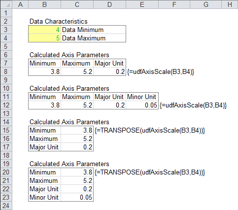
{=TRANSPOSE(udfAxisScale(min,max))}The following screen shot shows this in action. The min and max for an unseen axis are entered into B3 and B4. A three member horizontal array of axis min, axis max, and major unit is entered in B8:D8 using the formula shown in E8. A four member array including minor unit is entered in B12:E12 using the formula shown in F12 (it’s the same formula used in the three member array). A three member vertical array of axis min, axis max, and major unit is entered in C15:C17 using the formula shown in D15. A four member array including minor unit is entered in C20:C23 using the formula shown in D20 (it’s the same formula used in the three member array).
The following further illustrates the UDF. The cells in the upper three outlined rows contain X values (0 and 5 in the first column) and Y values (4 and 5 in the second column), which are plotted in both charts. The cells in the lower three outlined rows contain calculated values for minimum, maximum, and major unit for the X axis (first column) and Y axis (second column).
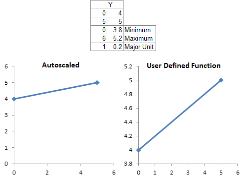
The axis parameters are manually changed from the left chart’s automatic values. . .
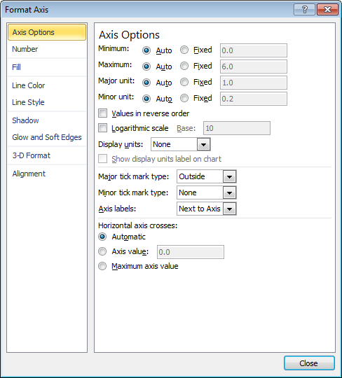
to the right chart’s calculated values, by entering the new values into the Format Axis dialog.

Call from Other VBA Procedures
Procedure
The following procedure takes an XY chart, finds the min and max of all series plotted in the chart, passes these to fnAxisScale above, then applies the calculated scale parameters to the chart. If the chart is not an XY chart, the X axis cannot be rescaled in this way, so the code must be modified.
Sub ScaleChartAxes(cht As Chart)
  Dim AxisScaleX As scaleAxisScale
  Dim AxisScaleY As scaleAxisScale
  Dim dXMin As Double, dXMax As Double, dYMin As Double, dYMax As Double
  Dim vXValues As Variant, vYValues As Variant
  Dim iSeries As Long, iPoint As Long
  Dim srs As Series

  With cht
    ' loop through all series and all points to find X and Y min and max
    For iSeries = 1 To .SeriesCollection.Count
      Set srs = .SeriesCollection(iSeries)
      vXValues = srs.XValues
      vYValues = srs.Values

      If iSeries = 1 Then
        dXMin = vXValues(1)
        dXMax = vXValues(1)
        dYMin = vYValues(1)
        dYMax = vYValues(1)
      End If

      For iPoint = 1 To srs.Points.Count
        If dXMin > vXValues(iPoint) Then dXMin = vXValues(iPoint)
        If dXMax < vXValues(iPoint) Then dXMax = vXValues(iPoint)
        If dYMin > vYValues(iPoint) Then dYMin = vYValues(iPoint)
        If dYMax < vYValues(iPoint) Then dYMax = vYValues(iPoint)
      Next
    Next

    ' compute X and Y axis scales
    AxisScaleX = fnAxisScale(dXMin, dXMax)
    AxisScaleY = fnAxisScale(dYMin, dYMax)

    ' apply X axis scale
    With .Axes(xlCategory)
      If .MinimumScale > AxisScaleX.dMax Then
        .MaximumScale = AxisScaleX.dMax
        .MinimumScale = AxisScaleX.dMin
      Else
        .MinimumScale = AxisScaleX.dMin
        .MaximumScale = AxisScaleX.dMax
      End If
      .MajorUnit = AxisScaleX.dMajor
    End With

    ' apply Y axis scale
    With .Axes(xlValue)
      If .MinimumScale > AxisScaleY.dMax Then
        .MaximumScale = AxisScaleY.dMax
        .MinimumScale = AxisScaleY.dMin
      Else
        .MinimumScale = AxisScaleY.dMin
        .MaximumScale = AxisScaleY.dMax
      End If
      .MajorUnit = AxisScaleY.dMajor
    End With

  End With
End Sub
Entry Points
The ScaleChartAxes procedure above can be called in several ways by the following procedures. Each one is run by the user, and passes one or more charts into ScaleChartAxes for rescaling.
This procedure rescales the active chart.
Sub ScaleActiveChartAxes()
  If Not ActiveChart Is Nothing Then
    ScaleChartAxes ActiveChart
  End If
End Sub
This procedure rescales all charts on the active sheet.
Sub ScaleActiveSheetCharts()
  Dim cht As ChartObject

  Application.ScreenUpdating = False
  For Each cht In ActiveSheet.ChartObjects
    ScaleChartAxes cht.Chart
  Next
  Application.ScreenUpdating = True
End Sub
This procedure rescales all charts that have been selected (using Shift or Ctrl to select multiple charts).
Sub ScaleSelectedCharts()
  Dim obj As Object

  Application.ScreenUpdating = False
  If Not ActiveChart Is Nothing Then
    ScaleChartAxes ActiveChart
  End If
  On Error Resume Next
  For Each obj In Selection
    If TypeName(obj) = "ChartObject" Then
      ScaleChartAxes obj.Chart
    End If
  Next
  On Error GoTo 0
  Application.ScreenUpdating = True
End Sub
More Axis Scale Articles
- Calculate Nice Axis Scales with LET and LAMBDA
- Calculate Nice Axis Scales in Your Excel Worksheet
- Calculate Nice Axis Scales in Excel VBA
- Chart UDF to Control Axis Scale
- How Excel Calculates Automatic Chart Axis Limits
- Reciprocal Chart Axis Scale
- Custom Axis Labels and Gridlines in an Excel Chart
- Custom Axis, Y = 1, 2, 4, 8, 16
- Logarithmic Axis Scales
- Link Excel Chart Axis Scale to Values in Cells
- Consistent Axis Scales Across Multiple Charts
- Gantt Chart with Nice Date Axis
- Select Meaningful Axis Scales
- Bar Chart Value Axis Scale Must Include Zero


Bob says
Hi Jon,
I’ve been using the following code to keep gantt charts, milestones and labels all lined up on a chart in a report
I put a couple of formulas on my model and this keeps the date scaling for the horizontal bars in line with the xy scale.
—-
Maybe some of you readers can leverage.
Cheers,
Bob
Calvin Graham says
The ideal solution to the chart formatting issues would be to define a new Chart class. Then you could loop through all the charts in the worksheet, processing all the scales, formatting and colours along the way using custom functions like this. Frankly though, that’s a large project and bespoke to how you want to do things.
For me, it’s mostly a case of keeping consistant colours across everything so that for instance the same countries in Europe are coloured the same across all charts; alternatively another formatting issue I deal with is pie chart label positioning. Now I’m adding scale stuff like this and I’m tempted to spend a day or two building up that new chart class.
Jon Peltier says
Calvin –
I don’t think you need to create a special class for the charts. There already are the Chart and ChartObject classes, with all of these properties. I make use of these when I use “For Each cht In ActiveSheet.ChartObjects”.
To keep your countries the right color, you could use a technique like I described in VBA Conditional Formatting of Charts by Category Label, updated for the Excel 2007 color model.
Calvin Graham says
Almost identical to my implementation, I use a hidden “Palette” tab.
I know about the chart/object classes but my point was to create a class with a similar set of paramaters as found in the chart class, but fixed. For instance if the scales were “auto”, they would actually be switched to manual and set using the ideas you’ve been looking at or set to a range on the sheet. Similarly the scaling, formatting, fonts and label positions/sizes would be sorted.
As I hinted, I don’t have a specific spec as such but at some point I might develop something; no doubt in time for Excel 2015/16/etc to fix everything…
Jason says
Jon
This is very nice.
I was wondering if there is a way to specify the number of tick labels required when calculating the scaling parameters? When constructing panel charts I usually like to limit the number of tick labels.
Jon Peltier says
Jason –
The code calculates the major and minor spacing. If you need fewer tick labels, the major spacing should be larger. Adjust the definitions of dScale and dSmall in the Select Case block, as I’ve done in the following example:
Changing dScale will have an effect on dMin and dMax. Experiment to find settings that work for your particular chart.
Jason says
Thanks Jon – I’ll give it a try.
Jason says
Hi Jon,
I’m trying to use your code to do some auto-scaling for some column line graphs. I graphing last twelve months of sales in columns and the margin as lines. Sales are on the primary axis and margin is on the secondary axis. I removed all of the x scale code. Now I’m trying to determine what I need to change to pick up the secondary axis. The code is applying same values for the secondary axis. Any feedback would be appreciated.
Jon Peltier says
Jason –
You have to keep your calculations straight, so you use the appropriate values to compute the primary and secondary axis scales.
In my code, .Axes(xlValue) is shorthand for .Axes(xlValue, xlPrimary) and references the primary Y axis. The secondary Y axis is .Axes(xlValue, xlSecondary).
Kyle says
Hi Jon, in line with Jason’s comments, I am trying to scale a line chart that has 3 series on the primary axis and one on the secondary axis. The problem I am running across is that the .SeriesCollection.Count returns 4 so the min/max is the combination of all 4 series. How do I “filter” the .SeriesCollection.Count to only loop through the 3 series on xlPrimary separate from the 1 series on xlSecondary?
Jon Peltier says
Check the .AxisGroup property of each series. If it is 1 (xlPrimary), include its data in the analysis; if it is 2 (xlSecondary), skip it.
Kyle says
Jon, thanks for the help and the base code. I was using a “dumber” version of this for years that worked, but wasn’t nearly as elegant as this. I made some revisions below to account for xlPrimary and xlSecondary axes based on your recommendation, to ignore #N/A data points (which I use often), and to center the chart title if present. I was having a problem with the minimum being set to zero on numbers vPValues(iPoint) Then If vPValues(iPoint) Empty Then dPMin = vPValues(iPoint)
If dPMax < vPValues(iPoint) Then If vPValues(iPoint) Empty Then dPMax = vPValues(iPoint)
Next
End If
‘find Secondary axis values
If .SeriesCollection(iSeries).AxisGroup = xlSecondary Then
vSValues = srs.Values
If iSeries = 1 Then
dSMin = vSValues(1)
dSMax = vSValues(1)
End If
For iPoint = 1 To srs.Points.Count
If dSMin > vSValues(iPoint) Then If vSValues(iPoint) Empty Then dSMin = vSValues(iPoint)
If dSMax < vSValues(iPoint) Then If vSValues(iPoint) Empty Then dSMax = vSValues(iPoint)
Next
End If
Next
‘ compute axis scales
AxisScaleP = fnAxisScale(dPMin, dPMax)
AxisScaleS = fnAxisScale(dSMin, dSMax)
‘ apply Primary axis scale
With .Axes(xlValue, xlPrimary)
If .MinimumScale > AxisScaleP.dMax Then
.MaximumScale = AxisScaleP.dMax
.MinimumScale = AxisScaleP.dMin
Else
.MinimumScale = AxisScaleP.dMin
.MaximumScale = AxisScaleP.dMax
End If
.MajorUnit = AxisScaleP.dMajor
End With
‘ apply Secondary axis Scale
If cht.HasAxis(xlValue, xlSecondary) = True Then
With .Axes(xlValue, xlSecondary)
If .MinimumScale > AxisScaleS.dMax Then
.MaximumScale = AxisScaleS.dMax
.MinimumScale = AxisScaleS.dMin
Else
.MinimumScale = AxisScaleS.dMin
.MaximumScale = AxisScaleS.dMax
End If
.MajorUnit = AxisScaleS.dMajor
End With
End If
‘center chart title if present
If cht.HasTitle = True Then
cht.ChartTitle.Left = cht.ChartArea.Width
cht.ChartTitle.Left = cht.ChartTitle.Left / 2
End If
End With
End Sub
Andrew says
Hi Jon et al:
I am trying to use your technique as applied to a bar/line chart mix (my Y axis is money…the second Y-axis is percentage of sales and the X is month of the year). know you mentioned that the parameters change when you are dealing with a different type of chart. What I am seeking to do is exactly what you have achieved but in this chart format. Would you mind showing what I need to replace and with what to get this working. I am in no way considered a programmer or experienced individual but the code I use is completely manual and I have to apply it to all my graphs individually because they refference different data. I will put this short/sad peice of coding I use to change it manually below (thanks so much for your time):
Sub NewScaleXaxis()
If ActiveChart Is Nothing Then
MsgBox “Please select the chart to modify first.”
Exit Sub
End If
With ActiveChart.Axes(xlValue)
.MinimumScale = 100000000 ‘manual’
.CrossesAt = 50000000 ‘manual’
.MaximumScale = 900000000 ‘manual’
End With
With ActiveChart.Axes(xlValue).TickLabels
.NumberFormat = “$###.###.##”
End With
End Sub
-Andrew
Jon Peltier says
You need to use the following syntax:
With ActiveChart.Axes(which_axis, which_set_of_axes)
where which_axis is either xlCategory for X or xlValue for Y
and which_set_of_axes is either xlPrimary or xlSecondary
Kyle says
Andrew, I am going to try posting my revisions to Jon’s code again and hope the website like it better this time. If this works, you should be able to apply this directly for your use. I also boiled the subroutines that call this code down to two – ScaleActiveSheetCharts & ScaleActiveChart – and embedded them below but you can obviously call it however you need.
'**********************************************************************************************************************

'**********************************************************************************************************************

'**********************************************************************************************************************

'***********************************          Scale Chart Macro Start       *******************************************

'**********************************************************************************************************************

'**********************************************************************************************************************

'**********************************************************************************************************************

'Original Code by Jon Peltier, modified by Kyle Whitmire as annotated KW

'**********************************************************************************************************************

'Option Explicit
Public Type scaleAxisScale
' Calculated Axis Scale Parameters
dMin As Double
dMax As Double
dMajor As Double
dMinor As Double
End Type
Function fnAxisScale(ByVal dMin As Double, ByVal dMax As Double) As scaleAxisScale
' Calculates tidy settings for the chart axes
Dim dPower As Double, dScale As Double, dSmall As Double, dTemp As Double
'Check if the max and min are the same
If dMax = dMin Then
dTemp = dMax
dMax = dMax * 1.01
dMin = dMin * 0.99
End If
'Check if dMax is bigger than dMin - swap them if not
If dMax 0 Then
dMax = dMax + (dMax - dMin) * 0.01
ElseIf dMax 0 Then
dMin = WorksheetFunction.Max(dMin - (dMax - dMin) * 0.01, 0)
ElseIf dMin vPValues(iPoint) Then If vPValues(iPoint) Empty Then dPMin = vPValues(iPoint)
If dPMax < vPValues(iPoint) Then If vPValues(iPoint) Empty Then dPMax = vPValues(iPoint)
Next
End If
'KW - find Secondary axis values
If .SeriesCollection(iSeries).AxisGroup = xlSecondary Then
vSValues = srs.Values
If iSeries = 1 Then
dSMin = vSValues(1)
dSMax = vSValues(1)
End If
For iPoint = 1 To srs.Points.Count
If dSMin > vSValues(iPoint) Then
If vSValues(iPoint) Empty Then
dSMin = vSValues(iPoint)
End If
End If
If dSMax < vSValues(iPoint) Then
If vSValues(iPoint) Empty Then
dSMax = vSValues(iPoint)
End If
End If
Next
End If
Next
' compute axis scales
AxisScaleP = fnAxisScale(dPMin, dPMax)
AxisScaleS = fnAxisScale(dSMin, dSMax)
'KW - If the text "NoScale" is present anywhere in chartobject name, scaling won't be applied. Allows way to ignore certain charts when executing sub for all chartobjects
If InStr(cht.Name, "NoScale") = 0 Then
' apply Primary axis scale
With .Axes(xlValue, xlPrimary)
If .MinimumScale > AxisScaleP.dMax Then
.MaximumScale = AxisScaleP.dMax
.MinimumScale = AxisScaleP.dMin
Else
.MinimumScale = AxisScaleP.dMin
.MaximumScale = AxisScaleP.dMax
End If
.MajorUnit = AxisScaleP.dMajor
End With
' apply Secondary axis Scale
If cht.HasAxis(xlValue, xlSecondary) = True Then
With .Axes(xlValue, xlSecondary)
If .MinimumScale > AxisScaleS.dMax Then
.MaximumScale = AxisScaleS.dMax
.MinimumScale = AxisScaleS.dMin
Else
.MinimumScale = AxisScaleS.dMin
.MaximumScale = AxisScaleS.dMax
End If
.MajorUnit = AxisScaleS.dMajor
End With
End If
End If
'KW - center chart title if present
If cht.HasTitle = True Then
cht.ChartTitle.Left = cht.ChartArea.Width
cht.ChartTitle.Left = cht.ChartTitle.Left / 2
End If
End With
End Sub
'**********************************************************************************************************************
'**********************************************************************************************************************
'**********************************************************************************************************************
'*********************************** Scale Chart Macro End *********************************************
'**********************************************************************************************************************
'**********************************************************************************************************************
'**********************************************************************************************************************
Trevor R Bird says
This is a very useful thread. One aspect not covered however, is setting a date scale to days, months or years using VBA. It can be done via the Format Axis dialogue so one would expect there is a VBA solution but google search as I might, I can’t find any tips on how to do it:-(
To explain, I have a worksheet which has stock price data from every day over a number of years and I select a date range depending on the period I wish to view on a chart. Further I wish to have the date scale set by VBA to Major Ticks of 1 month for periods longer than 6 months, and to 7 days for periods less than six months. I worked out the 7 days for major ticks, that was easy as the charts xlCategory appears to default to days when set by VBA. How can I set the major tick properties in VBA to 1 month.
Looking for clues…
Thanks in anticipation of success
Trevor
Jon Peltier says
Trevor –
If you’re using Excel 2010 or 2013, use the macro recorder while you experiment on a dummy chart. (Excel 2007’s macro recorder doesn’t record a lot of chart code.)
Here’s how to set the axis major tick spacing to 7 days, 1 month, and one year, and then reset it to automatic.
Trevor R Bird says
Thank Jon, that’s exactly what I needed.
Trevor
rog says
Hi, great post. But still having trouble adapting this to a secondary axis. it seems this problem still hasn’t been solved as I cannot find a solution anywhere online. Is it possible to have it such that minimums can be set for 2 y axes with corresponding series (1) and (2)? Cannot seem to get Kyle’s adapted code to work. Thanks in advance
Jon Peltier says
Rog –
You can cycle through the series in the chart to determine if a series is in the primary or secondary axis group. This way you can determine min and max for each axis. Then you simply apply primary axis scale limits to the primary axis, and same for the secondary.
John says
Jon – Great post!
My application of this needs to handle both positive and negative values. In short, I’m creating a sort-of Cartesian coordinate system X-Y graph that plots a circle based on user data that represents a ‘boundary’ condition. It then calculates and plots a single point based on other data, and the chart graphically shows the user whether their point is good or bad based on whether it plots inside the circle. But since the boundary circle center works as (0,0) coordinate, the user’s input could be +X or -X, and +Y or -Y. Is there a way to modify the code to handle this?
Jon Peltier says
John –
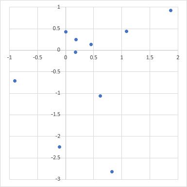
Did you try it? I just generated some random XY data with data in all four quadrants, and the code as presented in this article calculated appropriate min and max scales which were “nicer” than Excel’s defaults.
Here’s the data and the original chart:
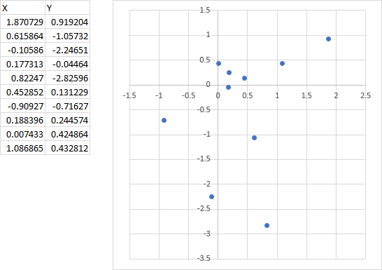
Here is the rescaled chart:
Alex Immanuel says
could you please attach the link to access the sample file you used for the above example
Jon Peltier says
Alex –
There is nothing useful in that workbook. It has a lot of small charts, none recognizable as those in the pictures here, and some worksheets that use the functions. The code is exactly as presented here.
If you are having trouble implementing the code, look at my tutorial How To Use Someone Else’s Macro.