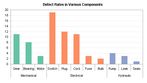
A reader commented on the previous post, Chart with a Dual Category Axis, asking whether I’d use a Pareto chart for this data. I commented that it almost was a Pareto chart, since at least within each category the data is sorted from high to low. Then I got to thinking, if I put my data into a table, and use a pivot table to sort both the main category and sub category by number of defects, I would essentially have a Pareto chart.
A Pareto chart is a column or bar chart that lists items in decreasing order of their occurrence. A Pareto chart may include a line chart series showing the cumulative occurrence of the items. The left-most items are most prevalent, so if your Pareto chart shows instances of failure modes, you start fixing the left-most failure modes first.
This post was revised on 26 March 2022.
Data
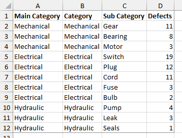
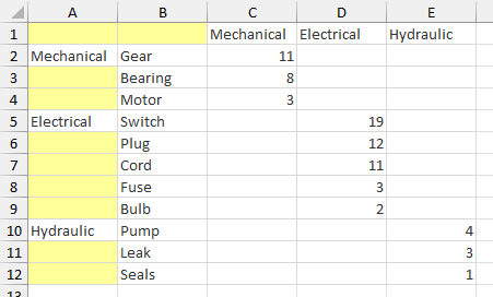
Here is my data table. The main category data from the first column is duplicated in the second for reasons which will become clear when you try to use the category in two places in the pivot table.
Pivot Table
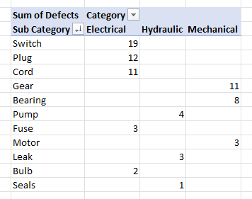
Select the data and insert a pivot table. Put the Main Category and Sub Category fields into the rows area, the Category field into the columns area, and the Defects field (Sum of Defects) into the data area. Click the filter button on the Sub Category field header, choose Custom Sort; in the Sort dialog, select Descending (Z to A), and in the dropdown select Sum of Defects. This Pivot Table uses the Tabular layout, which I prefer.
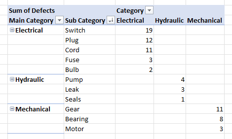
The compact (shown below) and outline layouts work just as well, and the pivot chart comes out the same.
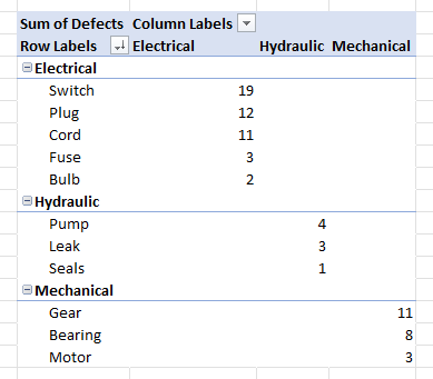
The data arrangement in the tabular layout looks very much like what I set up manually in the last post.
Pivot Chart
Now you can make a pivot chart from the data, using the stacked column chart type.
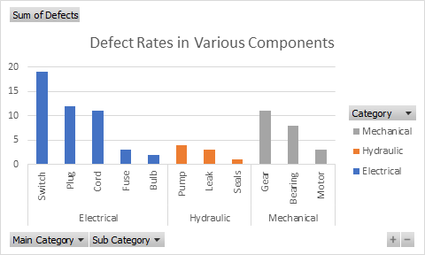
You can clean up the chart by hiding the pivot chart field buttons: right-click on any of the buttons, and choose Hide All Field Buttons on Chart. You can also delete the legend, which is redundant given the outer level of category axis labels.
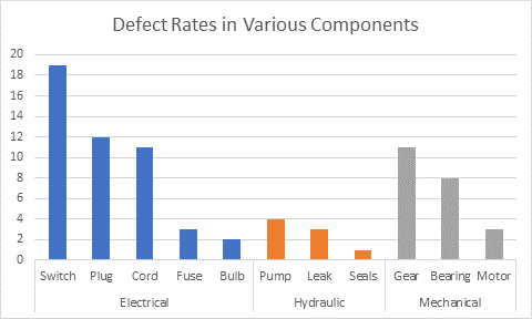
Regular Chart
I often will make a regular chart from my pivot data, as long as the pivot table isn’t going to change its shape too much. You need to use the Pivot Table’s tabular layout for the category axis to work out properly. The protocol is described in Making Regular Charts from Pivot Tables, and the result is the same as the chart above.
The advantage of the regular chart is that you have full control over all formatting, and over the data used in the chart. The disadvantage is that if the pivot data changes and the pivot table is refreshed or repivoted, the pivot table may cover a different range, and the chart will plot the original range. If the data changes a lot, you will have to (a) update the chart source data links manually, (b) design some clever dynamic range definitions so the links automatically keep pointing to the correct range, or (c) write a VBA procedure to update the chart’s links. This last option is pretty tricky to set up but saves lots of time and frustration in the long run.
Want a “Regular” Pareto Chart
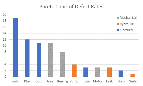
If you want a Pareto chart with a single sorted set of bars in your chart, simplify the Pivot Table, and leave out the Main Category field. Sort Sub Category by Sum of Defects, the same as before. Since there is only the Sub Category column of labels, the chart’s category axis will have only one set of labels.
Create a chart and remove the pivot field buttons, like before. Keep the legend, to identify the colored bars.
Second in a series
- Chart with a Dual Category Axis
- Using Pivot Table Data for a Chart with a Dual Category Axis
- Dynamic Chart using Pivot Table and Range Names
- Dynamic Chart using Pivot Table and VBA


 By far the biggest change in Office 2007 is the complete redesign of the user interface. After a decade or more, the familiar menubar and toolbars are gone, replaced by a large monolithic Ribbon splayed across the top of the application window. The user’s first reaction upon seeing this wonderful new interface is “Wow!” This is followed soon after by panic, as the user desperately tries to figure out where all the old controls have gone. They all are still there, and eventually most are found. Some are pretty obvious, and the Ribbon was designed to make them so, but others stubbornly stay hidden. The “Copy Picture” command in “Classic Excel” (97 through 2003) was somewhat obscure, requiring the user to hold Shift while selecting the Edit menu. This was kept obscure; it took me, a seasoned Excel user, a month to find it, cleverly buried under the Paste dropdown button.
