When I was a kid, I remember hearing of seasonally-adjusted economic indicators. I was rather disappointed to learn, upon growing up and taking econ, that seasonally-adjusted economic indicators were not calculated using some highly theoretical formulas taking into account all manners of variation, but were merely moving averages.
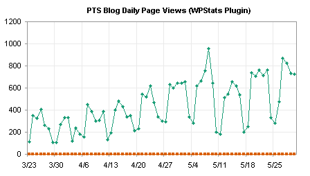
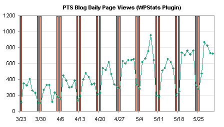
In Highlight Certain Time Periods in a Chart, I used my blog stats to illustrate how to highlight weekdays from weekends. Another way to account for cyclical variations is to take a moving average. I’ll use the same data here to show two ways to construct moving averages. A moving average simply moves along the data, taking the average at each point of the previous N values.
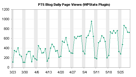
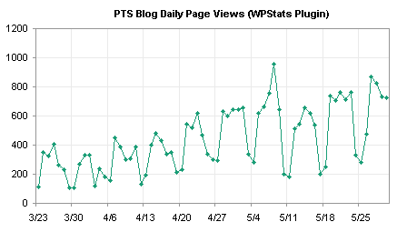
The raw data is shown in this chart, and the cyclical variation is pronounced, making it more difficult to pick out longer term trends.
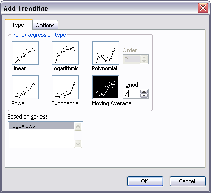
The easiest way to take a moving average probably is to right click on the chart series, and choose Add Trendline. Excel offers several types of trendlines, and moving average is included among them. For daily data that has different weekday and weekend values, a 7-point moving average is an appropriate option.
Here is the chart with a moving average trendline.

You can also calculate your own averages in the worksheet, and add a series with the average values. This is appropriate if you are using a weighted moving average (such as an exponential moving average) or if you need to use the averages in subsequent worksheet analysis. The technique is simple. Skip the first N-1 points (i.e., 6 points for a 7-point moving average), then use a simple formula to average seven points, and fill the rest of the range with this formula. For data starting in cell B2, make a 7-point moving average starting in cell C8 with this formula, and fill the formula down column C to the last row with data in column B:
=AVERAGE(B2:B8)
Then add this column’s data to the chart as a new series.

For this simple example the two approaches are virtually indistinguishable. If you’ve calculated your own averages, you can remove the raw data series and show just the smoothed line.

Trendline and Regression Articles on this Web Site
- Trendlines and Chart Types in Excel
- Add One Trendline for Multiple Series
- Trendline Calculator for Multiple Series
- Trendline Fitting Errors
- Choosing a Trendline Type
- Plot Two Time Series and Trendlines with Different Dates
- Polynomial Fit vs. Statistical Process Control
- Stacked Column Chart with Stacked Trendlines
- Deming Regression
- Deming Regression Utility
- LOESS Smoothing in Excel
- LOESS Utility for Excel


