Nathan Yau of FlowingData asks Can You Improve this Mediocre Statistical Graphic?
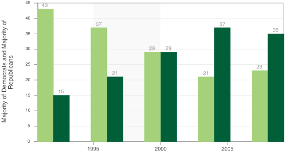
So what’s wrong with this chart? [Read more…] about California Majority Party by County
Peltier Technical Services - Excel Charts and Programming
Nathan Yau of FlowingData asks Can You Improve this Mediocre Statistical Graphic?

So what’s wrong with this chart? [Read more…] about California Majority Party by County
Posted: Friday, July 18th, 2008 under Chart Types.
Tags: Column Charts, Line Charts.
Comments: 10

In A Gauge Chart That Works?, Clint describes his efforts to come up with a dial-type chart that isn’t as terrible as most. He comments that Stephen Few‘s Bullet Graphs are unfamiliar to most people, which is true, ans they’ve only been around for three or four years. Bullet graphs and most gauge-type charts are tricky to create and maintain, since they rely on a melange of chart types and additional chart elements to produce unusual visual effects. Clint’s boss wanted a gauge, but Clint didn’t want to work with ugly, bulky dial gauge replicas. Long story short, Clint designed the following gauge to show page views in a web site he was watching:

I’m not wild about the new gauge, but it isn’t totally awful. I’m not sure that a bullet-style graph with this color scheme couldn’t have been used (shown below without the text elements), but I’ll leave that discussion alone. I also won’t dwell on the observation that a bullet chart is really a gauge at heart.
![]()
On the positive side, Clint’s graph is linear instead of circular. Also, the new Excel 2007 feature is nice that allows arrowheads on series lines and error bars. (One of the few nice things about Excel 2007 charting, and not worth putting up with the problems.)
On the negative side, it’s a gauge. Gauges like this only show one point in time; there’s no historical context, and you can’t tell if your month to date numbers are on target to hit the total per month target. Also, what happens if the value goes to 11? Seriously, there is no provision for an out-of-scale measurement.
I’ve sworn off gauges myself. I’ve removed a speedometer tutorial from my web site, for at least a couple of reasons. First, it is a poor display device, for all the reasons stated above and elsewhere. Second, I would receive too many questions from people who didn’t understand enough math to customize it. It’s algebra and a little trig: find a tenth grader to help, people!
To overcome these issues, I returned to an old standby, the line chart. I use a category value to show days elapsed during the month, and vertical measures of page view targets and measurements. Colored backgrounds are made using stacked columns to provide a bad-medium-good scale across the chart, and dual scales, showing values and percentage of target, decorate the vertical sides of the chart. I also stuck with colors similar to Clint’s. Here is my non-gauge chart:
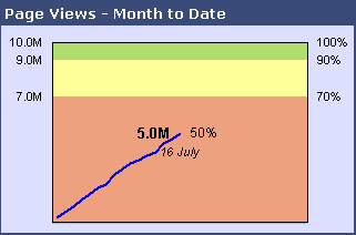
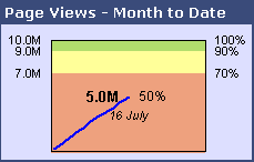
This chart takes up about as much space as Clint’s, but it adds the missing time component. I can visually extrapolate the line forward to the end of the month and estimate whether we’ll hit our target. Since Clint’s chart has some empty space, it can be shrunk; so can the line chart without too much difference in legibility:
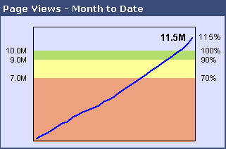
Through the use of (ahem!) clever formulas, these charts can be made to adapt when the value exceeds the target:
When I have a chance to pretty it up, I’ll post a tutorial showing how I created this chart.
Posted: Friday, July 18th, 2008 under Chart Types.
Tags: Gauges, Line Charts.
Comments: 12

A reader named Julie has a regular chart that is linked to a pivot table. When the pivot table is pivoted or updated, it may have different numbers of rows and columns, and the chart must be updated manually. Julie asked whether a procedure could be developed to update the chart automatically.
I’ve done this in a number of projects, so I thought I’d illustrate it with a simple example. Let’s start with this dummy data in a list (I’m using Excel 2003).

Insert a pivot table using this data. Drag the Item field to the Rows area, the Category field to the Columns area, and the Value field to the Data area. Simple enough.

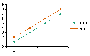
Now create a regular chart from this pivot table, using series in columns, one series per item in the Category field, Category entries (alpha and beta) as series names, and the item names as category (X) axis labels.
[Read more…] about Update Regular Chart when Pivot Table Updates
Posted: Wednesday, July 16th, 2008 under Dynamic Charts.
Tags: Pivot Tables, VBA.
Comments: 21

XL Cubed (parent company of BonaVista Systems, maker of the MicroCharts add-in for Excel) has shown some very effective dashboard report examples in a couple of recent posts.
In 2008 Excel Dashboard Competition Winners the winners of the 2008 Excel Dashboard Competition are announced:
1. Wade Stokes – International Bank Dashboard
Displaying many disparate Banking Key Performance Indicators, and designed as the basis for the Management review of business performance, it truly achieves More Information per Pixel.
2. Jim Uden – Outpatient Surgery Center Dashboard
Developed for Meridian Surgical Partners, as a one page snapshot for the review and presentation of partnership level business operations and trends. Jim also includes probably the best associated description of dashboard content and the thought processes involved which we’ve seen.
3. Hitesh Patel – Pharmaceutical Sales Dashboard
Developed by Hitesh Patel and Mike Askew of Data Intelligence, for Bristol Myers Squibb. A key report for the Regional Sales Managers, containing the information required to run the business in terms of cash, growth, share, and competitive performance.
In More Information per Pixel!, they display a very nice report by Professor Rolf Hichert:
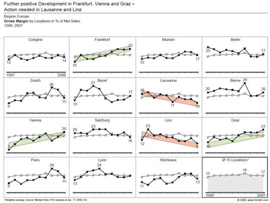
Rolf very effectively uses the technique of small multiples with sparing colors to highlight high and low performers among a portfolio of organizations.
These MicroCharts guys are really onto something.
Posted: Wednesday, July 16th, 2008 under Dashboards.
Tags: MicroCharts, Sparklines.
Comments: 3

In Chart Rules, As Simple as Possible, But Not Any Simpler!, More Information per Pixel! (the blog of XLCubed, the BonaVista Systems – MicroCharts parent company) has posted some comprehensive chart type selection guidelines, to follow up the recent brouhaha over pie and bar charts. It’s not inappropriate to repurpose a quotation from Einstein, because it reminds us that a data presentation should be simplified to the extent possible, without oversimplifying all meaning out of it.
I am recreating a portion of the XLCubed guidelines here, which shows for a given class of relationship between variables, which chart type you should use.
If you want to follow up on the recent posts, here is a roughly chronological list of posts that I’ve followed:
Posted: Monday, July 14th, 2008 under Chart Types.
Tags: .
Comments: 2
