Many physical phenomena exhibit behavior that shows faster rates or greater solubilities at higher temperatures. An Arrhenius equation gives the following relationship between some measure of reaction rate or chemical solubility and temperature:
K = A exp (-Q/RT)where K is the rate or solubility, A is a constant, Q is an activation energy, R is the gas constant, and T is the absolute temperature. The equation above can be restated to:
log (K) = A' - Q/RTA chart can be constructed with log(K) on the Y axis and reciprocal temperature (1/T) on the X axis; the slope of this line indicates the activation energy (actually -Q/R) and the intercept is the new constant A’. This page describes the construction of one variation of this type of chart.
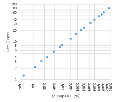
Microsoft Excel does not offer a built in capability to chart reciprocal data, but the technique described here allows you to simulate a reciprocal scale along a chart axis (the horizontal axis in this example). A dummy series is plotted along the X axis, and formatted to look like an axis, with error bars as customized vertical gridlines and data labels as customized axis tick labels.
In addition, we will use a dummy series along the Y axis to display selected minor tick mark labels.
Data
The tables below show the dummy experimental data (shaded blue), along with the data I used to construct the simulated X axis (shaded orange) and Y axis (shaded green) in this example. The only significance of this data is that I chose it to fall roughly on a straight line on the log K vs. 1/T chart. This line has a positive slope because the reciprocal temperature increases from right to left (temperature decreases from left to right).
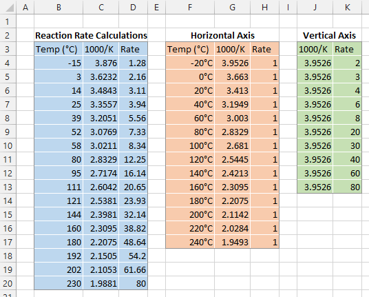
The temperatures in column F are numbers with a custom number format of “0°C”. The reciprocal temperatures in columns C and G were defined as possible: For a Celsius temperature in cell B4, the formula in cell C4 is:
=1000/(B4+273)Dummy Horizontal Axis
Reciprocal temperatures (Column G) are used for the X values, but the original Celsius temperatures (Column F) are used for the X axis labels, because they are more meaningful.
Y values (Column H) correspond to the minimum on the Y axis (it will eventually be a logarithmic axis with a min of 1 and max of 100).
Dummy Vertical Axis
X values for the Dummy Vertical Axis correspond to the maximum on the X axis (Column J, X=3.9526), not the minimum, because the values are charted in reverse order.
The Y axis labels (Column K) were chosen to show selected minor tick labels, to supplement the built-in major tick labels (1, 10, and 100).
The Chart
This is an XY Scatter plot of the Rate Y (Column D) as a function of Temperature X (Column B). This is not the chart we will start with.

We will start with this XY Scatter plot of Rate Y (Column D) as a function of Reciprocal Temperature X (Column C).
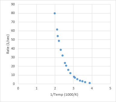
First I’ll construct the custom X axis labels and vertical gridlines, then I’ll add custom Y axis minor tick labels. I’m using the same light gray color for all axis lines and gridlines in the chart.
Horizontal (Reciprocal) Axis Construction
We want temperature to increase from left to right, so reciprocal temperature should increase from right to left. To accomplish this, format the horizontal axis, and select the Values in Reverse Order option.

We want the vertical axis on the left, so while formatting the horizontal axis, select Axis Crosses at Maximum Axis Value.

We want the horizontal axis to go from -20°C to 240°C (on a reciprocal basis), so set the min to 1.9493 and the max to 3.9526. The major spacing doesn’t matter, because we will not be using the built-in axis labels or vertical gridlines.

Select the default vertical gridlines and press Delete.

Format the horizontal axis, and for Label Position, select the none option.

Copy the dummy horizontal axis data from columns G and H, select the chart, and use Paste Special from the Home tab of the ribbon to add the copied data as a new series. These are the orange circles near the bottom of the chart.

We’ll use error bars for the chart’s vertical gridlines. Select the dummy horizontal axis data points, and add error bars using the plus icon next to the chart (Excel 2013) or the Chart Tools > Layout tab (Excel 2007-2010). Since it’s an XY Scatter chart series, it gets both horizontal and vertical error bars.

Delete the horizontal error bars. Format the vertical error bars using the Plus direction only and without end caps, with a value of 99 (the Y maximum of 100 minus the Y minimum of 1), and using the light gray line color.

Right click the dummy horizontal data series and select Add Data Labels. They were added above the points, and I’ve used the same orange as the font color to clarify this tutorial.
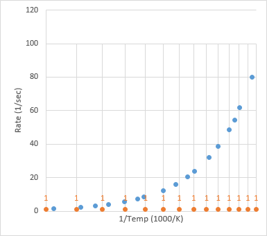
Several techniques for using custom labels as chart series data labels are described in Apply Custom Data Labels to Charted Points elsewhere on this blog. I’ve used Excel 2013’s Value From Cells label option, using the Celsius temperatures in column F.

Change the data label position from above to below the points.

Change the alignment of the data labels to “Rotate Text Up” on the Home tab of the ribbon or “Rotate 270°” in the Format Data Labels dialog.

Finally, resize the plot area to increase the margin between the plot area and the bottom of the chart. This allows the axis title and data labels to appear without overlapping.

The custom horizontal axis is now finished. Hide the last evidence of your trickery by reformatting the dummy axis series to show no markers.

Vertical (Logarithmic) Axis Construction
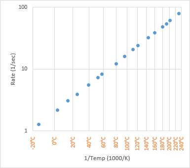
Start fixing up the vertical axis by formatting it, and selecting Logarithmic Scale, and keep the default base 10. The error bar/gridlines now span the entire height of the chart.
Add minor horizontal gridlines and format them with the same line color as the other gridlines and axes.

Copy the green-shaded data for the dummy vertical axis series from columns J and K, select the chart, and use Paste Special to add the data as a new series.

Add data labels to this new series to the left of the data points, using the default Y value labels. These new labels are shown in green in the chart below. The labeling of the vertical axis is now complete.

Format the vertical dummy axis series to use no markers, hiding any evidence of your axis deception.

Here is the finished chart, with all labels in the same dark gray font color.

Extension to Other Custom Axes
The technique shown here to add gridlines and labels corresponding to a reciprocal temperature scale can be applied to any arbitrary scale type, limited only by your ability to transform the desired scale into a plain vanilla linear axis. You could generate a Probability Scale Axis, or put Category Labels Along a Vertical Axis, or apply more Conventional Scientific Notation Axis labels.
More Axis Scale Articles
- Calculate Nice Axis Scales with LET and LAMBDA
- Calculate Nice Axis Scales in Your Excel Worksheet
- Calculate Nice Axis Scales in Excel VBA
- Chart UDF to Control Axis Scale
- How Excel Calculates Automatic Chart Axis Limits
- Reciprocal Chart Axis Scale
- Custom Axis Labels and Gridlines in an Excel Chart
- Custom Axis, Y = 1, 2, 4, 8, 16
- Logarithmic Axis Scales
- Link Excel Chart Axis Scale to Values in Cells
- Consistent Axis Scales Across Multiple Charts
- Gantt Chart with Nice Date Axis
- Select Meaningful Axis Scales
- Bar Chart Value Axis Scale Must Include Zero


derek says
Great tutorial, Jon, but aren’t those labels backwards? I’d expect the fastest rates (1 every two seconds) to be at the highest temperatures (240°C) on the bottom left and the lowest rates (1 every 100 seconds) to be at the top right (~0°C).
I wonder if the XL2013 labeling routine assigned the labels left to right even though the points were drawing right to left, and if so, whether you’ll have to format the data table upside down to get it to behave.
Bob says
Thanks for this post Jon,
I’ve been out of the lab for over 20 years, but still remember using log graph paper to draw these types of curves. Great post.
Bob
Jon Peltier says
Derek –
The axis has been reversed, so the smaller 1/(273+240) or 1.9493 is to the right and the larger 1/(273-20) or 3.9526 is to the left.
derek says
I see, so it’s the vertical axis I was misinterpreting. Not 1 per 100 seconds, but 100/sec!
Fred Hammers says
Jon,
I apologize in advance for highjacking this topic, but I couldn’t find a way to post this comment on the Scientific Notation axis labels page.
I develop custom productivity applications for a value engineering department of my division. Your scientific notation axis labels are great. I’ve had this on my to do list for a while now, and I’m glad I found your solution; it saved me the time and trouble.
Your solution works very well, but I added an enhancement I wanted to share with you. Rather than have a user select the labels after VBA inserts them and move them (left and below, respectively), I added the following:
I do have question about the code. Although this code
seems to be intended to handle the exception which occurs when the users hasn’t selected a chart in advance of calling the procedure, the following statement fails:
I’ve done (five minutes) of tracing, but it isn’t clear to me why this fails. Any thoughts?
Thanks again for all your effort and for posting your very good work.
Fred Hammers
///////////////////////////////////////////////////////////////////////////////////////////////////////////////////////////////////////////////////////////////////////////////////////////////
The entire procedure looks like this:
Jon Peltier says
Fred –
Wow, that’s an old post in need or upgrading. The code really should be updated to run explicitly on the active chart, and maybe it could be made smart enough to figure out what data it needs to add to make the dummy axis series and what labels it needs to add to show the scientific notation.
That code fails because it assumes if you’ve input chart number 0 that you’ve also selected a chart. You could try the following, which will do the first chart on the active sheet:
or this, which will exit more gracefully: