Several years ago I helped someone who was having trouble with a fitted trendline in an Excel chart. I saved the example, because I knew I’d have a blog someday, and I’d need a topic. I will use this example to describe a number of errors people encounter when fitting data. The errors are listed in the order they are likely to be realized, not in the order of severity.
The person had a motor, and had measured horsepower (HP) at particular rotational speeds, in RPM (revolutions per minute). The data is charted and tabulated below:
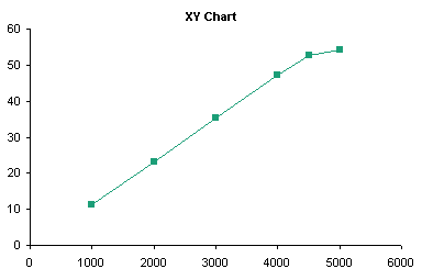
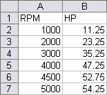
Note: Some versions of Excel have problems performing statistics on some data sets. For the most part, Excel is adequate for this purpose, particularly if the data aren’t “extreme” (a statistical term) and if the data is not overfitted.
Applying a Trendline
Adding a trendline is straightforward. The easiest way is to right click on a series, and choose Add Trendline from the context menu.
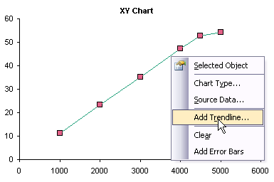
This pops up a dialog from which you can select a type of trendline to fit to the series, as well as choose options for the trendline. This dialog also appears when you right-click on an existing trendline and choose Format from the context menu, with an additional tab for patterns (to format the line). The specifics of this dialog are a topic for a different discussion.

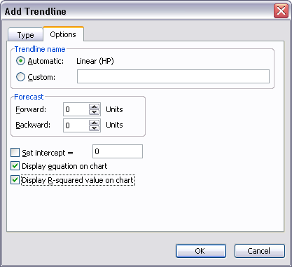
The added trendline is dumped onto the chart, obliterating details in its vicinity.
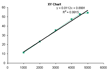
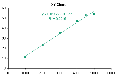
You can right click the trendline, choose Format, and make it much more presentable. Below I’ve formatted the trendline and trendline formula to match the line series, and changed the line series to display markers only.
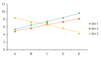
Trendlines are really valid only for charts with a numerical category axis, such as an XY chart, or a line chart with a date-scale axis.
You can add trendlines to a line chart; Excel makes no value judgments here. Note that the categories are not numerical, and a trend between discrete categories may be meaningless (e.g., Cat, Dog, Ferret, Goldfish). I discuss use of trendlines on the wrong chart types in the next section.
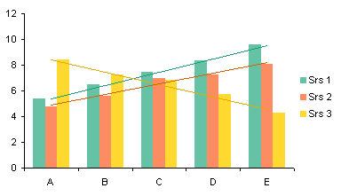
You can also add trendlines to a clustered column chart. Note that the trendlines don’t necessarily match up with their corresponding columns, but with the center of the cluster (centered over the category labels). This adds to the confusion of non-numeric categories.
You can even add trendlines to a horizontal bar chart, but their usefulness is even less than that of trendlines in a line or column chart.

You cannot add trendlines to a stacked series: the command is disabled.
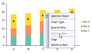
For qualitative purposes of illustration, I’ll show how to add trendlines to this type of chart. You must promise never to use them for evil purposes. Note that each trendline captures the variability of not only its respective series, but all other series stacked beneath it.
In the sheet, calculate the sums of the first series, then the first and second, then the first, second, and third series, etc., and add them to the chart as line chart series, formatted below as markers without lines.

Apply trendlines to the unstacked line series, format the trendlines, format the line series to display no markers, and remove all the unneeded entries from the legend.

You cannot add trendlines to a 3D chart: the command is disabled. This is Yet Another Reason not to use 3D charts, when will you ever learn?

Error 1: Wrong Chart Type
The first problem that many people encounter when fitting a trendline is caused by using the wrong chart type. The person who asked about fitting this data didn’t make this mistake, but this is a fine place to illustrate it.
In Line Charts vs. XY Charts I described differences between XY and Line charts. For our purposes here, suffice to say that XY charts treat both X and Y data as continuously variable numerical data, while line charts treat the X values as non-numerical text labels, and if necessary, treats them using the counting numbers 1, 2, 3, etc.
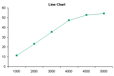
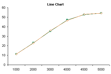
The first mistake people make while fitting trendlines to charts is when they start with a line chart. Notice the X values: The axis doesn’t start at zero, and although the differences between adjacent numbers are not all the same (some differ by 1000, others by 500), the spacing between labels is constant.
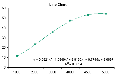
In this chart I have applied a fourth order trendline to the data, removed the lines between the points, and formatted the curved trendline to match the series. The fit doesn’t look too bad, but as I pointed out, the X values are not appropriate for the fit.
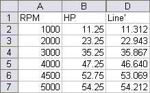
When the coefficients and actual X values are plugged into the trendline formula, we get the following actual HP values and fitted values (“Line”).
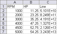
The calculated values are way too high: 5.1E+10 is 51 billion. The RPM values (1000 through 5000) were plugged into the formula, but it was calculated by Excel using the counting numbers 1 through 5. The fitted data matches the actual pretty well.
I discussed trendlines on other improper chart types (clustered and stacked column and bar charts) in the preceding section.
Error 2: Wrong Precision
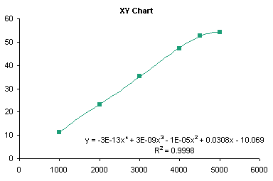
The following shows the trendline for the same data in an XY chart. It fits the points pretty well, with a little curvature even over the lower few points, which seem like they should fit a straight line.
When we plug the RPM data and the fitting coefficients into the trendline equation, we get the following horrendous match.


This illustrates the second mistake people make. They accept the trendline formula from the chart without thinking about the coefficients. Notice the second through fourth order coefficients above (-1E-5, 3E-9, and -3E-13): these are shown with only one significant digit. That’s a miscalculation waiting to happen. Select the trendline formula, and apply a scientific number format with lots of digits, and you’ll plainly see the source of the error.

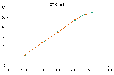
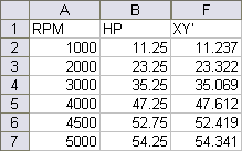
Here are the actual and fitted data points: much better.
Error 3: Manually Transcribing Coefficients
If you want to use the trendline coefficients in the worksheet, there’s a better approach than manually transcribing data from the trendline formula to cells. Excel has a function called LINEST which performs linear regression calculations. Select a range 5 rows tall and N+1 columns wide, where N is the order of the regression, type this formula in the top left cell, and array-enter it by holding Ctrl+Shift while pressing Enter:
=LINEST(B2:B7,A2:A7^{1,2,3,4},,TRUE)
If you’ve entered the formula correctly, Excel signifies that it is an array formula by enclosing it in curly braces (typing them yourself will only produce an error):
{=LINEST(B2:B7,A2:A7^{1,2,3,4},,TRUE)}
B2:B7 is the range of Y values, A2:A7 is the range of X values, A2:A7^{1,2,3,4} signifies that the X values are to be raised to the first through fourth powers for the regression. For more details on the formula and the results (below), refer to the help files.
The first row of the resulting range contains the coefficients, from fourth power to constant. The first cell in the third row contains the fitted R². These are identical to the coefficients in the XY chart’s trendline formula.

Error 4: Overfitting
I noted earlier how the first several points look like a straight line fit. Below I’ve computed the straight line fits for the first 5 points (blue dottedline) and the first 4 points (dashed red line). These lines fit all but the last point nearly perfectly.
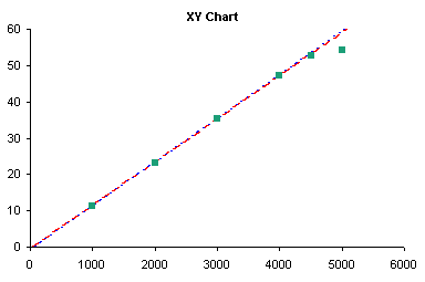
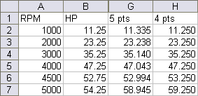
This illustrates another error people make when fitting trendlines: overfitting. A 4th order polynomial fit has no physical significance in any model I’ve ever heard of. It makes a “nice” curve, but is valid for interpolation only, for purposes of looking up intermediate values along smooth curves. First and even second order fitting may have some reasonable theoretical basis, but if the data curves systematically, you should consider applying logarithmic, exponential, or trigonometric transformations to your data prior to calculating a trendline.
Error 5: Ignoring the Physics of the Problem
This leads to my third point. One should not blindly apply statistics without first using one’s own trained eyeball. Yes, your eye may see patterns that are not there, but your eye can be better than statistical techniques at analyzing results. The high correlation of the 4th order fit (0.9998) might lead one to believe that the HP is truly proportional to RPM to the 4th power. A quick glance led me to look at the first part of the data, up to 4000 or 4500 RPM, which looked linear. It felt good in my gut that horsepower increases linearly with RPM. Then as RPM exceeds some threshold value, something breaks down. I don’t know what it may be, but I know where I would look. I would take multiple measurements in the 4500-5500 rpm range, to see whether I get a smooth curve, perhaps approaching some maximum HP asymptotically. Perhaps there is some slipping in the linkage, or some thermal effect from friction, or some deformation in the mechanism. The point is, don’t let a seemingly nice statistical fit prevent you from noticing what your eye is seeing, and always consider some real physical mechanism underlying the data.
Summary
To avoid errors in the use of trendlines, one should follow this approach:
- Consider the system under analysis. Does it lend itself to a curve fit? Do you know anything about the system that suggests a particular physical relationship?
- Consider the type of fit and the purpose for the fit. Is the fit used to make the chart “look nice”? A poly fit is probably fine. Are you using the relationship to interpolate between known values? A poly fit is probably fine, unless you know the relationship is logarithmic, exponential, or power law. Will you try to interpolate beyond the existing data? Not generally wise, especially using a polynomial fit.
- Use LINEST to get coefficients into the worksheet. This is easier and generally more reliable (subject to certain caveats) than manually transcribing coefficients from the trendline formula label in the chart.
- Use an appropriate chart type. This almost always means use an XY chart. You can get away with using a line chart (particularly with a date-scale axis), so long as you understand what the categories mean.
- Apply a suitable number format to the trendline formula. Generally a scientific format with lots of digits (14 or 15 digits) will provide sufficient resolution.
Related Trendline and Regression Articles
- Trendlines and Chart Types in Excel
- Add One Trendline for Multiple Series
- Trendline Calculator for Multiple Series
- Choosing a Trendline Type
- Plot Two Time Series and Trendlines with Different Dates
- Polynomial Fit vs. Statistical Process Control
- Moving Averages
- Stacked Column Chart with Stacked Trendlines
- Deming Regression
- Deming Regression Utility
- LOESS Smoothing in Excel
- LOESS Utility for Excel


Jennifer says
Love your site and your blog, Jon.
I want to share a little bug-a-boo that I have with Excel trendlines.
I am a quantitative researcher with 15-years of experience using SAS as a statistical programming language — and have recently moved from investment banking to a small startup.
People here at my new job use Excel to place trendlines on graphs and refer to the trends — with no exploration into whether the coefficient on the slope of the line is significant!
I was in an internal meeting once where a long, painful discussion took place to figure out how best to explain the unexpected negative slope of a trendline on an Excel graph to a client. I finally asked whether the negative slope was actually *that* important — thinking about whether it was strongly significant or just borderline.
Turns out — no-one had checked the significance of that coeffcient at all.
When they did, it was really FAR from being significant. In other words — even though there seemed to be a negative slope when you eyeballed the data — mathematically (with the amount of data and the amount of noise in the data) we could not say with confidence that the slope wasn’t zero. In actuality, we should be telling the client that there is no trend. That the data is constant over time.
This was a rude awakening to some people at my work and I just wanted pass along the joy!
Jon Peltier says
Thanks for sharing that story, Jennifer.
I once worked for a guy who didn’t understand this whole concept. We’d be talking for an hour about how we were going to process this lot of material, and I’d show test data that he didn’t follow. Finally, he’d ask me (yet again), “What’s the definition of Standard Deviation”? He was the Director of Engineering, but we all called him Duh-rector.
John Mansfield says
Jon – thanks for the great post. I’ve known of the problem via the MS charting forum but never really understood it until now.
adam higgins says
Interesting post, but unfortunately it didn’t give the answer I was looking for. I’m fitting a 3rd order polynomial “trendline” to data. The trendline displayed on the plot looks good and even looks reasonable when extrapolated (to a point). However, the equation displayed on the chart does not appear to match the data (at all!). It is not because of a lack of significant digits in the coefficients. It appears that excel has displayed the wrong coefficients on the chart. My data is below:
0 273.15
0.019477851 273
0.043981716 272.3
0.074296729 270.9
0.109878671 267.9
0.127178507 266.2
0.135243092 265
Any suggestions would be appreciated.
Thanks,
Adam
Jon Peltier says
Adam –
You didn’t include your trendline, so I can’t comment directly. When I plot your data in Excel 2003, I get this closely fitting trendline:
y = -746.65×3 – 317.45×2 – 3.2524x + 273.16
R² = 0.9996
I have heard of problems with the trendline formula in Excel 2007 with some data sets. I repeated this in Excel 2007, and got this trendline:
y = -746.65×3 – 317.45×2 – 3.2524x + 273.16
R² = 0.9996
Exactly the same. What’s more, the LINEST results below agree with the trendline:
Here is the data and calculated Y values based on the LINEST coefficients:
Here is the chart with the trendline:
Here is the chart with the original data and the LINEST-fitted data:
On the off chance that the chart type was incorrect, I converted the chart to a line chart. This changes the nature of the curve from concave downward, like half of a parabola, to a sigmoidal curve, and the trendline doesn’t really fit:
y = 0.0847×3 – 1.1768×2 + 3.2385x + 270.87
R² = 0.9932
Here’s the line chart, which obviously looks amiss:
Bas V says
One of my associates has found an instance of Excel 2007 SP1 displaying incorrect fit coefficients for a third order polynomial fit with a forced zero intercept. The value of the bad third order coefficient was not real small (same order as the other two) Moreover, the bad coefficient would not display at all in SP1 version once the document was saved and reopened. The problem went away with an update to SP2. SP1 users beware!
Jon Peltier says
Hi Bas –
In my understanding, Excel 2003 had finally worked out most of the statistics bugs. For years, the trendline formula was (believe it or not) considered a world-class techniue for calculating poly fits, but 2003 finally brought this capability to the worksheet functions.
Excel 2007 broke the trendline formula for many cases, inappropriately changing coefficients within a certain range to zero due to an overzealous rounding error correction algorithm. SP1 made a few improvements, SP2 has made more. We all hope and wish that Excel 2010 will clean up all of the problems (and not just with statistics!).
John L says
I have frequently used EXCEL TRENDLINE features. A recent new workbook does not show the TRENDLINE TYPE – POWER EXPONENTIAL or LOGARITHMIC . Any idea what has happened? Previous workbooks still display those options.
Jon Peltier says
John –
This would not be present or absent on a workbook basis. Instead it depends on the data. If you have zero values in the series data, Excel does not allow some trendline types.
John L says
Thanks very much!! In all the years I have been using the TRENDLINE function I have never run across this point; but it is the reason!
chip says
Jon, have you heard of issues with XL2003 displaying incorrect formulas for the logarithmic trendline? I haven’t used these a lot. I plugged that formula reported by the Add Trendline option back against my data manually and it was nowhere close to what the trendline was showing. When I calculate the log trend using LINEST I can use the results to replicate the trendline Excel draws exactly. I have Excel 2003 loaded with the 2007 compatability pack.
Jon Peltier says
Chip –
I’ve heard lots of complaints about accuracy of Excel’s statistical computations, enough that I can’t keep track of what’s supposedly wrong in which version.
Did you allow for sufficient sig figs to reduce rounding errors in your calculations?
chip says
Thanks, Jon. I used plenty of digits I think. The formula generated that supposedly represents the line is:
y = 2677.2Ln(x) + 1820.4
Plugging my raw data back into this, it’s way off. By a magnitude of at least 4.
Using LINEST according to the formulas on John Walkenbach’s spreadsheet page, I come up with:
y = 1036.569Ln(x)+ (-1751.76)
Obviously a very different formula! When I plot the data plugged back into this formula, it matches the trendline drawn by Excel.
I did not find any reference to this anywhere and I wonder if it’s something in the 2003 with the 2007 compatibility pack that breaks it. I did not intend to actually use the formulas written by the trendline anyway, but was pretty concerned that I was doing something very wrong.
Jon Peltier says
Chip –
Another important point is that the chart has to be an XY chart, not a line chart. Using the wrong chart type means the algorithm uses 1, 2, 3, etc. instead of the actual X values.
chip says
Thanks, Jon. That’s actually the problem. Once I changed to an XY it matched my LINEST calcs exactly.
Jeff Perreault says
Jon,
I’m using the LINEST function to extract the terms of a 3rd order poly using the method you’ve described, but am only getting the a, b, and d terms (ax^3 + bx^2 + cx + d). I’m using Excel 2007 SP2. I should be more rigorous and say that I’m getting 0 for the c term. It gets even worse on another machine that’s running 2010 – there I’m only getting the a and d terms. I saw on one of your earlier responses:
“Excel 2007 broke the trendline formula for many cases, inappropriately changing coefficients within a certain range to zero due to an overzealous rounding error correction algorithm. SP1 made a few improvements, SP2 has made more. We all hope and wish that Excel 2010 will clean up all of the problems (and not just with statistics!).”
Is this the problem I’m seeing? I tried to change the formatting to scientific notation with 30 decimal positions, but it still says the value is zero.
What’s even more bizarre is that if I plot the data and fit a 3rd order poly trendline I get all 4 terms.
What gives, and what can I do to get these terms from the LINEST function (I don’t want to get into copying them from a chart trendline formula).
I’ve got a related problem. In order to “pass a sniff test” I’m plotting my data and then overlaying values calculated using the LINEST terms, and adding trendlines for both. I’ve got scads of data, so I’d like to be able to copy/paste the whole rigmarole but the pasted chart has its source data pointed at $c$r locations. No matter what I’ve tried I haven’t been able to come up with some elegant solution that will work. Your thoughts and suggestions would be most appreciated!
Many thanks, Jeff
Jon Peltier says
I looked at Jeff’s data, and the problem is that while Excel uses mathematically exact numerical methods to compute some of its statistics, these methods are not computationally optimized, especially with respect to floating point computer calculations. Jeff’s X values ranged over a number of minutes, that is, a small fraction of a day. The X values were not minutes, though, they were date-time values, so this small number of minutes was added to 40-something thousand days since 1 January 1900. The calculations lost the precision of the minutes, and was left with X values with indistinguishable values, hence the wrong coefficients. Subtracting the same date from each X value resulted in the correct coefficients.
uday kumar says
Hello Jon Peltier,
I have got a problem in trend line fitting in excel 2007. It needed a 6 degree polynomial to fit given data points correctly on xy chart. My data is shown below.
z force
5.70E-01 8.45E+00
5.90E-01 8.60E+00
6.10E-01 8.41E+00
6.30E-01 8.23E+00
6.60E-01 6.81E+00
6.90E-01 5.42E+00
7.20E-01 4.10E+00
7.60E-01 2.54E+00
8.00E-01 1.49E+00
8.40E-01 8.53E-01
8.80E-01 5.07E-01
9.20E-01 3.41E-01
9.70E-01 3.18E-01
1.02E+00 1.95E-01
1.07E+00 1.15E-01
1.12E+00 6.03E-02
1.17E+00 1.13E-02
1.22E+00 0.00E+00
when i used the polynomial to find the y value (Force), I got a huge difference. But on graph the polynomial fitted pretty well as R^2 value is 0.999 ! I also increased the precision of coefficients as you have suggested but it is not giving correct result.
Please help me. I am in deadly need to have this correctly as I have to write thesis.
Thank you
Uday Kumar
—
Jon Peltier says
Your example is described by more than one of the errors I described in the article.
First, I need a better understanding of the data. Were the forces measured as the values in the first column were increasing or decreasing? Was the increase in the first column really a step function (increase of 0.02 for the first four measurements, then 0.03 for three measurements, then 0.04 for five measurements, etc.) or was it smoother and we’re seeing (admittedly slight) rounding errors? There is a discontinuity in the curve, which appears as a small bump between X=0.9 and 1.0, but on a log log plot it looks like there was some slippage in X. Also, the point with zero force looks like it’s measured at a greater X than eyeball extrapolation of the last four or five points would warrant. Zoom in on the poly fit and you should be disturbed. The fit at the very top is also irregular, but not as much so. If all you care about is interpolating to generate a standard curve, then this is probably okay. But you ought to rerun the measurements and see if the discontinuity and the behavior at the ends are replicable.
First, I think you’re ignoring the physics of the problem (error 5). This is a force-vs-displacement curve, right? Well, forces might have a coefficient for either 1/d² or for d, where d is corrected for an offset, and other residuals are related to error or non-uniformity in the system being measured. Is there a physical model for how the data should behave?
There’s also an issue of overfitting (error 4). A sixth order polynomial is generally not physically justified.
The discrepancy between your calculated values and the data is related to the precision of the equation of the fit (error 2). You can also improve this by not manually entering the coefficients (error 3).
I assume you didn’t commit the first error (using a line chart). The fit on an XY chart is visually much better, and R² is slightly better, than on a line chart.
An example of non-uniformity or of measurement errors is the bump between .9 and 1.0.
Uday Kumar says
Hello Jon,
Sorry for the confusion created. so let me make my question clear by explaining a little bit of physics behind it.
I have a system of molecules and there is a wall initially placed at infinity. I bring the wall gradually from infinity to some distance near to molecules. I have to calculate total work done in bringing wall. The interaction between wall and system particle is governed by a force which reduces to zero at infinity and then keeps increasing as you bring it closer.
Now, for practical purpose, infinity means z= 1.22(column 1), so the force is zero (2nd column). then it increases as you decrease z until z=0.59 then again it decrease. The last data (z=0.57) is explainable for my system as at so close distance wall will destabilize the molecule.
But any way, whatever be the nature of data, my intention was to get a best fit trendline which in this case happened to be a 6 degree polynomial on xy chart as mentioned earlier too. With this , I wanted to calculate area under the curve (Total work done) by simple definite integration from 0.57 to 1.22.
I used linest to get coefficients, then i expanded it to 15 digits precision and then calculated y value from this fitted line corresponding to an x value. It was bizarre!
For better understanding I put my data in good precision below (column 1 is z and 2 is force)–
5.70E-01 8.45002963900E+00
5.90E-01 8.59978043600E+00
6.10E-01 8.40686574200E+00
6.30E-01 8.22601760400E+00
6.60E-01 6.81293026500E+00
6.90E-01 5.41986090200E+00
7.20E-01 4.10282183800E+00
7.60E-01 2.53566658100E+00
8.00E-01 1.48921823300E+00
8.40E-01 8.52721285200E-01
8.80E-01 5.06784985200E-01
9.20E-01 3.41086346700E-01
9.70E-01 3.17832630000E-01
1.02E+00 1.95372219600E-01
1.07E+00 1.14643531000E-01
1.12E+00 6.02774290400E-02
1.17E+00 1.13115969100E-02
1.22E+00 0.00000000000E+00
So, irrespective of physics my basic questions are following —
1. if a trendline seems to fit very well by visually looking and by R^2 value, then why does the trendline equation not outputs a value nearer to the sample data.
2. If the deviation is so high between trendline equation generated data (you may plot and see my data) and sample then what it this equation being flashed on the chart and how do i believe it if it is correct.
3. How can i calculate area under the curve for discrete and irregular interval data (like mine) ?
In fact, I would be grateful if you answer at least Q3.
Thank you
uday kumar
Jon Peltier says
Uday –
I’ve worked through the exercise in Area Under a Fitted Curve.
uday kumar says
Many many thanks to you jon for answering expeditiously.
Actually, as you have written , the area can be calculated by trapeziod rule also; i knew this. But i got interest in trendline for two reasons- first, i saw that it fit the data very well (R^2=0.9996), so instead of calculating area using trapeziod rule, which is relatively more cumbersome than definite integral of a polynomial, I was tempted to use trendline equation; second- when trendline equation did not give the same y value or even near to actual y value then i was intrigued that why did it happen if it fitting so well.
As you have suggested in this post, I increased the precision of co-coefficients but even then i did not get the value near to actual value. Then i thought there is some problem with equation itself and i raised question on the equation.
Now when you plotted the fitted value using the trendline equation it is very much matching. at least it is not as far as i was getting.
THE REASON FOR THIS DISCREPANCY WAS THAT I DID NOT PROPERLY DRAG THE TRENDLINE EQUATION OVER ALL DATA POINTS. so the fitted y was wrong. -:)
sometimes people are just habitual to handle big problems but can not silly problems!
Regards
uday
—
Jess Hughes says
Hey great website, I’m having trouble with excel and getting mixed messages from the different people I ask or talk to. See the following forum where I have made a post about the problem I’m having and please let me know whether I have a good reason to be going crazy or whether I’m expecting too much of excel or whether I’m expecting too much of myself because I don’t know enough!
http://www.mrexcel.com/forum/showthread.php?t=587954
Cheers
Jesse
ike9898 says
This article really helped me, specifically the part about using too few significant digits when copying down the coefficients for a fitted curve. Before I found this page, I was really stumped.
tim mayer says
Hi Jon,
I have 2 questions: I have a series of graphs of climate data and stats for a given site. Each time I import data from a new climate station, I run a macro to calculate some seasonal climate statistics and then update the underlying data/titles for the graphs. The graphs are updated automatically (with one exception). I notice that when I change the underlying data, the trendline on the graph updates but the trendline formula on the graph does not. Is there a way to get the formula on the graph to update as well (I am using Excel 2010). Second, is there a way to quickly produce a p-value related to the slope of a linear trend (something alluded to by the first post here). I would like this to be autocomputed and shown on the updated graph as well. I know I can get a t-stat from the TINV fxn – maybe I just say something about the significance based on this?
Jon Peltier says
Tim –
Does deleting then redisplaying the label with the formula show an updated formula? If not, you probably need to delete and recreate the trendline itself with formula.
You can calculate the t-statistics for LINEST coefficients from the LINEST output table, and you can get p-values from these.
Lenore says
Hi Jon,
Great website here. So I am wondering why the “Inverse” and “S” trendline options are not available in Excel? It seems there is a limited number of trendline options.
I just fitted my data to a bunch of curves in SPSS and the two best fit (with the highest R2 values) were “Inverse” and “S”. But for the documents I make I need to have excel graphs so was hoping to use the trendlines in Excel. Is there a way to plot an “inverse or “S” trendline in excel? I now have the formulas (e.g. y = -6.831 + (0.762/x) is the “Inverse” curve equation for one of my data sets) for the trendlines if that is any help.
Thanks in advance!
Lenore
Jon Peltier says
Lenore –
If you have a formula, you can roll your own trendline.
In a column enter a sequence of X values which you want the trendline to span. In the next column, enter the formula based on the cells in the first column. Copy these 2 columns of data, select the XY chart, and use paste special to add the data as a new series, categories in first column.
Mohd says
Thanks for the blog and I have the same issue with curve fitting of polynomial equation of pump and fluid rates.
Mike says
Wow, Jon – your blog is AWESOME! Thank you so much!!
Ewen McLaughlin says
Jon, one issue not raised here is that the power and exponential trendlines aren’t optimal, and report the wrong r-squared value. Excel transforms the data into a linear form, fits a straight line to find the parameters, and reports the r-squared value of the straight line. Using Solver to tweak the parameters will find a better-fitting curve with a correct (and larger!) r-squared value.
bahaa siha says
Hi I have a question regarding polynomial trend line in a scatter plot.
When I plug the X values back to the equation, The new Y’s don’t fall on the curve. Only if I use linear equation, X’s fall on the line!
Why is that?
I really appreciate an answer.
Thanks
Bahaa
Jon Peltier says
Bahaa –
Make sure you have used an XY chart, and not a line chart. Also make sure the coefficients in your trendline formula are displayed with lots of precision, or compute them in the worksheet using LINEST. Finally, be careful not to overplot, which is a common problem with polynomial fits.
These points are covered in the article, so check the details and see where you can improve.
bahaa siha says
Hi Jon,
Can’t thank you enough! Yes my problem was error2: Wrong Precision
I used LINEST function and got high precision coefficients. Now when I feed X’s back to the equation, all Y’s fall on the curve, (as expected),
Thanks again
Bahaa
Bob Branfield says
Jon
Thanks a ton. Have been battling with these trendline errors (not enough significant numbers) for some time.
Relief!
bahaa siha says
John,
Can I use LINEST function for a power trendline? if so what is the formula.
Thank you much
Bahaa
Jon Peltier says
Bahaa –
The power law is Y = A X^M
Take the logarithms to get ln Y = M ln X + B, where B = ln A
Select a 5-row x 2-column range, type
=linest(ln(Yrange),ln(Xrange),,true)
then hold Ctrl+Shift while pressing Enter. Excel will put brackets around the formula if it is entered correctly:
{=LINEST(LN(Yrange),LN(Xrange),,TRUE)}
The top left cell of the result is the exponent M, the top right cell is the coefficient A.
bahaa siha says
Thank you Jon. that works fine exept that the top right cell will be LN(the coefficient).
Thanks
Bahaa
jose says
Thank you, Jon! I fell for the XY vs Line Chart trick when calculating trends with Open Office and your article saved me.
bahaa siha says
Hi Jon,
What is the LINSET formula for the Logarythmic Linetrend: y = 0.13770ln(x) – 0.53903
Thank you much
Bahaa
Jon Peltier says
Actually, that looks like the result of LINEST, where -0.53903 is the intercept and 0.13770 is the slope of ln(x) vs Y.
The LINEST formula would be the following, array-entered (Ctrl-Shift-Enter):
=LINEST(y-value-range,LN(x-value-range))
bahaa siha says
Thank you Jon
Bahaa
veer.chandran says
Please help to create trendlines for the following
Capactiy : 6000 tickets per month
Dec inflow ( Forecast) : 5000 tickets
Dec (actual inflow till 5th) : 1000 tickets
I have 26 days to go, how can i calculate trending forecast with for whole of dec till 31st. I am looking for trendlines which will tell me based on the current inflow (1000 tickets) can i get the forward trend of the inflow for Dec.
Regards
Veer
Jon Peltier says
Veer –
If you have plotted data, for example, cumulative sales by date, you could use either of these:
=FORECAST(X,Known-Ys,Known-Xs)
=TREND(Known-Ys,Known-Xs,X)
to calculate Y (sales) at X (date, 31 December in your example) based on known Ys (cumulative sales) and known Xs (dates).
You can show it graphically on a chart if you add a trendline, then format the trendline so it forecasts forward by 26 units.
Or quick and dirty, you can divide the 5-day total by 5 and multiply by 31 to get an approximate total. Using five days to forecast an entire month is a bit iffy, since you haven’t taken into account different sales by day of week (e.g., on weekends) or on holidays. Five days doesn’t even give you a whole week to allow you to average the effects of days of the week, and the last week of December is pretty dead.
shiv says
Dear Sir, please tell me how can i restrict my trendline till the x awis and no extrapolation of my trendline may occur
Jon Peltier says
Shiv –
You can limit the points used in the fitting calculation, or you could manually fix the minimum of the Y axis to zero (and the part of the fitted line below the axis will not appear).
GSKrasle says
John,
It’s been a long time since I’ve looked at this post; interesting that it’s still popping!
Anyway, you have mentioned “overfitting” a few times, and I’d like to point-out that there is actually a mathematically-rigorous treatment of the concept: Runge’s phenomenon (http://en.wikipedia.org/wiki/Runge%27s_phenomenon).
It is similar to Gibbs’ phenomenon when constructing a step or square-wave from summed harmonics….
I’ve cribbed lots of useful stuff from here over the years, and I guess it’s time to give some back….
Jon Peltier says
GK –
Thanks, I think I’ve seen that page. Runge’s Phenomenon is a specific problem where polynomials don’t fit well because of the shape of the actual function. I was talking about the much more common general case, where a poly fit isn’t right because poly fits especially above order 2 do not describe physical phenomena. I guess you could say the curved fit in the first chart under the label “Error 2: Wrong Precision” is related to Runge’s Phenomenon, where a sharp change in the last point of the data throws off the nice linear fit of the rest of the points.
Steve Bayliss says
Hi Jon,
Firstly I would to thank you. I have learnt alot from your website, inparticular with dynamic charting.
I am using Excel 2010 and have a question with regard to a scatter chart vs a date based line chart – I would expect that the charts and trendline formulas would be the same but this is not the case.
Given the following data:
x y
15/04/2013 16.2
25/06/2013 15.4
4/09/2013 14.5
23/01/2014 13.5
31/03/2014 11.8
12/06/2014 10.8
24/08/2014 9.9
5/11/2014 8.5
I have created a XY Chart using this data and a Date based line chart, the linear trendline formulas with extra precision show
y =-0.013303x + 566.931587 and R² = 0.983295 for the Scatter and
y = -0.013262x + 564.988567 and R² = 0.986236 for the Date based line chart.
SLOPE and INTERCEPT functions on this data yeild the same results as the scatter.
I also notice when the two charts are positioned underneath each other and resized so that the first and last data points of each chart are aligned vertically that there are internal data points which do not line up vertically between the two charts?
Is it possible to explain this discrepancy?
Thanks & Regards
Steve Bayliss
Jon Peltier says
Steve –
That data is spread out enough that Excel decides to use a base unit of months for the axis. This plots each point on the middle of the corresponding month, and the months are all the same width.
Change the axis base unit setting to days, and you get the same trendline as with the scatter plot.
Steve Bayliss says
Fantastic… Thank you for such a quick response Jon. Pretty sure your blood type is XL+ :)
Cheers mate.
Sameh Ali says
Hi Jon,
Firstly I would to thank you for your great efforts. I need got the below equation after selecting linear as trendline
Y = 126.50X+ 35.59
The (R-squared) = 0.993
The problem is when substituting the values of X, the Y values I am getting are fine for the high values of X, but with small values of X I am getting negative values of Y that is not accepted considering the physical nature of the variables.
How to overcome this issue. If you could please end me your email, I can send you the values of X and Y
Thanks and appreciated
Sameh Ali
Jon Peltier says
Sameh –
If you plug any positive X value into your formula, you should calculate a positive Y value, since the slope and Y intercept are both positive. Some errors may arise from using the displayed coefficients in the trendline formula, if insufficient digits are displayed for accurate calculations. These are fixed by using SLOPE() and INTERCEPT() formulas in the worksheet and using these results for calculations. This isn’t your problem, and without seeing the data, I can’t tell what is wrong.