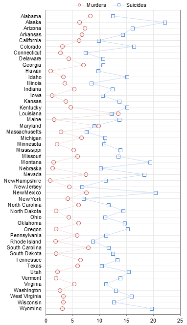
In Suicide vs. Homicide by State, per 100,000, Bourree Lam of Freakonomics posted a chart related to a recent Freakonomics podcast that discussed why suicide is “twice as” prevalent in the US as homicide. All of the charts here show suicide or murder rate per 100,000 population.
I’ve recreated the clustered bar chart below. The common problem is that the longer bars tend to overwhelm shorter bars. Most of the red bars seem to be hiding behind the companion blue bars, and it’s harder to notice the shorter blue bars. In addition, the data is sorted alphabetically by state, which completely obscures the ranking of states by either quantity.

The first step to improving the readability of this chart is to change the chart type to a dot plot. I’ve written about Dot Plots, and created a Dot Plot Utility for anyone who needs dot plots but doesn’t want to follow the tedious procedure to make them by hand. Here is the first dot plot of the data. The data is still sorted alphabetically by state, but already it is easier to read than in the bar chart.

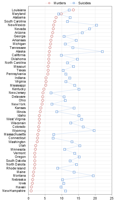
The next step is to sort the data, either by murder rate

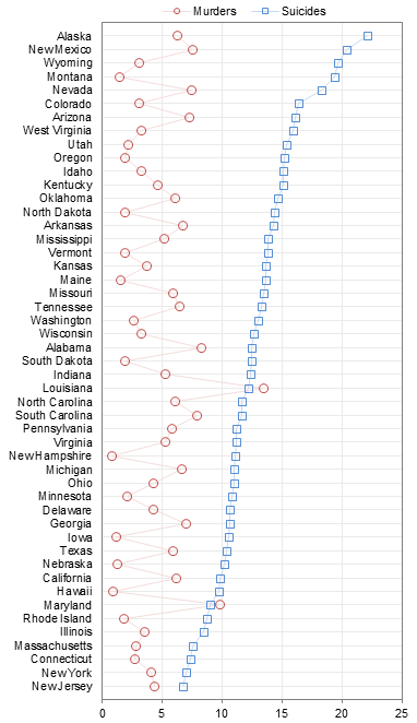
or by suicide rate.

Both of these charts show that suicide and murder rates are uncorrelated. When sorted by one rate, the data for the other rate bounces around as much as in the alphabetically sorted chart. In both charts, it is easy to see that in two of the states plotted, Louisiana and Maryland, murder rate exceeds suicide rate, but that generally the suicide rate falls well below murder rate.
We can look at the ratio of murders to suicides, below. There are only two states in which this ratio exceeds one, again Louisiana and Maryland, and we can also see that the ratio for these states far exceeds the ratio for the rest of the states. A criminologist may want to investigate these two states.

The intent of the Freakonomics podcast is to investigate why there are so many more suicides than murders, so we could look at the opposite ratio, suicides per murder, below. This time two different states, New Hampshire and Montana, are substantially higher than the rest, and a third state, Hawaii, is still markedly higher than the other states. This is the chart that best supports the podcast, and you can tell that rather than suicide being “twice as” prevalent as murder, suicide is probably more like four times as prevalent as murder.

My charts show data for fewer states than the original Freakonomics chart. I followed the sources cited in their post, but the data I found was not complete. I show all states except Florida, and I also omit DC, Puerto Rico, and the Virgin Islands (which had no data on the Freakonomics chart).
Follow-Up September 9th, 2011
My friend and colleague Chandoo has taken a similar but alternate graphing approach in Suicides & Murders by US States – An Interactive Excel Chart. He’s used a combination of worksheet formulas, in-cell charting, and conditional formatting to produce a VBA-free interactive chart. Very cool.


Chad Pitre says
Great post Jon,
I am also annoyed by massive clustered bar charts like at the beginning, and the real problem is it makes no attempt to correlate the two measures, or even rank them, so very nice re-work of the same data to give a new perspective.
Cheers,
Chad
Calvin Graham says
Interesting stuff (as always!) On the later charts “x per y” I might have the points colored red, yellow green based on whether the state is large like California or Small like Wyoming. We’re looking at social things here and population/wealth are the drivers
If it’s the US then I normally show some maps coloured in state by state. I suspect that a lot of readers wiill probably consider that worse than using a 3D pie chart, owing to the size difference between, say, Rhode Island and Texas, but I find it no worse than any chart with 50 series plotted and almost any visuals are better than large tables.
If anyone’s curious, I do the map plotting in Excel. I shrunk some rows/columns down and plotted a map 150×200 cells, each with a range name to a country cell in a table. The colour formatting is automatic based on cell value. I did one for the US, one for the world. Took about a day each and I’m sure there’s add-ons that could do something like this but I like the slightly blocky 1980s look.
Dan Murray says
Excellent post! Really like the simplification and use of ratios to convey the data.
Jesse says
OMG, thank you! I saw that original chart and like a horrible itch I wanted it to be sorted.
derek says
I have a Pavlovian reaction to the words “two things” together with “correlate”, which is to make them a scatter chart. But these two things are more likely to correlate each with population, urban population (murder), or population density (suicide), rather than each other. The last is hinted at in the bar charts above, where the longest suicide bars are Alaska, Montana, Wyoming, Nevada, and New Mexico, all I take it large states with small populations (but don’t most Nevadans live in a largish city?).
Looking at the pdf which was the source of the Freakonomics article, New Hampshire’s murder rate is asterisked out as “too small to be reliable”, and when the age-related rates are used, as the paper recommends, Hawaii looks less severe in the suicide/murder rate ratio. The highest ratios then are Montana, Oregon, Maine, Utah, and Iowa, and I suspect Wyoming would have been in the running if its low murder rate hadn’t disqualified it like New Hampshire. Again, lots of states with a reputation for being big and empty. Alaska’s relatively high murder rate gives it a low ranking in suicide/murder despite a high suicide rate. Interesting that the paper doesn’t consider area or density in its discussion.
Bill says
RE: Both of these charts show that suicide and murder rates are uncorrelated.
Like Derek, I had immediate reaction to the statement above. Correlation cannot be determined by looking at “parallel” lines. A scatter plot is needed. Apparently people have a different capability for detecting divergence versus convergence thus making “parallel” line tracking not the technique of choice.
Jon Peltier says
I did in fact look at scatter plots, which looked like shotgun blasts. The trendline was vaguely positive, and R² was miniscule (0.0057). So here’s the scatter plot:
Jeff Weir says
Nice post. The add for Final Destination 5 at the top of the post has a very fitting picture given your blog topic!
Love the dot plots, but suggest you could include an option to repeat the x axis labels at the top of the chart. In these long charts it is a long way to visually scroll from the data point at the top of the chart down to the actual value at the bottom. And if you are viewing them online, then you must physically scroll.
paresh says
Hi Jon,
The fact that you have connected the ‘dots’ seems to connect them in some way. I feel it would be more effective without the line. Secondly, the grid line is distracting. Also by using the ration we have no clue of the actual numbers.
We need to consider another chart type.
paresh says
This may be an occasion where just plain statistic is enough.
We do not really want to know the state wide distribution. From what Jon has mentioned the main point was to understand why suicides are more than murders.
The objective as far as I can see is not to do a state wide comparison which is what the dot charts seems to encourage
Jon Peltier says
Paresh –
The state-by-state dot plots were generated in response to the state-by-state bar chart in the web page I cited.
The lines connecting points are the faintest shade I could use. The horizontal gridlines are needed to relate the points to the axis labels, and they are the lightest gray I could use. The vertical gridlines are less important, but I left them in, using the lightest gray I could.
As always, one chart never tells the entire story. I made two dot plots to compare the two rates, one sorted by each rate. Then I made a final dot plot to examine the ratios of these rates, because the web page cited a ratio of 2:1. I don’t think we need another chart type, we just need to recognize that we may need more than one chart to tell the story.
Part of the understanding of the relative rates of suicide to murder is knowing about variation in this ratio. A single statistic is always dangerous: should we use mean? median? Knowing the rates for each state, we can then look into demographics of the states: population, population density, population distribution (rural/urban), climate, gun laws, unemployment, etc.
paresh says
How about the mean and standard deviation ?
Nigel West says
Good re-work, Jon! Regarding the need for two plots, this could be taken further in one single plot, I think. It might be more meaningful to combine the ‘Suicides per murder’ and ‘murders per suicide’ on one chart and swing them either side of the ratio one (not zero). The reason I suggest this is that when either ratio is less than one it is not as graphically distinguishable or comparable to the rates greater than one. For example, 0.25 murders/suicide is the same as 4 suicides/murder. Thus, by having a chart of two havles (one side for murders/suicide and the other side for suicides/murder) and swinging them around the ratio of 1 (not zero), the different rates then become easier to compare on either side of the chart. Additionally, presenting the data like this then makes it more apparent where the suicides/murder outweight the murders/suicide and vice-versa, which could in itself be highlighted with further meaningful formatting for example.
Jon Peltier says
Nigel –
Like below? I plotted the ratios on the left, but the murder per suicide was flattened to the left. Taking the log of the horizontal axis spread the data out, making one the mirror image of the other.
Jon Peltier says
Paresh –
Using Mean and SD is only one parameter more than some kind of central tendency (mean, median, whatever), and is most meaningful if the distribution is a symmetric gaussian curve. But as stated, there are complicated socioeconomic factors involved, which single parameters mask. Seeing the state names at least begins to let us determine what factors in different states may affect rates and ratios in these states.
Nigel West says
I rather meant like this:
The above is just an example as I don’t seem to be able to get to the raw data right now.
Matt says
Jon,
I like your data presentations and usually agree with you, but in this case I question your plotting the ratio of murder to suicide and the reverse. If the two are not correlated (which your initial plots show – and the scatter plot shows even better), why look at the ratio? A ratio implies there is something to be learned from the ratio but since the data are uncorrelated the ratio tells you nothing. Might as well ratio to the gasoline prices in each state.
I’m just not sure what is to be learned by looking at the ratios (maybe that is why you are plotting them).
Jon Peltier says
Nigel –
That’s an interesting approach. The problem, as you see, is that the Murder:Suicide ratio only ever gets very slightly above 1.
Even if I omit the states where the Suicide:Murder ratio exceeds 2, you can still barely see the blue bars.
Jon Peltier says
Matt –
Maybe since the two rates are not correlated, the ratio is meaningless. I just thought of it as a way to highlight states where the suicide rates need more attention.
Nigel West says
On their own the ratios only go so far. However, when you combine this with other data from the surveys, it can become more meaningful, just like Jon pointed out earlier. For example, you could order the states by their wealth, health, unemployment rates, population density etc. Thats when the trends ‘might’ become apparent and give the local gov’ners something to think about.
Matt says
Nigel,
I agree with you. I’d like to see other measures looked at to see why the suicide rate is high. I suppose a large part of Jon’s post was to propose a better presentation, not explain the high suicide rates. I haven’t looked at Chandoo’s chart yet, but it would be nice to be able to toggle on/off different statistics to see if others correlate.I’m becoming a fan of interactive charts because they allow the user to look at data whichever way they want. Admittedly that is not always what the creator of the graph wants.
DaleW says
Jon,
Aren’t you & Chandoo deploying rather excessive Excel data visualization firepower for a situation where a simple XY scatterplot convincingly shows no correlation?
I do like your first dot plot, as it lets us see both rates by state alphabetically. IF we had useful predictors (per capita income or legal & illegal gun ownership rates?), then ordered dot plots could show which states don’t follow the general trend, and perhaps bring to mind additional predictors to explore. While we might do stepwise multiple regression interactively and graphically as some here seem to be clamoring for, it is rather time-consuming, especially in native Excel.
Whether two variables are significantly correlated is ultimately a statistical question, and it is often unclear from just looking at a scatterplot whether a weak correlation in a large data set is statistically significant. I more or less agree with Paresh’s intuition that some statistic should be able to take the place of plotting the data for any possible XY pair of interest. To explore and model data efficiently, it is best to apply both data visualization and statistics.
Excel easily calculates correlation coefficients, but doesn’t have a built-in function to tell us that Pearson’s correlation coefficient r = +0.075 for N~50 points here is not remotely statistically significant at p~0.60. Fortunately this is not too hard to improvise (using Regression from the included Data Analysis add-in, or a t-transform or the Fisher transformation function — a native function which is not very well explained by Excel’s Help files).
A deeper problem is that significance testing for Pearson’s r or r² is only reliable when both variables are normally distributed. Somewhat analogous to your ordered dot plots for both variables, nonparametric correlation coefficients such as Spearman’s rank order rs may be needed to answer whether there is significant correlation when outliers impact the correlation. I’m hoping Excel 2015 will include some nonparametric statistics along with dot plots and box plots . . .
Christopher says
Great site. If you do not mind I would like to add it to the blog page of the directory. Fabrice sent me the link via the Excel Hero group. He actually sent some really nice links to blogs and web sites. This being one of them. So I would like to add this to the Excel directory for the members to use as a resource.
Christopher
Wayners says
I recommend doing it by city rather than State. How many are committed in cities v. rural areas.