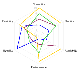
In You are NOT spider man, so why do you use radar charts? Chandoo presented a “petal chart” as an alternative to a radar chart (or spider chart, after its spider-web-like appearance). Here is the radar chart Chandoo wanted to replace:
And here is the replacement petal chart:
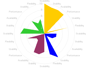
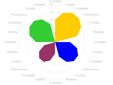
That’s a pretty jagged flower. I think the name “petal chart” probably refers to an idealized chart of this type:
Though the corresponding radar chart is somewhat meaningless:
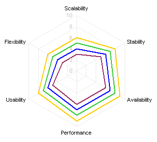
It actually seems that the petal chart is even worse at allowing comparisons than the lowly radar chart. At least in a radar chart, the items being compared are all along the same spoke, whereas in the petal chart, they are distributed around the circle, 90° apart in this example. Also, the false zero values on either side of the categories for each petal can be distracting.
Radar charts are not very effective, despite their frequent appearance where scores in a set of categories are being compared. Their radial nature gives more emphasis to larger values toward the outside of the chart. If there are any zero values, the chart can become very difficult to read:
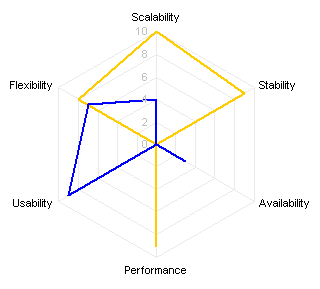
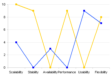
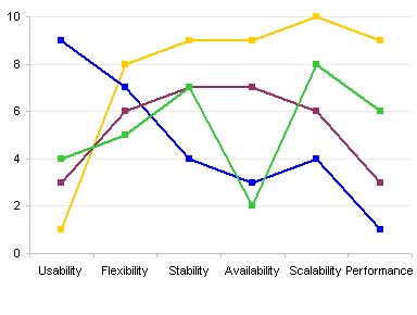
This bias toward larger values and the confusion caused by zeros can be minimized by selecting a more appropriate chart type, the familiar line chart:
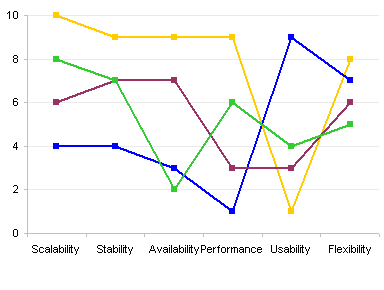
The line chart is a better choice even if the radar chart has no zeros to confound the data:
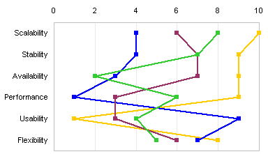
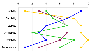
A vertical line chart (or dot plot) is also a good choice:
Derek of Information Ocean has analyzed Chandoo’s radar and petal charts in Reorderable tables II: Bertin versus the Spiders. He applied Jacques Bertin’s assertion that charts are really just tables, and after a little rearrangement of the categories and series, came up with this spot matrix:
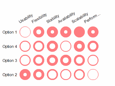
Derek rearranged the data to impart a diagonal trend to the chart. He likes spot matrix charts, but I’m not really wild about them. Bertin liked to use a stack of column charts to show this type of data, and I think I prefer Derek’s stacked chart to his spot matrix.
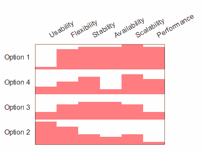
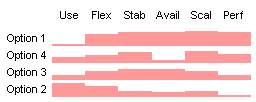
Shrink the stacked chart a bit, and it becomes a sparkline.
The radar chart is no better for ordering of the data:
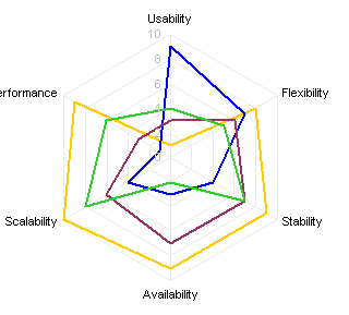
The line charts and dot plots are improved somewhat by the ordering. The sorted data makes it easier to see that the yellow line (option 1 in Derek’s charts) is good in all areas except for usability (probably the worst category to rank poorly in). The blue line (option 2) has outstanding usability, but it’s at or near the worst in four of the other five categories.
Bottom line: Radar charts are not too effective for what they are often used for. Chandoo made a noble attempt to improve on them, but sticking to a chart with a circular shape wasn’t a good move: the petal chart looked nice, but it was even less effective at displaying the data. Line charts are one of the best choices, though Derek presented a couple good alternatives. Derek’s sorting of the categories helps to bring out patterns in the data, in his charts and in the line charts.


jenmoocat says
For me, the rule of thumb about charts is that your audience should be able to grasp the main insight in 30 seconds or less.
And — even after 5 minutes of staring at a radar or petal chart, I still have no idea what the main takeaway is supposed to be…..
And the other line graphs — just as bad, in my opinion.
Now, the spot matrix chart — that I understand.
And very quickly.
This kind of graphic is actually somewhat familiar.
I believe that I’ve seen similar ones on sites that compare and review consumer goods like electronics along various dimensions.
I do not think, however, that the options should be presented out of order.
jenmoocat says
Now I am all excited about the spot matrix chart.
It might turn out to be a really good replacement for a stack of five, independent bar charts.
I understand that you don’t really like them, Jon, but (off the top of your head) do you have any insight on the best way to construct such a thing in excel?
Jon Peltier says
Jen –
Go to Derek’s post at Reorderable tables II: Bertin versus the Spiders. He probably has a link to his spot matrix resources.
Chandoo says
@Jenmoocat – I have posted a small tutorial on creating spot matrix charts in excel here: http://chandoo.org/wp/2008/10/07/excel-radar-charts-replacement-spot-matrix-download-template/
you can download the template and play with it to suit your data / needs. I hope this helps you :)
Andy Pope says
I did a spot chart some time back,
http://www.andypope.info/charts/spotlight.htm
Jon Peltier says
Andy –
Once the decision is made to make a grid, there are a wide range of alternatives. Your spotlight, which is like the spot matrix, which is like Harvey Balls, which is like your tile chart, which if you expand the tiles to fill the grid is like a heat map.
Haytamales says
Hello, I’m trying to create a vertical line chart (or dot plot) in excel. Do you of any place I could find that tutorial??
Jon Peltier says
Here’s a dot plot tutorial: https://peltiertech.com/Excel/Charts/DotPlot.html
Paul Boos says
One type of chart that may also be helpful is a bubble chart.: I tailored one to provide 4 dimensions. X and Y axes are the primary considerations, bubble size (I only had 3 sizes) indicate another dimension, and then 4 small “hierarchical” type structures on the diagonals of the bubbles to indicate a complexity dimension. Simplicity had a single spark, moderate complexity and a spoke with a ‘V’ shooting off it, and complex had a ‘V’ off each tip of that V making the bubble appear more like a molecule. Each bubble was the alternative under consideration and I had about 12 bubbles at varying positions, sizes and “molecular fuzziness”. Since I was in PowerPoint, I animated their appearance to simply appear one at a time so as I spoke, people knew exactly which one I was talking about.
Chandeep says
Hi Jon,
I have a similar DOT Chart here but used it for performance data
http://www.goodly.co.in/create-a-dot-chart-in-excel/
Your views on this will be valuable!
Thanks
Chandeep