It’s relatively easy to apply conditional formatting in an Excel worksheet. It’s a built-in feature on the Home tab of the Excel ribbon, and there many resources on the web to get help (see for example what Debra Dalgleish and Chip Pearson have to say). Conditional formatting of charts is a different story. People often ask how to conditionally format a chart, that is, how to change the formatting of a chart’s plotted points (markers, bar fill color, etc.) based on the values of the points. This can be done using VBA to change the individual chart elements (for example, VBA Conditional Formatting of Charts by Value), but the code must be run whenever the data changes to maintain the formatting. The following technique works very well without resorting to macros, with the added advantage that you don’t have to muck about in VBA.
Unformatted Charts
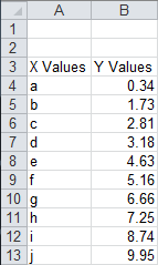
Here is the simple data for our conditional chart formatting example.
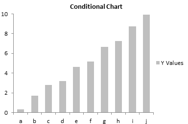
The data makes a simple unformatted bar chart. . .
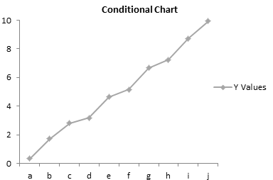
. . . or a simple unformatted line chart.
We want our charts to show different colored points depending on the points’ values. Except for some simple built-in formats, conditional formatting of worksheet ranges requires formulas to determine which cells should take on the formatting. In the same way, we will use formulas to define the formatting of series in the charts. We will replace the original plotted data in the line and bar charts with several series, one for each set of conditions of interest. Our data ranges from 0 to 10, and we will create series for each of the ranges 0-2, 2-4, 4-6, 6-8, and 8-10.
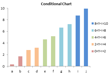
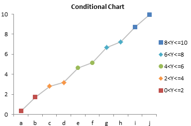
Conditional Formatted Bar Chart
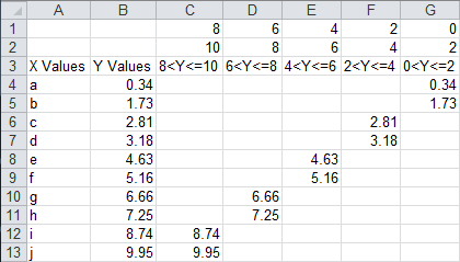
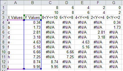
The data for the conditionally formatted bar chart is shown below. The formatting limits are inserted into rows 1 and 2. The header formula in cell C3, which is copied into D3:G3, is
=C1&"<Y<="&C2The formula is cell C4 is
=IF(AND(C$1<$B4,$B4<=C$2),$B4,"")The formula shows the value in column B if it falls between the limits in rows 1 and 2; otherwise it shows an apparent blank. The formula is filled into the range C4:G13.
When the bar chart is selected, the chart’s source data is highlighted as shown.

We need to change the source data, removing column B and adding columns C:G. This is easily done by dragging and resizing the colored highlights.

The chart now shows five sets of colored bars, one for each data range of interest. It’s not quite right, though, since it’s a clustered bar chart, and each visible bar is clustered with four blank values.
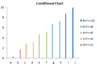
This is easily corrected by formatting any one of the bars, and changing the Overlap property to 100%. This makes the visible bars overlap with the blank bars.
Conditionally Formatted Line Chart
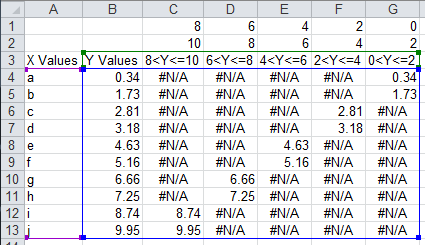
The data for the conditionally formatted bar chart is shown below. The formatting limits are inserted into rows 1 and 2. The header formula in cell C3, which is copied into D3:G3, is
=C1&"<Y<="&C2The formula is cell C4 is
=IF(AND(C$1<$B4,$B4<=C$2),$B4,NA())The formula shows the value in column B if it falls between the limits in rows 1 and 2; otherwise it shows an error, #N/A, which will not be plotted in a line chart. The formula is filled into the range C4:G13.

When the line chart is selected, the chart’s source data is highlighted as shown.
We need to expand the source data, keeping column B as a line connecting all points and adding columns C:G for the separately formatted series. This is easily done by resizing the colored highlights.
The chart now shows five sets of colored markers and line segments, one for each data range of interest.
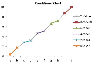
A little formatting cleans it up. Remove the markers from the original series, remove the lines from the other series, and apply distinct marker formats to the added series.

Remove the unneeded legend entry (for the gray line) by clicking once to select the legend, clicking again to select the label, and clicking Delete.
Conditional Formatting Flexibility
This simple example has formatting formulas defined based on the Y values in the chart. It is possible to define formatting based on Y values, X values, or values in another column which is not even plotted. As in worksheet conditional formatting, the only limit is your own ability to construct formulas. This technique works on most useful Excel chart types, including bar and line charts shown here, and XY charts as shown in Conditional XY Charts Without VBA.
Peltier Tech Articles About Conditional Formatting of Excel Charts
- Conditional Formatting of Excel Charts
- Conditional XY Charts Without VBA
- Invert if Negative Formatting in Excel Charts
- Conditional Donut Chart
- Highlight Min and Max Data Points in an Excel Chart
- Split Data Range into Multiple Chart Series without VBA
- Conditional Formatting of Lines in an Excel Line Chart Using VBA
- VBA Conditional Formatting of Charts by Value and Label
- VBA Conditional Formatting of Charts by Series Name
- VBA Conditional Formatting of Charts by Value
- VBA Conditional Formatting of Charts by Category Label


Bob says
Hi Jon,
I like this technique. I have an immediate use for this approach with showing statistical outliers on xy charts.
On the off scale or suspect points, I’ve set the points to be labelled and use the big circular point markers. It makes the point of calling out the bad in the context of the good.
Thanks
Bob
Dave Dudus says
Nice stuff. I did something similar with a scatterplot where I built myself a tool that takes X &Y data and bins it according to some z-axis variable. I made the plot flexible so I could go up to 10 z-variable bins. That allowed me the ability to add a trend line for each bin.
Charlene says
Hi, You always have exellent posts, easy to follow and spot on. I do have a question on this one. I need to plot a comparison between forecast and baseline numbers, I’m using a bar chart. If the variance is x, the forecast bar should be red, if between x and y, it’s yellow, and over y, it’s green. I can do this with the non-vba process above, but here’s the catch. I want the forecast to overlap but not the baseline. I’ve tried using a second axis but the yellow (the middle value) overlaps with the baseline. Any thoughts??
Thanks!
Jon Peltier says
Charlene –
Are you plotting baseline and forecast together? I don’t know what you mean about overlapping.
Charlene says
Thanks for responding. My intent is to have two bars per project, one is the baseline cost and the other the forecast cost. As you suggested, I set up three different series for the forecast cost so that the bar can be green, yellow or red based on the difference from baseline. My problem is that I end up with spaces for the empty series, and if I overlap, it also overlaps with the baseline bar (which I don’t want.) If I still am not making sense I can email you the chart in the morning, it’s on my work laptop.
Thanks again.
Jon Peltier says
Charlene –
Oh, I get it. When you overlap the conditional columns by 100%, it overlaps all columns.
You need to follow a more intricate protocol. I’ve written a tutorial called Clustered and Stacked Column and Bar Charts. You need to set up such a chart, with one column clustered next to a stack of three coumns, and those three columns are the red-yellow-green.
In other words, in the other article, in the table that has Q1 Actual, Q2 Actual, Q1 Budget, Q2 Budget, with the two actual values in the same row, and hte two Q2 values staggered one row lower, You would have:
where Budget is in one row, and the red, yellow, and green conditional Forecast values are in the next. The chart looks like there’s only one of the conditional columns in each slot, because the zero-height bars don’t appear.
Oh yeah, you might consider adjusting the red/green color scheme, for the 10% of the males in your audience with color vision deficiencies.
Steve says
Hi Jon – great post! How would you set something like this up for an XY Scatter that is being used as a 2×2 matrix to plot Ease (y-axis) against Benefit (x-axis)? I’m looking to do two things:
1. Change the color of the marker based on which quadrant the data plots to
2. Change the type of marker based on another variable that I will specify in one of the columns along with the data (e.g. Finance, HR, Sales)
Thanks,
Steve
Joseph Souders says
This was a great directional idea. I applied the same logic to scatter plot charts and the results were exactly what we wanted to do. It really helped to visually see range of stores in color based on their tiering. So many uses for this approach. Glad I stumbled across it and so glad someone took the time to both show and explain the approach. Awesome article.
Stuart Gibson says
So how would I change the colour of a value if it goes above a target value. for example:
Week Target Value
1 10 9
2 10 8
3 10 13
4 10 5
Thus plotted on a line graph any value above the target value would display in red and any value below target value would display in green
Thanks
Jon Peltier says
Stuart –
It’s actually easier than the line chart example above.
Here is your data, with two more columns. The formula in column D displays a number if the value is less than or equal to the target, while the formula in column E displays a number if the value exceeds the target.
I plotted all columns. The Target and Value columns are plotted as lines, while the Below and Above columns are plotted as distinct markers.
Mac says
I’m trying to display tank volumes, in gradients of green to yellow to red. Using Conditional Formatting, my data cells depict it nicely. However, how can I also see similar gradiation in my bar chart? I’m unable to get beyond manually coloring each bar to correspond to its data cell. Won’t Excel color the bars just like it colors the data cells?
Thank you!
Jon Peltier says
Mac –
If Excel colored its charts the way it colors the cells, I would not have had to write this article.
If you need some kind of gradient, you could figure out how RGB values vary with your tank volumes, and write some kind of VBA to handle that. In fact, if you are willing to share your workbook (jon at peltiertech dot com), I could put it on my list of articles to write.
Richard says
Hi there,
I was wondering if you could conditionally format 100% stacked bar charts. I am trying to create a tracking tool for NPS and would like to use the colours red , green and yellow.
Regards,
Richard
katie says
I am trying to make a graph showing order time and how long the deliver took. I have column a “order time” and b “deliver time”. i wanted to make column c “# of guests” and in my legend i wanted to make it:
1 GUEST
2 GUESTS
3 GUESTS
4 GUESTS
5+ GUESTS
i was wondering if there was a way for my graph to have the different # of guests different colors when plotted. thanks.
Jen Graves says
So thankful for your help! Really! This is so important to a project we are working on right now – a customer deliverable and am SO GLAD not to have to do VB.
Jen Graves says
Jon,
Is there a way to also show data labels conditionally?
ie – the chart colors update beautifully, I have 4 bars and parameters on each bar that apply the chosen color for that range. But when I show data labels, there are 4 on each bar (I can see the logic of this) but only want 1 data label displayed per range. Can this also be done without VBA or manual work?
Jen
Glenn says
Novice excel 2003 user here trying to develop a line chart for the following: I have monthly data for the S&P 500 index since 1890, separated in two series, one is the average monthly close, the other is an exponential moving average of the same data. I would like to show the monthly line as one color when it crosses above the EMA, and another color when it crosses below the EMA.
Can anyone help?
Marc says
Hi Jon,
Is there a way to do conditional format on staked bar and 100% stacked bar
Thanks for your support,
Marc
Jon Peltier says
Marc –
These routines do not care whether the chart is stacked or clustered, column or bar. It’s up to you to be creative with your formulas.
Marc says
Hi Jon,
I have a stacked bar chart with 4 series. I want to be able to conditionally format each of them.
When doing conditional formatting on stacked bar, the series that meets the formatting condition starts from 0% and not from its original position (>0%)
Scott says
I tried following your methods and was able to drag and resize top header but when I tried to resize data labels [blue lines] it wouldn’t let me resize that to capture the formula’s I had put in.
Suggestions?
niladri sarkar says
Hi Jon,
Could You please share the excel sheet wherefrom you formatting graph ?
Because I tried your method but unfortunately things are not working for me; I want to see where I am going wrong.
My excel version MS2007!
Fred Cumming says
Hi Jon
I loved your tip about using other objects as point markers.
I chart wind speed and direction and was looking to place arrows on the chart points that align with the wind direction. Your tip got me started.
I wrote a macro that used the down arrow from the autoshapes and rotated it according to the wind direction then pasted it to the chart point. I made this into an addin which I can use on any chart with a wind speed series.
It looks great and communicates the information extremely well.
Thanks
Fred
Robert says
Jon,
Awesome tip on this. I have a linked spreadsheet that I produce graphs off of. The problem is I have all my values in one column that I cannot change around without causing problems many other places. The autoformat already changes the colors of the values in the cell based on their values. The current chart uses column A as the serial identifier on the x axis. How can I get it to automatically change the bar color based on the autoformat color of the cell it is linked. This chart deals with individual serial aircraft and hours until inspection.
Thanks
Robert
Jon Peltier says
Robert –
Seems like you could use the approach in VBA Conditional Formatting of Charts by Category Label.
martin says
not really a comment but a request.
i have a series of datasheets for different materials. each sheet has a significant amount of data, 1000’s, against time. so i can plot the variables against time, no problem. i also plot the data for one variable for each material, slighty harder because each series refers to a different sheet. what i would like to is displayed data values for specific x values. i can dsiplay all labels but obviously there are 1000’s.i want to be able to specify the x value, say 30 seconds, not datapoint and get a y value for all series on the chart (scatter plot). any clues gratefully recieved. thks
Jon Peltier says
Martin –
Check out Excel Interpolation Formulas.
Kate Rampersad says
I have followed your steps but when I actually expand the Y series from one column to 4 columns, it gives me separate series for each of the columns. Any advise?
Jon Peltier says
Kate –
That is what is supposed to happen. Each series is then formatted uniquely. When a value changes, the value moves from one column to another based on the conditions written into the formulas.
Steve says
Hi Jon,
Thank you for maintaining this great website. I’ve come here many times in the past seeking advice and tricks to improve my worksheets. This time however I do have a question that I was not able to find the answer to….
Time is what I am working on: http://i45.tinypic.com/orrzpv.png
What I would like is to have the portion of the column that surpasses the 100% mark to change to a different color, is this possible? For example if the column reaches 101%, the first 100% would remain green and the 1% above it would be red.
Thanks is advance.
Steve
Jon Peltier says
Steve –
Make a stacked column chart, with two series. The green series uses formulas to plot MAX(Value,100%), and the red series on top of it uses formulas to plot MAX(Value-100%,0).
Lars Vaering says
Hi Jon,
Very nice, it helped me a lot. I only have one issue left. I would like to have the value on the chart. When I do that it shows #N/A for the series that of course is empty. Can you remove that?
Lars
Jon Peltier says
Lars –
If it’s a bar chart, replace #N/A or NA() in the cells with “”.
Dr Moradian MJ says
I have a two raws of logarythmic data and want to produce a conditional scatter plot:
A 1.76 .31
B 1.66 .46
C 2.47 .63
D 1.81 .27
E 2.34 .32
Jon Peltier says
Do you have a question? Did you try and get stuck?
nevenka says
Hi!
I have a simple table with 10 categories and 10 numbers corresponding to it. So, the graph has 10 bars and under each bar it’s the name of the category. So… I want to automatically color the bars in different colors depending on the category. For instance, each time I write “House” as a category, the bar should get yellow. And so on..
Anybody has an idea how to do it?
nevenka says
Hope you understand my problem. And thanx :)
Meribeth says
Hi Jon,
I appreciate you posting this technique, it is quite helpful. However, I am having difficulty modifying this approach to work with my data. I would like to use a line or scatterplot chart, but instead of plotting conditionally formatted markers, I would like one continuous line to show the formatting. The data are a daily time series of stream temperature and are categorized as below average, average or above average.
Here is an example:
Date Temperature Category (as numerical value)
1/1/2011 14.5 1
1/2/2011 15.3 1
1/3/2011 16.9 2
1/4/2011 15.6 1
1/5/2011 14.8 1
1/6/2011 12.3 0
1/7/2011 12.6 0
1/8/2011 11.3 0
1/9/2011 14.2 1
1/10/2011 14.8 1
Using your suggestion but removing the markers and keeping the lines results in a connection between dates (e.g. 1/5 data point connected to 1/9). Is there a way to work around this without removing the connecting line by hand? I would appreciate any insight. Thanks!
Jon Peltier says
You want the lines to show the formatting? Each line segment is associated with a marker, so if you select one marker, its line segment is the one that connects it to the previous marker. I don’t see how to set this up automatically in Excel, and even doing something with VBA sounds tricky.
MJ Moradian says
Hi
I have two raws of data (one x and one y) for each point and I want input condition for both i mean if X>a number or Y>another number it shows me a color:
if x<=0 or y<=0 class one
0<x<0.2 or 0<y<0.2 class two
0.2<x<0,4 or 0.2<y<0.4 class three
0,4<x<0.6 or 0.4<y<0.6 class four
0.6<x<0.8 or 0.6<y<0.8 class five
0.8<x<1 or 0.8<y1 or y=>1 class seven
Jon Peltier says
You can write formulas that refer to both X and Y, or to anything else you want.
Dario says
Hi Jon, congrats for your blog, it’s really really useful.
I’ve a question about bar charts with a specific color based on value like bars in this link http://i.imgur.com/AzNkv.png.
Do you think is possible make a charts like the attached one for a low-skilled excel user?
How can I make the red-green bar?
Thanks a lot for you help
Cheers
Emma says
Hi Jon,
Im having an issue with a data series i am trying to plot into a line chart. it plots all my points fine, but i need to see where there are gradient changes. i was wondering if there is any way to format the lines so that it is a positive gradient its green, negative red and unchanging as amber.
Thanks
Em
Jon Peltier says
Emma –
Changing the format of the line segments cannot be done just with formulas, it requires VBA. An upcoming post will address this technique.
Ken says
Hi Jon,
You have great instructions and examples for us to use. I hope you can help me on one step I am having trouble with. I tried to adjust the colored “blue” highlights of the “Conditional Formatted Bar Chart” from your instructions above where it says “We need to change the source data, removing column B and adding columns C:G. This is easily done by dragging and resizing the colored highlights.” For some reason I couldn’t change it so it highlights columns C:G. Please help.
Thank you!
Ken
Jon Peltier says
Ken –
You can’t drag the colored highlight outlines? Can you change data by right-clicking and choosing Select Data? If it is a pivot chart, you can’t change its data.
sakshi says
Hi!
The instructions here has been a great help and I was able to conditional format the data points. I would like to know that if I want to give range in the formula -2<Y<=0, the excel is taking it as a NAME error.
What should I do now?
Please help as the instructions has beautifully helped me in making the plots for my datasets.
Jon Peltier says
A NAME error means Excel thinks something in your formula is a Name, that is, a defined range or defined formula. Perhaps you’ve misspelled a function. What is formula in the cell with the error?
Dan B-T says
Hi Jon
This is a great blog. My query, is both for something more simple yet seemingly more difficult. I’m after showing via a equal segmented pie chart (almost grapefruit like) the status of a certain contract with say 8 points to it, each with a need to show a RAG rating on it:
Q1 = 2
Q2 = 1
Q3 = 1
Q4 = 3
etc with 1 = red 2 = amber 3 = green
I have been trying to frantiacally find an easy solution as to how to show this, can you help?
Thanks
Dan
Jon Peltier says
You need to set up an algorithm that looks at the Qi rating to determine the format. For each segment in your chart, you need three possible values, for red, amber, and green (note that red and green are a poor choice for opposite extremes, given the prevalence of red-green colorblindness). So the data is like
Segment A1 =1 if red, =0 otherwise
Segment A2 =1 if amber, =0 otherwise
Segment A3 =1 if green, =0 otherwise
Segment B1 =1 if red, =0 otherwise
Segment B2 =1 if amber, =0 otherwise
Segment B3 =1 if green, =0 otherwise
Segment C1 =1 if red, =0 otherwise
etc.
First use values of 1 for all segments, so you can apply formats. Then apply the formulas. The appropriately colored segment appears (with value of 1) and the others do not (with zero values).
Smoke and mirrors.
Anonymous says
Thank you!! This was great!
Pa Chia says
Thank you!! This was great! Really helped me out.
Greg says
On a spreadsheet someone sent me, I notice at the bottom right of a section is a small arrow you can pull down or to the left to expand the section. I”ve created a new sheet with conditional formatting to shade every other line, but how do I get that little arrow feature?
Jon Peltier says
Sounds like that formatted range is a Table. The formatting is Table formatting rather than conditional formatting.
Insert Table is next to Insert Pivot Take on the Insert tab. Of course, Convert to Table would be a better name, because you’re not really “inserting” anything.
Joe says
Hi Jon,
Great site!
I’m able to resize the header, but when I try to resize the data set, it will not allow me to drag and select multiple columns.
I’ve tried right clicking the line graph > select data, but I get this error:
“The reference is not valid. References for titles, values, or sizes must be a single cell, row or column”
I’m using Excel 2010. Have I missed a step?
Thanks,
Joe
Jon Peltier says
Joe –
I don’t know which data you’re trying to resize. If it’s the data for a series (you’ve selected a series and clicked Edit, or you’ve clicked Edit above the category labels), the range can only be one row or column wide.
David says
Hi Jon, excellent site, thanks very much!
I am having one issue I woud be grateful if anyone had any ideas on. I have added data values to my chart but sometimes, when I change either a value or a threshold in the base data, the value on the chart changes to 0% and I have to manually recreate it. It seems to happen when the value shifts from one group to another.
Any ideas?
Many thanks,
David
Jon Peltier says
How are you changing the value?
David says
I am just typing over the number in the Y Values column – the relevant bar in the chart changes size and colour as expected but the data value changes to 0% as if it is still referencing the cell the value was in before (i.e. in columns C to G in your example).
Thanks, David
David says
Also I am using Excel 2003, not sure if that is an issue…
Jon Peltier says
By data value, you mean data label, right? You need to add data labels to all series, not just selected bars, and use a number format that suppresses zeros. Whatever your number format, append three semicolons (which will suppress negatives, zeros, and text labels). For example, if you’re using percentages:
0%;;;
David says
That’s perfect, thank you!
Jose Daniel Villegas says
Hey ! Thanks a lot for this simple and useful technique. Now I can make a control chart with automatic alerts.
Again, Thanks a lot, this is going to make me look very well with my boss :)
Sheryl says
Dave Dudas (from Feb post) or anyone else – I am wondering if you would share your scatterplot example? That is exactly what I need and was searching for when I found this post. I’ll try working it myself of course, but would love some help.
Excellent stuff here everyone. Thanks for putting it out there. I’ll be sure to visit often now.
Juanjo Tordera says
Hi, Jon. I’m trying to change the colour of the bubbles in a bubble chart but I don’t know how to do it. My idea is to use the colour as the “4th dimension”. X would be business attractiveness, Y relationship attractiveness, Z (size of the bubble) amount sold, and then the colour would be the profit, being green “High Profit”; Orange “Medium Profit” and Red “Low Profit”, I also want to keep the name of the client. So far, I have X, Y, Z (Bubble size) and name of the Client but I don’t know how to move on with the Profit “thing”.
I use Excel 2010.
Thanks a lot in advance!!
Jon Peltier says
Juanjo –
As in the line chart example above, set up three different bubble series (three sets of Y values), one for each color.
Neil says
Hi,
This was extreemly useful however I have a problem. The colur of my bars in the chart change with no problem however when the value drops below the threshold my data labels display 0 instead of the true value. I.e. colour changes from green to red at value of 5 but data label only displays true value if it is 5 or above. otherwise it displays 0 is there a solution to this?
Regards,
Neil
Jon Peltier says
Neil –
Use a number format that suppresses display of zero. For example:
0;;;
0.0;;;
0%;;;
The first item in the semicolon-delimited list shows how positive numbers are displayed, the second (blank) shows negative, the third (also blank) shows zeros. So negative values and zeros are not displayed with one of these formats.
Girish says
Jon,
Great article, we have peculiar problem. We are connecting to a cube (MS SSAS) to fetch data for a dashboard which is showing set of graphs (bar,line charts). We need to depict different colors based on data obtained from cube( we are making use of slicers, as dashboard needs to dynamic based on parameters selected). We have used VBA to depict the color changes in graphs, however VBA doesn’t work when used in Excel Services. We are using Excel 2010 and we have observed that in Excel 2010, Conditional formatting icon is disabled when connected to cube. We would appreciate if you could provide us pointers on the same.
Our problem statement is to change colors in Excel 2010 without using VBA for set of graphs (bar and line) which is fetching data from a cube. Pointers on this would really help, as we are struck.
Thanks
Jon Peltier says
You could use formulas to set up different colored data points, per techniques in this article. However, the formulas have to be very smartly written to accommodate pivot tables with changing configurations.
Girish says
Jon,
For some reason, when we access cube and show charts based on pivot data “conditional formatting” is getting disabled. Any inputs for the same.
Thanks 7 Regards,
Girish
Jon Peltier says
Girish –
You mean Conditional Formatting in the worksheet? I can’t advise on this, because I don’t use cubes.
Maz says
Hi John,
I need help in creating a bar graph with 4 columns of different data set and want to overlap all these 4 columns. I’ve successful with overlapping 2 columns but not with 3 or 4 columns. I need this chart for my report and will appreciate any help i can get.
Thankyou in advance for your help!
Maz
Jon Peltier says
Maz –
You want bars in front to partially obscure the bars in back? I don’t know why you’re having trouble getting all the bars to do this, unless some are on the secondary axis. But obscuring data in this way may distort the impressions conveyed by the obscured bars.
Gavin Lawrence says
I would like to be able to do something clever with the data points in a scatter plot: where the y-axis=Probability and the x-axis=$m. The data points represent the 80th percentile of a distribution for a number of variables.
I want to represent the statistical uncertainty of each of the underlying distribution fro each of the data points and I felt the following uncertainty criteria might apply:-
1. Magnitude of the data point represent by the colour of the marker – purple, blue, green, yellow,orange or red (low-high)
2.Uncertainty measured by Standard Deviation determining the diameter of the marker
3. Min-max range determining the thickness of the outer line.
4. The colour of the line to reflect the Upper Quartile – Lower Quartile range using the colours in (1) above.
Is there any way of achieving this attempt to describe the uncertainty around the data point.? Or some other solution to capture the uncertainty in the distribution?
Jon Peltier says
Gavin –
A little formatting goes a long-long way, and you’re describing a lot of formatting.
1. What’s the magnitude of a data point? If it’s X or Y value, we’re already using position to denote that. Color’s not good to represent value, other than in broad categories.
2. Rather than diameter, which is a pain to do well, how about error bars? This also allows showing it in two directions, without having to try to scale an oval marker.
3,4. If it’s a range that can be represented on the chart, draw it on the chart, don’t abstract it even further into line weight or color. Maybe use dashed lines, or a lighter line, for some kind of limits.
Error bars are used in a lot of ways to try to capture uncertainty. Box plots show distribution in one direction. If you have lots of points, the density of a scatter cloud shows the distribution in the plane.
MJ Moradian says
Hi
I have a table of values with X and Y number for each cell and I want to have a conditional fomatting for both x and y values.
Jon Peltier says
You have two values (X and Y) in each cell?
Gavin Lawrence says
To clarify this is a common method of displaying risks in a graph. Risk is calculated as the product of probability (Bernoulli distribution) and impact (a continuous distribution). The y-axis is probability 0 to 1, x-axis for impact 0 to 50. Obviously since the product of two distributions is a third continuous distribution and you cannot plot a number of risk distributions on a scatter plot. Companies are often interested in the 80th percentile so the scatter plot locates the marker of the basis of the P() v. P(80) impact.
This tells the reader nothing about the nature of the underlying distribution’s uncertainty in terms of standard deviation, min-max range, kurtosis, upper/lower quartile range.
This is the challenge to demonstrate the relative value of a set of risks by P(80) value and also their distribution uncertainty.
Jon Peltier says
Yeah, “common method”. So you have to follow existing patterns while trying to include more information to help show the confidence in the plotted values. So some color coding is useful, and some bubble sizing also. Or maybe not.
Can you use your error bars to show the uncertainty in the position of your points, that is, to indicate where an 80% point would be if the probability ranges between 75 and 85%?
Gavin Lawrence says
Here is an oddity I observed:
Marker size ranges from 2pts to 72pts
The outer line 0pt to 144pts
If you set the centre marker size to 72pts. Then start increasing the outer marker line.
As outer line increases in width the cenre marker starts decreasing in size although the format tool still shows 72pts.
When the outer line reaches 72pts width the centre marker starts to increase again until it reaches 72pts.
When the inner markets is fully back to 72pts the width of the outer circle is 144pts.
This is very odd, what is the cause of this?
Gavin Lawrence says
Hi John,
There are no constraints or limitations on how I can do the graph. Anything that is an improvement is a step forward.
Bruce Williams says
John,
This is exactly what I needed, and I wanted to reach out and say thanks for all your hard work! It’s very much appreciated, and I look forward to reading more of your blogs.
Cheers,
Bruce Williams (OE Specialist)
Bernie Palo says
A big show gratitude you for your post.Much thanks again. Great.
Abhineet Shukla says
This is infact a very good post to learn conditional formatting. It is helping me a lot in improving my sales chart report. i am still very new in this thing so i am taking it as a slow process to learn, but definitely getting more quality report this time than the earlier which I submitted in June last month.
Divya says
Hi Jon,
I tried to adjust the colored “blue” highlights of the “Conditional Formatted Bar Chart” from your instructions above where it says “We need to change the source data, removing column B and adding columns C:G. This is easily done by dragging and resizing the colored highlights.” It won’t let me resize this area.
I tried right-clicking and changing the data source using “Select Data,” but when I try to highlight both columns an error message pops up stating, “The reference is not valid. References for titles, values, or sizes must be a single cell, row, or column.”
I’m using Excel 2007. Do you have any suggestions for fixing this?
Jon Peltier says
Divya –
The behavior you describe is what happens if you select one series, and the data for just that one series is highlighted. Select the plot area (the box defined by the axes) or the chart area (the rectangle that everything else fits in). This will highlight the source data range for the whole chart.
Christophe says
Hi Jon,
Thanks for setting up such a great website. I’ve used your waterfall graph guideline multiple times and it works great. I tried following your tutorial here as well to get the results I wanted but fell a bit short. I’ve got a line chart, which I’d like to format green when above 0 on the y-axis, and red when below 0. The issue here is that for a connecting line that goes from above 0 to below 0, the color only switches once it reaches the point below 0. Is there a workaround for this?
Thanks in advance for your help.
Jon Peltier says
Christophe –
This is the way lines work in line charts and scatter charts.
The workaround, which is totally painful, is to determine where the line crosses the axis, put a point with no marker at that intersection, and format the line segments on either side of this point.
In an XY scatter chart, this is not too big a deal.
In a line chart, you can’t place a point at any arbitrary X value, but only on the X axis categories. You could overlay a scatter chart, but that’s got its own issues.
DINAKAR says
Is it possible to conditional format chart series colors.
I.e If the values is 0 or “” , then the series color and the corresponding legend color should be white else the series color and the corresponding legend color should change.
Any help would be highly appreciated
Jon Peltier says
Dinakar –
If this technique isn’t applicable, try
https://peltiertech.com/vba-conditional-formatting-of-charts-by-value/
This uses VBA, so the code must be run any time the chart data changes.
You can add code to hide the legend entry, or you can use data labels instead of a legend.
Also see https://peltiertech.com/mind-the-gap-charting-empty-cells/ to learn about how Excel charts zero values and text (i.e., “”).
Peter says
Hi Jon,
I have just stumbled across you posts this morning and found them very informative and have tried out the two examples,; “conditional formatted charts” and the post, dated Tuesday 27th March 2012 08:47. However I have had difficulty with the latter.
The Chart draws as per your example except the “below” line continues across all 4 weeks ie from value 8 to value 5. I have checked and rechecked values and formulae but cannot see what is wrong. I would appreciate any assistance that you can offer.
Thank you
Jon Peltier says
Peter –
Is there a discrete data point for the “Below” series at Week 3, or is it just the line connecting the Week 2 and Week 4 points? The “Above” and “Below” series should be formatted as marker-only, without the connecting lines.
Richard says
Hi Jon
I have a question regarding conditional formatting of stacked columns which I am struggling with.
I want to create 2 stacked columns which have different segments coloured according to some indicator, as an example my data is as follow. The two columns are at points 1 and 2 on the x axis, the height of each segment is given by the y values, and the colour I want of each segment is given by some indicator, I have suggested colours blue and green here.
x y Indicator
1 10 Blue
1 15 Green
1 25 Green
1 50 Green
1 50 Blue
1 50 Blue
2 25 Blue
2 25 Blue
2 50 Green
2 50 Green
2 50 Green
2 0 Blue
To achieve this (and it be automatic) I believe I need to plot a total of four stacked columns, and at each point 1 and 2 on the x axis there will be two columns on top of each other (i.e. overlapped 100%) so I can then format one blue and one green. I therefore set up my data like this:
x y1 (Green) y2 (blue)
1 0 10
1 15 0
1 25 0
1 50 0
1 0 50
1 0 50
2 0 25
2 0 25
2 50 0
2 50 0
2 50 0
2 0 0
The problem I have is that when I plot this data, I end up with 12 segments (or series) at point 1 on the x axis, and 12 segments (or series) at point 2 on the x axis i.e. not 2 separate stacked columns which are plotted ‘on top of each other’. The total height of the stacked column ends up being much higher than I want it to be, as it is plotting all of the y values as if they belong in the same column.
Any ideas how I can stop this from happening, and therefore plot two stacked columns on top of each other at the same point on the x axis? I read your article on clustered stacked columns but that didn’t help either, as the stacked columns still end up side-by-side instead of completely on top of each other.
Thanks so much!
Richard
Jon Peltier says
Richard –
Your initial data indicates 6 separate bars at X=”1″ (a blue one, three green ones, and two more blue ones) and 6 separate bars as X=”2″ (two blue ones, three green ones, and one final blue one). Of course, you can’t get this chart using your existing data layout.
I suspect you only want one green and one blue bar for each category.
Richard says
Hi Jon
Many thanks for the response. That is what I wanted (as described in my first post) – basically a stacked column which had some segments coloured blue and some coloured green. My problem was getting two different stacked columns to sit on top of each other, but I have now figured this out – I had to select the series’ for the second column to be on a secondary axis which I hadn’t done before. I then played around with the transparency settings to get what I wanted, so all sorted! Thanks so much for getting back though
All the best, and thanks for all your fantastic pages
Richard
Jon Peltier says
I’m not sure how using a secondary axis would let you stack the data the way you want.
Bo Jensen says
Hi,
I am having an issue… I about to create a chart that displays deviation between a reference value and a measured value. My issue is, the template my chart is in have various number of measurement points (2 to 10), and I want the chart to display the points to be measured. So.. just catching up here… i.e. I have 5 points to be measured, but my chart displays 10 points, the first 5 with the correct deviation, and the last 5 points are suited at zero. I do not want the 5 points at zero to be displayed on chart. How to do?
Thanks in advance!
Jon Peltier says
Bo –
Here’s how to make your chart dynamic: Dynamic Charts, Easy Dynamic Charts Using Lists or Tables, Dynamic Chart Review.
Henry says
Hello Jon,
I hope you can help. I am a novice Excel user with no VBA skills and I am trying to create a 3D Bubble Chart with 4 data dimensions where I would like one of the dimensions to have conditional formatting depending on the cell’s value. The data categories (columns) are as follows:
Customer Name Discount % Volume Revenue Margin %
I would like x-axis to be volume, the y-axis to be discount percentage (discounts are represented by negative percentage values – e.g. -20% is a greater discount than -10%), the bubble size to be revenue and and the bubble colour to be a different colour depending on the margin percentage (e.g. margin less than 20% is red, less than 30% is yellow, less than 40% is green and 40% or more is blue).
Visually, customers with low volume and deep discounts would end up in the lower left quadrant – undesirable, especially if they are in red, reflecting low margin).
I would appreciate any help you could provide.
Thank you
Jon Peltier says
Henry –
This is pretty much the same as above. You need to separate your data into separate columns, so the points are plotted as separate series.
Here’s some sample data:
The bubble data is in columns A:C (X values, Y values, and bubble sizes):
We’ve split the bubble data into four additional columns using the following formulas:
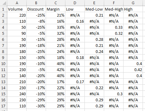
D2 (filled down to D17):
=IF(C2<0.2,C2,NA())
E2 (filled down to E17):
=IF(AND(C2>=0.2,C2<0.3),C2,NA())
F2 (filled down to F17):
=IF(AND(C2>=0.3,C2<0.4),C2,NA())
G2 (filled down to G17):
=IF(C2>=0.4,C2,NA())
Make a chart using the first three columns:
Right click on the chart, choose Select Data, click on the only series in the list on the left, and click Edit. The dialog looks like this:
I’ve already changed the series name to cell D1, and moved the bubble data range from column C to column D. Make sure the X, Y, and bubble size data starts in row 2, not row 1.
By changing the data, I now only show the points that have numerical values in column D:
Click the Add button in the Select Data dialog, and add a new series that uses the same X and Y data range, and series name and bubble size from column E. Repeat with columns F and G. Click OK, then format the series:
Henry says
Thank you so much, Jon. This has helped very much. Is it possible to add one more dimension/data set which would be revenue that would drive the size of the bubble while the margin would only conditionally effect the colour of the bubbles?
Also, is there a way to label each bubble with the applicable customer name?
Thank you so much for your assistance.
Jon Peltier says
Henry –
Minor differences
Columns A-D contain Volume, Discount, Revenue, and Margin. Margin isn’t used in the chart, but it is used to decide which values of Revenue appear in which conditional column. Columns E-H contain the conditional data, with these formulas:
E2 (filled down to E17):
=IF(D2<0.2,C2,NA())
F2 (filled down to F17):
=IF(AND(D2>=0.2,D2<0.3),C2,NA())
G2 (filled down to G17):
=IF(AND(D2>=0.3,D2<0.4),C2,NA())
H2 (filled down to H17):
=IF(D2>=0.4,C2,NA())
Jon Peltier says
To add company labels, put the company names into another column, then if you’re using Excel 2013, add data labels to the points using the labels from cells option, and select these labels in the worksheet. If you don’t have Excel 2013, download and install Rob Bovey’s Chart Labeler from http://appspro.com, and use it to label the points.
Henry says
Thank you, Jon. Your advice was invaluabe and I very much appreciate your help. I don’t mean to monopolize your time; however, I do have one more query related to this chart. I have one other column containing the customer’s name which I did not include in the chart data set; however, if possible, I would like to include the customer name and their revenue in the data label.
From the Data Label options, I am able to include any of the 4 data cateogires; however, i cannot include the customer name. I can create the cell reference to the customer name, but then I am unable to include a second cell reference to their associated revenue. Is there any way to include two or more cell references into a data label? I did try to combine the two values in a separate cell, but then I lose the currency format of the revenue and I would prefer to keep it, if possible.
If there is any way to accomplish this, I would, once again, greatly appreciate your guidance.
Thank you
Henry says
Sorry, Jon, I did not see your additional response on the labels prior to sending my follow-up question. I will try that; however, our corporate guidelines may not allow me to download unsupported appkications onto my desktop.
Thanks again for all your help.
Henry says
Hi Jon,
I actually found a work-around. It may not be pretty, but I inserted a column after the customer name column and then referenced that new column to the revenue column. I was then able to select the two consecutive cells in the row which included the customer name and their revenue. My data table has a couple of extra columns now, but I guess I could always hide them, if necessary.
Thanks, again, for all your great help.
Hitesh says
Hi, I would like to know that how can I format/change the color of a single value in axis label. For eg – If the axis label consists name of all the months and I want to Change color of one single month like lets say June.
Jon Peltier says
Here is how to format axis labels individually: Individually Formatted Category Axis Labels.
Greg says
Jon, is there a simple way of changing the formatting for one data point in a bar chart (without VB). I have 3 bar series(on same y axis) in the chart and don’t want to overlap just want the data point of interest to be different than the others. Obviously can manually format but that’s ok for a few not for many hundreds!
Jon Peltier says
Greg –
There are no “simple” ways to do this. The article above shows how to set it up ahead of time, but if you already have a lot of charts not set up this way, it’s too late. VBA may give you the power and flexibility to hunt through all your charts for data that meets particular criteria for highlighting.
Erica says
I am very unskilled at VBA and reading your instructions sent me into panic mode. I have a simple and basic graph that shows a line for my goal and a bar for each month. I am wanting to have my YTD average show red if we are above our max goal and green if we are below our max goal. Can you help me with this?
Jenny says
Hi Jon, I’m hoping you can help and I apologise if you have answered this elsewhere. Is it possible to have the range 0<Y<=4 and 9<Y<=12 so that any number that falls into this range is added into the applicable cell.The other ranges I have are 7<Y<=8 etc. I have data that sometines falls into the upper and lower ranges but these only need to be the same colour as the 4 range for the lower number and the 8 range for the higher number. I would prefer not to have to add columns to cover the ranges 0 – 1, 1 – 2, 2 – 3 and 3 – 4. Any help would be appreciated
Jon Peltier says
Jenny –
You only need to add one column for each distinct format. Notice in the screenshots, there are endpoints in C1:G2, and these are set up in ranges two units wide (8-10, 6-8, etc.). You can use as many of these as you need, and set them up however you want, and you can use other formulas if they make more sense. This was just an example with a set of guidelines.
MICHAEL COLLINS says
I WOULD LIKE TO SET UP TRAFFIC LIGHT BACKGROUND ON A RADAR CHART SO LESS THAN 25% IS RED AND ORANGE FROM 25- 75% AND THEN GREEN FROM 75% -100% – ON AN 8 AXIS SPIDER RADAR DIAGRAM. CAN YOU SET THAT UP
Jon Peltier says
1. Your caps lock button is broken.
2. As I’ve written elsewhere on this blog, radar charts do not effectively show data.
3. The formulas to split the data into three series are pretty much the same as those in the article and in other follow up comments.
Jack says
URGENT: How do I change the colors rendered when I apply the conditional data range to the bar graph? I need to use a specific color scheme based on my company’s protocol, and while this method does allow me to apply different conditional coloring to the bars, there is no info here on how to change the colors the data automatically maps to when following your method. How do you change these colors?
Jon Peltier says
Jack –
You format these colors just like any other chart feature. Select the object, press Ctrl+1 to open the Formatting dialog or task pane, and choose the colors you need.
karan singh says
I need to set my y axis. My axis details are as under :
Axis Options:
Minimum – 10
Maximum – 37
chart type – Line with markers
These minimum and maximum values are fixed and whenever I set the chart mimimum and maximum value the major tick mark type of maximum value get removed as shown in image.
I need to set major lines value so that my minimum and maximum value shows in chart. I tried to set major lines as auto then it works fine but my maximum value get change as per major lines.
I would request you to please give some suggestion.
Thanks
karan
Jon Peltier says
If you want both the min and max of your axis scale to be labeled, you need to choose a major unit that evenly divides the span (max minus min). For your chart, 37 minus 10 is 27, which leaves you with unconventional divisions of 3 or 9.
karan singh says
hi John,
thanks for the previous solution. Now I need to make a chart like this. I had tried to make but i was not able to make this.
1 . If there is only one rating except bad then chart will show like cht.jpg.
2. if there are two rating except bad then chart will show both rating from the date started as shown in the table.
Please suggest any idea because its based on dates.
Thanks
Jon Peltier says
Karan –
I don’t understand your question.
Karan Singh says
Hi Jon,
Sorry I was not able to explain my question. Now I’ve explained everything in the excel file.
I’ve shared file in below mentioned link. I would request you to please download it from there. I would also request you to please suggest or share some code so that I can make that scale chart.
http://www.4shared.com/file/mULai0RZba/Chart.html
Thanks
Karan
Jon Peltier says
Does the rating table represent points extracted from the data in columns A and B of the sheet? The scores in the rating table are monotonically increasing, but the data plotted in the chart are not. I don’t understand why you’re doing what you’re doing, I’m not sure I understand what you’re trying to do, and I don’t understand what the shaded bars (or rating table) are supposed to represent, since the data doesn’t follow the rating table smoothly. Shading something at the top of the chart disconnects it somewhat from the chart.
Wouldn’t it make more sense to add shaded bands to the chart?
Lisa says
Hi Jon,
Thank you for your great work! I have a question concerning the change of colors in a bubble chart. I whish the color of the bubbles to be dependant of different value than Y. Is this possible?
I will explain what I’m trying to create. I’m making a chart of some boys who are making a lot of trouble. They are assessed each month and get a score that I put into the chart. The score is dependant on how much trouble they’ve caused. I can then easily present the general change of behavior of the boys. Besides the score it would also be nice to instantly see if they are attending school or not which also changes frequently. I’m trying to find a way to make the bubbles change color based on this condition. Lets say the bubble is blue if the boy attends school and red if the boy doesn’t. How could I set up the following example:
Martin, score = 5, goes to school
George, score = 2, goes to school
Peter, score = 1, doesn’t go to school
Jim, score = 4, doesn’t go to school
Lawrence, score = 2, goes to school
http://i60.tinypic.com/35lulqs.png
I hope the question makes sense. Thanks in advance
Lisa
Jon Peltier says
Lisa –
You can vary four parameters in a bubble chart. X and Y, obviously, as well as bubble size. Take care not to make the bubble size too quantitative: if you have more than small, medium, and large, the sizes will be difficult to tell apart.
Finally, you can vary color. Even more so than bubble size, don’t make the color be a quantitative value, but make it categorical. This way, you can use multiple series of bubbles, one for each color you need. For example, add a series for Martin, and color it red; add a series for George, color it blue. You shouldn’t use too many different colors (different series), because the chart will become cluttered, and too many similar shades will make the colors hard to distinguish.
Lisa says
Thank you Jon!
Mikolaj Rutkowski says
That’s a great post! However I miss some more chart formatting functionality – formatting axis.
Is there a way to format the X axis where I present the dates, so the weekends were somehow distinguished? As the presented data drops during weekends, it would be nice to have them marked in order to avoid unnecessary questions :)
Jon Peltier says
Mikolaj –
There’s no built-in way to highlight weekends, but you can use the approach in an ancient tutorial, Highlight Certain Time Periods in a Chart.
Pat says
Superb!! I just needed a way to take a 15 column chart (6 near identical 15-column charts to be honest) and change the colour of one column, based on a particular X-axis label. I thought it was going to be so difficult, but this was a breeze.
Nice work!
Pat says
Hi Jon,
I’ve used your technique to conditionally format one chart column differently, but I’m having trouble with labels. I have two series which are 100% overlapped so I get zeroes for the “hidden” series. In the formulas that make the series I tried replacing 0 with “”, but that did not help.
Maybe I’m not explaining it very well, so the following file might help http://www.mediafire.com/view/t9upz9xkq496khk/Book1.xlsx Is there a way to either (1) not show the label for the irrelevant columns or (2) format them the same as a background colour so they appear invisible?
I’d really love it if you could offer some advice.
Thank you
Elle says
Hi Jon,
This has been most helpful but I a am still having trouble, I want to graph a basic three bar chart, if its below zero I want the bar to have the RGB 175,29,45 (a red color), and if its above I want it to have RGB 0,131,62. I tried following the line plotting example but not sure how you go the color to change and I put my target as zero but it still seems off. Can you help? Thanks!!
Elle says
Jon-
Another question, I have a 7 bar graph, if the bar is greater than 3 or less than -3 I want the bar color to be red, if its within 3 or -3 I want the bar to be colored green. Can you help? Thanks!
Jon Peltier says
Elle –
Set up the data like this. The formulas for columns C and D are below the data range. Basically you want the value in column B to appear in column C if it’s negative, or in column D if it’s positive. Select the blue shaded cells (select one range, then hold Ctrl while you select the second range), and insert a chart (top chart).
Select one of the series and press Ctrl+1 (numeral one) to open the Format Series dialog or task pane. Below left is the Excel 2013 task pane, but other versions of Excel are substantially the same. Select solid fill, click the down arrow next to the Color button, and choose More Colors. The color selection dialog below right pops up, so enter your RGB values, and click OK. Repeat for all series you need to apply colors to.
Your second example is much the same. The range is slightly larger, and the formulas are different, but the process is the same.
gabriel says
Hi Jon,
I have a question. If, using your example, the value in column B is 8 then it appears under the range covered in column D. I want it to appear in column C. Or using another value in your demonstration, if the value in column B is 6 it appears under the range established in column E (green)and i would like it to be color coated by the range in column D (light blue). Is there any way you can help me modifying your formula so that if or when the value equals the border between the two colors, it displays the color of the upper value range instead of the lower value range? Thank you!
gabriel says
I just commented earlier, just wanted to make sure that you knew that I am using the bar chart example. Thank you again
Jon Peltier says
Gabriel –
Change
=IF(AND(C$1<$B4,$B4<=C$2),$B4,"") to =IF(AND(C$1<=$B4,$B4
SANDRO GRAHAM says
Hey Jon,
I would be very happy if you could help me.
I just transform a Radar Chart into a Radar/Pie chart, i would like to know if it is possible to set the colours of the deferents series by %.
Like from:
0 to 25 – red
25 to 50 – yellow
50 to 75 – blue
75 to 100 – green
I saw your post and tried to adapt for the radar/pie chart, but as i have 360 degrees os values, it got a little more complex that i thought.
Thanks Very Much.
Jon Peltier says
A radar/pie chart?
SANDRO GRAHAM says
Yes John,
Like in this exemple:
http://superuser.com/questions/687036/how-to-make-a-pie-radar-chart
SANDRO GRAHAM says
Hey John,
Did you took a look at the exemple at the link?
I used your exemple to make a bar chart with de condicional formatting for the colours to change according to the values.
I try to think how could i do it the same with the Radar/Pie chart, the problem i think is that we can’t use the overlap with the diferente data, so i think maybe it is impossible! No?
Thanks,
Sandro Graham
Jon Peltier says
FWIW, a bar chart shows the data much more clearly, in a smaller amount of space. With the added benefit of allowing easy implementation of additional techniques like this blog post.
Shawn says
I have got the formulas to work and the output data show like your example. (I’m doing the bar chart colored based by value) But when I try to drag the blue selection chart data over the new multi column data it will only let me select one column. If there something i’m doing wrong or a setting I need to change? I’m using Excel 2013
Jon Peltier says
Shawn –
Select the whole chart before dragging the rectangle. If you select just one series, you are only adjusting the data for that series, and you are constrained to one column.
Mios says
I noticed that your examples uses conditional formatting for two variables; is it possible to color format a plot with a third variable (like “size”), where the third variable is linked to the initial first two variables?
e.g. If I was plotting points for a unemployed people versus highest education level, and a third variable for age, where the point is colored red, orange, yellow, green, blue, etc. depending on the unemployed person’s age.
Jon Peltier says
Mios –
The functionality is limited by your ability to create the right formulas. For each condition (color) you need a separate series in the chart, so a different column of formulas that filter by the criteria that result in that color. Then add the series to the chart and format as needed.
Simon Bennett says
Hi Jon,
I am trying to format a bar graph similar to the example you explained on 02 July 2015 for Elle.
My challenge is that I would like to format 2 differenet colours on the positive and 2 in the negative.
This is to say for example: from a target of 20 plus to a value of 30 plus I would like one colour, and from the target of 10 plus to a value of 40 plus I would like the colour to change to a different colour. And the same I would like to do in the negative (from the target of 20).
regards, Simon
X says
I did not see any discussion regarding 3D bar charts. Overlaying several 3d charts one for each color only kind of works sometimes because of the bars hiding behind bars thing. Best to just use vba for this case?
Jon Peltier says
3D bar charts are great for obscuring and distorting data, not so good for actually trying to help people understand data. There is some discussion on this blog and elsewhere about the problems with 3D charts.
Steve Dearborn says
I’ve taught myself about Excel 2016 line charts this week and I’ve gotten the VBA to give me the chart I need.
I’ve researched, but not been able to figure out how to conditionally format the chart the way I need. I have a trigger point (3.0 for example) that I’m trying to color in the zone (background?) as green if Y values are 3.
Steve Dearborn says
That didn’t look right when I posted. I want a green zone (background?) below 3 and red zone above 3.
Jon Peltier says
Steve –
Here’s how to get the two-zoned region in your chart. Alongside the line chart data, add a column for your trigger point. Create your chart with both sets of data (or add the trigger point data to the existing chart). Right click on the trigger point series, select Change Series Chart Type, and select column chart. Format the trigger column chart series, and change the gap width to 0%. Format the trigger columns to the green color you want. Click above the green region to select the plot area, and format this with the red color you want.
A quick note about colors. For large area fills, it’s better to tone colors down a bit; I toned mine down some by lightening the HSL luminosity while selecting an “other color”, but I think I should have gone further. Also, keep in mind that 8% or so of the male population experiences red-green color vision deficiencies, so blue-orange or blue-yellow would be better options.
Steve Dearborn says
Thank you, Jon.
I’m doing this to automate a manual chart that uses OMG red & OMG green, so I plan to tone down the colors…
Steve Dearborn says
Is it possible to have all major gridlines to show?
I tried adjusting transparency, gap width, etc., but couldn’t get much to show below the trigger line.
Jon Peltier says
Steve –
You need to use a modification of my approach, with a no-color plot area (the default), a green set of bars, plus a red set of bars stacked on top of the green ones. Make the gridlines a bit darker than usual, then make the green and red bars transparent so the gridlines show through.
manish agarwal says
Hi Jon,
I am not an expert in excel and still learning from fantastic blogs like yours. I got the reference of your blog from another blog named chandoo.org.
I want to understand that why we need to do so much work to change the colors of the bars when excel has this feature of change the color as per the data points.
Secondly, I want to understand the on what logic we need to create the buckets (0,2,4,6,8, 2,4,6,8,10) in the row 1 and 2
Jon Peltier says
Manish –
Excel’s capability to vary colors by point is only available if there is one series in the chart (the approach above can be extended) and the colors are the default chart colors in the order of the points without any intelligence to color according to value or according to any other formula you may come up with.
My approach seems like a lot of work, but once you understand the concept behind it, and start thinking out of the box a little, it’s actually clever but not hard to recreate.
The logic is built into the formulas. I chose the 0, 2, 4, etc. buckets arbitrarily, but the formulas in columns C through G identify which points fall within these limits in the top two rows.
Rinku Kumar says
Hi Jon,
Can you help me with Bubble diagram. I wan to give colors to bubbles instead of size according to third variable.
Jennifer Lembach says
Thanks for all the great information. I have a slightly different but similar question. Rather than making the different points along one line be different colors, is there a way that I can use conditional formatting to make the different lines on the chart be different colors? My graph has 4 different scales from a survey with two points in time. So the graph has 4 lines. I would like to format it so that scales that showed a statistically significant change from time 1 to time 2 would be one color and scales that did not show a change would be another color. I was thinking I could have a column that indicates significance or not that would be used as the reference for conditional formatting. Is this possible?
Thanks!
Jon Peltier says
Hi Jennifer –
I’ve covered that in another article, Conditional Formatting of Lines in an Excel Line Chart Using VBA.
Jon Peltier says
Rinku –
If the bubbles do not change size, then use a regular scatter chart with circular markers of whatever size looks good, and use the approach above to create one series per color.
If the bubbles do change size (you have four variables: X, Y, size, color), then make a bubble chart with multiple series, using this technique to produce one series per color.
Igor Bajovic says
Hi all,
Please also see this video in which a bar chart is created in Excel that changes colours based on conditional formatting.
https://www.youtube.com/watch?v=b0vRrqs_COY&feature=youtu.be
Fabian says
Hi Jon,
thanks a lot for this threat!
I am currently working on something similar. What I want to achieve is to create a Sunburst / Doughnut chart where the sections change colours depending on the underlying values.
E.g. If a value is 0 the section in the Sunburst chart should get greyed out.
My values are changing depending on a drop-down list, which is why I cannot change the colours manually.
Many thanks in advance
Fabian
Many thanks in advance
Arjen says
Just saying thanks for this.
Using it to display KPI’s.
https://imgur.com/M5c5i1A
Jon Peltier says
Here is Arjen’s chart. For some reason, WordPress did not let me add it to his comment.
Abdallah says
Great stuff. I followed righ t away.