My friend Debra Dalgleish notified me the other day that it was National Pie Day.

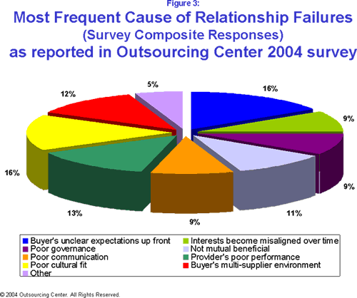
I missed National Pie Day, but while reading The Real Reason Outsourcing Continues To Fail, I encountered a pie chart that gave me indigestion. It purports to show problems with inter-cultural relationships that lead to outsourcing failures.

What’s wrong with the chart?
What’s wrong with this pretty chart, you may ask (or you may already have a good idea). Where to begin…
It’s a 3D pie chart, and we’re looking at it almost end on, so the sizes and angles are all distorted. The values are unsorted, so position around the pie doesn’t help determine relative percentages. The legend is ordered by row instead of by column, so you have to go back and forth between the pie and the legend, then back and forth between the two columns of legend entries, then if you remember, back to the pie.
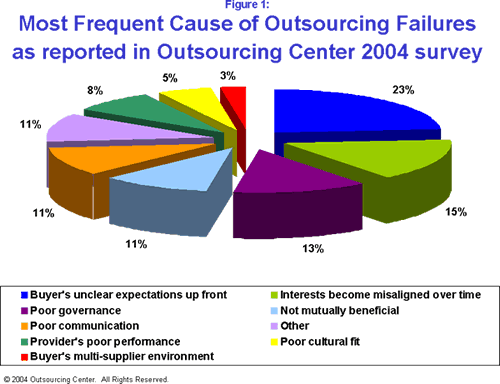
When I visited the original report that contained this chart, What Causes Outsourcing Failures?, the reason for the unsorted values became clear. Figure 1, earlier in the report, showed its slices sorted by value. Because of the severe angle you can only tell the chart is sorted because the data labels are in numerical order.

Placing “Other” in the middle of the data is unorthodox. Generally “Other” is placed at the end, because typically it’s comprised of several very small values.
Figure 3 used the same order as Figure 1, except that “Other” was placed at the end where it belongs. This consistency is not a bad thing, but it’s dwarfed by the other problems with the charts. There is another pie chart, Figure 2, which shows Least Frequent Causes of Outsourcing Failure. I’ll spare a kitten and not repost it here.
How can we make these charts better?
Let’s dispense with the 3D distortion. The circular arrangement also does not aid in understanding, especially in the unsorted Figure 3. Let’s remove the legend and put the labels right next to the points. This way, we can reduce the number of colors (which I haven’t mentioned, since it often boils down to a matter of taste).
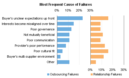
Well, that sounds to me like a bar chart, so here are bar charts of the two pies above, Figure 1 above and Figure 3 below.


Easy to read, easy to correlate label with data point, easy to see a strong variation in Figure 1 but not in Figure 3. But they take up a bit of room, don’t they? Let’s see how they look in a panel chart.

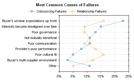
That’s good to compare the general shapes of the trends. If we’re concerned with the specific values of each category, we can even plot the data in the same space with a dot plot.


Debra Dalgleish says
Poor performance, poor communication, not mutually beneficial — those labels describe the chart pretty well.
Tony Rose says
Jon – I really like the dot plot. Honestly, the whole pie chart converting to a bar chart is wearing on me. Don’t get me wrong, it’s a great design change, but so over done at this point. So, I really like that you added the dot plot to mix it up and give readers another options that is light years ahead of a pie chart.
Note: If you [readers] are still putting pie charts into presentations or dashboards, you’re selling yourself short and playing checkers when others are playing chess.
Naomi B. Robbins says
The one nice feature of a properly drawn pie chart is that it makes it clear that the sum of the wedges is 100%. That feature is lost when you explode the wedges as done here. That adds one more answer to Jon’s question: What’s wrong with these charts?
Jeff Weir says
Poor performance, poor communication, not mutually beneficial — those labels describe my relationship pretty well. With Excel 2007.
Jon Peltier says
Tony –
It seems like 2007 has finally caught up to or overtaken all versions of Classic Excel among my customers and clients. I use 2007 for this reason, but not for my own stuff. I’m no Luddite, but I’ve analyzed my own usage patterns, so I’ll keep using 2003 until you pry it out of my cold dead hands.
Tony Rose says
Jeff, Excel 2007 isn’t perfect, but the expanded rows and averageif() formula are really nice features.
Jeff Weir says
Here’s another example for you, Jon. (Will have to download the file first)
http://cid-f380a394764ef31f.skydrive.live.com/self.aspx/.Public/Most%20frequent%20cause%20of%20charting%20failure.xlsx
Jon Peltier says
Jeff – “Where the Wild Things Are” LOL
Doug says
Jon, I think this is your best bad pie yet! I would say the presentation is the least of it – the categories themselves read like they were designed by a committee. Let’s see, did our interests become misaligned, or did we have poor communication (perhaps due to poor cultural fit) or was it just not mutually beneficial? hmmm …
Jeff Weir says
Q: What’s worse than comparing categories within a pie chart?
A: Comparing categories between 2 pie charts.
http://www.dol.govt.nz/publications/lmr/hlfs-investigation-reports/men-labour-market-downturns-2009dec/index.asp
“Manufacturing and construction are typically prone to changes in economic conditions and employ a high proportion of men (see Figure 1). In contrast, a higher proportion of women tend to be employed in publicly funded sectors such as education and health (see Figure 2).”
Jon Peltier says
Jeff –
Thanks for the link. I’m writing another post showing how a Dot Plot can be used to make the point much more clearly and succinctly. It will hit the tubes Friday.
Matt Healy says
I too will “keep using 2003 until you pry it out of my cold dead hands.”
As for pie charts, in most cases I think their creators should get pie in their faces.