ProBlogger.net recently polled its readers, to see which blog platforms were most common, and published the results in What Blogging Platforms Do We Use?
I use self-hosted WordPress, called WordPress.org in the ProBlogger results. WordPress is by far the most popular platform, with loads of features and thousands of third-party plugins, and I find it interesting that so many of the other platforms haven’t disappeared yet. I understand that some people don’t want to hassle with hosting their own blog software,which explains Blogger and WordPress.com as the next two choices. I’ve played a bit with both of these, and I can’t imagine why anyone could possibly use Blogger.
I’m not going to discuss the different platforms, though. I’m going to discuss ProBlogger’s visualizations. I’m not picking on ProBlogger, I’m just showing the type of graphic displays that are all too common, because people rely on familiar buttons in whatever charting program they use.
ProBlogger made pie charts for poll results from 2009, 2007, and 2006.

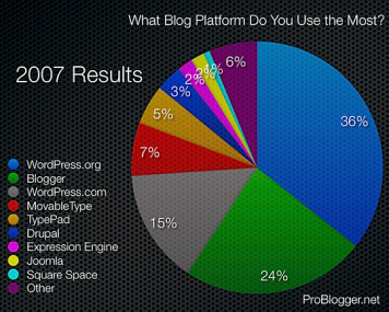

The pies are huge and ugly (these are reduced to 66% of their original size; click on the link above to see the original’s in ProBlogger’s article). The large sizes of the images forces us to scroll up and down to compare the charts. Not only are they large in pixels, the polka dot texture leads to image file sizes close to half a megabyte, or 50 kilobytes per data point (my reduced images are only around 200 KB).
Besides the unfortunate formatting, the pies suffer from several problems common in pie charts. With ten points in each chart, the last few are pretty small. (These charts do have a segment for “Other”, which a team from Microsoft even forgot.) In an attempt to make the values readable, data labels have been added to display the percentages. Of course, these labels overlap, so they fail at their intended purpose.
The corresponding bar charts are only 6 or 7 kilobytes per chart, and are easy to read. Data labels and aren’t required, because the parallel bar lengths can be compared more easily than misoriented wedge areas or angles. A legend is also unneeded: the labels in a horizontal bar chart are horizontal, thus easy to read, and positioned adjacent to the plotted data points.

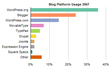
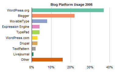
In these bar charts, the colors are not even needed. Their presence here helps to illustrate a weakness in many sets of pie charts: the colors do not refer to the same platform. This makes comparisons between years difficult, since the encoding changes from chart to chart.
This color confusion can be avoided in bar charts by using a single color for all bars. None of these monochromatic bar charts is any less informative than the corresponding multicolored bar charts above.
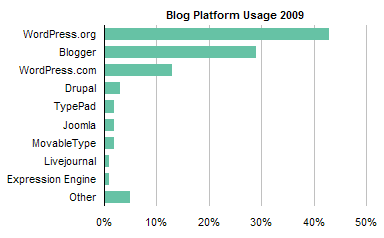

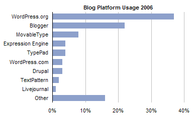
You could add data labels, but they’re not really necessary.
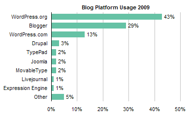
Comparisons between years is made difficult by using a separate chart for each year. With a pie you’re stuck with separate charts. Well, you could make a donut chart, but nobody can tell me this chart isn’t totally illegible:

However, you can combine ths data into a bar chart, and the result is not too awful.
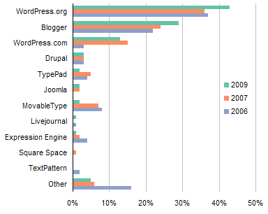
You could use a dot plot, but you lose any sense of the passage of time from year to year.

The vertical sense of time in the bar chart is contrary to the customary horizontal depiction of time. A column chart can address this, but it suffers from hard to read vertical labels.
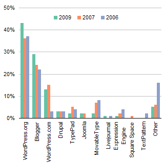
Generally, lines are better than columns at showing time series. This can be accomplished with a panel chart:
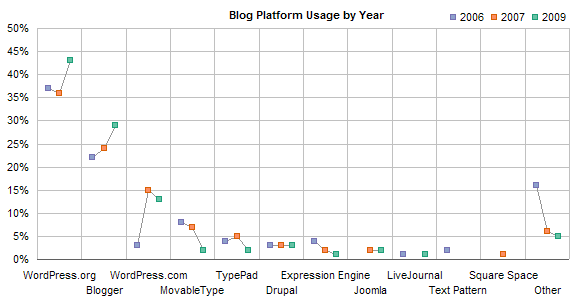
The chart above spaces the yearly data equally even though the space between the years of the last two polls is double the space between the years of the first two polls. If the polls were run in April 2006-October 2007-April 2009, this spacing is correct, but if the polls were given in the same months of each year, you may want to adjust the spacing.

From this chart we can readily compare the usage and trends in usage for several popular blog platforms, as reported by the readers of ProBlogger.net who responded to the poll. Use of the three most popular blogging platforms has increased since the first poll in 2006, while use of other platforms (those named as well as those combined into “other”) has declined.
To summarize, the blog platform poll results charts can be improved by
- Eliminating gratuitous textured formats,
- Replacing pie charts with more effective chart types, such as bars or lines,
- Combining poll results from multiple dates in a single chart, such as a panel chart.


Chandoo says
Welldone Jon.
I have often observed that even bloggers like techcrunch do not really follow simple visualization rules like this. They go for popular choices like pie chart, gradient effects and textures as if that would make the chart look totally cool. While they can argue that they are not selling charts (and hence can make lousy charts), I think there is scope for improvement.
I like your panel chart idea, but somehow it makes the comparison between platforms a bit more difficult. I would prefer a chart like this: http://chandoo.org/wp/wp-content/uploads/2008/11/excel-chart-mkt-share-data-alternative-1.png (read more here: http://chandoo.org/wp/2008/11/14/excel-charting-alternatives-market-share-data/ )
Especially if the author wants to convey the idea that one blog platform is growing over the period, then the above link would be very well suitable for that…
Thom Mitchell says
Excellent, Jon; simply excellent!
The best parts of your posts are the effective alternatives you provide. Your bar and line charts have extremely high “bang per ‘square-pixel'” information content. And if we take a ratio to the original pie charts, then we’re flirting with division by zero!
Jon Peltier says
Chandoo –
I don’t think the comparison between platforms is made more difficult by using separate panels. The ones that are close to each other are lost in the weeds at or below 5% (so who cares?), and the ones in the significant fractions are easy enough to compare. The line chart in the image you cite is reasonably effective as long as overlapping doesn’t obscure results. In contrast, the stacked chart is effective only for the top and bottom points; the slanted connecting lines don’t help much, and without the labels it would be hard to compare the values because of the variable baseline.
Incidentally, I see that I submitted a panel chart in the article you’ve cited.
Naomi B. Robbins says
Chandoo said, “I like your panel chart idea, but somehow it makes the comparison between platforms a bit more difficult.”
Panel charts, also called multipanel charts or trellis displays, plot several variables while holding others fixed. One gets more insight from the data if they are plotted more than one way by holding different variables fixed. Jon’s three bar charts make up a panel chart with the years fixed while his panel chart has the platform fixed. This pair of panel charts facilitates all comparisons.
Sorry, Chandoo, but I much prefer either of Jon’s charts mentioned above to your entry for the reasons Jon mentioned. In the stacked bar chart you are communicating through the labels since it is so difficult to compare lengths without a common baseline. I have seen plots like your left one that were a tangled mess.
Chandoo says
@Jon: “The line chart in the image you cite is reasonably effective as long as overlapping doesn’t obscure results. In contrast, the stacked chart is effective only for the top and bottom points; the slanted connecting lines don’t help much, and without the labels it would be hard to compare the values because of the variable baseline.”
Having the same baseline when comparing multiple values across several time periods is a tricky issue. It boils down to selecting the right chart for the situation (and the message you want convey). I think panel charts, some variations of stacked charts and may be animated versions of charts are much better than a bunch of pies on any day.
“Incidentally, I see that I submitted a panel chart in the article you’ve cited.”
Of course it is yours… almost 6 months ago.. :)
@Naomi: “I have seen plots like your left one that were a tangled mess.”
Have to agree with you. There is a time and place for every chart, when misused even a bar chart (which is more or less harmless and simple) can be a disaster. On the second thoughts, may be the chart I suggested would be very messy given that there are 12 different blogging platforms.
Jon Peltier says
Here are “official” panel charts, combining the bar charts I used. First, the data for the platforms cited for each year, in decreasing order within each year.
Second, the data for all platforms, in decreasing order by 2009 value.
Jon Peltier says
Chandoo – Some of the mess in your line chart could be ignored since the clutter is concentrated in the <=5% region (“who cares?”) at the bottom of the chart.
Gary says
Those final panel charts are simply beautiful!
Michael Pierce says
I definitely like the line panel charts the best. They allow me to compare relative strength of the major platforms as well as understand some of the trends. Although, I ultimately like having the bar charts in conjunction with the panel chart to better understand the complete picture.
It’s really unfortunate that the 2008 data is missing. As well, it’s too bad that data points are missing for specific platforms in various years; presumably they are lost in the “other” category.
Jon Peltier says
Michael – I don’t think the 2008 data is “missing”, I think there was never a 2008 poll. Probably the blogger woke up one day in 2006 and said, “Let’s do a poll”. Then twice since then, the blogger woke up and said, “What should I write about…? I know! Another poll.” The time between polls was probably not systematic, the population size may have been all 200 readers that got his feed on the day of the poll.
Naomi B. Robbins says
Two principles of effective graphs are:
1. Order by size rather than alphabetically.
2. Use consistent ordering when comparing charts.
The top chart of Jon’s panel bar charts follows the first principle; the bottom follows the second. There are times when there is only room for one chart. My advice when two principles conflict with one another is to choose the one that is least likely to confuse the reader. Since some readers might not notice that the ordering has changed in the top set, I would choose the bottom one if forced to only use one of these two. The bottom one also highlights the fact that the share for some platforms such as movable type were quite different in 2006 and 7 from 2009.
These comments just apply to the case where the year is held fixed; I like also showing the line graph with the platform held fixed.
Michael Pierce says
Jon, you’re right. As I looked at the original blog post over on ProBlogger, 2008 isn’t missing just a very odd interval was used between polls: January 2006, November 2007 and May 2009.
Jon Peltier says
Naomi –
I prefer the second panel bar chart, which keeps the platforms in the same order. I preferred this one before I even drew the chart, because the mixed up order of platforms in the original pie charts caused me some initial confusion.. The platforms are sorted by total value in all four years in the panel line charts, because that’s how the Excel pivot table I used sorted them. The bar charts were done more manually, so they might use that order, or the order of platforms in 2009.
Jorge Camoes says
Jon, great job. I would aggregate all those small platforms because they just add noise and probably are not correctly sampled.
I think that copy writing and data visualization share some basic principles, but when it comes to applying those principles something is lost in translation.
It would be interesting to link Darren’s charts to his own advices on writing and managing a blog, and show how these charts fail to apply those principles.
Can you guess what charting tool he’s using? Bloggers-about-blogging and internet marketers seem to love it, and I see that background all the time…
Jon Peltier says
Jorge –
Darren uses WordPress for ProBlogger. I thought he was one of the many users of the Thesis theme too, but I see a link to a designer in the footer of the page. I’ll be using Thesis, too, when I get a chance to implement it.
Good point about copyrighting and graphics having similar purposes, and how his graphical treatment here worked against his otherwise good writing.
Colin Banfield says
The panel bars are definitely better than the panel lines. The missing 2008 data means that the trends shown in line charts are misleading (e.g. for WordPress.org, there could have been a dip in 2008 before the rise in 2009). However, you could get around the problem by using markers only or showing no line (or perhaps a dotted line) between 2007 and 2009.
As to the question of which of the panel bars is the better option, I think that it depends on how the data was collected. For a one-time (static) chart with manual collection and arrangement of the data, I agree that the botton panel bar might be better. However, if the data is the result of a database query, then you can’t presume the list, and the first panel bar is the only option (you’d somehow have to alert the reader that the list of platforms aren’t the same from one year to the next).
One other thing. Suppose that one or more or the platform makers went out of business. For example, if the makers of TextPattern went out of business sometime in 2007, would it make sense to show this platform in 2007 and subsequent years?
Jon Peltier says
Colin –
I was more interested in the year-to-year trend, so I liked the line panels better, though both have their place. There was no missing 2008 data, by the way: someone confirmed that the spacing of the surveys was early 2006, late 2007, early 2009, so 18 months or so between data sets. I wouldn’t bother with dotted lines in the case of uneven intervals, unless I knew for sure there was missing survey data, or if the gap was substantially wider than the time between other surveys.
I’d guess that the platforms that had no charted data some years actually had around 1%. The data seems to have been cut off arbitrarily at the 9th platform. I would have tried to plot the platforms with the largest combined values, and plotted them in all years. If you don’t know what the small value is you could always apply “N/A” or a similar label. If one of the featured ones went belly up, I’d have used zero, if the overall total was enough for its inclusion. In fact, I would probably have shown only WordPress.org through Expression Engine, and included more into Other. More room for labels, less worrying about the missing values: were they around 1% or did they signify going out of business, because compared to the rest, who cares?
Jon Peltier says
Here are the bar panel charts after removing more of the platforms to “Other”.
The more I see the one on the left with the rearranged order of categories, the less comfortable I am with it.
Colin Banfield says
Jon, with the clarification, the line panel chart makes good sense. To avoid misinterpretation, month and year should have been indicated in the original pie chart (so that the 18-month interval is clear). Normally, when you plot years on a chart, it’s assumed that the whole year is being considered.
Agree with the other changes. With this level of analysis, who cares about the platforms with very small market share? If anyone is interested, a separate chart of “other,” broken down into individual platforms, can be created. Good work as usual.