I’ve been obsessed with maps since I was a kid. One of my favorite magazines is National Geographic, and my favorite issues are the ones with a large folded map. I can waste spend hours on a well-designed map. The National Geographic maps generally have a modern physical map on one side, showing geological and political details, and the reverse is often an historical perspective, showing how different cultures have interacted in the region. (I’m also interested in archaeology, both anthropological and paleontological.)
Google got into maps long after we’d been using MapQuest, taking the search analogy beyond web pages to physical locations. Google started showing aerial and satellite photographs of the mapped regions some time after Microsoft introduced us to them with its TerraServer. I don’t know whether Google is using the same data or if they’ve launched their own satellites. Google’s trip calculators became very powerful when they introduced the ability to drag points on the route to other roads, recalculating based on the new selections. And now Google Earth allows us to view information in amazing 3D virtual globe representations.
In this article I will review some work done on these visualizations, and discuss criticisms of this work.
Google Earth Visualizations
Google offers at least a couple different visualizations based on embellishments to globes. Notable are the 3D Prism Map and the 3D Proportional Symbols.
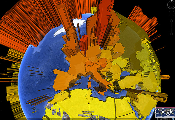
Google Earth 3D Prism Map, from 1.
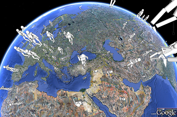
Google Earth 3D Proportional Symbols, from 1.
Very pretty, aren’t they? But are they effective ways to display information?
I will concentrate my discussion on the prism maps. I’ve already blogged about the use of proportional symbols in Bad Bar Chart Practices, or Send in the Clowns. That discussion applies here, with the additional problem that the 3D versions have with varying orientation of the symbols.
All About 3D Prism Maps
This isn’t really all about these visualizations, it’s mainly about one person’s obsession with them. Bjørn Sandvik loves 3D prism maps. He writes code and blog articles relating to them.
Bjørn shows us a chloropleth, that is, a color-coded map or globe, in this case a globe showing infant mortality statistics for Africa and surrounding regions. It shows Africa pretty well, without too much distortion as the viewpoint moves from countries directly below the observer to those which are further away along the earth’s curvature.
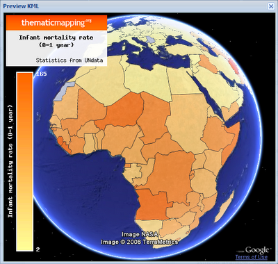
Chloropleth: Infant Mortality in African Countries, from 2b.
If you really want to compare the numbers, you can’t go wrong with a simple bar chart.
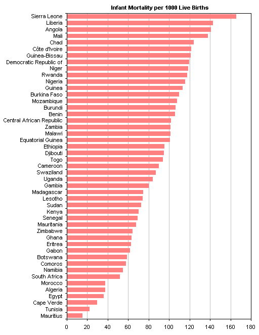
Seeing the map helps to identify particular regions with high or low mortality rates. The best solution would be side by side map and bar chart.
Well, the map isn’t very sexy, and the bar chart is a definite turn-off, although Dr. Mark Harrower of Axis Maps [1] says that “nothing is fundamentally wrong with our proven and highly efficient planimetric thematic maps.”
To add a little excitement, Bjørn extrudes hot magma outward from the earth’s core, through a hole in the earth’s crust shaped like each country, to an altitude representing the number of infant deaths per 1000 live births in that country.
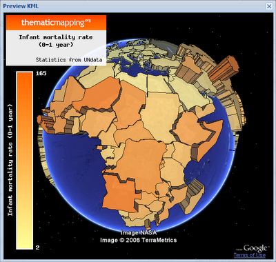
Prism: Infant Mortality in African Countries, from 2a.
Now that’s cool, I think, but it’s no longer easy to recognize the geographic boundaries, let alone determine what the relative heights of the odd-shaped prisms are.
Proportional Symbols, Warts and All
I wasn’t going to talk about proportional symbols, but Here is one that I had to share.

Warts, Pimples, and Goosebumps, from 2d.
Bjørn assures us that the dome shape allows people to judge their volumes. The problems are that (1) people are not particularly good at estimating volumes, and (2) the apparent diameters for a given volume change as the domes move further away along the curve of the globe’s surface.
UUhat in the UUorld?
A group called UUorld Inc. implores us to “Explain the world with maps”. Their maps are extruded prisms also, as shown in these maps of unemployment rate by state. I think simple bar or line charts would be as effective.
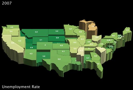
Unemployment Rate by State in 2007, from 3a.

Unemployment Rate by State in 2008, from 3a.
In another pair of charts, UUorld shows eligibility by state for certain federal tax cuts. The 3D chart does not show the data any better than the 2D, and the 2D chart doesn’t forget that Montana is a state too.

Eligibility for Tax Cuts, from 3b.

Eligibility for Tax Cuts, from 3b.
Many of the problems described below apply to the UUorld graphics, especially the occlusion of shorter blocks by taller ones. UUorld likes to animate their models while rotating them, which replaces the problem of occlusion with one of vertigo.
The Problem With Prisms
This representation has a number of problems, some of which Bjørn himself admits. According to Dr. Mark Harrower of Axis Maps [1], the approach has these limitations:
- Visual occlusion (not all of the map can be seen at once since some places hide others)
- People suck at estimating volumes, especially of complex shapes (e.g., try estimating the size of moving van you’ll need for your home)
- Mental rotation of complex shapes is extremely hard, so hard that it is often used as a measure of intelligence in IQ tests.
- Lack of a zero-line referent makes it hard to judge absolute magnitudes.
- The “fish eye lens” effect mean each prism is viewed from a different angle than its neighbors, making comparison just a little bit harder as we have to mental account for these differences in our estimates.
- It is hard to judge the height of something when you are staring directly down at it.
Dr. Harrower says that the prism charts are a prime example of chart junk:
Chart junk takes what should have been a simple-to-read graphic and makes extracting information (1) slower, (2) more difficult, and (3) more prone to reading errors, because of excessive ornamentation and unnecessary design additions—like adding a 3D effect that communicates nothing in and of itself but simply “looks cool.”
Dr. Harrower calls these charts a “technology in search of a problem”. The 3D graphical technology is very advanced and look very cool. But being cool is a poor justification for using graphical techniques which do not improve the ability to understand a chart’s data. And “nothing is fundamentally wrong with” the existing techniques, so there is no problem to be solved.
Bjørn reminds us that the 3D prisms make country comparison easier when spinning the globe.
For me, the need to spin the globe to see all of the data is a severe drawback. I want it all, and I want it now. I don’t want to have to turn over my map to see more information, and lose sight of information on the first page. It should all be visible at one time.
Bjørn gives us a flat representation instead of the globe, but he is fiercely reluctant to give up his extruded prisms.
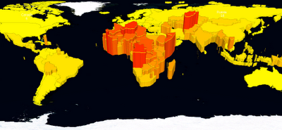
Flattened 3D Prisms, from 2a.
This view remedies one deficiency with the 3D prisms, while retaining all others. For example, I don’t think I can see Egypt on this map.
Bjørn shares a few more prisms, which further illustrate the problems with prisms. This one shows life expectancy in countries around southern Asia.

Prism: Life Expectancy, from 2c.
Well, there’s a problem: the prism for Afghanistan is so short that it is obscured by Pakistan. No problem, just change the view, right? Let’s center the view on Afghanistan. This has the primary effect of adding a very wide border around Afghanistan.

Prism: Life Expectancy at High Viewing Elevation, from 2c.
Bjørn adds an additional redundant scale, using color to help us when we can’t judge the height of the prisms.

Prism: Life Expectancy, Color Coded, from 2c.
This merely raises the question, Why not dispense with the prism height metaphor and stick to color-coded countries? In fact, why not use a bar chart to show the values?
To these criticisms of 3D prism maps Bjørn replies, “In conclusion, country comparisons are problematic on a 3D globe, but it shouldn’t stop us from doing it!” [2a] And he insists that Virtual Globes are a good idea for thematic mapping.
So he’ll keep doing his cool thing, and Dr. Harrower will go on making readable maps.
1. Dr. Mark Harrower, Axis Maps, Virtual Globes are a seriously bad idea for thematic mapping.
2. Bjørn Sandvik
2.a. Why 3D works #1: Looking on the other side
2.b. Why 3D works #2: It’s all about prisms
2.c. Why 3D works #3: Mother Earth gives us a clue
2.d. Why 3D is not working #4: Am I sacrificing accuracy for eye candy?
3. UUorld, Inc.
3.a. US Unemployment in 2009 – More Job Losses in Production
3.b. The Obama Stimulus Package, State by State


Mike Woodhouse says
“Very pretty, aren’t they? But are they effective ways to display information?”
Indeed. If Tufte were dead, he’d be spinning in his grave. I went from “Wow” to “what can it tell me” to “WTF” in short order.
Both the Google and UUorld creations reek of solutions in search of problems.
Now if Google can give us cartograms, ideally in Google Charts, then I might be a little more excited. Actually, I think I’d be very excited indeed.
Liu 's chart blog says
Though I like data map , I still think all this maps are too fancy ,in our words , 形式大于内容,only the 2D map is acceptable .
cybpsych says
hi jon,
good post here.
I just read a new report from Akamai tittled “The State of the Internet”. Link: http://www.akamai.com/stateoftheinternet/
On this page, it has some flashy heatmap maps covering all the continents.
If you download the Q4’2008 report, on the 2nd page (where the globe ‘shines’), the caption stated this “The “spinning globe” featured in the Akamai NOCC represents where Akamai servers are located and how much traffic they are seeing.”
Again, nice to look, but hard to digest the data ;)
Anonymous says
yuk!
Tim Wilson says
Wow. Great analysis! So, there is value in using a map overlay when you’re looking at data by geography. IF the geography is a truly meaningful dimension of the data. Looking at a map showing red/blue states or counties after an election can yield some useful insights. And, if the consumers of the information are in the U.S., and have the typical world geographic literacy from the U.S. public education system, you really DO need a map if you’re looking beyond North America! One little lightbulb that went on for me as I read this post has to do with how/why “3D” is so often a bad idea in data visualization. It’s because, even though we refer to these as being “3D representations,” they’re not — they’re 2D representations rendered to look 3D. I wonder what a truly 3D globe with mortality-rates-by-country-height would do for me. Maybe that would be effective? I don’t remember if it was in a Tufte book or if I just saw it somewhere, but there was the guy a couple hundred years ago who plotted a graph of temperature over the course of the day on a thin piece of wood, and did that every day over the course of the year. Then, he cut out each piece of wood and glued them together. It was a truly 3D visualization…and it worked! But, 3D in a 2D medium is pretty much always a stinker.
Bjørn Sandvik says
Hi Jon,
Thanks for joining the discussion. A few clarifications from my side:
“Bjørn assures us that the dome shape allows people to judge their volumes.”
Wrong. I’m only saying that volume of each symbol are calculated according to a statistical value. I do acknowledge that people are not particularly good at estimating volumes, especially when seen in perspective. It’s one degree harder for the viewer to assess the relative size of 3-dimensional symbols compared to 2-dimensional, which again is harder to compare to 1-dimensional.
http://blog.thematicmapping.org/2008/06/why-3d-is-not-working-4-is-it-only-eye.html
http://blog.thematicmapping.org/2008/06/proportional-symbols-in-three.html
“Bjørn reminds us that the 3D prisms make country comparison easier when spinning the globe.”
Wrong. I’ve said that the ability to compare all countries is lost when thematic maps are rendered on a globe. Still there are various ways to address this issue:
http://blog.thematicmapping.org/2008/06/why-3d-works-1-looking-on-other-side.html
Jon Peltier says
I made this statement:
“Bjørn assures us that the dome shape allows people to judge their volumes.”
After reading this statement:
“At least, the dome shape makes it possible to calculate the volume of each object, as the volume should represent the statistical value.”
Your statement did not clarify that you meant is is possible for the computational software to calculate the size of a bubble based on a value. It reads as if the already displayed dome shape is easy for people to calculate its volume.
I said this:
“Bjørn reminds us that the 3D prisms make country comparison easier when spinning the globe.”
After reading this:
“I’m using two visual variables (colour and height) to represent the same statistical indicator. This makes country comparison easier when spinning the globe.”
On re-reading your statement, I see that the different colors makes it possible to make sense out of the prism heights. Which again raises the question:
If you have two display features (color and prism height) which encode the same variable, and one of these is difficult to interpret (the prism heights), why not use a single feature which is easy to read?
You’ve admitted in several statements that the prism construction has shortcomings in terms of comprehensibility, and you have not satisfactorily explained what advantages it has. So the only reason I can think of to persist in using these is that you’ve develped a technology (in search of a problem) and are looking for problems that it helps to address. So far you have been looking unsuccessfully, since the basic chloropleth is superior.
Bjørn Sandvik says
Hi Jon,
From Slocum et al., 2005 (“Thematic Cartography and geographic visualization”), page 70:
“Use of perspective height produces what is commonly termed a prism map. In Figure 4.11 note that perspective height is the only visual variable receiving a “good” rating for numerical data. The justification is that an unclassed map based on perspective height can portray ratios correctly (a date value twice as large as another will be represented by a prism twice as high), and that readers perceive the height of resulting prisms as ratios.”
Slocum recommends lightness and hue as visual variables for nominal and ordinal data, and perspective height for numerical data (ratios).
Jon Peltier says
“. . . and that readers perceive the height of resulting prisms as ratios.”
Which assumes that readers can see the baseline, which is not likely for a landlocked country. If you care at all about showing actual values and ratios, you have to give up the paradigm of charting values on a map/globe, and placing values into something like a bar chart. Use a chloropleth to show people the geographic relationships (that is, to show regional effects that encompass multiple countries), then use a bar chart with data sorted by a meaningful factor (by value of the target or other variable, not by spelling of country name).
Bjørn Sandvik says
I’m also working on various chart representation for statistical data. I’m giving the user the possibility to choose between bar chart, 2-D map, 3-D prism map, and a table.
A 3-D prism map can reveal patterns not so easily discovered in a traditional choropleth or a bar chart.
Jon Peltier says
I’ve yet to see patterns in a prism-enhanced globe or map that could not be shown more clearly using simpler approaches. If you have any, please share them, and I’ll admit that I was wrong.
Bjørn Sandvik says
Hi!
I’ll add some examples on my blog.
Bjørn