In Conditional Formatting of Excel Charts I showed how to simulate conditionally formatting in your charts charts. The trick is to set up ranges containing formulas for each of the conditions, so that if the condition for that range is met, the value will be plotted in the appropriately formatted chart series. Otherwise it doesn’t appear in the chart, but a differently formatted point will.
In most cases the technique in the cited article is the best approach, since it does not use VBA and it updates with the speed of Excel formulas. Sometimes, though, you need a VBA solution.
Prepare for VBA Formatting
In a worksheet named “ColorSheet”, I have set up a range that has row headers corresponding to the category labels I expect to encounter, and column headers corresponding to values I want to use as cut-offs for conditional formatting. The cell at the intersection of the category label row and value column is formatted in the way I want the chart’s data to be formatted. For example, a point with a category label of Alpha will be some shade of blue, while a point labeled Eta will be orange. The shade of the color used is lighter for smaller values and darker for larger values. I have included a label “other” in case an unexpected label is found, and a value of “above” in case the maximum in the table is exceeded. The light shades might be too light, and in any case, shades of color shouldn’t be expected to provide much resolution when encoding information.
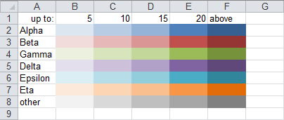
Naturally, your labels and values will be different, and in fact you may need more complicated algorithms in the code.
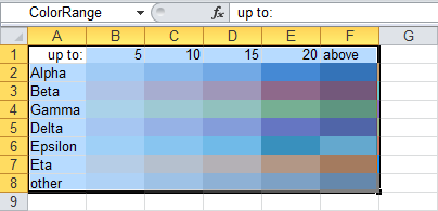
I’ve named this region “ColorRange”. Note that this name appears in the Name Box above column A when the range is selected.
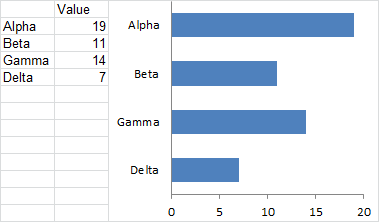
Here is my data and chart. The bars have the default formatting for series 1.
Apply Formatting by Running the VBA Code
Here is the chart after running the FormatPointByCategoryAndValue procedure.
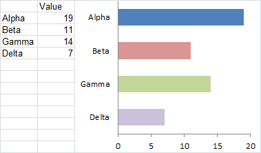
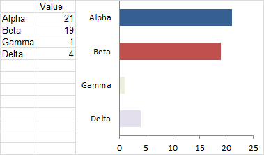
After changing the values and rerunning the procedure, the chart’s bars keep their color, though the shades have become lighter or darker. The light green for Gamma is too light to distinguish from gray, and almost too light to see at all. I should probably go back and darken all of the lighter shades.
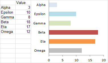
Now all of the data has changed, and in fact, more data is plotted in the chart. The code still works as expected. Note the Omega series, which is colored gray because that label was not included in the original color table.
The VBA Procedure
The code is not too complicated. After the declarations (Dim and Consts) the first thing that the code does is abort if the user has not selected a chart (a little extra effort is always well-spent if it that a run time error). There is a line of code which, if uncommented, will remind the user to select a chart by showing this dialog:

Then the range containing the colors is identified and its values put into an array to make the values easier to work with.
The first series of the active chart is defined as the series we are formatting. The category labels (XValues) and values (Values) are put into arrays, also for ease of processing.
The code then looks at each point’s value and label, to determine which cell has the desired formatting. The rows and columns are looped starting at 2, since the first of each contains an irrelevant label. The looping stops one count before the end. If a match is not found, the loop counter points to the last row or column.
Finally the point is given the same fill color as the matching cell in the color table. Note that there are two sets of syntax, one for Classic Excel (2003 and earlier) and the other for Neo Excel (2007 and later). I’ve commented out the 2003 syntax, because I now use 2010 for most of my outward-facing work.
Sub FormatPointByCategoryAndValue()
  Dim rColor As Range
  Dim vColor As Variant
  Dim srsColor As Series
  Dim iRow As Long
  Dim iCol As Long
  Dim iPoint As Long
  Dim vCategories As Variant
  Dim vValues As Variant

  Const sColorSheetName As String = "ColorSheet"
  Const sColorRangeName As String = "ColorRange"

  If ActiveChart Is Nothing Then
    ' uncomment following line to alert user
    'MsgBox "Select a chart and try again.", vbExclamation, _
        "No Active Chart"
    GoTo ExitHere
  End If

  Set rColor = Worksheets(sColorSheetName).Range(sColorRangeName)
  vColor = rColor.Value

  Set srsColor = ActiveChart.SeriesCollection(1)

  With srsColor
    vCategories = .XValues
    vValues = .Values

    ' cycle through points
    For iPoint = 1 To .Points.Count
      ' find category (row)
      For iRow = LBound(vColor, 1) + 1 To UBound(vColor, 1) - 1
        If vCategories(iPoint) = vColor(iRow, 1) Then Exit For
      Next

      ' find value (column)
      For iCol = LBound(vColor, 2) + 1 To UBound(vColor, 2) - 1
        If vValues(iPoint) <= vColor(1, iCol) Then Exit For
      Next

      ' apply color of identified cell to given point
      ' Excel 2007+ syntax
      .Points(iPoint).Format.Fill.ForeColor.RGB = _
          rColor.Cells(iRow, iCol).Interior.Color

      ' Excel 2003- syntax
      '.Points(iPoint).Interior.ColorIndex = _
          rColor.Cells(iRow, iCol).Interior.ColorIndex
    Next
  End With

ExitHere:

End Sub
To run the procedure, select the chart, then press Alt+F8, select FormatPointByCategoryAndValue, and click Run.

Related Articles about VBA Conditional Formatting of Charts
- VBA Conditional Formatting of Charts by Series Name
- VBA Conditional Formatting of Charts by Value
- VBA Conditional Formatting of Charts by Category Label
- Conditional Formatting of Lines in an Excel Line Chart Using VBA


Matt says
This way of coloring the columns is very useful for a dynamic Dashboard I am creating these days. Thanks to you I will probably finish it ahead of schedule!
One thing though for newbies like me:
you have to change the name of the sheet to ColorSheet (or rename it in the VBcode) in order to make it work.
Planilhas Excel says
Your site has very good information for improving one’s charts, congratulations!
Rajendra says
Hi,
I am a newbie to VBA and working on creating a dynamic chart where in the starting cell changes. Here is an explanation.
I have a chart that displays several columns of data for rows 2:84. Whenever
I insert a new row #2, the new data range for the chart is now 3:85. How do I
keep a static data range for my chart (2:84) whenever I insert new rows into
the workbook?
I have tried editing $A$2:$E$84 to A2:E84 and then saving the changes …
but it is an excercise in futility, it always reverts back to $A$2:$E$84.
Jon Peltier says
Rajendra –
Check these articles:
Easy Dynamic Charts Using Lists or Tables
Dynamic Chart Source Data
Victor says
Hi Jon
Love your material on charting, and this article is no exception.
What WordPress plugin did you use to get your VBA code to display black with green comments? It looks really neat. Or did you achieve that some other way rather than using a plugin.
I’ve been experimenting with WP syntax highlighter plugins on my own blog, but haven’t found such a clean-looking solution. For example you can see some code on this article that was created with the SyntaxHighlighter plugin:
http://www.launchexcel.com/google-maps-excel-demo/
Cheers,
Victor
Jon Peltier says
Hi Victor –
There’s no magic in the code samples. It’s just manually applied CSS & HTML. I haven’t found a code highlighter that I didn’t hate, though I stopped looking some time ago.
Wu says
For the horizontal bar chart, I have a question: take the above chart as an example, the name list of the data is “alpha, beta, gamma, delta”, but in the chart, the order of the vertical lables changes as “delta,alpha, beta, gamma”. How can I keep the same order as in the data table?
Thanks!
Jon Peltier says
Wu –
I don’t see the chart you’re referencing. By data table, are you referring to the data that the chart uses as its source? The chart will use the same order as its source data, though in some cases it will be the reverse of this. If you sort this data, the chart will reflect the sorted order. Or are you referring to the range that has the labels and the colors? The order in this range has no relation to the order of the data.
Wu says
The table and chart I refered to is the one under the color table-under line”Here is my data and chart. The bars have the default formatting for series 1.”
Like you said, it is possible that the order might be reversed in the chart. Could you let me know whether there is a way to fix it when the reverse happens?
Thanks!
Jon Peltier says
Wu –
In the chart you mention, the labels are in the same order, so I thought you were referring to something else.
To fix the reversed axis, see Why Are My Excel Bar Chart Categories Backwards?
Kevin says
You are a god. You have saved me hours and hours of work. Thank you so much.
JDC says
I’m trying to conditionally format pivot charts to show significance. Is there a way to do this so that an asterisk would be put at the end of any bar if it was determined to be statistically significant?
Jon Peltier says
JDC –
There’s no built-in way to do this. You could put formulas into a range that show an asterix if a linked value in the pivot table exceeds a target value or nothing otherwise:
=if(C6>$D$1,”*”,””)
then use a third-party app like Rob Bovey’s Chart Labeler (appspro.com) to add labels from this range to the series of bars.