A reader commented on the previous post, Chart with a Dual Category Axis, asking whether I’d use a Pareto chart for this data. I commented that it almost was a Pareto chart, since at least within each category the data is sorted from high to low. Then I got to thinking, if I put my data into a table, and use a pivot table to sort both the main category and sub category by number of defects, I would essentially have a Pareto chart.
A Pareto chart is a column or bar chart that lists items in decreasing order of their occurrence. A Pareto chart may include a line chart series showing the cumulative occurrence of the items. The left-most items are most prevalent, so if your Pareto chart shows instances of failure modes, you start fixing the left-most failure modes first.
This post was revised on 26 March 2022.
Data
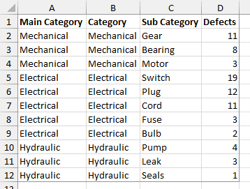
Here is my data table. The main category data from the first column is duplicated in the second for reasons which will become clear when you try to use the category in two places in the pivot table.
Pivot Table
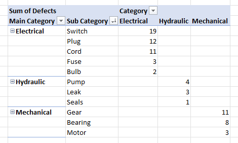
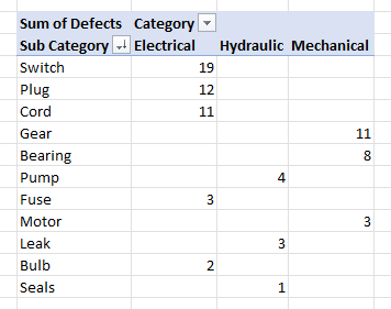
Select the data and insert a pivot table. Put the Main Category and Sub Category fields into the rows area, the Category field into the columns area, and the Defects field (Sum of Defects) into the data area. Click the filter button on the Sub Category field header, choose Custom Sort; in the Sort dialog, select Descending (Z to A), and in the dropdown select Sum of Defects. This Pivot Table uses the Tabular layout, which I prefer.
The compact (shown below) and outline layouts work just as well, and the pivot chart comes out the same.
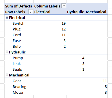
The data arrangement in the tabular layout looks very much like what I set up manually in the last post.
Pivot Chart
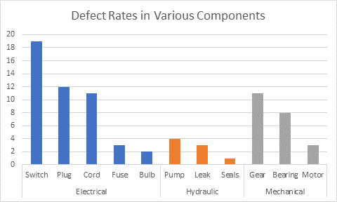
Now you can make a pivot chart from the data, using the stacked column chart type.
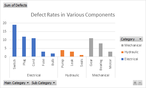
You can clean up the chart by hiding the pivot chart field buttons: right-click on any of the buttons, and choose Hide All Field Buttons on Chart. You can also delete the legend, which is redundant given the outer level of category axis labels.
Regular Chart
I often will make a regular chart from my pivot data, as long as the pivot table isn’t going to change its shape too much. You need to use the Pivot Table’s tabular layout for the category axis to work out properly. The protocol is described in Making Regular Charts from Pivot Tables, and the result is the same as the chart above.
The advantage of the regular chart is that you have full control over all formatting, and over the data used in the chart. The disadvantage is that if the pivot data changes and the pivot table is refreshed or repivoted, the pivot table may cover a different range, and the chart will plot the original range. If the data changes a lot, you will have to (a) update the chart source data links manually, (b) design some clever dynamic range definitions so the links automatically keep pointing to the correct range, or (c) write a VBA procedure to update the chart’s links. This last option is pretty tricky to set up but saves lots of time and frustration in the long run.
Want a “Regular” Pareto Chart
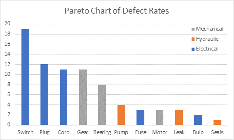
If you want a Pareto chart with a single sorted set of bars in your chart, simplify the Pivot Table, and leave out the Main Category field. Sort Sub Category by Sum of Defects, the same as before. Since there is only the Sub Category column of labels, the chart’s category axis will have only one set of labels.
Create a chart and remove the pivot field buttons, like before. Keep the legend, to identify the colored bars.
Second in a series
- Chart with a Dual Category Axis
- Using Pivot Table Data for a Chart with a Dual Category Axis
- Dynamic Chart using Pivot Table and Range Names
- Dynamic Chart using Pivot Table and VBA


Jon Peltier says
Tony –
Thanks for the comment. Pivot tables are really very powerful, flexible, and fast. They’ve received an upgrade in Excel 2007, but I haven’t played with the new ones enough yet to say anything profound. Pivot charts are powerful in their own right, but inflexible. They’ve also gotten an upgrade in Excel 2007, and even the ones I made for this post didn’t annoy me as much as I recall from the old days (perhaps the new color palette is more of an improvement than I thought).
Stay tuned, because I have two more posts coming. One will show how to use dynamic names in the worksheet to update a chart when the pivot table is updated (this works in cases where the number of series does not change), and the next will show how to use VBA for cases when the names won’t do it.
Tony says
Well said! The only thing I may add is a description of what a Pareto chart is and how it is different than a regular column chart in case any readers aren’t familiar with the term. One common use of a Pareto is in Six Sigma for DPMO (defects per million opportunities).
I am not a fan of the pivot table charting feature because of the same reasons you stated, but I am a huge pivot table fan! I will create a separate version with a custom chart like you created. The power of a pivot is the ability to refresh it to update the data while keeping the same visualization. If you have to recreate the chart, with all the customization every time, it will be very tedious.
Great follow up post!
Anonymous says
well you can do the chart on getpivotdata information and than you can have complete flexibility
Eric says
Hi Anon,
Could you elaborate on that?
Do you mean make a chart, based on a table, based on GetPivotData? If so, how would that be dynamic (without VBA)?
Leila says
How can I create 2 pivotCharts that contain different data on one worksheet?
Jon Peltier says
Leila –
I don’t really understand the question.
A pivot chart by definition contains all the data from one pivot table.
You can create the pivot charts (in Excel 2003 & earlier they are added as separate chart sheets) and change their location to objects on the same worksheet.
The pivot table that a pivot chart uses can be located on any worksheet, and multiple pivot tables can exist on a single worksheet.
tannaz says
hi,
I wonder how we can add error bars? i tried once but only i could add error bars on first categories,but in second and third categories i could not see any error bars!!!
Niper says
Hello, great articles on Dynamic Pviot Graphs, are these spreadsheets downloadable anywhere?
Jon Peltier says
Only a few of these tutorials are accompanied by workbooks.
Anon2 says
Hi Jon,
Is it possible to set the Y-axis to min and max value in the chart?
Thanks.
Jon Peltier says
You can manually set the min and max to whatever you want. Right click the axis and choose Format from the pop up menu.
Kate says
Hi,
I am working at a venue/theater with 5 “Rings” (levels/tiers). Under each RIng, you can purchase reserved seating. How do I create a pivot table to determine how many reserved seats are in each Ring? How do I create a pivot table so that I know what seats are remaining for general seating and so that I know how many are reserved in each Ring? I’m sure it’s simple, but for some reason, this has me stumped!
I hope this makes sense!
Zach says
I am creating an admin dashboard (in excel) that makes calculations based off work order information like completion date. (This data is imported daily.) I want to create a YTD chart of our three different types of work orders by qty. using a pivot table. Is there a way to have the horizontal axis of the plot show all months that will be in the fiscal year (to keep plot proportions the same over time), even though I don’t have any data for those months yet?
Jon Peltier says
Zach –
You need to configure the appropriate fields of the pivot table to show items with no data, so the missing months appear in the pivot table. Then they will appear in the chart.
Tom Williams says
I’m using Excel Home & Student 2016 and I finally got the two columns under Sum of Defects but I cannot see how you got the sort order shown in the article. If I click on a value under the Mechanical category (for example) and sort large to small it changes the order under the other categories. It would be helpful to know what version of Excel produces your example as the default behavior and even MORE HELPFULl if you could document how to reproduce your example in other versions. The steps you mention just don’t produce the example and I have tried dozens of variation of the steps you listed. BTW thanks for great articles!
Jon Peltier says
Hi Tom –
Thanks for bringing this ancient post to my attention. I first wrote it using Excel 2003 or 2007, but now I’m using Microsoft 365, which has additional Pivot Table features.
I’ve also added some details on constructing the Pivot Table. To sort, you need to use a custom sort of the Sub Category field, by Sum of Defects. Excel’s default Pivot Table style is the compact layout, but I prefer the tabular layout, which was the only layout available when I wrote the article. You can change the Pivot Table default layout and many other defaults in File > Options > Data.