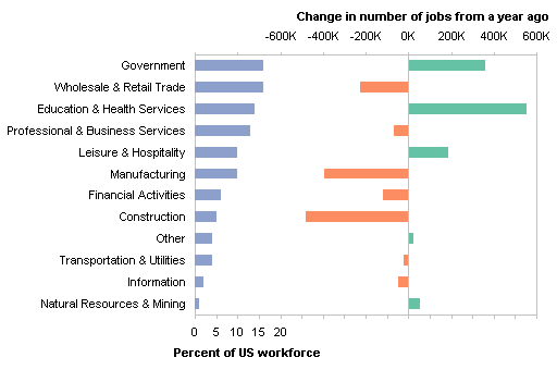
In US Employment Slump Chart I used a panel column chart to display the size of nonfarm sectors of the US workforce and the change in number of jobs in each sector. It is a panel chart even though the percent of workforce and job change panels are not separated by a line. The white space separates the panels sufficiently.

In a comment to that earlier post, Bob asked if I would show the steps required to create this chart. Bob, this Bud’s for you.
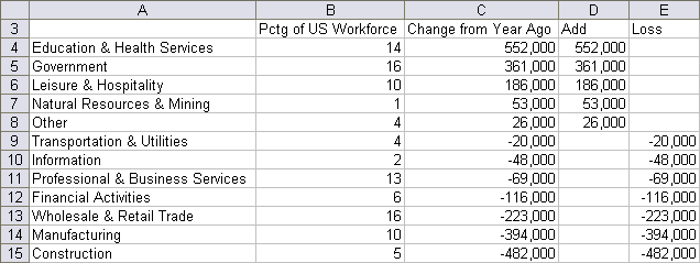
This is what I used for the chart data. I have separated the job change numbers in column C into negative and positive numbers in columns D and E.

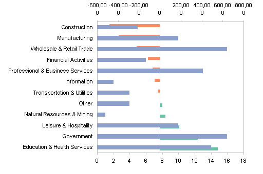
I selected A3:B15, held Ctrl while selecting C3:E15 so both areas were selected, and created a clustered bar chart with three series. The percentage of workforce bars don’t show up because their values are so much smaller than the job numbers.

I selected the percentage of workforce series by selecting a different series and clicking the arrow key once or twice, and moved the series to the secondary axis.

This gave me a secondary Y (value) axis for the percentage of workforce data. Note: the Y axis in a bar chart is the horizontal axis. I added the secondary category (X) axis. In Excel 2003 and earlier this is under Chart menu > Chart Options > Axes tab. In Excel 2007 it’s in the Chart Tools > Layout tab > Axes group.

I switched the positions of the primary and secondary value (Y) axis between the top and bottom of the chart. Format the primary category (X) axis (vertical axis toward the left) so the value axis crosses at the maximum category, and format the secondary category (X) axis (vertical axis on the right) so the value axis does not cross at the maximum category. This takes longer to type about than to actually do.

I moved the secondary category (X) axis to the left by formatting the secondary value (Y) axis (horizontal axis on the bottom) so the category axis did not cross at the maximum value.

I removed the secondary category (X) axis, since both axis groups used the same categories and it was redundant. Redundant is good for NASA, but here it adds clutter. The easiest way is to select the axis and press Delete.

Then I changed the category axis label position setting from Next to Axis to Low.

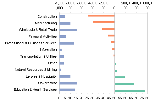
I picked axis scales that prevented overlap of the two panels of data. Read the values off the chart.

I used custom number formats to suppress the display of labels outside of the applicable panel. For the primary (top) value axis, I used a format of [>=-600000]#,##0,"K";;; so that only values greater than the minimum -600,000 would appear, and they would lose the last 000 in favor of K. For the secondary (bottom) axis I used a format of [<=20]0;;; so only values less than the maximum 20 would appear.

I did some touch up formatting of the bar series. I set the gap width to 100% (default is 150%) for both axis groups, and for the primary axis group I also set the overlap to 100% (default is 0%) so the bars lined up properly.
An Axis Group is the collection of all series on a particular axis. In this chart, the primary axis group contains the job loss and job gain series, while the secondary axis group contains the percentage of workforce series.

I added and positioned the primary and secondary category (X) axis titles, and the chart was complete.

To change the chart, all I have to do is sort by a different column.


Tim Mayes says
Jon, thanks for the explanation. I was searching for this after reading your post yesterday. It is a bit involved, but the result is definitely worth it. Nice job.
Jon Peltier says
Tim –
It actually isn’t so involved. It takes a couple minutes, if you’re a little familiar with Excel charts and have done it once or twice.
Bob says
Hi Jon,
Wow. Thanks for the tutorial. I would have thought you finessed the axis stuff with XY charts and dummy series to get it all to line up. Way off.
I will call this one the dance of the category axis… :)
I will open a Bud shortly.
Cheers,
Bob
Jose Gomez says
Jon, is including a third series possible with this method? IE, Current/1970’s in addition to Current/Prior Year. Wondering if separated stacked bar chart could accomplish this.
Jon Peltier says
Jose –
It would be difficult to add more data, since I’ve already used primary and secondary axes. Of course, nothing is impossible, and you can always use other tricks to get the appearance that you want. The use of tricks also must be balanced with the need not to clutter up a chart and confuse your audience.