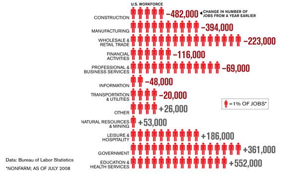
In U.S. Job Market Skid Chart, Tony of Support Analytics presents a chart from Business Week. The chart shows change in employment figures in nonfarm job sectors compared to a year ago. Tony thought the use of human figures instead of solid bars was distorting and confusing. He also felt the sort order made the chart more confusing.

Aside from the jpg image file format making the edges in the chart fuzzy, it was hard to read for other reasons. First, the sector names were not sorted by the number of human figures in the data bars. Second, the numbers in the data labels did not seem to correspond to the number of human figures in the data bars. Third, too much of the information was conveyed using just text rather than graphical elements. It was only after reading the various captions in the chart several times, and thinking of the data that was buried beneath the various images and numbers in the chart, that I realized what the chart was attempting to show.
I decided to redraw the chart. I made an informal panel chart, with one panel showing each sector’s fraction of the total US nonfarm workforce, and the other showing the change in number of jobs in each sector. I also made two versions of the chart, one sorted by change in jobs, the other by sector size.


Either of these charts is much better than the original. An XY chart is another option that the popular media avoid because it is considered too difficult to understand (naturally, anyone who reads their publications cannot possibly be smart enough). Since the readers of this blog are all of well above average intelligence, I present an XY chart here:

UPDATE
See US Employment Slump Chart – How To for a step-by-step description showing how I created the panel bar charts shown above.


db says
great work, Jon!
Tony says
Well done Jon!
I really like your first stab at the enhanced recreation and also the XY chart. I think both charts are excellent visualizations to show the change in number of jobs from a year ago.
I also like seeing the second chart with the sort on the percentage of the US workforce. It adds another clean element that a reader could use to study the data further.
Nice job!
John Dawson says
Nice work – certainly a VAST improvement on a really awful first chart. Could I suggest that one improvement would be to have the X axis intersect the Y axis at 0 and not the lowest value?
Bob says
Will you be showing how you were able to produce the horizontal bar charts with the offset layout?
I have an idea how you did it, mostly from reading your blog daily, but am interested in the method.
This type of graphical layout could have uses in project management.
Jon Peltier says
John – Thanks for the suggestion. I thought of that after I’d posted the article. Your suggestion helped me to overcome my natural laziness.
Bob – A follow-up post is on the way with the procedure. You also helped with my motivation.
derek says
Thanks for adding a zero llne to the scatter graph: my grasp of the original one was held up for a second or two wondering what the significance of the orange and green symbols meant, besides a match to the bar chart. The line makes it obvious.
One of my many peeves about Excel axes is that you can have lines without ticks but not ticks without lines, and you can put the labels far from the axis, but the ticks stay with the axis, not with the labels. But did you know you can put a white line on top of the axis line to blank it out? Not as powerful as the arbitrary axis range technique, but useful as a quick fix.
Jon Peltier says
Derek – So much of Excel charting consists of quick fixes, doesn’t it?
Speaking of quick fixes, if you want ticks without the axis line, run a dummy XY series up the axis, hide the points and apply short horizontal error bars.