Many of the charts we create compare actual performance to a predefined target. This tutorial shows how to create a “dumbbell” chart that compares actual and target levels of performance, and clearly highlights which performers surpassed their targets and which fell short.
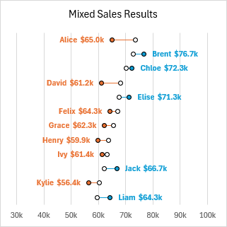
A dumbbell chart consists of pairs of dots connected by a line, resembling the dumbbells found in the weight room at the gym. The dumbbells are more commonly aligned horizontally to make labels easier to read, but they can also be aligned vertically.
Bar Chart
We could make a simple target-vs-actual bar chart with three columns of data: name, target, and actual. But this chart is rather dark with all of the ink that colors the bars, and I think the alternating bars are not easy to read.
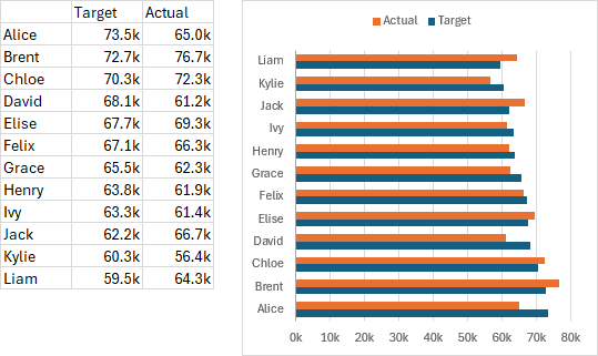
In Target vs Actual Thermometer Chart, I showed an easier-to-read style of bar chart called a thermometer chart. In this article I’ll demonstrate a style of dot plot called a dumbbell plot. A dumbbell plot consists of pairs of dots connected by a horizontal line.
Dumbbell Plot
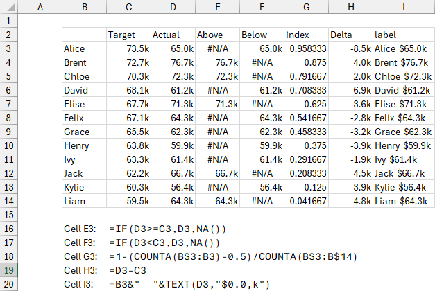
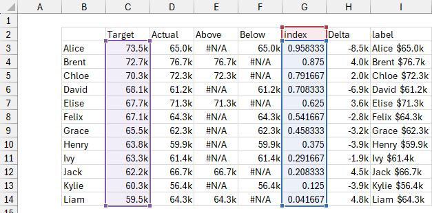
Our dumbbell plot needs more columns in our data range. In addition to the three columns used above (Name, Target, and Actual), we need Above, Below, and index columns for the color-coded dots, a Delta column with data for horizontal error bars to connect the dots, and a column with the labels we’ll apply to the dots. The formulas used to construct the data are shown below the data range.
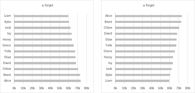
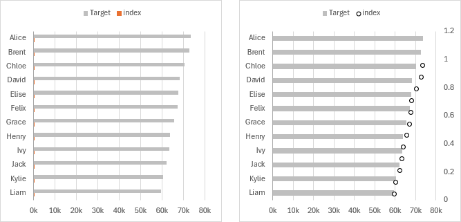
Select B2:C14 and insert a bar chart. I’ve filled the bars with a light shade of gray so steps I’ll take next are easier to see (below left).
As happens every time we insert a bar chart (see Excel Plotted My Bar Chart Upside-Down and Why Are My Excel Bar Chart Categories Backwards?), the vertical axis labels are in the opposite order from how they appear in the worksheet. It’s actually easy to fix. Double-click on the vertical axis, select Categories in Reverse Order and Horizontal Axis Crosses at Maximum Category (below right).
We need three sets of X values for the dots: Target in column C, Above (Actual greater than Target) in column E, and Below (Actual less than Target) in column F; the Y values for all three series of dots are in column G. We have to add the series one by one, starting with Target. Select C2:C14, hold Ctrl while selecting G2:G14 so both areas are selected, and copy (Ctrl+C). Select the chart and use Paste Special to add the data as new series in columns, with series name in the first row and category labels in the first column. A very small new bar chart series appears, the orange specs right next to the vertical axis; the legend entry is “index” (below left).
We need to change the orange bars to dots. Right-click the gray bars and choose Change Series Chart Type. Find the “index” series in the list, and in the Chart Type dropdown select the XY Scatter option with markers only. I’ve formatted these markers with a black outline and white center. Notice the secondary vertical axis along the right edge of the chart (below right).
The series shouldn’t be called “index” since it’s the Target series, but that’s how Excel parses the data when we paste it into the chart. Select the series and see what is highlighted: the series name has the red border and light red fill. You can simply drag the highlight from cell G2 to C2 and the series name will change.
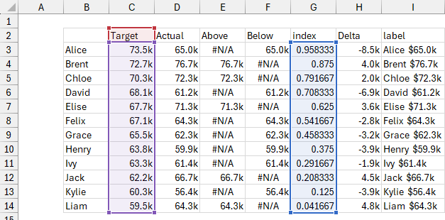
Here is the highlight in its appropriate position.
You could also edit the SERIES formula of the chart series, changing the first argument from G2 to C2, or changing this:
=SERIES(Sheet1!$G$2,Sheet1!$C$3:$C$14,Sheet1!$G$3:$G$14,2)to this:
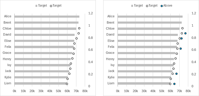
=SERIES(Sheet1!$C$2,Sheet1!$C$3:$C$14,Sheet1!$G$3:$G$14,2)The corrected chart is shown below left.
Select E2:E14, hold Ctrl while selecting G2:G14 so both areas are selected, and copy (Ctrl+C). Select the chart and use Paste Special as before with new series in columns, series name in the first row and category labels in the first column. A new set of dots appears (Excel remembers that we just changed the previously added series to dots, saving us a few steps), and I’ve given them a black border and blue fill. Change the series name from cell G2 to cell E2 (below right).
Copy F2:G14 and use Paste Special as before to add the third set of dots, which I’ve formatted with a black border and orange fill. Change the series name from cell G2 to cell F2 (below left).
Double click the secondary vertical axis (right edge of the chart) and change the maximum scale to 1. Now the dots line up perfectly with the Target bars and the primary vertical axis labels (below right).
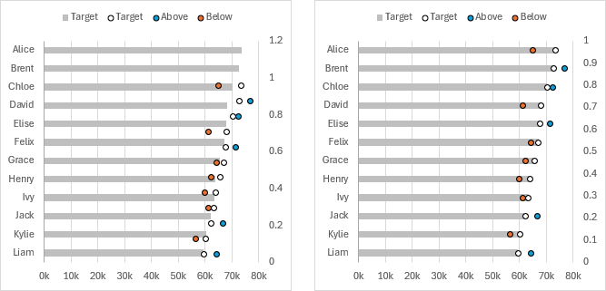
Now we can hide the secondary vertical axis. Double click on it, format it so its Label Position is None and so it uses a Line Color of No Line. We can hide the Target bars: double click on one of the gray bars, and format them with No Fill (we need the bars to retain the vertical axis labels). Finally, we don’t need the Target legend entry for the hidden bars: click once to select the legend, click again to select the unneeded legend entry, and press Delete (below left).
Now we will add custom error bars for the grip of our dumbbells. Column H has the Delta values, Actual minus Target. We’ll use these values for the custom error bar values for the negative horizontal error bars of both series. Select the Above series of dots, and on the plus icon floating beside the chart, click on Error Bars > More Options. Both vertical and horizontal error bars appear (below right).
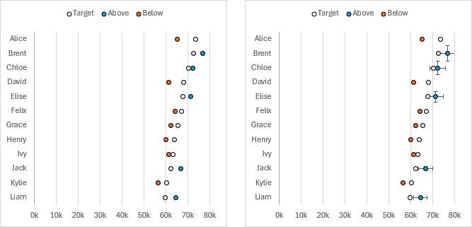
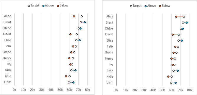
Select the vertical error bars and press Delete. Select the horizontal error bars and press Ctrl+1 to format them. In the task pane, choose Cap for End Style, choose Custom for Error Amount, and click on Specify Value. In the dialog, type 0 (zero) for positive, and select H3:H14 for negative. Click OK, then format the error bar with a blue line color (below left).
Repeat for the Below series. Select the series, then click on the plus icon > Error Bars > More Options. Delete the vertical error bars, format the horizontal error bars with No Cap and Custom Error Amount, with 0 for positive and H3:H14 for negative values. Format these error bars with an orange line color (below right).
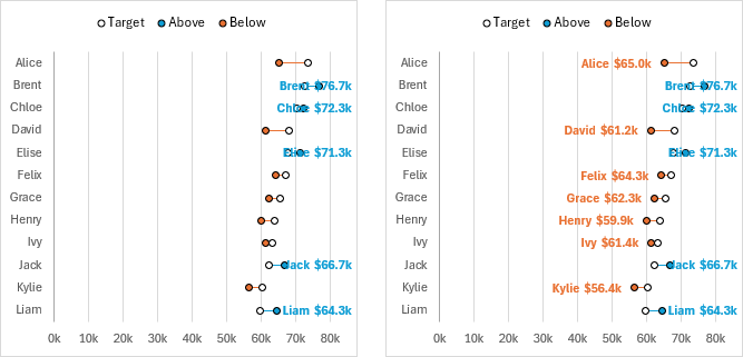
Now we need the data labels. Select the blue Above series, click on the plus icon floating beside the chart, click the chevron (>) beside Data Labels, and select More Options. In the Format Data Labels task pane, click on Value From Cells, and in the dialog select the range containing the labels (I3:I14). Uncheck the other options in the Format Data Labels task pane, and for Label Position choose Right. Make the labels bold, and color them blue to match the marker fill color (below left).
Select the orange Below series, and repeat this sequence, [+] > Data Labels > More Options > Value From Cells. In the dialog select the same data label range (I3:I14), unselect the other options, and for Label Position choose Left. Make the labels bold, and color them orange to match the marker fill color (below right).
Double-click on the horizontal axis, and apply a maximum value that is high enough to make room for the blue data labels (below left I’ve used 100k). You can also change the minimum value, since a chart with markers does not require the axis to include zero (below right I’ve used 30k). If the minimum is not zero, you should use no color as the vertical axis line color, so the vertical line at 30k looked like a gridline, not an axis. You can also remove the vertical axis labels, since the names also appear in the colored data labels.

Modified Dumbbell Plots
Once you have completed the basic construction of this chart, it is easy to modify it to change its appearance.
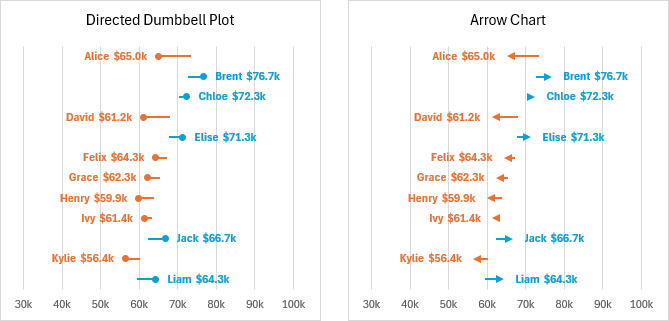
For example, use no markers for the Target series and tweak the marker and error bar formatting for the other two series to generate a Directed Dumbbell Plot (below left). Or hide all the markers and add arrowheads to the error bars to make an Arrow Chart (below right).
About This Chart
This is the second* of two posts inspired by Better than a Big Bar Chart, on the Storytelling with Data website, which starts with a regular bar chart showing Target and Actual data, progresses through a thermometer chart, and finally shows a dumbbell chart. The two posts on the Peltier Tech Blog apply those lessons, with more detailed instructions showing how to implement them in Excel.
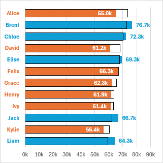
*The first of these posts is Target vs Actual Thermometer Chart, which plots the same data like this:
Combination Charts on the Peltier Tech Blog
This dumbbell chart is a combination chart because it uses bars to provide vertical spacing and XY points to show values. Here is a partial list of other combination chart articles on the Peltier Tech Blog.
- Pareto Charts in Excel
- Clustered Column and Line Combination Chart
- Precision Positioning of XY Data Points
- Add a Horizontal Line to an Excel Chart
- Horizontal Line Behind Columns in an Excel Chart
- Bar-Line (XY) Combination Chart in Excel
- Salary Chart: Plot Markers on Floating Bars
- Shaded Quadrant Background for Excel XY Scatter Chart
- Excel Chart With Colored Quadrant Background
- Fill Under or Between Series in an Excel XY Chart
- Fill Under a Plotted Line: The Standard Normal Curve
Dot Plots on the Peltier Tech Blog
Here are a few more articles about making Dot Plots in Excel.


Leave a Reply