Shaded Background Quadrants
People often ask how to shade the background of an XY Scatter chart. This may help to define certain regions of performance or cost-benefit. The desired end result is something like this:
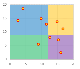
This is a rework of an older article. The protocol has been simplified and the steps reordered to work more reliably in Excel 2013 and other recent Excel versions.
Scatter Plot Data
Here is the simple XY data used in this tutorial. The data scales between 0 and 20 on both axes.
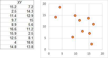
Background Data
These two tables show the data and calculations needed to draw the shaded background areas in the chart.
The first table shows relevant values for the X and Y axis, including the minimum and maximum, as well as where we want the divisions between left and right shaded areas and between upper and lower shaded areas. You don’t need to use such a summary table, but you might find it helpful.
In this example, we want the areas to extend from X=zero (the left edge of the chart) to X=12, and from X=12 to X=20 (the right edge of the chart). Likewise we want them to extend from Y=zero (the bottom of the chart) to Y=9, and from Y=9 to Y=20 (the top of the chart).
The axis parameters were selected arbitrarily here, partly to show that the quadrants don’t have to be of equal width or height. These are static values, but you could put formulas into the range C3:D5 if you wanted the divisions based on the statistics of the data or on any other variable criteria.
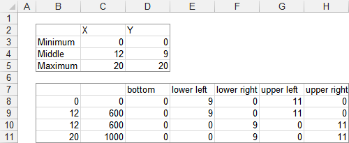
The second table above uses formulas that reference the first range:
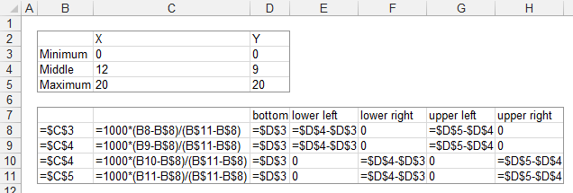
The factor of 1000 is used in the formulas in C8:C11 simply because it will provide the appropriate resolution of the division between shaded areas.
This data will produce this background pattern:
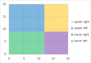
The need for the “Bottom” area series is discussed at the end of this tutorial. It may be better to wait until indicated in the middle of this protocol before you read it.
Building the Chart
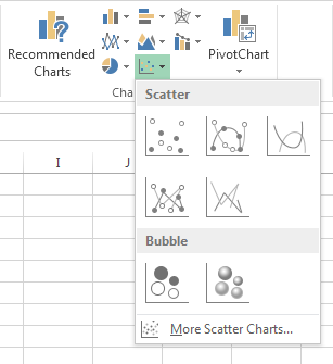
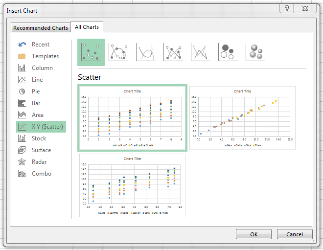
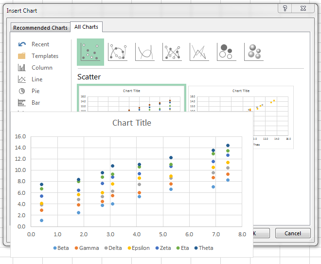
Start constructing the chart by selecting the XY data and inserting an XY Scatter Chart from the Insert tab of the ribbon. The legend has been included to help show all the series in the chart through this protocol.
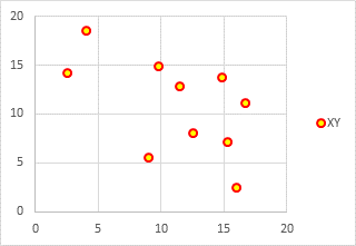
Next, copy the data for the shaded regions, which is in C7:H11 (don’t include column B, which has intermediate values).
Select the chart, then click the little down-pointing triangle on the Paste button of the ribbon’s Home tab, and select Paste Special. You will see a dialog like this, and you should make sure these are the settings before clicking OK. In this case, Excel should figure them out correctly.
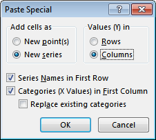
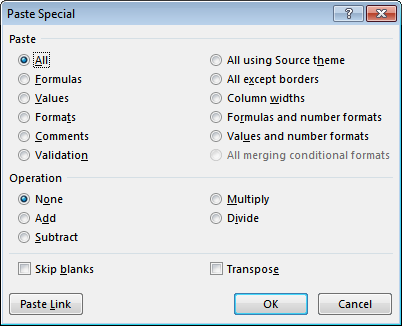
The following Paste Special dialog is for pasting data somewhere in a worksheet. This means that a cell or cells in the worksheet were selected when you clicked on Paste Special. Cancel this dialog, select the chart, and re-invoke Paste Special.
The chart now looks like this. Since the added series have a maximum X value of 1000, the original XY data with its maximum of 20 is pushed to the left edge of the chart. Don’t fret…
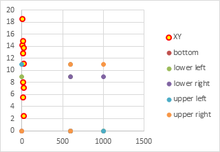
One by one, select each of the newly added series, and assign them to the secondary axis. This is the first setting you can control if you select the series and press Ctrl+1 to format it. It also can be done from the new Change Chart Type dialog in Excel 2013, shown at a later step of this procedure.
Excel has added a new vertical axis along the right edge of the chart.
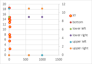
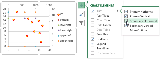
Add the secondary horizontal axis. The easiest way in Excel 2013 is to click on the Plus icon next to the chart, click on the right-pointing triangle next to “Axes”, and check the appropriate box.
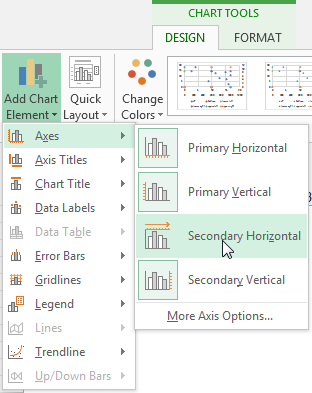
You could also use Excel 2013’s Add Chart Element control on the Chart Tools > Design tab.
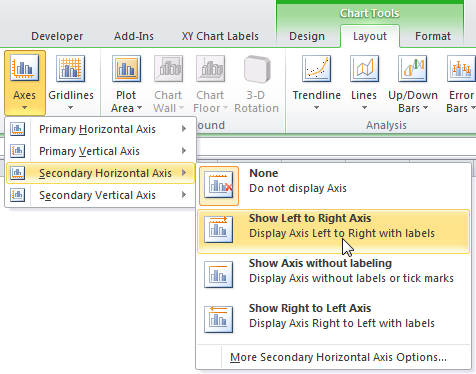
In Excel 2007 or 2010, go to the Chart Tools Layout tab, click the Axes down-pointing triangle, then Secondary Horizontal Axis, then select show Left to right Axis.
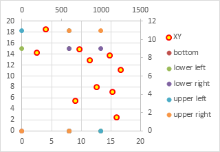
Here is the chart with all four axes deployed. Now the original XY data on the primary axis overlaps with the added data on the secondary axes.
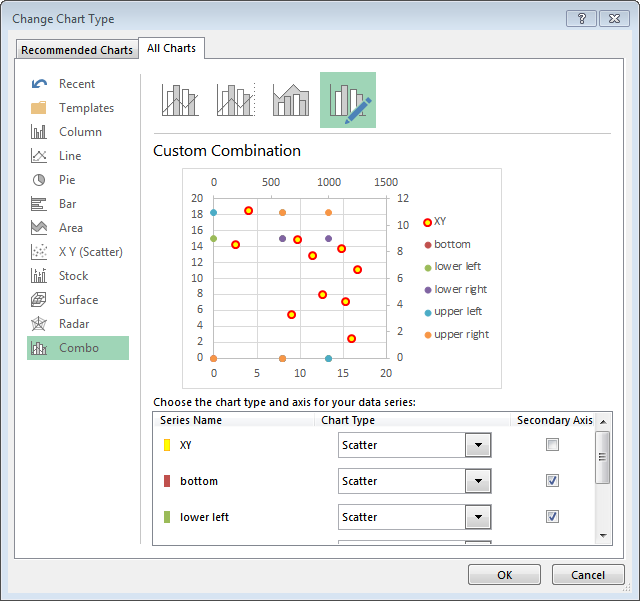
Now we need to change the added series from XY to Stacked Area. This is very easy with Excel 2013’s new Change Chart Type dialog. Right click on any series in the chart and choose Change Series Chart Type… The dialog shows the chart with a list of series in the chart. Beside each series is a dropdown showing its chart type and a checkbox showing its axis group.
We could have changed the axis group of the added series to secondary in this dialog, as long as we did so before selecting a different chart type.
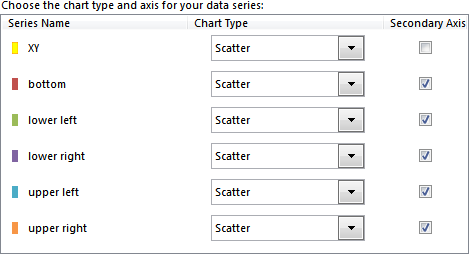
This panel shows all series in the chart, after changing axis group of the added series, but before changing their chart type to Stacked Area.
Click on the chart type dropdown, and you’ll see a collection of chart types. The XY Scatter type is selected, and the cursor is hovering over the Stacked Area icon.
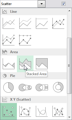
Here is the panel of chart series after changing the added series to Stacked Area.

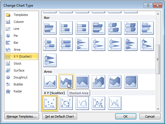
If you’re using Excel 2007 or 2010, you have to right click on each series you need to change, one at a time, and select Change Chart Type. You will see this dialog. The XY Scatter type is selected, and the cursor is hovering over Stacked Area.
If you have to change one series at a time, the intermediate chart will look rather strange. This is the chart after changing one series to Stacked Area in Excel 2010. If you only changed one series on the secondary axis in 2013, it would also look like this.
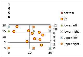
But don’t panic: after changing all of the series, the chart will look the same in all three Excel versions.
Here is the chart with all added series changed to Stacked Area.
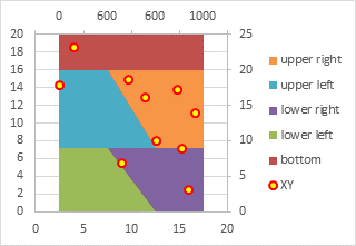
The need for the “Bottom” area chart series becomes evident in the chart above, with a little explanation. If you are interested, there is an explanation at the end of this tutorial.
The next step is to format the area series. Here I’ve made the “bottom” series completely transparent, and applied a transparency of 50% to the rest. This tones down the intense colors, so they don’t overshadow the actual data, and also allows the gridlines to show through.
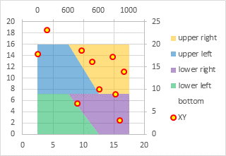
Select the secondary (top) horizontal axis and press Ctrl+1. In the formatting dialog or task pane, change the Axis Type to Date Axis. This changes the diagonal lines between adjacent shaded regions into vertical lines.
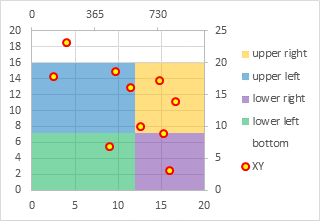
Select the secondary (top) horizontal axis, and press Delete. Then select the secondary (right) vertical axis and press Delete.
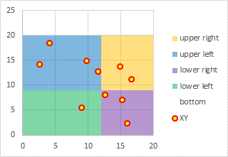
Finally, rescale both axes as appropriate. For this example, both should have a minimum of 0, a maximum of 20, and a major unit of 5.
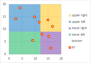
Finally, delete the legend, and the chart is finished.

Variations
Once you know the approach, it is not hard to expand the grid to 3-by-3. In the table below I’ve lightened the zero values to enhance the data for the shaded areas.
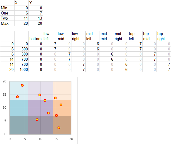
In fact, you can use any reasonable (i.e., visually and cognitively useful) number of shaded areas, and you don’t need the same number of rows and columns of colors.
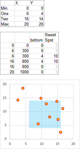
It’s also easy to highlight a target region, especially since you only need the bottom area and the target area.
Why We Need the Bottom Fill Series
Here is the chart right after all of the secondary axis series have been converted to Stacked Area type.

The “bottom” series seems to be on top of all of the rest of the series, which is pretty strange.
If we delete the “bottom” series, the “lower left” series has disappeared from the lower left region of the chart and now it is seen on top of the chart. Broken!
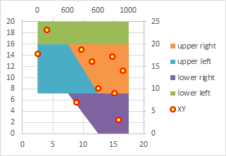
So what’s going on, anyway?
Let’s start with only the “lower left” series, in the position we want it: the bottom left portion of the filled regions.
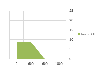
Look what happens when we move the category (horizontal) axis to the top of the chart, where the secondary category axis is found. Instead of filling below the “lower left” data points, the fill is above these points.
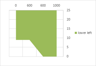
Aha! In an area chart, the first series fills between the category axis and the data points. So let’s start with the “bottom” series, with values of zero.
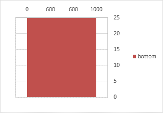
The “bottom” series starts from the category axis at the top of the chart, explaining why it appeared above the other areas, and extends to the bottom of the chart, or actually, to zero on the value (vertical) axis.
Let’s now add the “lower left” series, nearly transparent so we can see both series.
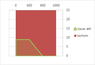
The “lower left” values are added to the “bottom” values, so it fills below its data points, in front of the “bottom” area.
Let’s add the other three series:
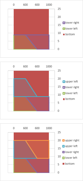
They all stack up nicely in front of the “bottom” series. Nice, just what we wanted.
Back to the non-transparent version that brought us here.

You may now return to the protocol.
More Peltier Tech Articles About Combination Charts
- Pareto Charts in Excel
- Clustered Column and Line Combination Chart
- Precision Positioning of XY Data Points
- Add a Horizontal Line to an Excel Chart
- Horizontal Line Behind Columns in an Excel Chart
- Bar-Line (XY) Combination Chart in Excel
- Salary Chart: Plot Markers on Floating Bars
- Shaded Quadrant Background for Excel XY Scatter Chart
- Excel Chart With Colored Quadrant Background
- Fill Under or Between Series in an Excel XY Chart
- Fill Under a Plotted Line: The Standard Normal Curve


