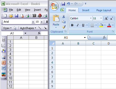
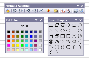
As part of the development of Excel 2007, Microsoft completely rebuilt the Excel charting engine. During overall development of the Office 2007 user interface, all of the charting dialogs were redesigned, and many features were added to the Chart Tools contextual tabs of the Ribbon. Office 2007 has been out now for well over a year, and I’ve been using it in some capacity since the beta kicked off over a year before its commercial release. I’ve decided it’s about time I gave a coherent review, rather than post bits and pieces in various forums. I hope that after this much time has gone by, my comments will be seen as the well-thought analysis I’ve tried to make it, and not a knee-jerk Luddite reflex.
Perhaps this assessment will help converts to Excel 2007 who are having difficulty with the changed charting environment, and hopefully any criticisms and suggestions will be taken to heart by developers of future releases of Excel. There is also a companion post reviewing general changes between Classic Excel and Excel 2007.
Creating Charts
The first thing that one notices when creating a chart is that the Chart Wizard is missing. Many people found the wizard confusing at first, but charting itself is a large feature, and the Chart Wizard was a relatively elegant way to put a lot of options into an orderly process. The Chart Options dialog, which was step 3 of the Wizard as well as a stand-alone dialog in its own right, is also gone. The lack of the Wizard and Chart Options means that many features are accomplished differently than before. This is not necessarily bad, as long as the features are still readily available and easy to use. For example, the selection of charts is available from the Insert tab of th Ribbon.
Chart Formatting
The second thing one notices is that Microsoft has modernized the default formats of Excel 2007’s charts.

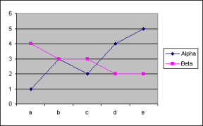
Excel 2003 Default Chart Formats
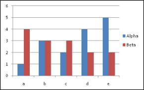
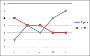
Excel 2007 Default Chart Formats
The new defaults look much better, without the murky gray plot area background and the dull blue and pink series colors.
Speaking of formatting, most of the upgrade to the charting engine for Excel 2007 is a vast expansion in the formatting ability of the various chart elements. Text can be formatted as WordArt, and elements have many options for fancy formatting, including gradients, transparency, edge effects, shadows, glows, and more. For the most part this amounts to eye candy, because these formatting features do not add to the actual portrayal of the data in the chart. Of what use are bevel and surface texture effects if your chart has 4-pixel wide markers? I suspect that the slow performance in redrawing of Excel 2007 charts is partially due to an overworked graphics rendering engine having to check whether to apply so many more possible formats in charts with dozens of series and thousands of points.
Ironically, a popular formatting option since Excel 95 or earlier (and from much earlier programs on the Mac) has been removed from Excel 2007. One can no longer apply patterned fills to chart elements through the extensive user interface. Fortunately the capability remains in Excel 2007 VBA, and my clever colleague Andy Pope has written an Excel 2007 Pattern Fill add-in which allows the user to apply these fills to chart elements and shapes.
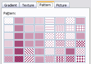
Pattern Fills: Lost, then Found
Chart Types
Many people looked expectantly at Excel 2007 to provide new chart types. Box Plots perhaps, or Waterfall Charts. But these expectations were met with disappointment. Excel 2007 includes the same roster of standard charts as Excel 2003. Fortunately the workarounds that many advanced users have developed to build custom charts are functional in Excel 2007.
Users will notice that the “built-in custom” (love that oxymoron) chart types from Excel 2003 are no longer available. This is not a great loss, as most of these types were either regular charts with different formatting, or simple combination charts. An intermediate user should be able to create combination charts readily in any version of Excel, so the built-in custom combos are not necessary. They were helpful, in that they showed the novice users that combinations were possible, although many users thought the only combination types available were those in the built-in custom dialog.
Excel 2007 has introduced a new technique for saving user-defined chart styles. Excel 2003’s system involved the user gallery, a hidden worksheet that contained samples of saved charts; this system was difficult to maintain (but then, I’m tough on my systems), and it was nearly impossible to distribute one’s custom types. Excel 2007’s system consists of individual chart template files saved in a templates directory. I have not tested this new system extensively, but it seems robust, and sharing custom types is as easy as exchanging files.
Chart Dialogs
A lot of people complain about the Office 2007 Ribbon, and claim it makes them slower than in Excel 2003. This point is partly valid: while charting, for example, there are three separate tabs for editing the chart, and the user often needs an extra click simply to activate the tab with the desired controls. As frustrating as that may be, it’s only a small irritation. What bothers me more than the Ribbon is the redesigned Excel 2007 charting dialogs. There are a number of problems with these dialogs that degrade their usability. I will not bring up every problem, but I will use a few examples to show the loss of usability.
Multiplicity of Tabs
In many cases while formatting an Excel 2007 chart, one has to click from one tab to another to accomplish what required only a single tab in Excel 2003. To illustrate, let’s look at the Format Series dialogs from the two Excels, 2003 on the left and 2007 on the right.
 |
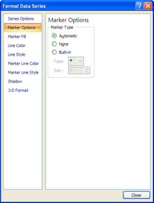 |
To format a line or XY series in Excel 2003, all the controls needed are found on one tab of the dialog. To do the same in Excel 2007, one must visit up to four Marker tabs and two Line tabs. I understand this was necessary to accommodate all of the new formatting options included in Excel 2007. But, such details: line gradients and line styles for the border of a marker? A marker that’s most likely no wider than 5 points?
I’d like the option to pop up a Chart Dialog Lite, that gives me a simple set of applicable and appropriate formatting tools: line color and thickness, line style for the connecting lines but not for the marker border, and marker shape, size, and fill color, without gradient fills or any edge, surface, or lighting effects. Put a button on the side that brings up the full-features form. This would allow me to make effective charts, and format their series as quickly as before.
Choice of Controls
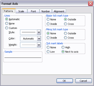
In many cases, the new dialogs use controls which are not as efficient to use as their older counterparts. I’ll use the Format Axis dialogs from Excel 200 (left) and 2007 (right) to illustrate this problem.
 |
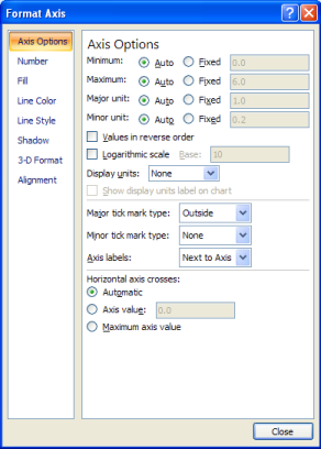 |
The Excel 2007 dialog combines axis scale formatting with axis tick formatting, which is pretty nice. However, the choice of dropdowns for the axis tick controls is far inferior to the Excel 2003 layout, which uses option buttons. Here are these sections of the dialog in closer detail:


One uses option buttons, or alternately a listbox, in order to show all options to the user. One selects a dropdown in contrast to save space on a crowded dialog. My interface design philosophy is to show all options to the user. I’ve been creating Excel charts for twelve or more years, I’m intimately familiar with these dialogs, and I still like to see all options before I select one. In fact, Microsoft issued a best practices white paper for Vista programmers (wish I could find the link), which urged designers always to use option buttons or listboxes rather than dropdowns, for this very reason. Using the dropdowns has certainly used less space than the option buttons, but this dialog has room for the option buttons. The problem with a dropdown is that one has to move the mouse and click on the control to expand it and see the options. This takes a mouse click, and the expanded control covers one or two controls below it. Then to select an option, the user has to drag the mouse and release it, or click again. Two clicks or a click and drag, instead of one click, times dozens of charts a day. And I find that if the options are hidden in the unexpanded dropdown controls, I tend to click back and forth as I mull my options.
Tortuous User-Dialog Interactions
Many of the easy interactions which we took for granted in Excel 2003 have been replaced by inflexible awkward interactions in 2007. I will illustrate this issue with the axis scale formatting dialogs in Excel 2003 (left) and 2007 (right).
 |
 |
The Excel 2007 dialog above right shows an improvement to Excel’s logarithmic scale axes. In Excel 2003, a logarithmic axis could only use base 10 logs, and the axis min and max scale parameters had to be powers of ten, and tick labels would only appear at intermediate powers of ten. For example, an axis scale could span between 0.01 and 100, and have tick mark labels at 0.01, 0.1, 1.0, 10, and 100. Excel 2007 allows the user to select the base of the log scale, and the min and max of the axis need not be powers of that base. The labeling is still inflexible, spaced from the minimum scale by powers of the base.
In Excel 2003, people were confused by the Auto checkbox. Even though Auto generally means let the program do what it wants, people would set their desired values, then check the Auto box. When Excel ignored their entries, they would wonder why. Excel 2007 solved this problem by replacing the Auto checkbox with Auto and Fixed option buttons. The rest of this sub-dialog undoes that improvement. Here are closeups of the scale formatting sections of the dialogs:


In Excel 2003, the entry boxes are always enabled, even when the Auto boxes are checked. The user needs only one click, in the entry box, to change the value. Clicking on the Auto checkbox or its label moves focus to the entry box and selects the contents of the entry box, making it so quick and easy for the user to make adjustments. When the user changes a value, the Auto checkbox is cleared automatically.
In Excel 2007, an entry box is disabled until the Fixed option button is clicked. Clicking the option button does not move focus to the entry box, the user still has to click in the box for this. And because the click on the option button does not select the contents of the entry box, the user needs a click and drag or a double click, not just a simple click, to select the entire contents of the entry box.
As I mentioned at the outset, the Excel 2003 dialogs were elegant in their usefulness, and the redesigned dialogs ignore usability best practices.
Range Selection
The way ranges are selected in some dialogs has been changed. Let’s look at the Format Error Bars dialogs.
 |
 |
The controls for selecting custom error bar values in Excel 2003 are right on the same dialog. The equivalent controls for Excel 2007 are not located on the form, although there is room for them. Instead the user must click on the Specify Value button, which pops up a small form with the range selection controls.

The selection boxes are rather narrow, so it’s particularly difficult to read the reference. in addition, this small dialog is modal, so the larger dialog is locked in place while this dialog is present. If your desired range was obscured by the larger dialog, you have to close this small range selector, move th larger dialog, and call the range selection dialog back.
Options Removed from Dialogs
Several favorite items have been removed from the dialogs. Let’s revisit the Format Series dialogs from above.
 |
 |
Error Bars and Data Labels can be added and edited from the Format Series dialog in Excel 2003, but not in 2007. The Options tab contains other goodies, depending on chart type: High-Low Lines, Up-Down Bars, Drop Lines, Series Lines. These features are all available on the Excel 2007 Ribbon, but not in the dialogs. We may get used to this change, but not having these items available on the formatting dialog disrupts previously smooth thought patterns.
Dialog Behavior
There are two aspects of dialog behavior that have changed for the worse in Excel 2007. The first of these is a minor inconvenience, but still annoying. Since the first time I’ve used a mouse (remember MacDraw on the old Mac Plus?), I’ve been trained by dozens of applications to point at an object, then double click, and a dialog would appear to help me format that object. For some inscrutable reason, all of office 2007 has lost this double-click-to-format behavior. Users frequently ask whether they need to reinstall Excel 2007, because the double click isn’t working right. I always agree that it isn’t working right, but that’s by design.
The more egregious change at first seems like a good idea. The formatting dialogs have become non-modal, so that you can interact with the objects under the dialogs while they remain open. This appears to make the dialogs more flexible, but the consequences are brutal. Let me explain.
In Excel 2003 you can format an object, say, a chart axis. You can visit every tab of the formatting dialog, then dismiss the dialog, select another object of the same type, another chart’s axis in this example, then press the F4 function key, and repeat all of the formatting that was accomplished during the previous visit to the formatting dialog. One click of the F4 key repeated dozens of actions. Alternatively, pressing Ctrl-Z would undo everything that was done during the visit to the dialog.
In 2007, with the non-modal dialogs, items are added to the undo/repeat queue one action at a time, not one dialog visit at a time. To undo a series of items from one dialog visit, you need to press Ctrl-Z many times. But the killer is that the F4 key (or Ctrl-Y) only repeats the absolute last action taken in the dialog. One click of the F4 key now repeats one action. One of a user’s most powerful productivity tools, the F4-Repeat Last Action command, has been eviscerated.
Summary
This analysis has been written after over two and a half years of working with Excel 2007, starting with the last Excel 12 alpha version, through four betas, the ultimate release version, and SP1. It is a hard thought, critical assessment of charting in my favorite charting platform, and how charting has changed with the introduction of Excel 2007.
Charting in Microsoft Excel has undergone a complete restructuring in Excel 2007. Most of the changes are cosmetic, confined to formatting of the charts, and the default Excel charts look much nicer than in earlier versions. There is a lot of eye candy, that is, fancy effects that others may (and do) call chart junk. While no new chart types were introduced in Excel 2007, the techniques developed to simulate unsupported chart types are still functional in Excel 2007.
The Office 2007 Ribbon has received a great deal of criticism for dumbing down the interface and making it less efficient for use by power users. I have found the inefficiencies of the Ribbon to be minor, dwarfed by major inefficiencies in chart formatting dialogs introduced by disregard of best usability practices. Because of these deficiencies, I find myself often struggling to create charts in Excel 2007 which in Excel 2003 would practically draw themselves. I write this review partly in the hope that the points I’ve raised will help guide development of an improved charting experience in future versions of Excel.


 By far the biggest change in Office 2007 is the complete redesign of the user interface. After a decade or more, the familiar menubar and toolbars are gone, replaced by a large monolithic Ribbon splayed across the top of the application window. The user’s first reaction upon seeing this wonderful new interface is “Wow!” This is followed soon after by panic, as the user desperately tries to figure out where all the old controls have gone. They all are still there, and eventually most are found. Some are pretty obvious, and the Ribbon was designed to make them so, but others stubbornly stay hidden. The “Copy Picture” command in “Classic Excel” (97 through 2003) was somewhat obscure, requiring the user to hold Shift while selecting the Edit menu. This was kept obscure; it took me, a seasoned Excel user, a month to find it, cleverly buried under the Paste dropdown button.
