I’ve been corresponding frequently with Paresh Shah (Visual Quest blog). Unlike me, Paresh is rather a fan of circular charts, as we learned from his comments under the recent ChartBusters post, Reworking a New York Times Box of Donuts. Paresh did point out to me, and has since blogged about, a circular chart he doesn’t like. This graphic from the Economic Times of India uses two pie charts to show changes in how people spend their free time, from 2005 to 2010.
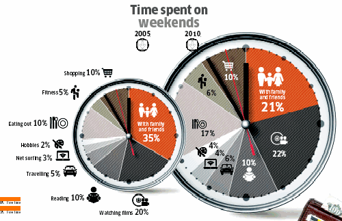
What’s wrong with this chart? Well, it’s two pies used to try to show different values over time. Why is this bad? Despite their proximity, each pie is a separate entity, and we have to look at one of them, load that into short term memory, then look at the other, then look back. In order to make the comparisons, we need to look back and forth many times, as if watching a table tennis tournament. It’s hard to make a lot of comparisons, because within a given pie, and from pie to pie, the different slices are misoriented. We could count minutes around the circumference, but this confuses the false measurement of minutes with the angular measurement that represents percentages.
This graphic is also very cluttered. One pie has icons and labels, while the other only has icons, so we must use the first pie as a legend. Since the topic is time, the pies are decorated like clockfaces, complete with tick marks for hours and minutes to confuse us, and hour, minute, and second hands to disrupt out view of each chart. In addition, the two pies are shown in different sizes, so we wonder whether the overall pie diameters are significant. And one pie overlaps the other, but the damage was already done.
“Improving” the Pie Charts
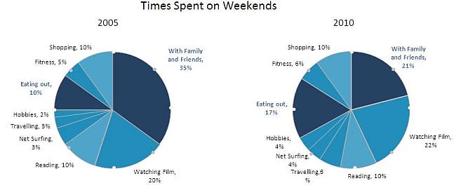
Paresh reworked the chart and came up with the following pair of pies. He criticized the original pies for having no baselines, but then neither have his. He removed the hour and minute tickmarks, but added his own markers at 45° intervals. At least there’s no clutter on the face of each pie, so you can see that the dark blue wedge decreased a lot in size, and the, uh, other dark blue wedge increased by almost as much. The rest of the wedges look about the same. I discovered later that there were three fill colors used, for large, small, and no changes.
I put on my Chart Busters cap, and made my own pies, partly to correct the ills of the two previous sets (I removed the markers around the circumference, and sorted the wedges), and partly to demonstrate once again that pies aren’t so effective at showing changes. Sure, we can see the large changes I mentioned before, and the two smallest slices seem to have grown. But all the other slices have changed positions around the pies, so as stated, there’s no baseline.
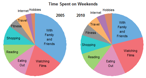
Hint: “Watching Films” (red) increased its value by 10%, but you wouldn’t know it from this graphic.
I don’t know about anyone else, but when I see two pie charts, I want to draw on a nose and mouth.
Unsuccessful Line Charts
The general consensus about plotting trends over time tells us to use line charts. I put this data into a line chart, and got a result which was not very good. There are obviously some points that are hidden behind the ones we can see, and it’s hard to identify the series.
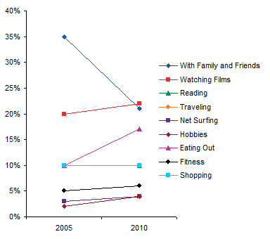
To identify chart series more clearly, I like to remove the legend, and place data labels by each series in the chart. That didn’t help in this case. Out of nine labels, three pairs are completely overlapped, and another pair is touching. Conventional wisdom has not helped much, though at least we can see that most series saw changes from start to finish.

Semi-Satisfactory Bar Charts
Okay, we know bar charts can be effective when comparing values. In this bar chart, clustered by year, it is easy to compare percentages within each year, but not between years.
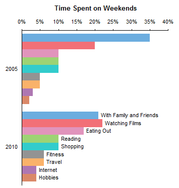
Transpose the data and group by category, and it’s easy to compare by year, and we haven’t lost much within each year. Time on the vertical axis is a bit irregular, though, and rotating the chart will result in hard to read category labels.

Stacked Bar and Area Charts
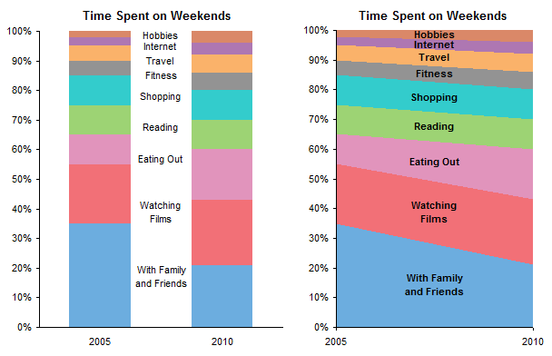
My comment to Pradesh was that his use of markers around the circumference of a pie chart was like adding a numerical scale. Might as well straighten out the scale and make stacked bar or stacked area charts. These aren’t too bad, but it’s hard to tell whether “Watching Films”, “Reading”, “Shopping”, and a few others changed during the five years.
Panel Chart – Hey, This Works!
The line chart is still best at showing the trends, but what if we didn’t have to overlap all the series? Let’s put each one into its own panel of a panel chart.

This graph clearly shows even the smallest change, and preserves the percentages as well. Apparently everyone has become bored with their friends and family, and is spending more time on other activities.


