 One of the resources I use on my web site is SiteMeter, which has basic (free) and more extensive premium versions of their web site statistics service. I am not endorsing SiteMeter here, just describing their statistics. Sitemeter provides web site tracking by hour of the day. This is pretty granular, compared to daily or monthly statistics, and I haven’t found much use for this detail. In any case, though, it provides a means to illustrate that radar charts, also known as spider charts due to the web-like appearance of their spokes and gridlines, are just not very good for most routine purposes.
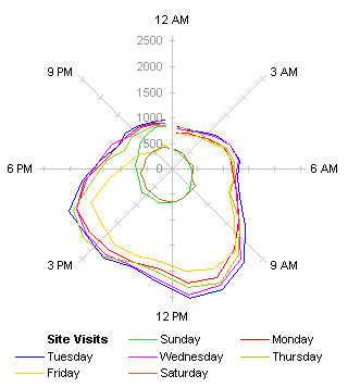
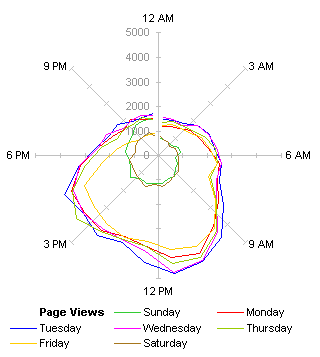
Below are two radar plots of site statistics, Site Visits on the left and Page Views on the right, orbiting around the origin according to time of day. Midnight is at the top of each chart, noon at the bottom, and the curves proceed, well, clockwise around the charts.


What can we say about the information in these two charts? Well, Saturday and Sunday are close to the center, so they must have less traffic. Also, for the weekdays, the curves bulge at the bottom, so daytime obviously gets more traffic than nighttime. The times in the SiteMeter data corresponds roughly to my own time of day here on the East Coast of the US, since I get around 50% of my traffic from the US, though I don’t offhand know the East Coast vs. West Coast split.
The radar charts certainly look useful at first glance. They are multicolored, which is good, and there is a kind of satisfaction of feeling that the cyclical nature of time (Sunrise, Sunset) is reflected by the cyclical nature of the displays. Because the values are represented by radial distances in the radar charts, it is difficult to compare different times, and it is not easy to follow hour-to-hour trends in the data.
Another problem is that the larger values are at the bottom of the chart, which is counterintuitive. This could be corrected by putting midnight at the bottom of the chart.
This was easier than it seems: I’m using a combination chart, with a hidden radar series providing the spokes, and the daily traffic data plotted on hidden X and Y axes, using trig functions. All I had to do was reverse the directions of the hidden X and Y secondary axes, and change the category labels of the hidden radar series.


Maybe this helps, maybe it doesn’t. The larger values are higher in the chart, but the variation in the orientation of radial distances is not alleviated. We’re also conditioned to see midnight on the top of our clocks (noon too, on a 12-hour analog clock). The radar chart is the source of cognitive dissonance.
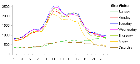
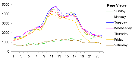
The inferiority of the radar chart becomes even more evident when compared to line charts showing the same Site Visit and Page View data (below). The charts start at midnight on the left and end at midnight on the right, and time flows smoothly from left to right. Instantly more detail is apparent than in the radar charts, and further details reveal themselves on closer viewing.
While the radar charts show a nondescript jellyfish-like bulge during the day, the line charts show a two-humped Bactrian camel appearance. There is a big hump just before lunchtime on the East Coast, and a smaller hump in mid- to late afternoon. The first bump can be explained by people starting to zone out before lunch, and surfing the web. The afternoon bump is a bit late for the West Coast pre-lunch traffic, but the West Coast pre-lunch crowd may be partially obscured by folks on the East Coast killing a few moments before leaving work for the day.
A smaller bump is evident in the early morning in the Site Visits chart (and you can imagine a similar bump hiding in the Page Views chart). Could this be the pre-lunchtime bump from Europe?


The Friday curve is interesting. It begins the same as the other weekdays, but it lags by midmorning, and by evening it drops to the Saturday level. Obviously people are trying to finish up their week’s work, and aren’t surfing as much. They may be leaving early, and nobody is browsing technical web sites on the weekends.
By midafternoon Sunday, traffic starts to pick up. I suspect this is due to my Asian visitors accessing the site. This traffic is usually drowned out by Europe and especially the Americas, but on Sunday evening (Monday morning to midday in Asia) it’s the major source of visitors.


