Many of the charts we create compare actual performance to a predefined target. This tutorial shows how to create a “thermometer” chart that compares actual and target levels of performance, and clearly highlights which performers surpassed their targets and which fell short.
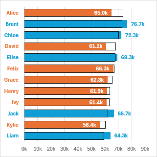
An old-style thermometer is comprised of a glass cylinder containing a fluid that thermally expands and contracts to indicate the temperature on a scale etched on the glass container. We can use a column or bar chart to mimic the behavior of one of these thermometers: our target series serves as the container, while the actual series serves as the expandable fluid contained within.
In this chart we can see a list of sales personnel, their target sales, and their actual sales. The actual sales and the personnel names are color coded with blue if the target was exceeded, and orange if the target was not met.
Simple Bar Chart
The data for a simple target-vs-actual bar chart consists of three columns: name, target, and actual. Select the data and insert a clustered bar chart.
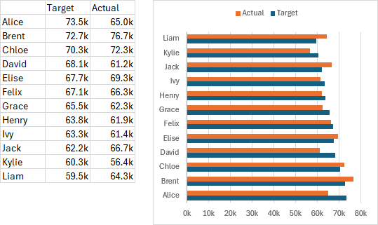
Some people would stop right there, but the chart isn’t quite right. Notice that the vertical axis displays the names upside-down compared with the list in the worksheet. This is such a common issue that I’ve written about it twice: Excel Plotted My Bar Chart Upside-Down and Why Are My Excel Bar Chart Categories Backwards?.
It’s easy enough to fix. Double-click on the vertical axis, select Categories in Reverse Order and Horizontal Axis Crosses at Maximum Category. All fixed.
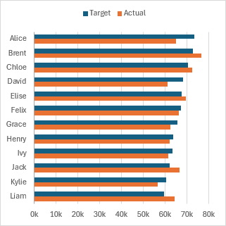
Some people would stop there, but I don’t think we’re done yet. All the data is there, and the chart is sorted the way we expect, but I think the bars of alternating colors are difficult to compare. Let’s turn it into a variation sometimes called a “thermometer” chart after its resemblance to an old-style thermometer, comprised of a glass container containing a fluid that thermally expands and contracts to indicate the temperature on a scale etched on the glass container.
Thermometer Chart
In our thermometer chart, the Target data will be plotted as the container and the Actual data as the changing fluid. Start with the bar chart above. Double-click the Target series to format it. Format it with a thin black border and no fill; I’ve also changed Actual to a blue fill (below left).
Double-click either series, and in Series Options enter a series overlap of 100%, so the fluid is aligned with the container, and set gap width to 50% (below right).
Almost there. Unfortunately, the fluid (Actual) is not contained within the container (Target). Target is the first series, so it’s drawn under the Actual series: we must change the series order.
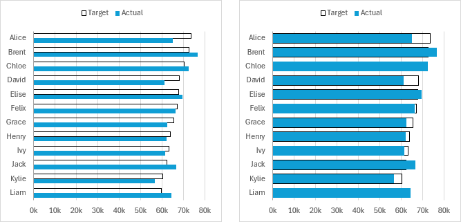
You can right click on the chart, click on Select Data, and change the series plot order in the dialog. But I find it easier to select one of the series and edit the series formula, switching the last argument (plot order) of the formula between 1 and 2. So change the Target series’ formula from this:
=SERIES(Sheet1!$C$2,Sheet1!$B$3:$B$14,Sheet1!$C$3:$C$14,1)to this:
=SERIES(Sheet1!$C$2,Sheet1!$B$3:$B$14,Sheet1!$C$3:$C$14,2)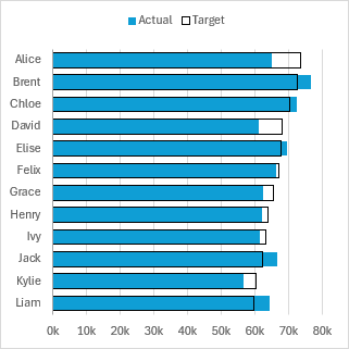
That’s not too bad, better than the default bar chart, and a lot of people would think they did a great job and stop there. But it’s possible to make the chart even better, without too many additional steps. What can we change? We can color code the thermometer so that the Actual series fluid changes from orange below the Target to blue above. We can also add data labels so we can read the Actual data. And we can color code the names along the vertical axis.
Advanced Bar (Thermometer) Chart
To add these enhancements to our simple thermometer chart, we need more columns in our data range. In addition to the three columns used above (Name, Target, and Actual), we need Above and Below columns for the color-coded bars, and X Above, X Below, and index columns for the color-coded names on the vertical axis. You can see the formulas used below the data range.
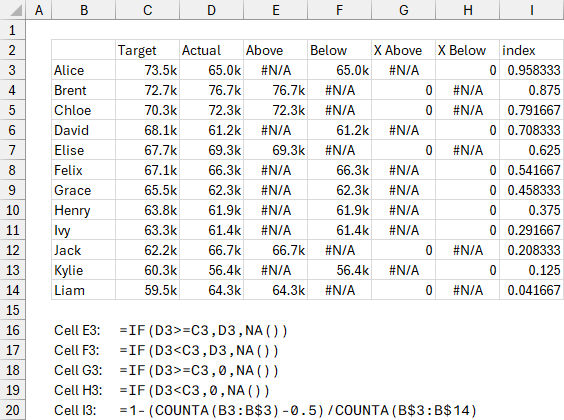
Select B2:C14, then hold Ctrl while selecting E2:F14, and insert a clustered bar chart (below left). I’ve already filled the Target series black, the Below series orange, and the Actual series blue.
The axis labels are in the wrong order, so double-click on the vertical axis, select Categories in Reverse Order and Horizontal Axis Crosses at Maximum Category (below right).
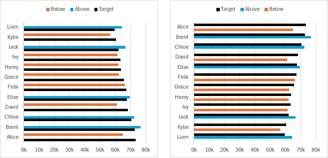
Format with Target series with a thin black border and no fill (below left).
Apply a series overlap of 100% to any of the series. I’ve also changed gap width to 50% (below right).
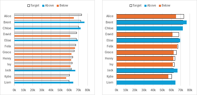
Change the plot order of the Target series from 1 to 3 so the black border is visible around the colored bars (below left).
Apply data labels to the Above and Below series, using the default Values setting (below right). For the Below series, use the Inside End position, and use a white text color. For Above, use the Outside End position, and use a blue color to match the bars. Make both sets of labels bold. Make the vertical axis labels bold too (spoiler alert) to ensure the color-coded labels we add later will have enough room in the margin. Change the horizontal axis maximum if needed to allow room for the labels.
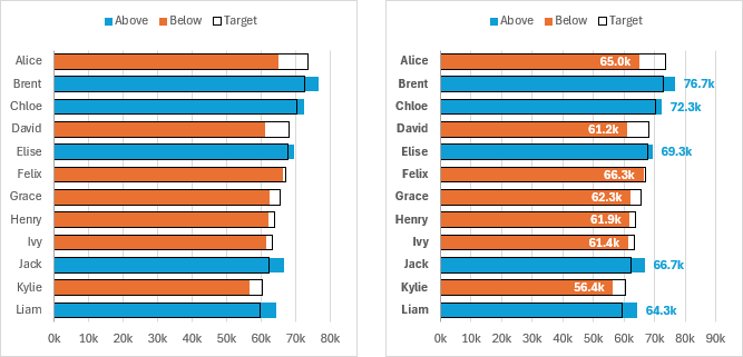
We can’t color-code axis labels individually. To add our color-coded labels, we need to add data points along the vertical axis, add data labels to these points, then hide the data points and the regular axis labels.
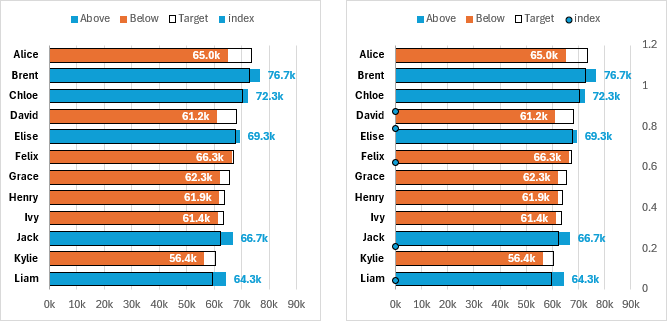
Add the first axis labels series. Select G2:G14, hold Ctrl while selecting I2:I14m and copy (Ctrl+C). Select the chart and use Paste Special (Home > Paste > Paste Special or right-click on chart > Paste Special). Use the New Series, Values in Columns, Series Names in First Row, and Categories in First Column options. The new series doesn’t appear in the chart itself, because it’s added as a bar chart series and has values of zero, but “index” appears in the legend (below left).
Right-click on any series in the chart and select Change Series Chart Type. In the list of series, find index, and change its type to XY Scatter. I’ve formatted the marker with a black border and blue fill for illustration purposes here (below right).
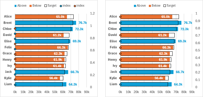
Add the second axis labels series. Copy H2:I14. Select the chart and use Paste Special: New Series, Values in Columns, Series Names in First Row, and Categories in First Column. This new series appears as an XY Scatter type, and I’ve formatted it with a black border and orange fill (below left).
There are now two “index” entries in the legend. Click once on the legend to select it, then click once on one of these unwanted entries and press Delete. Repeat for the other unwanted legend entry (below right).
Now we want to hide the vertical axis labels. If we format the axis and set Label Position to None, the labels vanish, but the space between the axis and the edge of the chart shrinks, leaving no room for the labels we will add. If we change the label font color to white, the labels seem to vanish, but they will haunt us because Excel draws the axis labels in front of any data labels they may obscure. The trick is to make the text transparent: double-click on the axis > Text Options > Text Fill > Transparency > 100%. This preserves the margin we will need for our labels (below left).
Select one of the series of dots along the axis, click the plus icon floating beside the chart, choose Data Labels > More Options. Under Label Options, choose Value From Cells, and in the little dialog, select B3:B14. Choose the Left position and uncheck Y Value (below right).
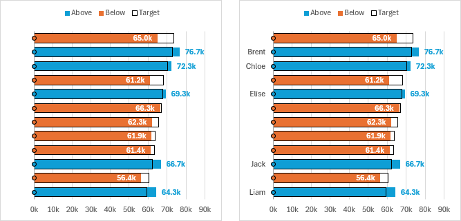
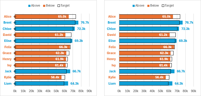
Add labels to the other set of XY scatter points, using Value From Cells and the same label range. Make all labels bold and use a font color to match the bar color of each series (below left).
Right-click one of the XY series, and format it to use No Markers. Repeat for the other XY series. The chart is finished (below right).
About This Chart
This the first of two posts inspired by Better than a Big Bar Chart, on the Storytelling with Data website, which starts with a regular bar chart showing Target and Actual data, progresses through a thermometer chart, and finally shows a dumbbell chart. The two posts on the Peltier Tech Blog apply those lessons, with more detailed instructions showing how to implement them in Excel.
Combination Charts on the Peltier Tech Blog
This thermometer chart is a combination chart because it uses bars to show values and XY points to anchor data labels. Here is an incomplete list of other combination chart articles on the Peltier Tech Blog.
- Pareto Charts in Excel
- Clustered Column and Line Combination Chart
- Precision Positioning of XY Data Points
- Add a Horizontal Line to an Excel Chart
- Horizontal Line Behind Columns in an Excel Chart
- Bar-Line (XY) Combination Chart in Excel
- Salary Chart: Plot Markers on Floating Bars
- Shaded Quadrant Background for Excel XY Scatter Chart
- Excel Chart With Colored Quadrant Background
- Fill Under or Between Series in an Excel XY Chart
- Fill Under a Plotted Line: The Standard Normal Curve


