In Chart Design: Abortion Ratios 1980-2003 Jorge Camoes shows a nice panel chart of Abortion Ratios vs. Year (1980-2003) for different age groups, taking US Census Bureau data. I reproduce a few panels of Jorge’s chart below; click on the chart to see his entire panel chart.
Jorge points out the downward trend in the curves from 1980 to 2003, which are evident in all seven age groups in the full panel chart (the “<15” age group actually has started to increase again after about 1995). What is less obvious is a downward trend from the “<15” through “30-34” age groups, which then rises again from “30-34” through “>40”. Jorge cautions against missing such patterns when planning a display such as this.
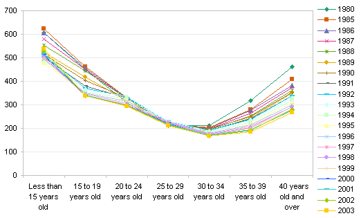
The first step to constructing an analysis like Jorge has made, is to examine the data from as many directions as possible. When you have rows and columns of data, the first exploratory charts you must make show the data plotted with series in rows and with series in columns. I made two charts of this sort, not separated yet as a comprehensive panel chart would be. The first chart below shows the data as Jorge has plotted it; the second shows the same data plotted orthogonally.


The first chart shows the downward trend Jorge chose to emphasize; the second chart shows the “U” shaped pattern Jorge warns us not to miss. There is no “best way” to show all of this information on a chart. Sometimes the solution is to use more than one chart.
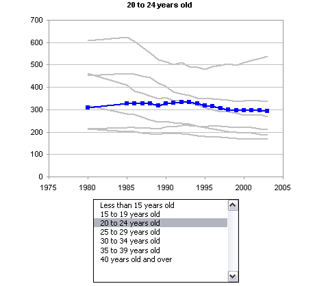
One way to make this easier depends on the ability to provide an interactive chart. In Excel this can be done using worksheet controls that redefine dynamic ranges as they are adjusted by the user. I used this approach on my web site to describe an Interactive Parallel Coordinates Chart. For this exercise, I created an interactive version of each of the charts above in a downloadable zipped workbook. One of these charts is shown below. All series are shown in light gray to provide context, while the series selected in the listbox is shown in a distinct color.

Jorge also points out that while the Abortion Rate is highest for the youngest age group, the percentage of abortions by age group is lowest for this age group. Another pair of charts displays this behavior; I will show these below, and suspend my analysis. Jorge has added this data to his panel chart using a thin bar beside each panel. Alternatively, an additional chart adjacent to the first may be used to show this data.


Some brainstorming could help identify reasons for the observed behavior. For example, the “<15” age group has the fewest pregnancies, and most of these are terminated by abortions.
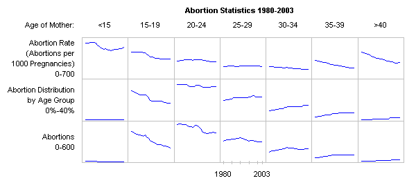
In Small Multiples – Abortion Data 1980-2003, Andreas Lipphardt has written about Jorge’s panel chart. Andreas likes the panel (small multiples) chart, but feels that it can be improved. He would leave off the light gray lines showing data from other panels (I actually like them, but Andreas is right, they really aren’t necessary here). Andreas would replace the bars showing the percentage of total abortions by age group (between the panels in Jorge’s plot) and replace them with another row of panels, showing how this data trends with time (Jorge had used a single time point, I believe the last year of the study). Andreas’ added panel corresponds to the first chart of my second pair, above. Following Andreas’ adjustments to Jorge’s chart, it may not be a bad design to include several rows in the panel chart. Here is a first cut, with absolutely minimal labeling.


