In Web Browser Stats: Problems With Data Gaps I looked at my website statistics to evaluate how relative usage of Internet Explorer, Firefox, and Google Chrome has evolved over the past year and a half. For part of my analysis, I plotted SPC-type control charts of browser stats using a simple mean ± 3 SD approach to control limits. My colleague DaleW reminded me that my quick and dirty approach was not as good as a rigorous Shewhart Individuals control chart analysis. I should have known better; I even covered the individuals chart approach in Introducing Control Charts (Run Charts).
To review the approach, the raw data is plotted in two ways. The actual points are plotted in one chart, and the moving ranges (differences between points i and i-1) are plotted in another chart. A horizontal line is drawn on each chart at the mean of the data. Control limits are calculated using the moving range as a measure of variability instead of standard deviation. The upper control limit (UCL) of the moving range chart is calculated as 3.27 times the mean of the moving range, and this is plotted on the moving range chart. The upper and lower control limits (UCL and LCL) of the individual values is given my the mean of the individual values ± 2.66 times the mean of the moving range, and these are plotted on the individuals chart.
If there is a trend in the data, the moving range will be smaller than the standard deviation, because the basis for determining variability is difference from the previous point, rather than from the mean of all points.
Individuals-Moving Range Analysis
This table shows the individual values and moving ranges for the three main browsers. The means and control limits are computed below the table of values, and values in the table are colored red if they lie outside the control limits. The values show browser usage each month by percent of visits to my site.
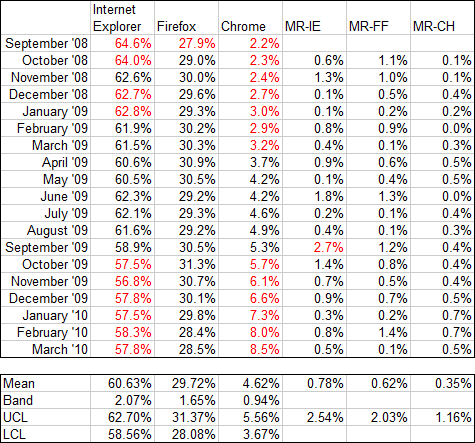
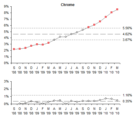
There is a lot of red (i.e., out of statistical control) in the IE and Chrome individual values, notably at the beginning and end, indicating a trend from start to finish. Firefox shows only one red point, and there’s no obvious trend. The only red value in the moving range data is a single point for IE.
The data is plotted in the following I-MR charts. The Y axis ranges are the same for all browsers for easy comparison. The trends for Internet Explorer and Chrome are rather obvious when the new control limits are plotted.

For IE (above) the upper and lower control limits calculated using mean and standard deviation were 67.9% and 53.5%, much further apart than those in the I-MR chart; in fact, those limits fall outside the Y axis scale of the I-MR chart. For Chrome (below), the Mean-SD upper control limit is 10.4%, which also falls outside the corresponding I-MR chart. Both calculations for Chrome’s LCL are below zero; since this makes no physical sense, zero is used.
The Firefox control limits based on mean and SD are further apart than the I-MR limits, by one percentage point (32.4% and 27.0%), but would still be visible in this chart.

I-MR Analysis for Sparse Data
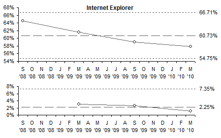
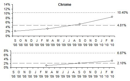
The conclusion from my earlier post was that three points over 18 months is insufficient data to judge whether there was a trend in the browser usage percentages. This conclusion holds when the more rigorous I-MR evaluation is carried out. If we perform the above analysis on four points, one point every six months, the I-MR calculations and charts show the processes are in control, and cannot be attributed to changing patterns of usage.
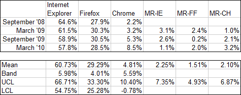
The moving range values are much larger than for monthly data points, since six months of changes are lumped into one point. As a result, the control limits are pushed far enough away from the means that there are no out-of-control points.
The data is plotted in the following I-MR charts. The Y axis ranges are the same for all browsers for easy comparison. Although we “see” trends for Internet Explorer and Chrome, since there are no points outside the control limits and not enough points to invoke the special Western Electric rules, we cannot conclude there is any variation not attributable to random fluctuations.

Further Reading about Statistical Process Control
- ISO 9001 – Introduction to SPC
- Control Charts on Wikipedia
- Interpreting Control Charts
- Selecting the Right Control Chart


