There are many reasons to add data to an Excel chart. Your data may not be ideally arranged to plot it all in one selection. You may decide after the fact to include more information. You may have received another month’s data to plot. You may be adding dummy data to generate some of the effects described in this blog, such as custom labels or a special axis.
Excel offers many ways to add data to a chart, and almost as many ways to adjust the data which is already in the chart. I describe them in this blog whenever the need arises, but I thought it would be good to list them all in one place.
Drag and Drop
One of the easiest ways to add data to a chart is to select the range of data, click on the edge, then drag it over and drop it onto the chart.
We see from the highlights in the worksheet that the active chart is populated with the upper block of data (alpha and beta). We want to add the lower block (gamma) to the chart.
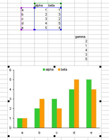
The first step is to select the data. When you mouse over the edge of the selection, the cursor shows a four-way arrow, indicating that the selection can be dragged elsewhere.
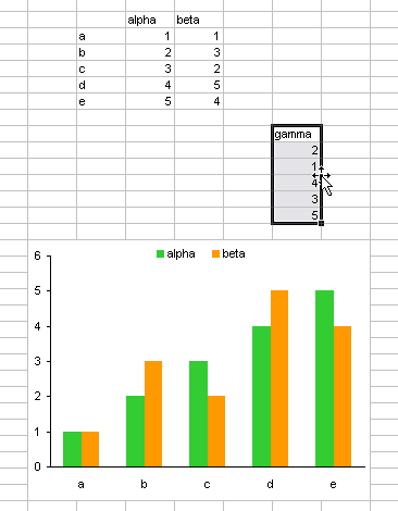
When the range is dragged over the chart, the chart outline is highlighted, and a plus sign appears next to the cursor, indicating that the selection can be added to the chart.
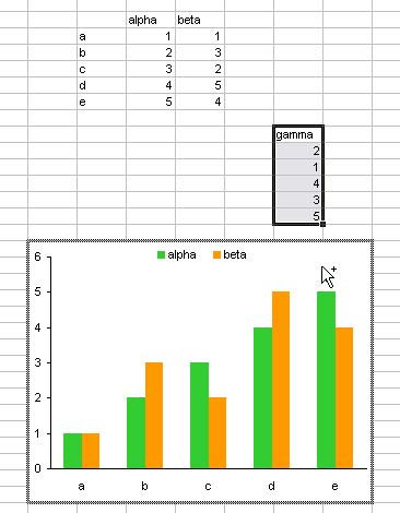
When the mouse is released to drop the data, the Paste Special dialog pops up, so you can make sure Excel is going to add the data the way you want it to.

Here is the chart with the data added. When the series is selected, we see that the selected range is highlighted to show the series name and Y values. Notice the existing category labels (X values) from the upper range are also highlighted.

This is a handy technique, even if it is limited to data on the same worksheet that the chart is embedded in. For some reason, though, it has been removed from Excel 2007. There are still many ways to accomplish this task.
Copy Paste Special
Instead of dragging the range and depositing it onto the chart, you can get the same result if you copy the selected range, then select the chart, and use Paste Special. The Paste Special box appears, allowing you to adjust the settings, if necessary. Data copied from another worksheet, even another workbook, can be pasted into a chart.
I never got into the habit of dragging and dropping data onto my charts, so I very frequently use Copy and Paste Special.
Copy Paste
You can also copy the selected range, then select the chart and use Paste. This bypasses the Paste Special dialog, instead applying the default settings without disturbing the user.
Neat Trick with Axis Labels
I learned a new trick this week in Excel Chart Tip – Insert Chart Series in an Excel Chart, by Ajay of the DataBison blog. You can use either the Copy Paste or the Drag and Drop technique to replace the category labels in a chart.
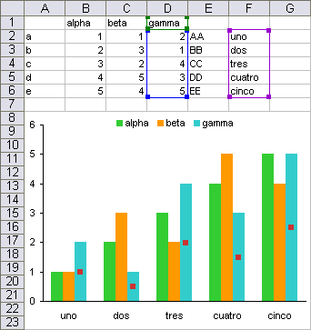
The chart’s source data has to be lined up, as in the chart shown below: the category (X) labels and Y values are all parallel and begin in the same row. It’s not necessary that the Y values be in consecutive order, nor that the category (X) labels be located to the left of the Y values. The Y value and category (X) label ranges can span different numbers of columns as long as they start in the same row.
An alternate set of labels can be used to replace the existing category labels. The new labels must be located in the same alignment as the category (X) labels and Y value, and the new labels have to be text labels, not numerical values.

Drag and drop the new label range onto the chart, or copy and paste the labels onto the chart. The new labels replace the existing category labels in the chart.
Drag Highlights in Worksheet
As described in Chart Source Data Highlighting and shown above, the source data range of a chart is highlighted in the worksheet. You can click on the corner of this highlighted range (the cursor turns into a multiple arrowhead)
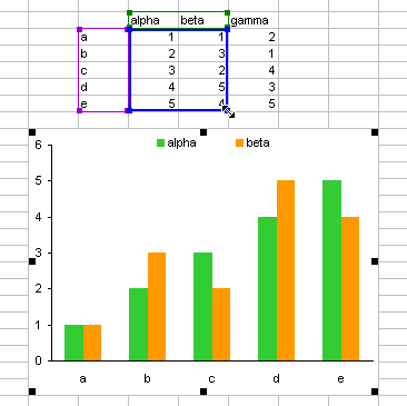
and drag it to enclose a different range

and the new chart source data will be plotted in the chart.

Obviously this technique is limited to data on the worksheet the chart is embedded in.
Add Series Formula
When you add a series to the chart, you add a series formula. Conversely, if you add a series formula, you also add a series. You can just start from scratch and type the whole formula, but it’s easier start with a copy of an existing formula. I think I used series formulas to edit chart data for a couple years before I realized that there was a source data dialog I could use.
Select an existing series in the chart, and note the series formula in the formula bar. Copy the formula.

Press Esc to exit editing mode in the formula bar. Select the chart area or plot area, click in the formula bar, and paste. Then edit the formula like you would any other formula. Here, references to column C are changed to D, and the plot order is changed from 2 to 3.

If an existing series is selected when you paste the formula in the formula bar, you will be replacing an existing formula, so the selected series will change based on the edited formula.
If the plot order is not changed, the new series will be inserted into the slot defined by the plot order index, and series with that index or higher will be moved higher in the list.
Press Enter to accept the formula, and the chart displays the added data.

You can copy the series formula from anywhere. It can be in the same chart or another chart, or you could save some frequently used formulas in a text file.
The formula can reference data in any worksheet or workbook. Tt can also refer to named ranges, and even data that’s not in a range: the series name can be a string embedded in quotes, while the X or Y values can be entered as an array. For more details, see my article on The Chart Series Formula.
Source Data – Data Range Dialog (2003)
You can add data to the chart using the Source Data dialog, Data Range tab, to stretch the range plotted in the chart. This works best if the data is in a contiguous range. You can’t add an arbitrary series in this manner, because any selection made in this dialog overwrites the existing source data.

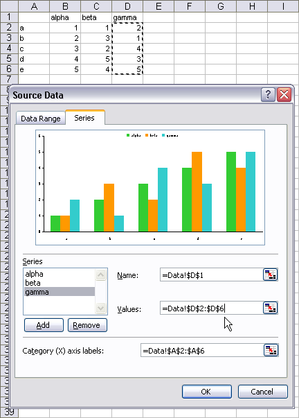
Source Data – Series Dialog (2003)
You can use the Series tab of the Source Data dialog to add any arbitrary series to the chart. The series name, X values, and Y values can be defined independently, even taken from different worksheets.
Select Data Source Dialog (2007)
In Excel 2007, the Data Range and Series tabs of the Source data dialog have been combined into the single view on the Select Data Source dialog. The dialog has lost the preview of the chart, and the individual series data has to be selected on small child dialogs that pop up when the user clicks on various buttons (Add or Edit).
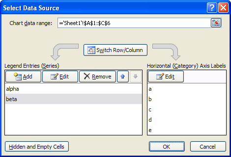
Despite the different appearance, this dialog works much the same as its classic equivalents.


