Column Chart with Primary and Secondary Axes:
Use a Panel Chart Instead
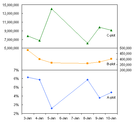
It’s hard to make column charts with primary and secondary axes; special steps must be taken to prevent secondary columns from obscuring primary columns. Such charts are even harder to read than most two-axis charts, probably because the primary and secondary columns are interspersed. You can avoid these problems if you use a panel chart instead.
What People (Think They) Want:
Column Chart with Two Axes
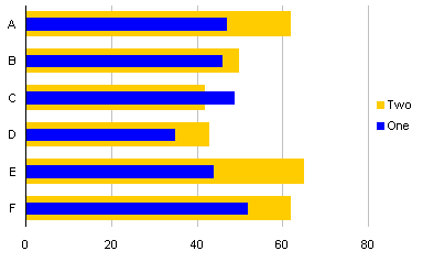
Let’s use some simple data to illustrate the situation. Here the Secondary data is more than an order of magnitude greater than the Primary data.

When plotted together on a single axis, we can’t tell much about the Primary data, because it is overshadowed by the Secondary data.

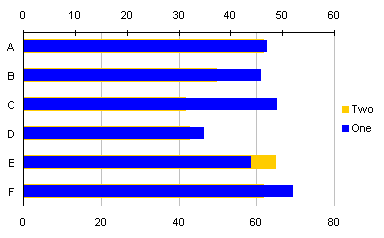
Aha! We’ll just plot the Secondary data on the Secondary axis, despite Jon’s earlier warnings about Secondary Axes in Charts.

Now the Secondary data really obscures the Primary data. This is where people usually get stuck with their chart.
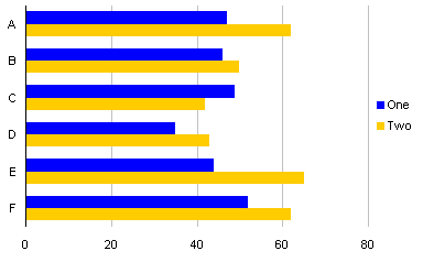
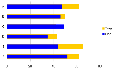
Of course, it’s possible to add dummy series to the chart to provide adequate spacing.
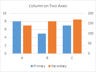
I’ve found that plotting data on two different axes makes it hard for the reader to determine and recall which axis goes with which data. It’s even more confusing with bars that alternate between axes. No matter how you try to clarify the chart, using axis labels that coordinate with the data (shown below), using arrows (not shown), people still mix them up.
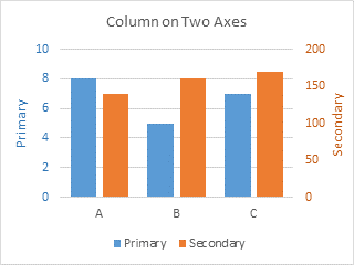
This is added to the usual confusion with two axes. I’ve had people (smart people, mind you) look at the chart, and their takeaway was that Secondary started lower then Primary, but finished higher.
Ah, the perils of a chart with primary and secondary axes.
What People Really Should Use:
Panel Chart
It’s okay to use primary and secondary axes in the same chart, but to avoid confusion, it’s best to separate them into separate panels of the chart. This is the protocol for creating such a panel chart.
We’ll use the same data.

Start by making a plain old column chart.
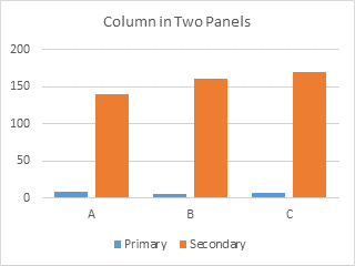
Format the Secondary series so it is plotted on the Secondary Axis.
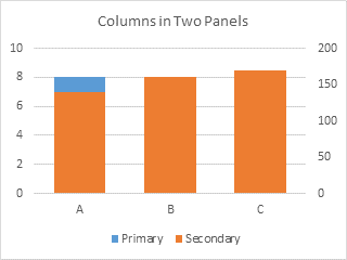
The Primary axis is scaled from 0 to 10, and the Secondary axis from 0 to 200. We need to adjust these scales so the Primary panel is in the bottom half of the chart, and the secondary panel in the top half. If the primary panel has to be 0 to 10 in the bottom half of the chart, we need another 10 units on top, so the total primary scale should be 0 to 20. If the secondary panel has to be 0 to 200 in the top half of the chart, we need another 200 units below this, so the secondary scale should be -200 to 200.
Format the primary and secondary vertical axes according to these computations. If you use a major unit of 2 for the primary axis and of 40 for the secondary axis, both sets of labels line up with the primary horizontal gridlines.
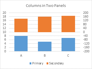
We don’t want to display primary axis labels in the secondary panel or secondary labels in the primary panel. We can use custom number formats to display only the desired axis labels.
In general, number formats have four elements, separated by semicolons. The first element shows the format to be used for a particular numerical situation, the second for another particular numerical situation, the third for all other numerical values, and the fourth for alphanumeric labels:
[first condition]format;[second condition]format;format;alphanumericIf conditions are not specified, the first condition is positive numbers and the second is negative number, leaving the third for zero values.
This makes the custom number format for the secondary axis very easy:
0;;0;@Positive numbers (first element) and zero values (third element) will be displayed as numbers with no decimal digits (i.e., “0”), negative numbers (missing second element) will not be displayed, and alphanumerics (fourth element) will be displayed as themselves (“@”). You could leave off the “@”, and alphanumeric values will also not be displayed.
The custom number format for the primary axis is not much more difficult, now that you know the system:
[<=10]0;;;@Values less than or equal to 10 (first element) will be displayed as numbers with no decimal digits (i.e., “0”), any other values (missing second and third elements) will not be displayed, and alphanumerics (fourth element) will be displayed as themselves (“@”), or omitted if desired (omit the “@”).
Format the primary and secondary axes in turn, and assign the applicable custom number format to each.

We’ll want to visually separate the two panels. Excel only gave us the secondary vertical axis, but we’ll add the secondary horizontal axis, and position that between the panels (at Y=0 on the secondary vertical axis).
First, format the gridlines to use a lighter shade of gray, and the primary horizontal axis to use a darker shade of gray (but not too dark, no need to use harsh black lines).

Using the plus icon (Excel 2013) or the Chart Tools > Layout tab > Axes control (Excel 2007/2010), add the secondary horizontal axis. Excel puts it at the top of the chart by default.

Format the secondary horizontal axis so it uses the same gray line color as the primary horizontal axis. Also format it so it has no labels and no tickmarks.
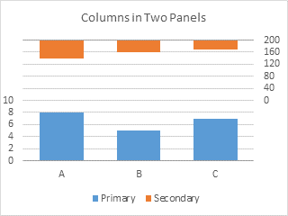
Format the secondary vertical axis (right side of chart) so the horizontal axis crosses at the automatic position (zero).
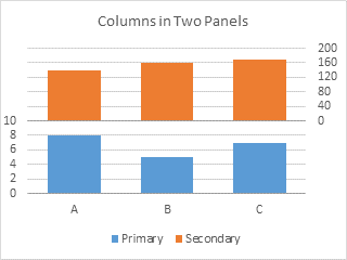
Nobody says you need to keep the original aspect ratio of your chart. You can make it narrower (more so for fewer bars) and taller. You can also adjust the size of the plot area to minimize the white margins around the plotted data.
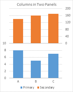
You probably want to label your vertical axes. Using the plus icon (Excel 2013) or the Chart Tools > Layout tab > Axis Titles control (Excel 2007/2010), add axis titles to the two vertical axes.
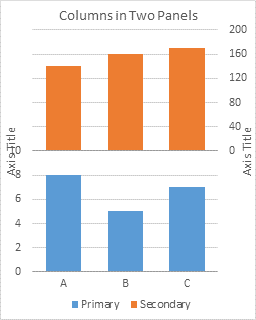
Excel centers these axis titles along the sides of the chart. You can drag them so they are centered on their respective panels. You’ll probably also have to readjust the plot area.

Adding Data
Making the panel chart seemed like a lot of steps, but it’s really not more steps than making any chart with primary and secondary axes, and it’s fewer steps than the gymnastics needed to put columns on two axes with appropriate spacing.
Adding data is also easier for the panel chart. If I add a series to the column chart with two axes, it throws off the spacing provided by the dummy series, and I’ll need to adjust the number and arrangement of blank series in the chart.
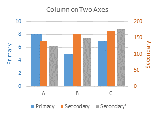
But I’m not going to bother. Instead I’ll add the data to my panel chart.
So copy the new data, select the chart, click on the Paste button of the Home tab (the Copy button in 2007!), and add the data as a new series.
The data is added to the secondary axis.

If the data belongs on the primary axis, simply format the new series and assign it to the primary axis.
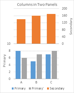
If the new series belongs on the secondary axis, you’re already done.
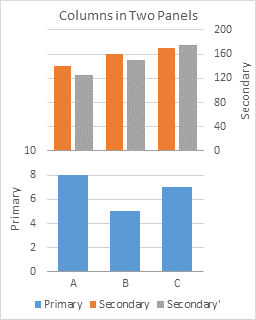
If you add multiple series, and they belong on both axes, well, just move the appropriate ones to the primary axis.
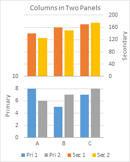
If you need primary and secondary axes, it’s easy to use panel charts to produce charts that avoid the confusion that overlapping axis scales can cause.


