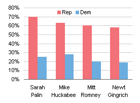
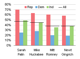
In Yikes! Another Pie Horror Show, I was showing problems with yet another pie chart. I know the criticism of pie charts getting tiresome, but I wanted to respond to a comment by Jeff Weir:
Q: What’s worse than comparing categories within a pie chart?
A: Comparing categories between 2 pie charts.
I will use an article Jeff cited to show a better way to make comparisons.
The Analysis
Jeff pointed to Why are men more affected by labour market downturns?, a study by the NZ Department of Labour. The article stated that of the 34,000 jobs lost by the NZ economy in the eight quarters ending September 2009, 80% were lost by men.
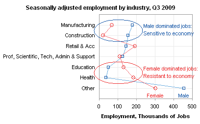
This disparity in job losses can be seen through an analysis of the jobs held by men and women. Many more men hold jobs in manufacturing and construction, sectors which are hard hit during recessions. Women on the other hand are more likely to be employed in fields such as education and health, which are largely government funded and tend to be less sensitive to economic conditions.
The Visualization
This is a well thought out analysis, but as Jeff pointed out, comparing wedge sizes in two different pie charts is not an effective way to support the argument. Their two original pie charts were huge, and not even posted on the same page, though they did show barely legible thumbnails adjacent to the text of the article. The following two charts show the breakdown of jobs by men and by women. I’ve enlarged the pit thumbnails somewhat, to improve legibility and to compare with an alternate display I’ve created below using Dot Plots.
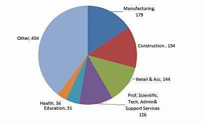
Seasonally adjusted male employment by industry September 2009 quarter
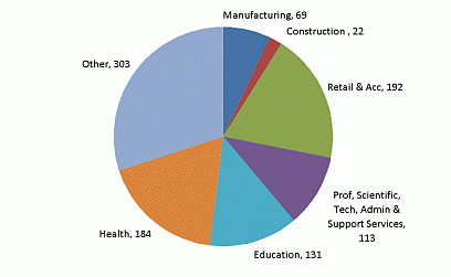
Seasonally adjusted female employment by industry September 2009 quarter
The Alternative Visualization
I’ve made two dot plots to show the same data. Within a couple pixels, the Dot Plots (including title) are the same size as these pie charts (without title), but each Dot Plot shows twice as much information, the Dot Plots have much more legible text, and the comparisons are much easier to make within a Dot Plot than between multiple pie charts.
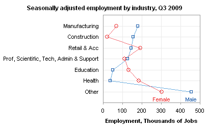
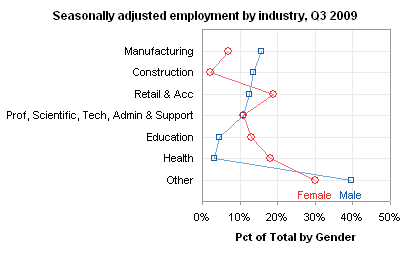
It would be so easy to make a few simple annotations on one of these dot plots to drive home the point of the analysis.
Dot Plots
Dot Plots have been developed as a more effective tool for categorical comparisons than bar charts, pie charts, or (gasp!) donut charts. You can read about them in several places:
- Good Graphs for Better Business by William S. Cleveland and N.I. Fisher
- Dot Plots: A Useful Alternative to Bar Charts by Naomi Robbins
- Some Comments on Dot Plots by Naomi Robbins (a guest post on this blog)
- Compare Metrics by Category Using Excel Dot Plot Charts by Charley Kyd
- Excel Dot Plots by Kelly O’Day
- Dot Plots on this web site
The last three links show various techniques for creating Dot Plots in Excel. Excel doesn’t make it easy to create Dot Plots: you need to use one helper series technique or another to generate the text labels along the vertical axis. The easiest approach is probably to use a horizontal bar chart with hidden bars to supply the labels, and an XY chart to supply the data points.
Dot Plots in Peltier Tech Charts for Excel
This tutorial shows how to create Dot plots, including the specialized data layout needed, and the detailed combination of chart series and chart types required. This manual process takes time, is prone to error, and becomes tedious.
I have created Peltier Tech Charts for Excel to create Dot Plots (and many other custom charts) automatically from raw data. This utility, a standard Excel add-in, lays out data in the required layout, then constructs a chart with the right combination of chart types. This is a commercial product, tested on thousands of machines in a wide variety of configurations, Windows and Mac, which saves time and aggravation.
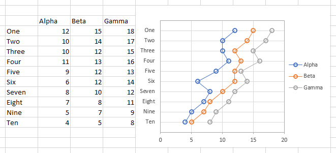
A simple dialog presents you with a few options for your chart.
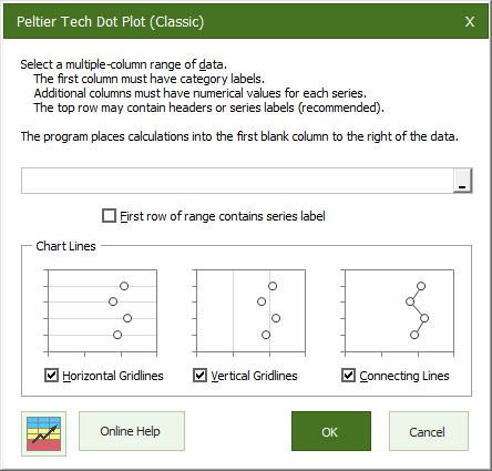
The output appears in an instant. The necessary calculations are hidden behind the chart, which is scaled and sized so the chart axis categories line up with the rows of the table.
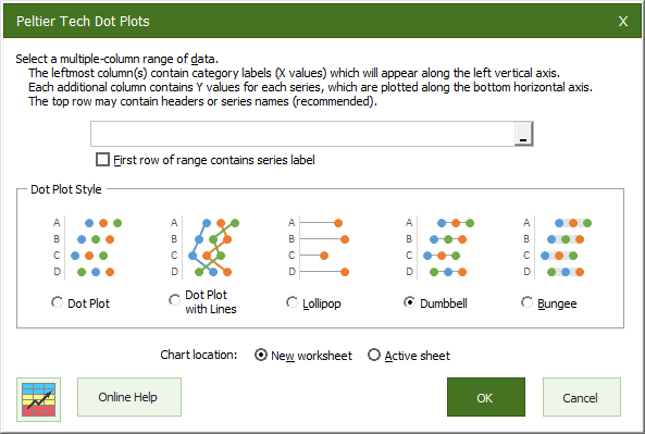
I’ve also added some additional types of dot plots, including lollipop charts and dumbbell plots. The dialog is simple to use:
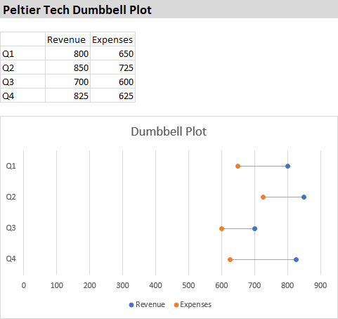
The output of this dialog is produced on an inserted worksheet:
Please visit the Peltier Tech Charts for Excel page for more information.


