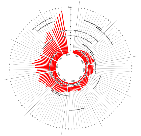
A few months ago, Pedro Monteiro of the What Type blog asked What type of events affects oil prices? To illustrate the changing price of oil over the past decade, Pedro built the following bicycle-spoke-like chart:

click to view original chart at full size
At first glance, the chart catches your eye.This chart was picked up by a number of blogs and other sites which thought this was a great work of visuaization: Flikr, Simple Complexity, and Occasional Roborant, to name but a few.
Upon closer inspection, it is obviously not very effective at displaying its information. There is no basis for the circular alignment, because it does not represent any kind of cycle, annual or otherwise. The resolution is limited to the radius of the chart, or half its height, whereas a simple bar chart would have the entire height of the chart, and thus twice the resolution. The original chart is much larger than this, more than twice as large, so shrinking it has made the labels illegible. It’s hard to tell which dates the labels reference, because some of the wrap far enough to span up to two years. Because of the angular rotation, it is not easy to compare bars that are more than a couple months apart.
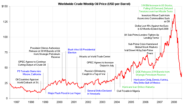
I looked up some petroleum price data and a few events, and built a line chart. My data is weekly, not monthly, so the line chart has finer resolution on the time scale. I also have the benefit of several more months of data, covering the precipitous price drop during the last half of 2008. In my chart, the black labels correspond to labels in the rotary chart. The blue labels also relate to labels in the radial chart, which I repositioned to more accurately indicate their occurrence. The green labels refer to other events I looked up to add a few more relevant details.

click to view chart at full size
I shrunk the chart slightly to fit the margins, but you can see much more detail. For reference, the shrunken versions of the radial chart and the line chart cover about the same area.
I’m no economist, so I’m not going to try to analyze which events affected oil prices in what way. But I will point out that a simple line chart is easier to interpret, and it leaves more room for clear labeling. If you’d like more information and an informed analysis, you can visit Annual Oil Market Chronology and Current Monthly Energy Chronology at the Energy information Administration of the Department of Energy, or Oil price chronology, a more detailed timeline at Wikipedia.
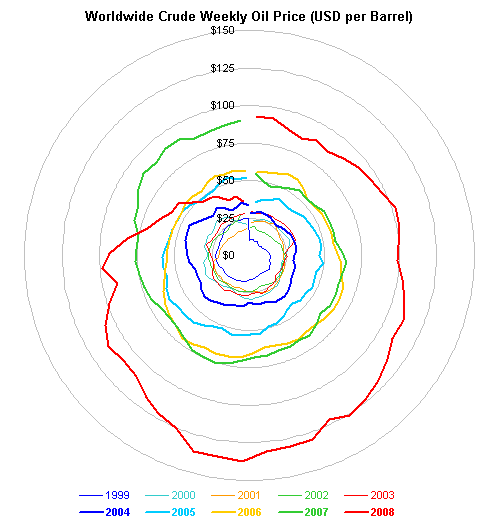
If you want to examine the data for any periodicity, you could plot it on a radar chart, which is difficult to read. I didn’t even try to apply labels, and I’m sure the peak in July 2008 is hidden by the spiral shape and the position of the peak near the bottom of the chart.

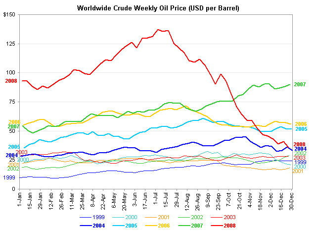
Alternatively you could draw a line chart with a category axis that spans a year. This is much easier to read. The lower prices of the early 2000s are not crunched into the center of the chart like a tangle of yarn. The rise in price which started in 2007 and accelerated in the first half of 2008, and the subsequent drop to 2004 levels, are clearly visible.

I guess the moral of this story is that simple chart designs are best. Plain, garden-variety line charts are much more effective than the radially oriented bar chart and the radar chart at showing the details of oil prices over the past decade.


