My friend Thom and I had a discussion about tracking weight and using histograms to show the shape of the weight distribution. He told me he disliked the native Excel Histograms, and I agreed. I’ve written a lot of articles about histograms (see the list at the end of this article), and my commercial software, Peltier Tech Charts for Excel, provides a couple types of histogram which are much more flexible than Excel’s.
I was going to show Thom how to build his own histograms, with a frequency table and all, and I thought, you know, all those new functions and features will make this easier. So I’m going to build a histogram using Dynamic Arrays and show you how easy it can be.
The Data
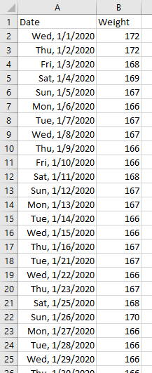
I’m using my recorded weights for 2020, which has a column for date and one for weight. The dates are in A2:A288 and the weights are in B2:B288. Easy peasy.
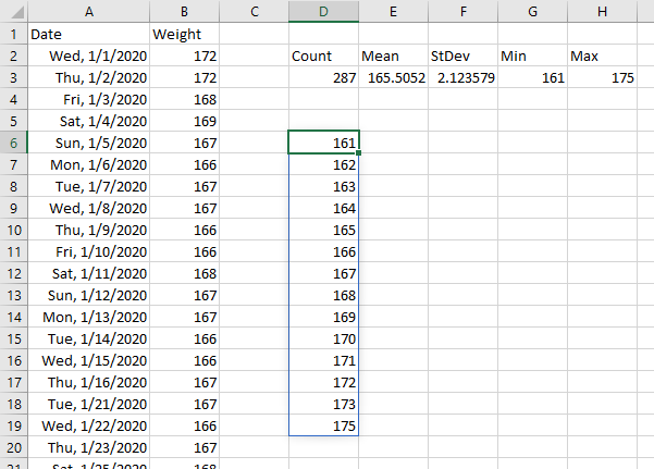
I like to make a little summary table when I do an analysis like this. Below I’ve included the number of data points (Count), the Mean and Standard Deviation, and the Minimum and Maximum values. The formulas are =COUNT(B2:B288), =AVERAGE(B2:B288), =STDEV(B2:B288), =MIN(B2:B288), and =MAX(B2:B288).

Generate Chart Data
Let’s make a list of weights. I’ll use =UNIQUE(B2:B88) to produce a list of weights in column B. But let’s also sort the list, using =SORT(UNIQUE(B2:B288)). The dynamic array formula starts in cell D6, and spills down as far as it needs to, in this case to cell D19. The spill range is indicated by the blue shadowed border of D6:D19. This spilling into appropriate-size ranges makes Dynamic Arrays flexible and powerful.
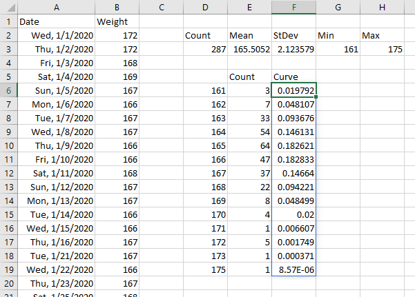
Given the weights we need counts for, we can use a simple COUNTIF formula. In cell E6 I have =COUNTIF(B2:B288,D6#). The # symbol after D6 in the formula means Excel will use the entire Dynamic Array defined in D6, and spill the results starting in cell E6, however long it may be.
And we see the Dynamic Array result in E6:E19

We can calculate the points we need for a Normal Curve using the NORM.DIST function. The function in cell F6, which spills into F6:F19, is =NORM.DIST(D6#,E3,F3,FALSE), using the mean and standard deviation calculated in cells E3 and F3.
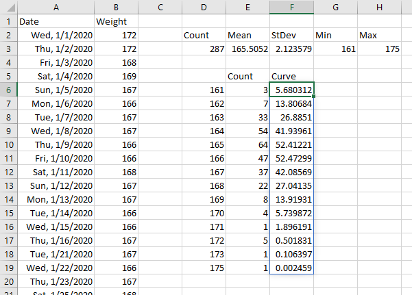
Actually, I can fix the curve data. The results above are in fractions while the counts are in whole numbers. But multiplying the fractions by the total number of input values will put the curve and the count on the same scale. So I’ll change the formula in F6 to =D3*NORM.DIST(D6#,E3,F3,FALSE).
Build the Chart
Select the range D6:F19 and insert a clustered column chart.
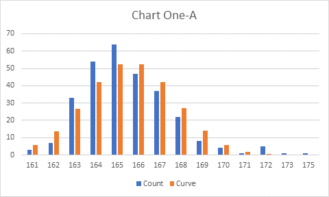
Right click on one of the visible data points, and choose Change Series Chart Type from the pop-up menu. Select the Curve series, and change the chart type to Line in the dropdown.
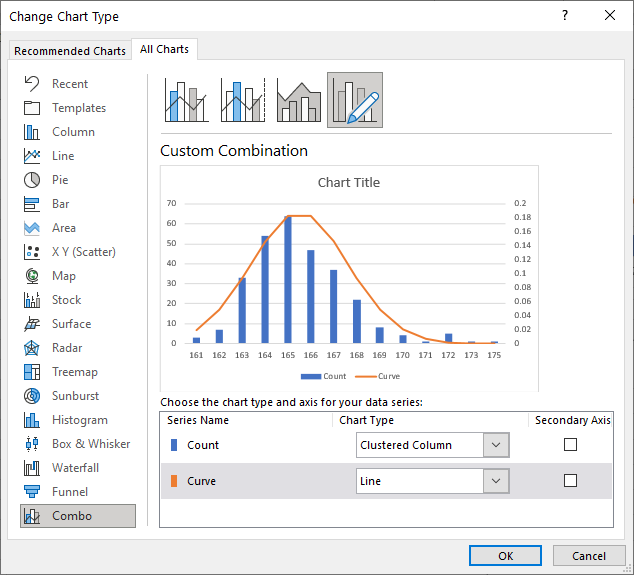
It’s a good start, but still a bit rugged.
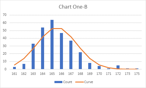
Format the Curve series line to use a Smoothed Line, and change the Gap Width of the columns to 50.
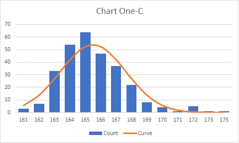
Finally I deleted the legend.
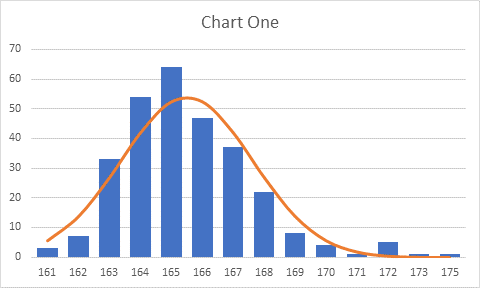
The bars and the normal curve are not perfectly aligned, because there’s a longer tail at the higher weights, but that’s not a problem.
So it’s a pretty good chart. Or is it…??
The First Correction
Did you notice that there was no value 174 between 173 and 175? The problem with using UNIQUE is that it only gives you what values are in the range, not every value you might expect.
I’ll fix this by using SEQUENCE(rows, columns, start, increment) rather than UNIQUE(range). Cell D6 has the formula =SEQUENCE(H3+1-G3,1,G3,1). The number of rows is the max plus one minus the min, H3+1-G3; the number of columns is 1, the starting value is the minimum, G3, and the increment is 1. This Dynamic Array formula requires an extra row (for the previously missing 174) but the Count and Curve Dynamic Arrays keep up easily.
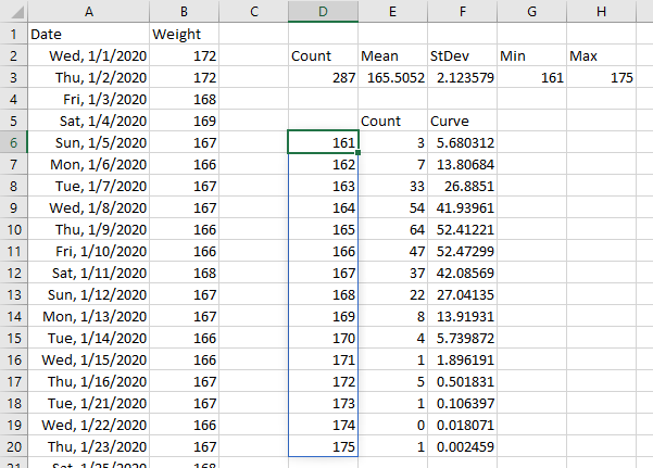
The chart now shows all categories, with a zero-height bar at 174.
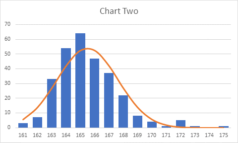
That’s even better. But is it good enough?
Non-Integer Inputs
Thom’s data is different from mine: I record weights as whole number pounds, but Thom records tenths of pounds. This requires a few changes.
If I regress to the first example and use =SORT(UNIQUE()), I get a list of every unique value in the data range. Obviously this isn’t what I want; I really just want whole numbers in the chart’s X values.
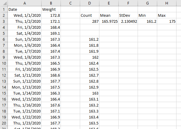
If I use the SEQUENCE approach with =SEQUENCE(H3+1-G3,1,G3,1) in cell D6, I still encounter a problem because the minimum isn’t a whole number.
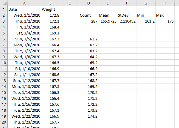
I need to adjust my calculated Min and Max, using =FLOOR(MIN(B2:B288),1) and =CEILING(MAX(B2:B288),1) to give me whole numbers in cells G3 and H3. The function in D6, =SEQUENCE(H3+1-G3,1,G3,1), now provides what I need
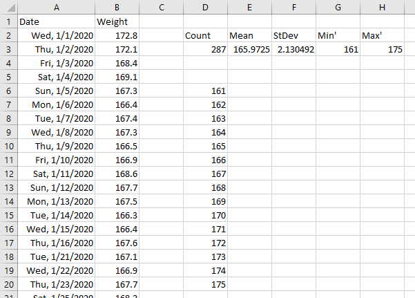
But now the COUNTIF() function in cell E6 falls flat. As written, the function looks for exact matches with the results from the D6# Dynamic Array, counting only 23 of the 287 weights.
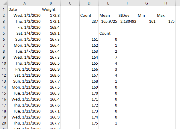
I need a smarter counting function in cell E6, so I will use =COUNTIFS(B2:B288,">="&D6#,B2:B288,"<"&D6#+1), which counts values between D6$ and D6#+1. This counts all 287 of these values.
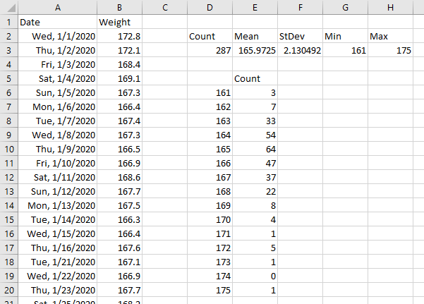
The same NORM.DIST function as before gives me the normal curve coordinates. Cell F6 has the formula =NORM.DIST(D6#+0.45,E3,F3,FALSE).
The reason for the offset of 0.45 in the formula for the curve is that I’m not counting whole numbers, I’m counting values between one whole number and the next. The bar for 161 reflects values between 161.0 and 161.9 (assuming a resolution of 0.1), which average 161.45.
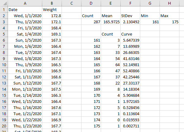
The chart is nearly identical to the one with whole number weights above.

Make the Chart Symmetrical
All the charts so far suffer from a certain asymmetry. Because it’s easier for my weight to float upward a bit for a few days than downward, there is a longer upward tail on the distribution, and the bulge of the chart is off center.
I can fix that with a further modification to the Min and Max in my summary table. To make the chart symmetrical, I need the same amount of space above and below the mean.
The distance from the mean to the max is MAX(B2:B288)-E3, while the distance from the mean to the min is E3-MIN(B2:B288). The symmetric space above and below the mean is given by MAX(MAX(B2:B288)-E3,E3-MIN(B2:B288), so the new min and max values in G3 and H3 ARE:
=FLOOR(E3-MAX(MAX(B2:B288)-E3,E3-MIN(B2:B288)),1)
=CEILING(E3+MAX(MAX(B2:B288)-E3,E3-MIN(B2:B288)),1)
When these are used as the bounds, I get the following Dynamic Arrays:
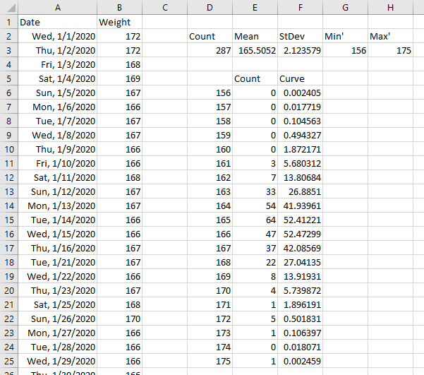
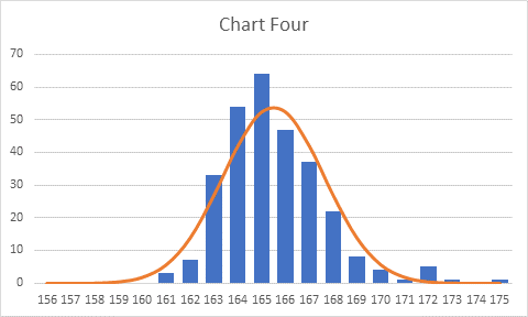
When I create a chart as above, the bulge of values is centered in the chart. This satisfies my internal aesthetic. Because of the longer tail at the top end, the curve and bars are not perfectly aligned, but I won’t dispute the data.
LET Me Take it Further
If the Dynamic Arrays are becoming easy for you, we can take it further, using the new LET function. With LET, I can define inputs and intermediate calculations, and use them in downstream calculations. I’m continuing with whole number data from here on, but these principles could be applied to either case.
My formula in cell D6 is shown below. I define the input range of weights, rng, and the calculated minimum and maximum values, datamin and datamax. I compute delta, the larger of the spans between the max or the min and the mean. Based on delta I compute my new minimum and maximum values, newmin and newmax. I determine my list of weights, then do my COUNTIF and NORM.DIST as in the individual Dynamic Arrays in D6:F6. By using CHOOSE({1,2,3},... I can output all of these from a single formula. It’s mind-boggling at first, but also exciting.
=LET(rng,B2:B288,datamin,MIN(rng),datamax,MAX(rng),avg,AVERAGE(rng),delta,MAX(datamax-avg,avg-datamin),newmin,FLOOR(avg-delta,1),newmax,CEILING(avg+delta,1),weights,SEQUENCE(newmax+1-newmin,1,newmin,1),CHOOSE({1,2,3},weights,COUNTIF(rng,weights),COUNT(rng)*NORM.DIST(weights,avg,STDEV(rng),FALSE)))
With this large formula in cell D6, here is my new Dynamic Array formula. Just like the previous one, but it takes one formula, not three.
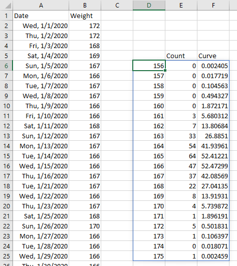
Since the calculations are identical, the resulting chart is identical.
Is your mind blown yet? If not, read on.
LAMBDA Anyone?
Dynamic Array formulas came first, and they awed and amazed us all. Then came the LET function, which allowed us to input arguments and perform intermediate calculations leading to our desired results. But LAMBDA takes Excel an order of magnitude further, allowing us to define a formula, then use it as a custom function wherever we need it.
Using LAMBDA I’m going to define a function HistoNormData, which will allow me to input a range, such as my weights, and spit out a data range that I can use in a histogram.
The bulk of my LAMBDA formula will be the LET formula from the previous section. I input the data range into LAMBDA, pass it into the LET, and output the chart data range. The LAMBDA formula looks like this:
=LAMBDA(rng,LET(datamin,MIN(rng),datamax,MAX(rng),avg,AVERAGE(rng),delta,MAX(datamax-avg,avg-datamin),newmin,FLOOR(avg-delta,1),newmax,CEILING(avg+delta,1),weights,SEQUENCE(newmax+1-newmin,1,newmin,1),CHOOSE({1,2,3},weights,COUNTIF(rng,weights),COUNT(rng)*NORM.DIST(weights,avg,STDEV(rng),FALSE)))
I can’t use it like this. But I can enter it into a formula and append values for the LAMBDA arguments. My only argument is rng, and I want to use B2:B288, so I enter the formula in cell D6, and append the range address in parentheses at the end of the formula:
=LAMBDA(rng,LET(datamin,MIN(rng),datamax,MAX(rng),avg,AVERAGE(rng),delta,MAX(datamax-avg,avg-datamin),newmin,FLOOR(avg-delta,1),newmax,CEILING(avg+delta,1),weights,SEQUENCE(newmax+1-newmin,1,newmin,1),CHOOSE({1,2,3},weights,COUNTIF(rng,weights),COUNT(rng)*NORM.DIST(weights,avg,STDEV(rng),FALSE)))(B2:B288)
This approach helps to debug the LAMBDA formula.
The result of the LAMBDA formula is identical to that of the LET formula in the previous section, and the resulting chart is also identical. Since the LAMBDA works out in this test, I’m ready to convert it into a custom function. This is done using Excel’s Defined Name infrastructure.
On the Formulas tab of the ribbon, click Define Name. When the New Name dialog pops up, enter the name of the custom function in the Name textbox, and enter the formula (not including the arguments in parentheses at the end) in the Refers To textbox. It’s easiest to just copy and paste the formula that you worked on in the Excel formula bar above: you can make the Name dialog larger, but you can’t make the Refers To box more than one row of text tall. Microsoft assures us they are working on a better formula editing experience, and we can’t wait.
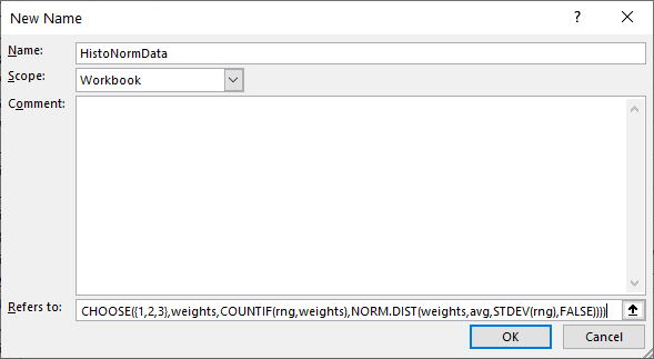
Click OK and the custom function is created.
The function is used like any others in Excel. Cell D6 contains the formula
=HistoNormData(B2:B288)
and my three columns of values are output in the sheet, spilling to fill as many rows as are needed.
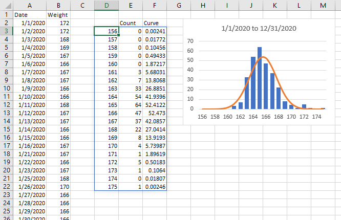
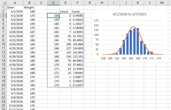
The range and chart are identical to what we’ve already seen above, but I can easily use my HistoNormData function to compute similar output ranges for other data in the same workbook. For example, in the worksheet shown below, I have a much larger range of data. I entered this formula in cell D6
=HistoNormData(B2:B783)
And I get a corresponding chart of the larger data set, without any additional work.
Names are defined for a given workbook, so you would have to define your custom function in any workbook where it is needed. But it’s easier than you think: you use the custom LAMBDA function on a worksheet, then copy that worksheet to another workbook, and the custom function is also copied to the new workbook.
Make the Chart Dynamic
I’ve written a follow-up article, Dynamic Charts Using Dynamic Arrays, that shows how to make this histogram dynamic, so that changes to the size of the Dynamic Array’s spill range are reflected in the chart.
A year or so after I posted these articles, Microsoft released an enhancement to Excel that made Dynamic-Array-driven charts themselves dynamic. If all of the data in the chart comes from a single Dynamic Array formula, the chart’s source data will change size to match the Dynamic Array’s spill range. This means we can select the original Dynamic Array and insert our chart, ignore the need to create Names for the X and Y values, and the chart will dynamically change its source data range as the Dynamic Array changes.
More Histogram Articles on Peltier Tech Blog
- Histogram With Normal Curve Overlay
- Histograms Using Excel XY Charts
- Histogram Using XY and/or Area Charts
- Filled Histograms Using Excel XY-Area Charts
- Histogram on a Value X Axis
- Histogram with Actual Bin Labels Between Bars
- Peltier Tech Histogram
More About Dynamic Arrays, LET, and LAMBDA
- ISPRIME Lambda Function
- Lambda Moving Average Formulas
- Improved Excel Lambda Moving Average
- Excel Lambda Moving Average
- LAMBDA Function to Build Three-Tier Year-Quarter-Month Category Axis Labels
- Calculate Nice Axis Scales with LET and LAMBDA
- VBA Test for New Excel Functions
- Dynamic Arrays, XLOOKUP, LET – New Excel Features


