In Dating Site Photo Effectiveness I proposed dot plots to show how different topics of profile pictures lead to different success rates of attracting attention from potential dates. The original analysis in The 4 Big Myths of Profile Pictures used bar charts which were potentially confusing because the origin of the bars was not zero, but instead was the average of all the data. Since my earlier post, Nathan wrote Get a Date With Your Online Profile Pic – Myths Debunked in his Flowing Data blog, and I was inspired to write about some simple graphical statistical tools.
The original analysis showed also the effects of facial expressions and eye contact on photo effectiveness. Profile pictures of women making eye contact are more effective than those without eye contact, for all of the facial expressions. Flirty-face pictures with eye contact are the most effective, while flirty-face pictures without eye contact are least effective.
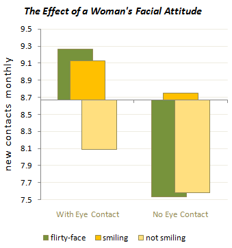
Bar charts show the data reasonably well. When the bars overlap, they may lead to conclusion, because the front bars partially obscure the back bars, and the back bars may appear smaller than they actually are because of this obstruction. It’s also not as easy to see the relative effects.
Main Effects Plots
When performing a statistical analysis, one of the simplest graphical tools at our disposal is a Main Effects Plot. This plot shows the average outcome for each value of each variable, combining the effects of the other variables as iff all variables were independent. In the chart below, we see that the averages for smiling (with and without eye contact) is highest, the average for not smiling is lowest, and flirty-face lies in between. The average for eye contact is greater than for no eye contact (for all facial expressions combined). We could have estimated these effects from the bar chart above, but it’s helpful to take the time to plot these effects.
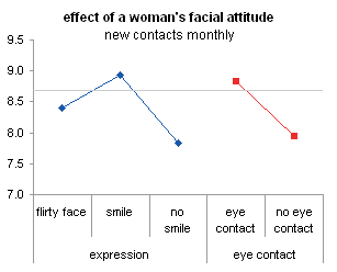
The data is shown below, with ranges shaded to match the color of the plotted points. The two columns to the left of the data are used to produce the two-level category axes in the charts. There is no need to label the series, since the series identification is simplified by these dual axis labels.
Note: I’ve used simple averages from the data in the original article’s charts, but in a real analysis you would have to weight the averages by the proportion of individuals using each level of each factor.

The main effects plot is simple and does not provide a great deal of information. Showing just the main effects of each factor level without accounting for the levels of other factors is simplistic and misleading.
For example, we might assume that the best success would come from smiling and making eye contact, and the worst from not smiling and not making eye contact. In fact, the flirty-face picture accounts for the best success (with eye contact) and the worst (without eye contact).
Interaction Plots 1
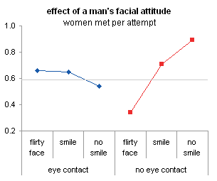
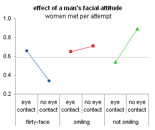
Another graphic statistical tools at our disposal is called an Interaction Plot. This type of chart illustrates the effects between variables which are not independent. Such a plot looks like the charts here. There are two versions, to illustrate better the effects of eye contact and of facial expression.
In fact, the original bar chart above shows interactions between factors, but it is more effective to use markers with connecting lines to display the data.

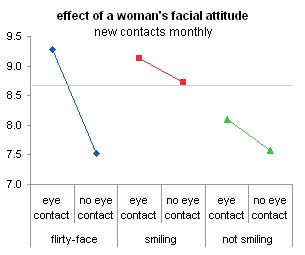
The two charts show the effect of expression for the two eye contact categories (left) and the effect of eye contact for the three expressions (right). The charts can be made easily using data with the appropriate arrangement. The chart on the right shows that the flirty-face expression is most effective, with eye contact. Without eye contact, this expression is a loser.
 – – –
– – – 
The two charts need independent data ranges. The two columns to the left of the data are used to produce the two-level category axes in the charts. There is no need to label the series, since the series identification is simplified by these dual axis labels.
Interaction Plots 2
An alternative and perhaps more common layout for interaction charts is shown below. As above, the two versions emphasize the effects of facial expression and of eye contact.


The series use the same single tier of category labels, and the lower tier of labels has been replaced by data labels on the series themselves. This alternative has the possibility of becoming more cluttered, but it also shows interaction effects more clearly.
For example, the nearly parallel smiling and not smiling lines in the right chart above indicate only a very weak interaction between eye contact and smiling, but the much steeper flirty-face line shows a stronger effect (or an interaction) of eye contact when the facial expression is a flirty face. The nearly parallel segments in the left hand chart show the same weak interaction between smiling and eye contact, while the huge difference between the two flirty-face data points show a strong interaction.
 – – –
– – – 
These two charts can use the same data range, using either columns or rows for the series data. Using series names as data labels adjacent to data points effectively identify the data.
Extension
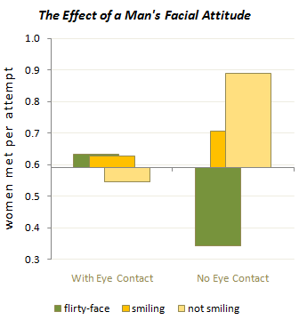
The same approach above provides insights into the photo effectivemess for male subjects.
Here is the original bar chart.
Main effects plot.

Interactions plots, both variations.
 – –
– – 


