My Big Fat Legend Keys
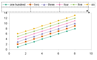
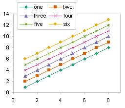
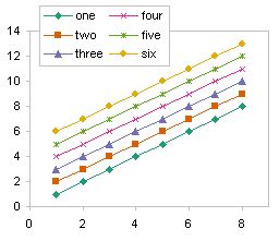
A client had a combination chart in his report, with some columns and some lines, and was complaining about the legend. It seems that when he added the lines, the column entries in the legend had a wide rectangle showing the series color, rather than a square, so the legend was taking up way too much space. The left hand chart below shows this fat-legend problem, while the right hand chart has no problem because I’ve fixed it.

Normally, the fill-type of series (column charts, area charts, bar charts) use a simple square for the legend key, the colored part of the legend entry that helps the user determine which series is which.
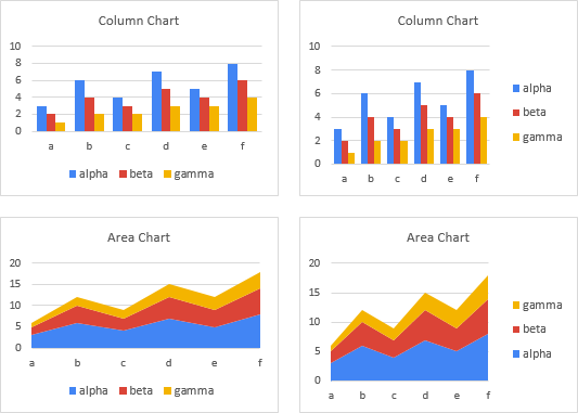
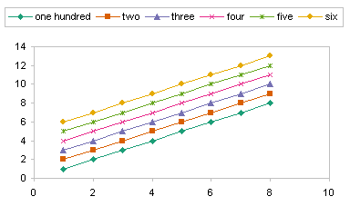
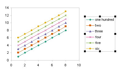
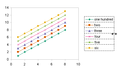
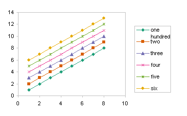
In contrast, line charts have a wider legend key, which allow for the display of a marker and a line.
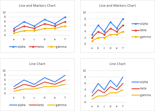
The problematic charts are mixed types. Wider legend keys are needed to show the lines for the line chart types, and to accommodate the added width, the squares for the fill-type charts are widened.
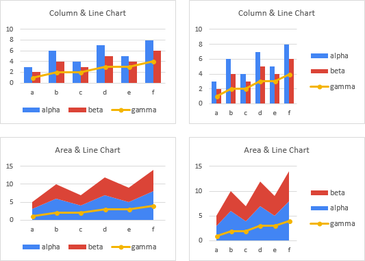
And I thought, wouldn’t we all like to be a little thinner? So I played around a bit, and I’ve found a way to fix this.
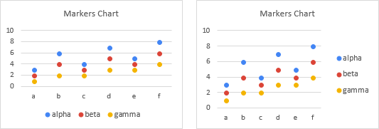
First, I noticed that if the line charts had markers but no lines, the legend keys were only as wide as the markers.
So I played a bit more, and discovered that I could format the whole line series to have no lines, but then format the individual points to have lines, and the legend would only show the whole series format, not the individual point format.
Fix the Fat Legend Keys Manually
I’ll show you the manual protocol first, then I’ll share some VBA that will remove the drudgery of it all.
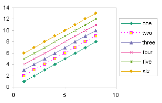
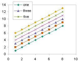
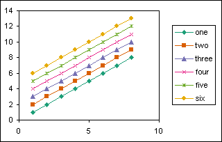
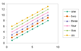
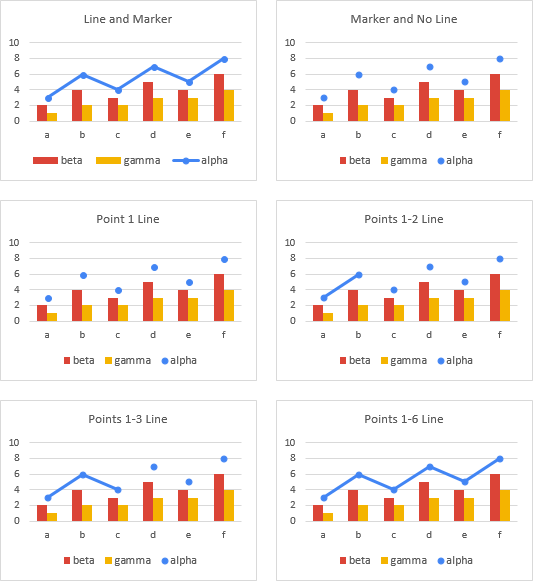
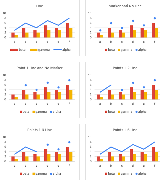
We’ll start with a combination chart with columns and one line series (top left).
The first step is to format the line chart series with markers but no lines (top right).
We select the first point, and format it to have a line, which does not appear, because it connects the first point to the point before that, which doesn’t exist (middle left).
We then select the second point, and format it also to have a line, which is now visible (middle right).
We select the third point and repeat (bottom left).
Finally, we repeat this for the rest of the points (bottom right).
That wasn’t so hard, was it?
What if the line chart has no markers? Well, it’s almost the same. Again we start with a combination chart with columns and one line series (top left).
The first step is to format the line chart series, adding markers but removing the lines (top right).
We select the first point, and format it to have a line but no marker. Neither the line nor the marker appear (middle left).
We then select the second point, and format it also to have a line but no marker (middle right).
We select the third point and repeat (bottom left). See where this is going?
Finally, we repeat this for the rest of the points (bottom right).
Fix the Fat Legend Keys Programmatically
So the protocol isn’t too hard, but you can just tell it’s going to get tedious when there are a lot of charts to process. So I’m here to streamline the process with a little VBA.
The core procedure inputs one line chart series and handles it as above. It first formats the entire series with a marker and no line. If the series originally had no marker, it temporarily uses a square; otherwise it uses whatever marker was present. Then it formats each point in turn to have a line, and if it originally had no marker, it removes the marker from that point.
Sub RemoveLegendLinesFromSeries(srs As Series)
  Dim iPt As Long, nPts As Long
  Dim bNoMarkers As Boolean

  nPts = srs.Points.Count
  Select Case srs.ChartType
    Case xlLine, xlLineStacked, xlLineStacked100
      bNoMarkers = True
    Case xlLineMarkers, xlLineMarkersStacked, xlLineMarkersStacked100
      bNoMarkers = False
    Case Else
      GoTo ExitSub
  End Select

  If bNoMarkers Then
    srs.MarkerStyle = xlMarkerStyleSquare
  End If

  srs.Format.Line.Visible = msoFalse

  For iPt = 1 To nPts
    With srs.Points(iPt)
      .Format.Line.Visible = True
      If bNoMarkers Then
        .MarkerStyle = xlMarkerStyleNone
      End If
    End With
  Next

ExitSub:

End Sub
The next procedure inputs an entire chart, doing each line chart series and ignoring the others.
Sub RemoveLegendLinesFromChart(cht As Chart)
  Dim srs As Series

  For Each srs In cht.SeriesCollection
    Select Case srs.ChartType
      Case xlLine, xlLineStacked, xlLineStacked100, xlLineMarkers, xlLineMarkersStacked, xlLineMarkersStacked100
        RemoveLegendLinesFromSeries srs
      Case Else
        ' nope
    End Select
  Next
End Sub
We have two entry-point procedures: the first handles the active chart.
Sub RemoveLegendLinesFromActiveChart()
  RemoveLegendLinesFromChart ActiveChart
End Sub
The second entry-point procedure figures out what the user has selected, and acts accordingly. If the user has selected a series, a point, a set of data labels, or a single data label, the procedure processes just the applicable series. If the user has selected a chart (i.e., there is an active chart, but none of the previously listed elements are selected), the procedure takes care of the whole chart. If the user has selected multiple charts, then all charts are handled. In fact, since this procedure handles an active chart, the previous procedure isn’t needed after all.
Sub RemoveLegendLinesFromSelection()
  Dim sh As Shape

  If Not ActiveChart Is Nothing Then
    Select Case TypeName(Selection)
      Case "Series"
        RemoveLegendLinesFromSeries Selection
      Case "DataLabels", "Point"
        RemoveLegendLinesFromSeries Selection.Parent
      Case "DataLabel"
        RemoveLegendLinesFromSeries Selection.Parent.Parent
      Case Else
        RemoveLegendLinesFromActiveChart
    End Select
  ElseIf TypeName(Selection) = "DrawingObjects" Then
    For Each sh In Selection.ShapeRange
      If sh.HasChart Then
        RemoveLegendLinesFromChart sh.Chart
      End If
    Next
  End If
End Sub
I selected the mixed charts from the screenshot in the first section above, and ran this last procedure, and in an instant, the legend keys were brought down to size.


