Chart Series and Legends
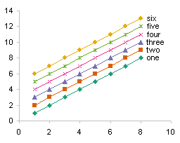
In Excel charts, series are drawn in a particular order and legend entries are listed in their own particular order, based on series number, series chart type, the axis a series is plotted on, and other features, like axis category order and whether series are stacked. People often ask how to move series within a chart or within a legend. This article should help explain what is even possible.
Single Chart Type
If a chart has one type of series, all on the primary axis, the series are plotted in the order that they are added to the chart. The legend usually lists them in this order as well.
Line Charts
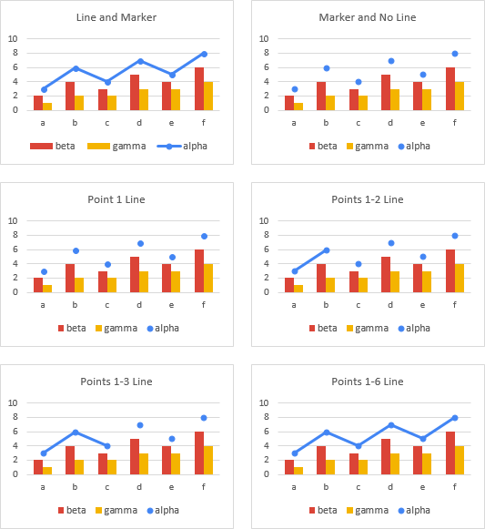
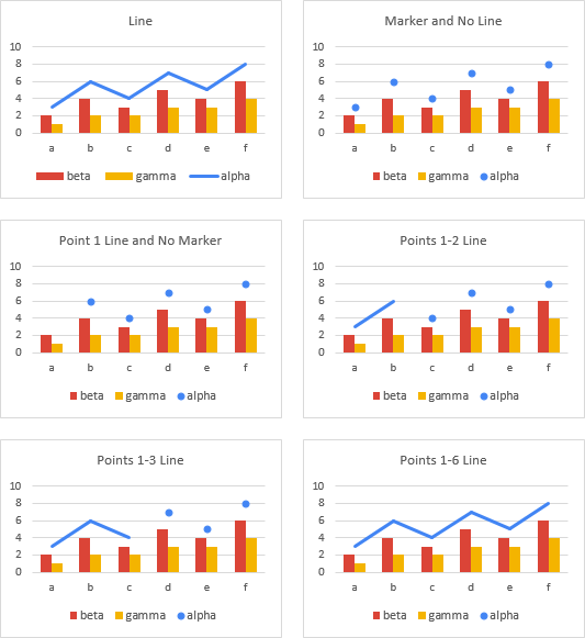
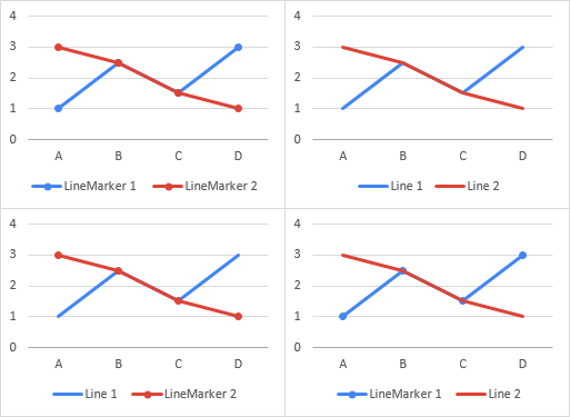
The line charts below illustrate the layering of series. Whether lines with markers or just lines, the second series in red is always plotted in front of the first series in blue. Even to the extent that the red line in the bottom right chart covers the blue markers. The legends all list the blue series first, then the red series.
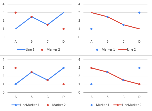
An interesting inversion occurs if one series has markers and no lines. The markers only series is plotted in front of the line series (top row of charts below) or in front of the lines with markers series (bottom row). In both right-hang charts, the blue markers of the first series or drawn in front of the red series. The legends still list blue first, then red.
XY scatter charts show the same behavior as line charts, with series plotted in order except in the case where one series has markers and no lines.
Column and Bar Charts
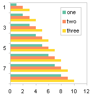
In unstacked horizontal bar charts, legend entries appear in the same order that the series appear in the chart. Below left, red bars and legend entries appear before blue.
Below right, the categories have been reversed in the vertical axis. Now blue bars and legend entries appear before red.
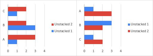
This swapping of the legend to match the arrangement of the bars helps with interpretation of the chart. You might expect column charts to show the same alignment of legend entries with plotted points.
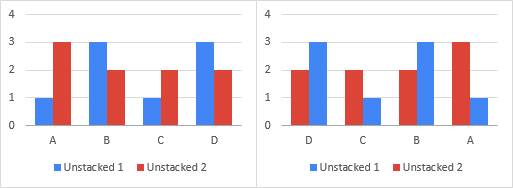
In the original chart, below left, the blue series 1 columns and legend entry appear before the red series 2 columns and legend entry. Reversing the categories in the horizontal axis does reverse the positions of the bars, but the legend keeps its original order, so the legend entries are now out of sync with the columns.
Effect of Stacking
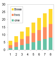
In stacked charts (area, bar, and column charts), each series is stacked on the previous series, so the chart shows totals of all series at each category. The legends are rearranged to list series in the order they appear in the stack. This helps the viewer interpret the plotted data.
Note: You can also stack line chart series, but it’s not a good idea to do so; stacked line charts can be very confusing.
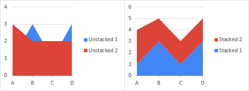
In the unstacked area chart below left, series 1 in blue is plotted first, and series 2 in red is plotted in front, partially obscuring series 1. The legend lists the series in this order.
In the stacked area chart below right, the blue area is plotted first and the red area is stacked on top. The legend is reversed, so that series 2, plotted at higher Y values than series 1, is also listed higher in the legend.
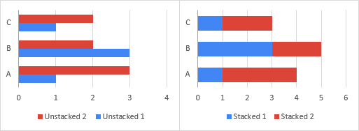
In an unstacked bar chart (below left), the legend lists series in the order they appear: red above blue. In a stacked bar chart (below right), the legend also lists series in the order that they are stacked, red to the right of blue.
In an unstacked column chart (below left), the legend lists series in the order they are plotted: blue before red. In a stacked column chart (below right), the legend lists series in the order that they appear, red above blue.

Mixed Chart Types (Combination Charts)
The order in which data is plotted in the chart and listed in the legend becomes more complicated when multiple chart types are used in the same chart. The rules are straightforward, but they aren’t documented anywhere, so people get confused.
Series Order by Chart Type
The order that series are plotted in the chart and listed in the legend follows this order of chart types: Area, Column and/or Bar, Line, and XY Scatter. Changing the plot order (by rearranging series in the Select Data Source dialog or by changing the last argument in the Series Formula) will rearrange series within a type, but will not move series out of their plot type order.
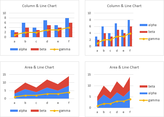
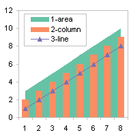
Start with this simple data and insert a clustered column chart (usually the default type). Then right click on any series and select Change Series Chart Type from the pop up menu. Change series “Area 1” to an area, keep “Column 2” as a column, and change “Line 3” to a line. The blue area series is drawn behind the other series and listed first in the legend, the red columns are drawn in front of the blue area and listed in the middle, and the gold line is plotted in front of the others and listed last.

Big deal, you may think, that’s the order that the data was arranged in the worksheet. Reverse all that, and the line will be drawn first, behind the others, while the area will be drawn last, obscuring the rest.
Below is the data in reverse order and the resulting column chart. Again, right click on any series and select Change Series Chart Type. Change “Line1” to a line, keep “Column 2” as a column, and change “Area 3” to an area. The gold area series is drawn behind the other series and listed first, the red columns are drawn in front of the gold area and listed next, and the blue line is plotted in front of the others and listed last.
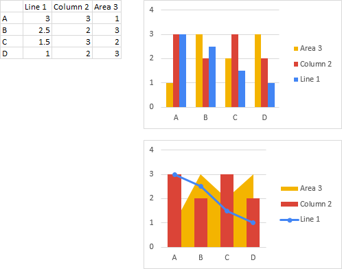
So we see that the chart type dictates the order in which series are drawn and listed, regardless of the order of series data within all of the data in the chart.
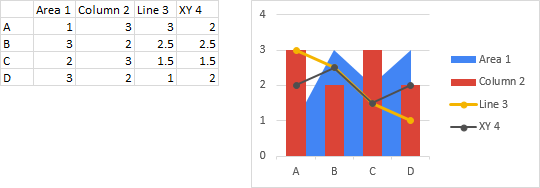
We can extend this further to show that an XY Scatter series will be plotted in front of all the other series, regardless of where it falls in the chart source data.
Primary and Secondary Axes
Earlier I wrote that the order of series by chart type was Area, Column and/or Bar, Line, and XY Scatter. I placed Column and Bar together because if your chart contains both column and bar series, they are plotted in the same layer between areas and lines, and they are listed together in the legend. Their precise order depends on which axis each is assigned to.
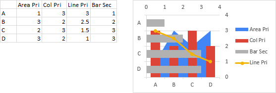
Below I’ve added a bar chart series to the first combination chart above. A bar chart series cannot be plotted on the same axis group as another chart type, so in the chart below, the area, column, and line series are plotted on the primary axis, and the bar is plotted on the secondary axis, so that the gray bars are in front of the red columns. Note that the legend order is area first, line last, and column and bar in the middle. Because the column series is on the primary axis, it is listed before the bar series.
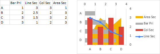
Next I’ve added a bar chart series to the second combination chart above. I’ve plotted the bar on the primary axis, while the area, column, and line series are plotted on the secondary axis. Note that the gray bars are behind the red columns. The legend order is still area first, line last, and column and bar in the middle. Because the bar series is on the primary axis, it is listed before the column series.
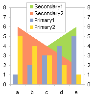
The following chart has no bar series, but area, column, and line series on each of the primary and secondary axes. All areas are listed first, then all columns, then all lines; within each chart type, the primary series are listed before the secondary series.

Legend ordering can be even more intricate. Below is four series of data and a column chart.
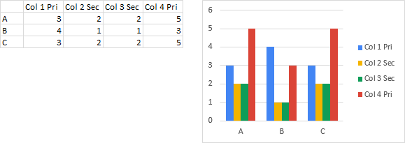
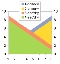
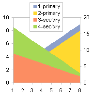
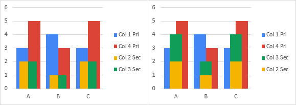
In the chart below left, series 2 and 3 have been moved to the secondary axis. Note that the legend lists series 1 and 4 first for the primary axis, then series 2 and 3.
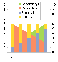
In the chart below right, series 2 and 3 on the secondary axis have been changed to stacked columns. The legend still lists primary axis series 1 and 4 in that order, but lists secondary series 3 and 2 in the order they re stacked.
Earlier I showed how a line chart series with markers and no line will be plotted in front of a later line chart series with a line (with or without markers). This happens if both series are on the same (e.g., primary) axis.
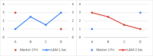
Below left: red series 2 markers plotted in front of blue series 1 line and markers. Below right: blue series 1 markers plotted in front of red series 2 line and markers.

If the series with markers only is on the primary axis and the series with the line (with or without markers) is on the secondary axis, the primary markers will not be plotted in front of the secondary series.
Below left: blue secondary series 1 plotted in front of red primary axis series 2. Below right: red secondary series 2 plotted in front of blue primary series 1.
Legends with Many Entries
Legends can get complicated when there are many charted series and many entries in the legend.
Legends with Multiple Rows and Columns
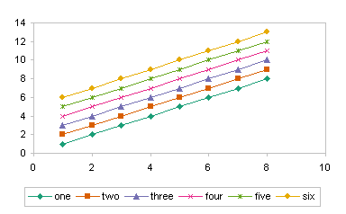
The following chart has a legend across the bottom, listing all 8 series in a horizontal row.
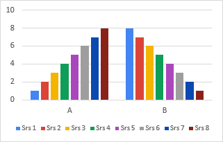
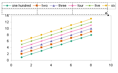
If you shrink the width of the chart, eventually the legend will no longer fit. Excel converts the legend to two rows. Shrink the chart further, and the legend will change to three rows, then four.
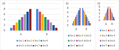
Excel tries to place the same number of entries into each row: 8 entries in the original legend, then 4+4 entries, then 3+3+2, and finally 2+2+2+2.
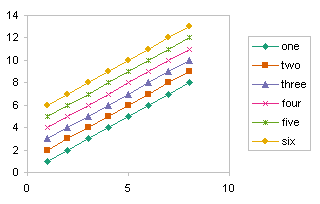
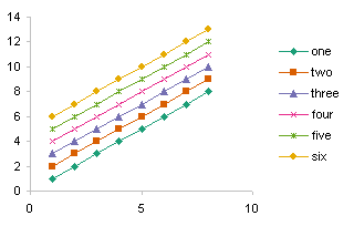
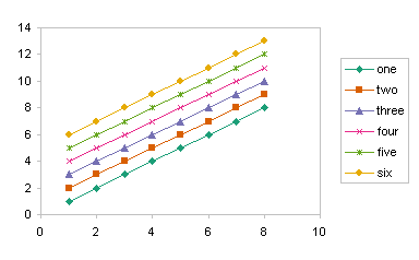
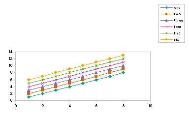
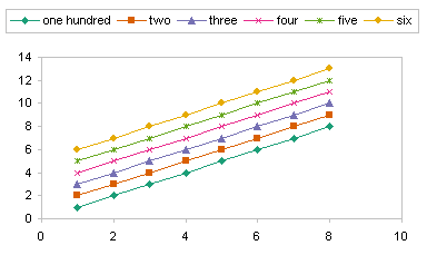
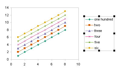
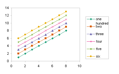
It’s a little different with a vertically aligned legend. Below left is the same chart as above, with the legend listing the series along the right edge of the chart. Shrink the chart so that the legend no longer fits, and Excel does not convert it to two columns, instead it simply drops items off the list.

In its automatic legends, Excel doesn’t like the entries to get too close together, but you can manually change the height of the legend, and more entries will fit. In the chart below left, the chart is the same size, and so is the font, but I’ve slightly stretched the legend and all eight entries appear. You can even shrink the legend, and push the legend entries together. (Shrink it too much, and again, you will lose items off the bottom of the list.)
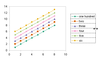
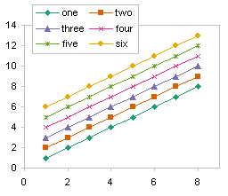
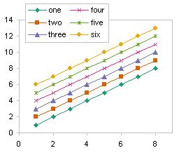
Alternatively, you can widen the legend, and Excel will add a column of legend entries (below right).

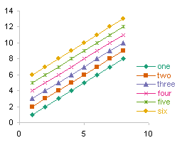
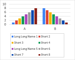
If your series names have different lengths but they fit in one row, Excel will position legend entries so the spaces between them are equal.

When you shrink the chart so that the legend reverts to multiple rows, Excel gives all legend entries the same amount of room. Note the wide spaces between the short legend entries below. I’ve used a light gray border on the legend to help illustrate this behavior.
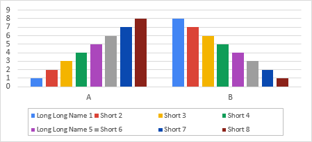
This effect continues with more rows of legend entries.
Partial List of Series
I was working on a research project management dashboard with a client, and he was showing a stacked area chart that showed data about his various projects over time. Like many analyses of this sort, most of the total was due to a small number of items. He wanted to show a list of the top N projects in the legend. He was able to do it once, but then couldn’t remember how he did it.
In my mock-up below, I have eight “projects” stacked up, and I want to show the largest four contributors to the total. These two charts have all eight series listed in the legend.

In the next two charts, I have reduced the sizes of the legends so that half of the legend entries have disappeared. The left chart has the vertical list I want, except it shows the four smallest series. The right chart shows the four largest series, but they are in a horizontal list. But I can start with the horizontal legend to produce the vertical list I want.

Below left, I have moved the legend to the top right corner of the plot area. Below right I have made the legend taller and narrower to force Excel to list the entries in one column.

Finally a little cleanup and I have the desired list of the four largest series.
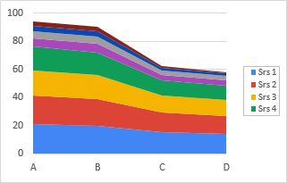
The client was thrilled when I showed how he could reproduce his top ten list of projects by starting with his legend at the bottom of the chart instead of the right side.
Other Posts About Legends
I’ve written several other articles about legends in this blog:


