Someone asked in the newsgroup how to create an XY chart in Excel that uses the label at the top of the columns of X and Y data for the axis titles. That’s not built in, but it’s not hard to do if you know a little VBA. I’ve taken an example from my web site, Interactive Chart Creation, and embellished it a bit.
The VBA procedure (code below) actually works a bit like my first recollection of Excel charting, which had two dialogs, one asking for the data range, the other asking for the range of cells to cover witth the chart. Since I always align my charts with the cell boundaries, this is nicer than the Chart Wizard in Excel versions up to 2003 and the Insert Chart command in Excel 2007.
The code uses a couple of input boxes to get the ranges from the user. I’ve added some smarts so it uses the selection as the default for the source data range in the first input box. If the selection is a single cell, the macro uses the cell’s current region (the contiguous range including the cell).
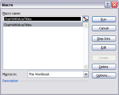
Copy the code below (use the plain text view of the code for copying) into a regular module in the VB Editor, then from Excel’s Tools menu, choose Macro, then Macros, or use the Alt+F8 shortcut key combination, then select and run the macro ChartWithAxisTitles.

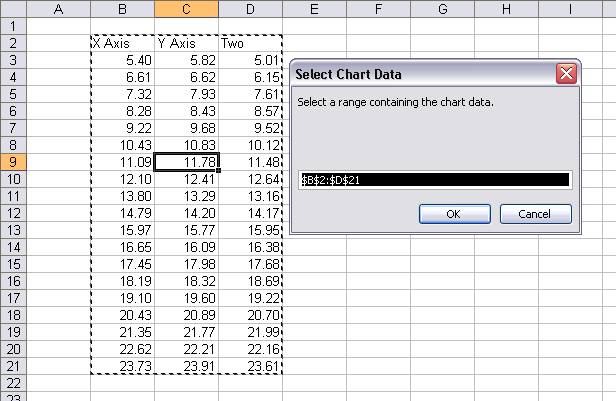
The first input box asks you to select the data range. Note that the active cell C9 has been expanded to its current region B2:D21 for the dialog’s default data range.

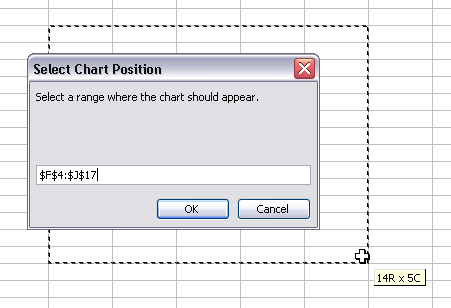
The second input box asks you to select a region for the chart to cover.

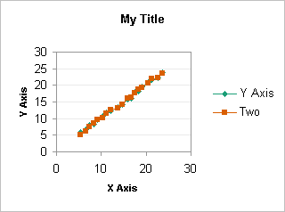
The result is an XY chart with default chart and series formatting. I’ve cleaned up the formatting slightly here, after the procedure inserted the chart, but obviously there’s room for improvement, particularly with the spacing of the chart elements.

My data range had three columns. The first is used for X values and the X axis title, the others are used for Y values for two series. The cell above the first Y data column is used for the Y axis title, and the cell above each Y data column is used for the corresponding series name.
Here is the minimally documented code:
Sub ChartWithAxisTitles()
   Dim objChart As ChartObject
   Dim myChtRange As Range
   Dim myDataRange As Range
   Dim myInitialRange As Range
   Dim sInitialRange As String


  ' bail out if we're not on a worksheet
   If Not ActiveSheet Is Nothing Then
     If TypeName(ActiveSheet) = "Worksheet" Then

       ' propose an initial data range
       If TypeName(Selection) = "Range" Then
         Set myInitialRange = Selection
         If myInitialRange.Cells.Count = 1 Then
           Set myInitialRange = myInitialRange.CurrentRegion
         End If
         sInitialRange = myInitialRange.Address(True, True)
       End If

      With ActiveSheet

        ' ask user for range that contains data for chart
         On Error Resume Next
         Set myDataRange = Application.InputBox( _
             prompt:="Select a range containing the chart data.", _
             Title:="Select Chart Data", Default:=sInitialRange, Type:=8)
         On Error GoTo 0
         If myDataRange Is Nothing Then Exit Sub

        ' ask user for range chart should cover
         On Error Resume Next
         Set myChtRange = Application.InputBox( _
             prompt:="Select a range where the chart should appear.", _
             Title:="Select Chart Position", Type:=8)
         On Error GoTo 0
         If myChtRange Is Nothing Then Exit Sub

        ' cover chart range with chart
         Set objChart = .ChartObjects.Add( _
             Left:=myChtRange.Left, Top:=myChtRange.Top, _
             Width:=myChtRange.Width, Height:=myChtRange.Height)

        ' Put all the right stuff in the chart
         With objChart.Chart
           .ChartArea.AutoScaleFont = False
           .ChartType = xlXYScatterLines
           .SetSourceData Source:=myDataRange, PlotBy:=xlColumns
           .HasTitle = True
           .ChartTitle.Characters.Text = "My Title"
           .ChartTitle.Font.Bold = True
           .ChartTitle.Font.Size = 10
           With .Axes(xlCategory, xlPrimary)
             .HasTitle = True
             With .AxisTitle
               .Font.Size = 8
               .Font.Bold = True
               .Characters.Text = myDataRange.Cells(1, 1)
             End With
           End With
           With .Axes(xlValue, xlPrimary)
             .HasTitle = True
             With .AxisTitle
               .Font.Size = 8
               .Font.Bold = True
               .Characters.Text = myDataRange.Cells(1, 2)
             End With
           End With
         End With

      End With
     End If
   End If
 End Sub


