I’ve run across a bunch of visualizations lately that I wanted to talk about. At the risk of perpetuating the “visualization porn” industry, as Robert Kosara of EagarEyes calls it in A Better Vis Web Community, I’ll share a few of them here. Apparently I’m an old curmudgeon, because I don’t like most of them, but I’ll start with one I happen to like.
NBA Team Maps

When I first saw the thumbnail for NBA Team Heat Maps on Ben Munson’s Obsessionism blog, I was thinking, great, another gratuitous use of multicolor graphics. I did think it was a great name for a blog, though not being a basketball fan, I wouldn’t consider Ben’s main obsession with the NBA as socially acceptable as, say, an obsession with Excel. (Just kidding, Ben!)
After about 30 seconds, I changed my mind. Each graph is easy to read, and shows the distribution of a team’s point differential over the past five years, When the team graphs are shown in small multiple layout, you can at a glance see and begin to understand the last five years of the NBA. It’s easy to see trends and to compare team performances in clutch games vs. blowouts, as well as rank their overall records.

I saw the thumbnail for the NBA Team Maps on the information aesthetics blog, which displays an obsession with the kind of visualizations I don’t care for, i.e., lots of colors, curvy lines going everywhere, cartoony drawings, etc. But has ten times the subscribers that the PTS Blog has, so I will keep reading it, hoping one day to get it.
Word Portraits

I don’t get the point of Word Portraits, such as the portrait above of Barack Obama from Word Portraits of Presidential Candidates on information aesthetics. What’s the information being visualized? It’s only a collection of words and phrases from the campaign, no information at all. At this point it becomes art, and belongs in a different class of blog.
Wordles
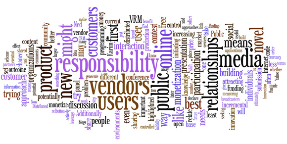
I haven’t quite decided about Wordles. These are related to Word Portraits, but the words at least convey some actual information. Generally each word is displayed in a font size related to the frequency of the word within the corpus analyzed in the wordle. Often the words are color coded to convey additional information about the words and their groupings.

Wordles are an advanced form of word clouds, which are often used on blogs to rate the popularity of categories or tags by showing them in different sizes. Sometimes, though, they come dangerously close to becoming uninformative art, like the Word Portraits.
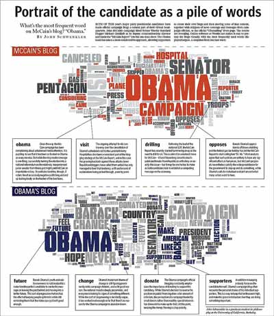
In Portrait of the Candidate as a Pile of Words the Boston Globe showed a thoughtful analysis of the presidential candidates. Two wordles were created, showing the frequency of words on each candidate’s blog.
AppScout reviewed the Globe’s article and had this to say:
By running the two blogs through Wordle Boston.com was able to get a reasonably accurate feel for their overall content. The largest word, corresponding to the most frequent use, on Obama’s blog is “Obama.” The largest word on McCain’s blog is “Obama” too! There are other interesting tidbits one only sees by taking the blogs’ words out-of-context and throwing them in a pile.
“Taking words out-of-context and throwing them in a pile.” This is an apt description of the process, and when done thoughtfully it can be very informative.
“Sim City” Infographics
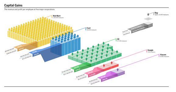
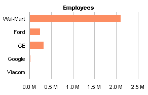
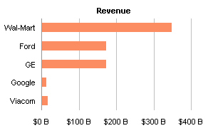
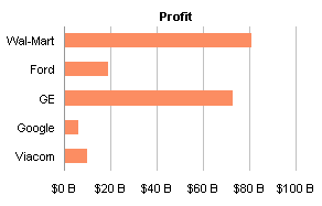
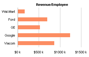
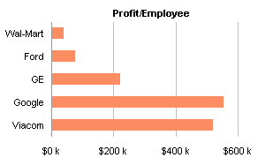
From Infographic example – poor info / great graphic on the Slides that Stick PowerPoint blog, I was pointed at this representation of capital gains for five companies at GOOD Magazine. Pretty colors, but the orientation reminds me of Sim City or Roller Coaster Tycoon, which is what led to my name for this class of graphic. Each of the individual blocks with a person standing on it is supposed to represent 10,000 employees, but the different size of each block distorts this information. A Viacom block is about four times the width or 16 times the area of a Wal-Mart block. But apparently the area of the block’s top surface is related to the profit per employee, and just the number of blocks represents the number of employees. The thicknesses of the blocks must somehow be related to the company’s revenues, but I cannot think of any algorithm that matches up the apparent thickness with either total revenue or revenue per employee. So I only half agree with Slides that Stick’s Jan Schultink: it’s poor info in a poorly conceived graphic. This same information would be easier and quicker to understand in a set of bar charts.
EagarEyes Commentary
In the first paragraph I cited Robert Kosara’s post A Better Vis Web Community, in which he lamented the sad state of the visualization blogosphere. As Robert said:
Why are the most popular visualization-related sites almost entirely about pointing at colorful pictures done by others, rather than doing their own? And how can we get more original, quality visualization content on the web?
When I look around, I see a lot of visualization porn. The pretty, flashy mash-ups of something or other, depicting somebody’s life, citing information graphics in a commercial, or growing flowers from twitter feeds. Is that visualization? Is that what we want visualization to be? Is there no way to do things better?
I was glad to see that I’m not the only one who feels this way, though I have to admit that Robert’s prose is much more elegant than mine would have been. I’ve added a number of blogs on visualization to my feed reader, and removed almost as many when they only point to the same shiny compositions of colorful blobs and arcs. The ones I keep tend to use words like “graph” and “chart” and “data”, rather than “visualization” and “infographic”.
